Task 15- Research into magazine adverts
ellie goulding
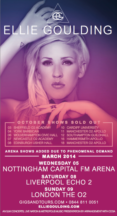
This is an advertisement for Ellie Goulding's 'Halcyon Days' tour. Much like her digipak, the same gradient has been used progressing from magenta at the bottom, to an indigo then through to a dark royal bluey-black. This will be recognisable by fans. The image is a headshot of Ellie in which she frames her face with her hands, making it a focal point. She only just stops giving direct address to the camera as she focuses just above the camera lens, which is essentially flattering and less intimidating to the audience. The Ellie Goulding logo is apparent in a bright white at the top of the advert.
The shape of the advert itself is a long, thin portrait orientated rectangle. The gradient develops into an opaque colour towards the bottom of it and this provides the perfect canvas for crucial information about dates and venues of tour destinations. These are displayed in a bright white which contrasts the deep magenta-plum colour. Meanwhile, the sold out shows are displayed in a soft pink colour which is less eye-catching as these are less important information regarding sales and profit.
The font used in this advert is the same that was used throughout her album 'Halcyon Days' which creates cohesion through her promotion and merchandise. The image appears to also have been taken during the same shoot and fans will recognize this.
Links to external sites possibly offering more information have been added at the bottom of the advert as this is where we instinctively look for these references.
Lines (aswell as changed to font colour) have been used to segregate separate blocks of information, for example around the sold out shows and next to the title of 'March 2014'. Bold has been used to highlight dates and the official site url.

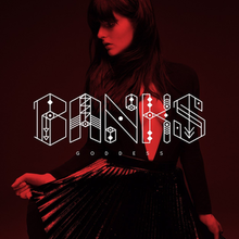
banks
This is a magazine advertisement for Banks' 'The Goddess' tour. It features the same imagery used by the album which means the advert will be instantly recognisable to fans of her music. Red is a consistently used colour by Banks throughout her album art and music videos. She appears seductive and sultry which makes her appear attractive and is a selling point for her.
The name 'Banks', presented in the format of her logo, has been enlarged slightly to add impact. The subtext of 'The Goddess Tour' has also has a black outer glow added to ensure that it is fully distinguishable against the background image.
The album cover has been referenced with an image of it, which will be to ensure the audience what to look for when looking for it (if interested and not familiar). There's also a date which is there for informative purposes.
Similarly to the previous advert, external links to the artist's official website have been added however in Banks', there are additionally links to social media. There include Twitter, Facebook and Instagram and this will increase hype as they are a great platform to gain and maintain fans with the ability to post regular personal updates.
The font and graphic throughout this advert is centrally aligned which is pleasing to the eye. The font for the support act 'Movement' is directly taken as their official logo and this will be recognisable by their fans much like Banks' will be.

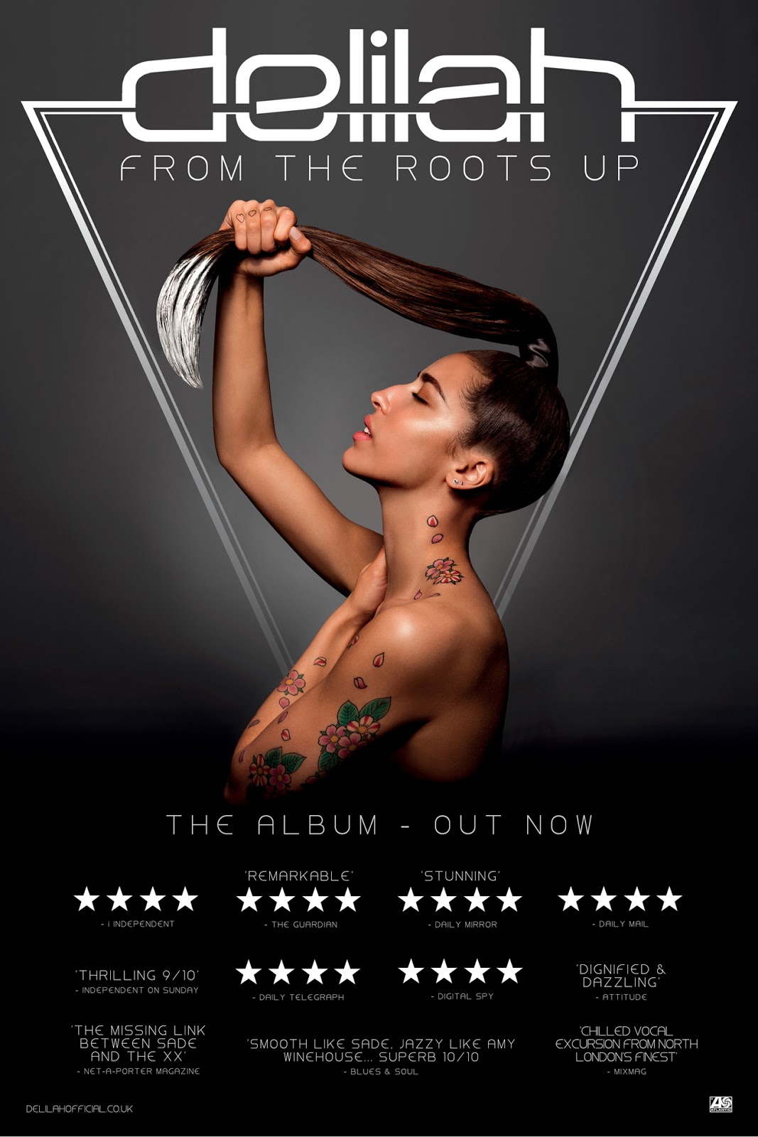
delilah
This is a magazine advert for Delilah's album 'From The Roots Up' in which the same image has been used however, with some slight changes. One of which is the contrast, which has been heightened and the tone which has been cooled slightly. Another is the placement of the album name which has been moved from the bottom to underneath the 'Delilah' logo.
In the image, Delilah appears nude and the angle particularly shows her tattoos which relate to the name of the album. This may make it more memorable to the audience.
The font used for the album title has been used throughout the rest of the poster and this creates cohesion between the album cover to the advert as well as just within the poster.
The poster is monochrome with a gradient background and the only colour coming from Delilah, reinforcing her as a focal point. Her tattoos are especially vivid against the greyscale surroundings and again, this makes them a strong focal point. The triangle creates two leading lines which our eyes will naturally follow down from the name 'Delilah' to her shoulders and this supports the idea of her being intentionally a focal point.
The four star ratings have been filled with white as apposed to just being outlines of stars and this makes them more prominent to the audience.
As did the previous two from Ellie Goulding and Banks, an official website external link has been referenced at the bottom left hand corner to allow the audience to find extended information.

marina & the diamonds
This is an advert for Marina & the Diamonds' album 'The Family Jewels' in which the same shot has been used as was used on the cover, although the scale varies slightly in relation to the text (logo) as well as the positioning of the logo components. The name logo has been altered as to make it more central, therefore commanding more attention.
Marina lays down with direct address to camera, her mouth open slightly and a seductive, sultry look about her. This will attract attention from the audience.
A referential image of the cover of single 'Shampain' has been added to inform the audience of what to look for if interested and browsing for it. The font, colour and style, has been added to the poster singularly also.
Names of the songs, for example 'Hollywood' have been made bold to increase attention to them.
Similarly to all other adverts i've analysed, there is an external link to the artist's official website placed in small text at the very bottom of the advert. They have also made reference to iTunes which is where profit can be made.


Research into magazine adverts
By caseyjefferies