When common sense
is not enough:
user testing and prototyping
Application Case Study
Ekaterina Orlova
/Accenture

Ekaterina Orlova

Software developer /Accenture Norway
Angular Trainer @ Netology Russia
@cheerypick
Girl Geek

Common sense assumptions?

http://prettyinthepines.com/2015/12/christmas-jammie-party/
-
Common sense assumptions are nice
-
Hard to predict when they fail
What is Min Bedrift 2.0?
- Self-service solution for Telenor's corporate customers
- Various customer range: 1 to 10000+ employees
(My Company)
Min Bedrift 1.0
- Powerful and complicated
- Created in 2007
- Conservative: "I'll better call customer support"

- 68,4% of log-ins by 2,2% active companies
Min Bedrift 2.0
- Large scale Angular application + JAVA RESTful API
- Angular Material inspired grid and SVG icon system
- Mock NodeJS API for prototyping needs


Min Bedrift 1.0 vs 2.0: DEMO
Agile Workflow

Prototype
- Axure -> Angular+NodeJS
- Not only for user tests
- Protect sensitive client data ("real" frontend + mock API)
- Distributed team collaboration(animations, interactions, etc)
Development is expensive
- Prototype early and often
- Verify ideas: design iterations
- Ask right people and ask right questions
- "We are testing solution, not you"

sensible.com/rsme.html
Text
Evolution: front page


Evolution: front page

Evolution: front page

Evolution: front page
What we learned
(and keep learning)

Text
Text
Text
Text
Text
Text
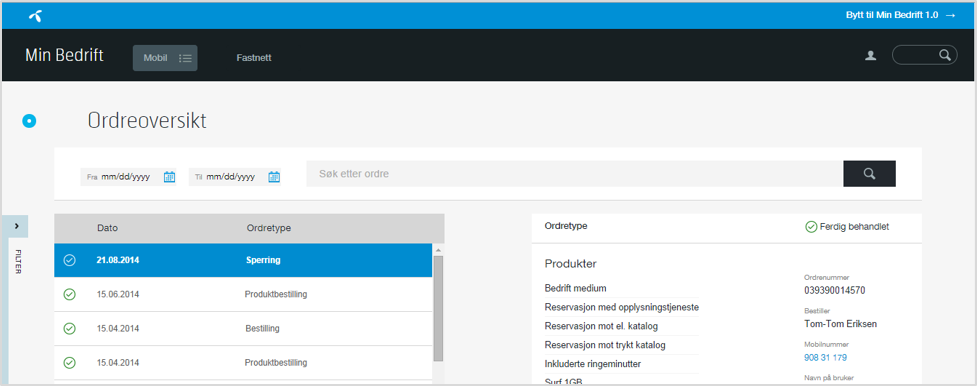
Before: order history with filter slider
-
The filters are difficult to find
-
Users want the number or name of the subscription to be displayed in the order history list
Text
Text
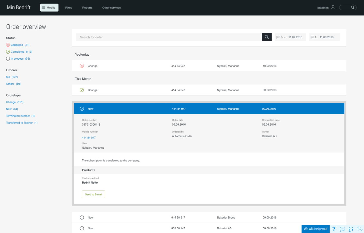
After: order overview with fixed filters and expandable rows
Empty states
ngIf
ngIf
ngIf
ngIf
ngIf
ngIf
ngIf
ngIf
ngIf
ngIf
ngIf
Menu navigation
vs
Extensive search usage
Problem:
complex subscription detail page with "a lot of scrolling"

Concept: quick nav sticky component

+
Most of the users said the icons on the navigation made sense in relation to which part of the page they were referring to.
–
The shortcut navigation was not used by any of the participants. By some of the participants it was not noticed at all.
Component reuse FTW!
...if it is the right use case for the component
Tiles:

"Intuitive and clean"
"That's quite awesome!"
"Easy to see what I have subscribed to, and what it costs"
Tiles:


Administrator access rights


Granting access is complicated for multiple companies and accounts
Modal bubbles


Subtle optimistic spinners

+ live update where possible
Thank you!
@cheerypick
Copy of AngularConnect: prototyping
By cherrypick


