Angular
Flex
Layout
Sophisticated component layout engine for
Angular
Ekaterina Orlova


github.com/cheerypick
Frontend web dev /Accenture Norway
Co-organizer of Mobile Era Oslo
Angular trainer @ Netology Russia
@cheerypick
Flexbox CSS
+
mediaQuery
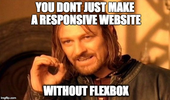

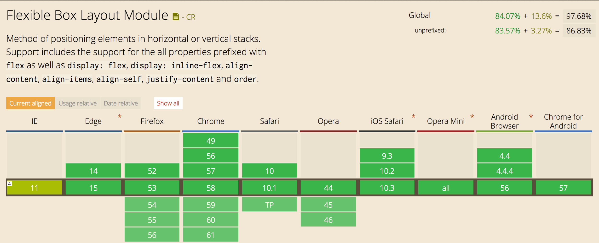
Browser support
Why
@angular/flex-layout?
Pure TypeScript layout engine
Independent of Angular Material
...but they work fine together
No external CSS stylesheets
Angular CLI Integration
Static API
Responsive API

npm install --save @angular/flex-layout@latestimport { FlexLayoutModule }
from '@angular/flex-layout';
...
@NgModule({
imports: [FlexLayoutModule],
...
})
export class AppModule { }Import Angular Flex-Layout NgModule
Install Angular Flex-Layout
v2.0.0-beta.8
Static Layout API
CSS Flexbox Model
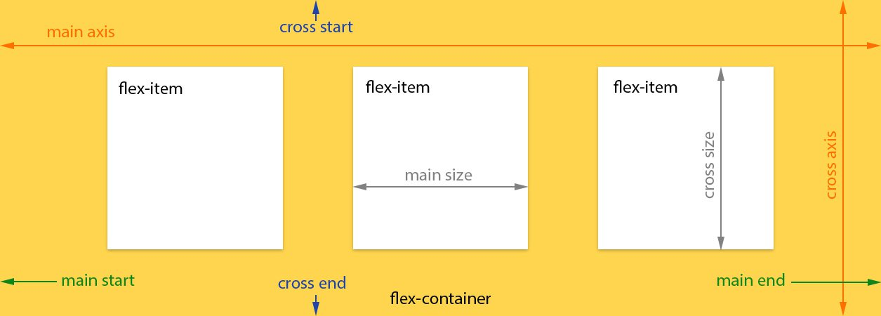
API for DOM containers
| fxLayout |
|
|---|---|
|
fxLayoutWrap |
|
|
fxLayoutGap |
|
|
fxLayoutAlign |
<div fxLayout="row"
    fxLayout.xs="column"> </div>
<div fxLayoutWrap> </div>
<div fxLayoutGap="10px"> </div>
<div fxLayoutAlign="start stretch">
</div>
fxLayout API
<div fxLayout="row">
  <div>One</div>
  <div>Two</div>
  <div>Three</div>
  <div>Four</div>
</div>
<div fxLayout="column">
<div>One</div>
<div>Two</div>
<div>Three</div>
<div>Four</div>
</div>
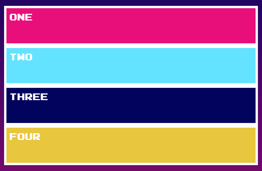
fxLayout options
<div fxLayout="row-reverse">
...
</div>
| Value | Equivalent CSS |
|---|---|
| default | {flex-direction: row} |
| row | {flex-direction: row} |
| row-reverse | {flex-direction: row-reverse} |
| column | {flex-direction: column} |
| column-reverse | {flex-direction: column-reverse} |
API for flex elements
| fxFlex |
|
|---|---|
|
fxFlexOrder |
|
|
fxFlexOffset |
|
|
fxFlexAlign |
|
|
fxFlexFill |
<div fxFlex="1 2
calc(15em + 20px)"></div>
<div fxFlexOrder="2"></div>
<div fxFlexOffset="20px"></div>
<div fxFlexAlign="center"></div>
<div fxFlexFill></div>
fxFlex API
-
flex-grow
-
flex-shrink
-
flex-basis
3 parameters:
flex-grow
Defines how much a flexbox item should grow ( proportional to the others) if there's space available.

flex-shrink
defines how much a flexbox item should shrink if there is not enough space available.

flex-basis
controls the default size of the element

fxFlex
<div fxLayout="row" fxLayoutAlign="center">
  <div fxFlex="1 1 auto">One</div>
  <div fxFlex="5 1 auto">Two</div>
  <div fxFlex="1 1 auto">Three</div>
  <div fxFlex="1 1 auto">Four</div>
</div>


fxFlex options
- fxFlex
- fxFlex="2 2 calc(10em + 10px)"
- fxFlex="102px"
- fxFlex="auto"
The flex-basis values can be pixels, percentages, calcs, em, vw, vh, or known aliases.
| alias | Equivalent CSS |
|---|---|
| grow | {flex: 1 1 100%} |
| initial | {flex: 0 1 auto} |
| auto | {flex: <grow> <shrink> 100%} |
| none | {flex: 0 0 auto} |
| nogrow | {flex: 0 1 auto} |
| noshrink | {flex: 1 0 auto} |
Runtime expressions
To use runtime expressions, developers should use the box-notation to specify 1-way DataBind (to an expression).
<div [fxFlex]="twoColumnSpan">...</div>Responsive API
Material Design Breakpoints
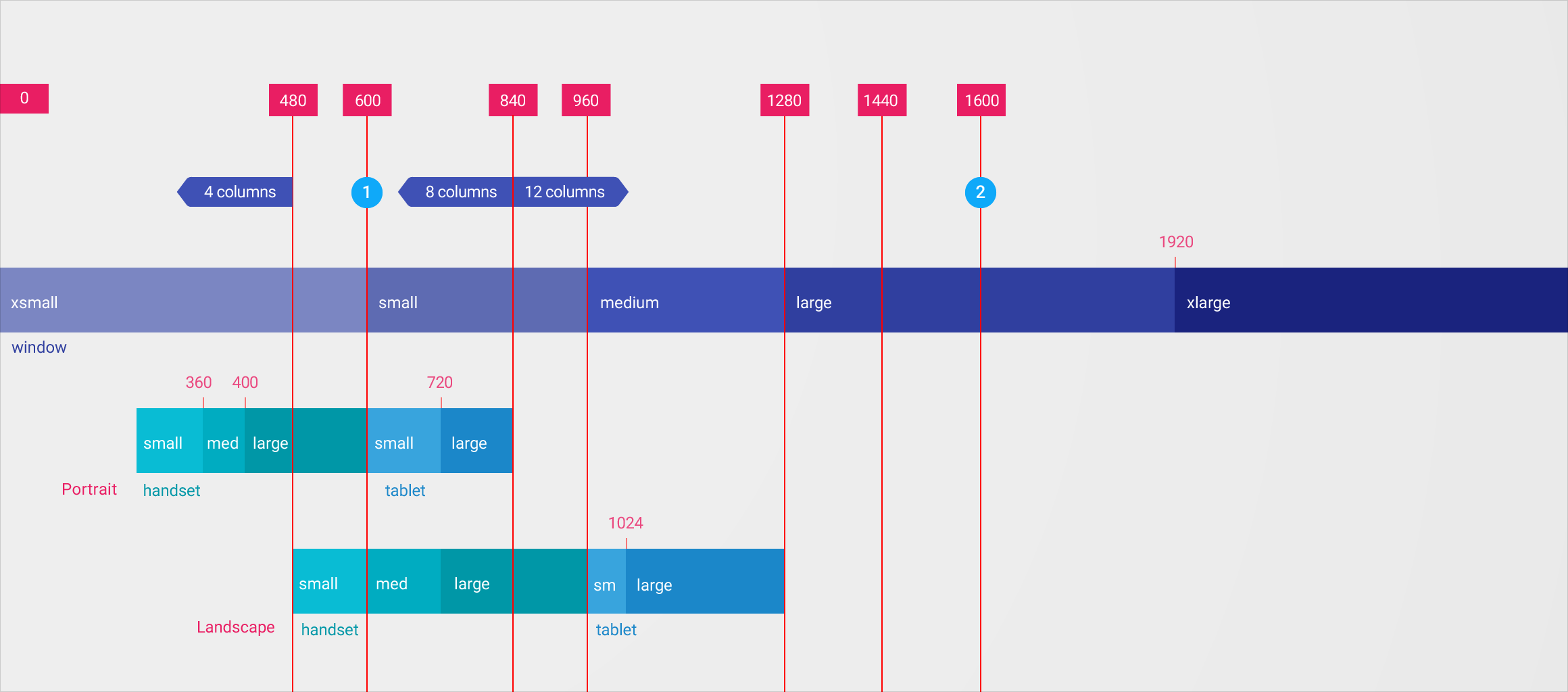
Media Queries and Aliases
| breakpoint | mediaQuery |
|---|---|
| xs | 'screen and (max-width: 599px)' |
| sm | 'screen and (min-width: 600px) and (max-width: 959px)' |
| md | 'screen and (min-width: 960px) and (max-width: 1279px)' |
| lg | 'screen and (min-width: 1280px) and (max-width: 1919px)' |
| xl | 'screen and (min-width: 1920px) and (max-width: 5000px)' |
| lt-sm | 'screen and (max-width: 599px)' |
| lt-md | 'screen and (max-width: 959px)' |
| lt-lg | 'screen and (max-width: 1279px)' |
| lt-xl | 'screen and (max-width: 1919px)' |
| gt-xs | 'screen and (min-width: 600px)' |
| gt-sm | 'screen and (min-width: 960px)' |
| gt-md | 'screen and (min-width: 1280px)' |
| gt-lg | 'screen and (min-width: 1920px)' |
Visibility example
<div fxShow fxHide.xs="false" fxHide.lg="true"></div>- xl, then fallback to the default fxShow; so the div is shown
- lg, then the div is hidden (since the value === 'true')
- md, then fallback to the default fxShow; so the div is shown
- sm, then fallback to the default fxShow; so the div is shown
- xs, then the div is shown (since the value === 'false')
Sizing example
<div fxFlex="50%" fxFlex.gt-sm="100%"></div>- xl, then fallback to 'gt-sm' so the div sizing is 100%
- lg, then fallback to 'gt-sm' so the div sizing is 100%
- md, then fallback to 'gt-sm' so the div sizing is 100%
- sm, then fallback to the default fxFlex="50%"; so the div is 50%
- xs, then fallback to the default fxFlex="50%"; so the div is 50%
Special Responsive Features
| fxShow |
|
|---|---|
|
fxHide |
|
|
ngClass |
|
|
ngStyle |
<div fxShow
    [fxShow.xs]="isVisibleOnMobile()"></div>
<div fxHide
    [fxHide.gt-sm]="isVisibleOnDesktop()"></div>
<div
    [ngClass.sm]="{'fxClass-sm': hasStyle}"></div>
<div
    [ngStyle.xs]="{color: 'blue'}"></div>
ngClass API
@angular/flex-layout ngClass directive is a subclass of the @angular/common ngClass directive
Classname assignments with selector (and its responsive versions) are destructive and will overwrite any existing classnames in use.
class
<div class="default" class.xs="responsive"></div>This div has either default or responsive class assigned!
ngClass API
The Flex-Layout ngClass adds responsive features to add/remove CSS classes for activated breakpoints
<some-element ngClass="first second"
  [ngClass.xs]="{'first':false, 'third':true}">
</some-element>
for xs:
- remove the class='first'
- keep the class='second'
- add the class='third'
Adaptive layouts
- different components for different breakpoints
- alter animations based on viewport size
JavaScript API (Imperative)
Programmatic features
| ObservableMedia |
|
|---|---|
|
BREAKPOINTS |
|
|
BaseFxDirectiveAdapter |
constructor(public
    media:ObservableMedia ) {}
providers: [{provide: BREAKPOINTS,
    useValue: MY_CUSTOM_BREAKPOINTS }]
export class ClassDirective
    extends NgClass {}
ObservableMedia
injectable ObservableMedia service provides mediaQuery activations notifications for all registered breakpoints
ObservableMedia:
API summary
- subscribe(): Subscription
- asObservable(): Observable<MediaChange>
- isActive(query: string): boolean
ObservableMedia::subscribe()
subscribe(
  next?: (value: MediaChange) => void,
  error?: (error: any) => void,
  complete?: () => void
): Subscription;
Subscribe to mediaQuery activations
import {Subscription} from "rxjs/Subscription";
import {MediaChange, ObservableMedia}
  from "@angular/flex-layout";

constructor(media: ObservableMedia) {
  this.watcher = media.subscribe(
    (change: MediaChange) => {

      if ( change.mqAlias == 'xs') {
        this.loadMobileContent();
      }

    });
}
ObservableMedia::asObservable()
import {Subscription} from "rxjs/Subscription";
import 'rxjs/add/operator/filter';
import {MediaChange, ObservableMedia}
from "@angular/flex-layout";


export class MyDemo {

  constructor(media: ObservableMedia) {
      media.asObservable()
        .filter((change: MediaChange) =>
            change.mqAlias == 'xs')
        .subscribe(() => this.loadMobileContent() );
  }
}
ObservableMedia::isActive()
import {MediaChange, ObservableMedia}
from "@angular/flex-layout";

const PRINT_MOBILE = 'print and (max-width: 600px)';

@Component({
   selector : 'responsive-component',
   template: `
      <div class="ad-content" *ngIf="media.isActive('xs')">
        Only shown if on mobile viewport sizes
      </div>
   `
})
export class MyDemo implements OnInit {
  constructor(public media: ObservableMedia) { }

  ngOnInit() {
    if (this.media.isActive('xs') && !this.media.isActive(PRINT_MOBILE)) {
       this.loadMobileContent();
    }
  }
}
Custom breakpoints
-
Developers can easily override the default breakpoints used within Flex-Layout
-
Build custom providers to override the default BreakPointRegistry provider
Customising breakpoints
import { NgModule } from '@angular/core';
import { DEFAULT_BREAKPOINTS, BreakPoint } from '@angular/flex-layout'
import { validateSuffixes } from '@angular/flex-layout/utils';

/**
 * For mobile and tablet, reset ranges
 */
function updateBreakpoints((it:BreakPoint) => {
  switch(it.alias) {
    case 'xs' : it.mediaQuery =  '(max-width: 470px)';   break;
    case 'sm' : it.mediaQuery =  '(min-width: 471px) and (max-width: 820px)'; break;
  }
  return it;
})

@NgModule({
  providers: [
    // register a Custom BREAKPOINT Provider
    {
      provide : BREAKPOINTS,
      useFactory : function customizeBreakPoints() {
        return validateSuffixes(RAW_DEFAULTS.map( updateBreakpoints ));
      }
    }
  ]
})
export class MyBreakPointsModule { }
"Holy Grail" of layouts
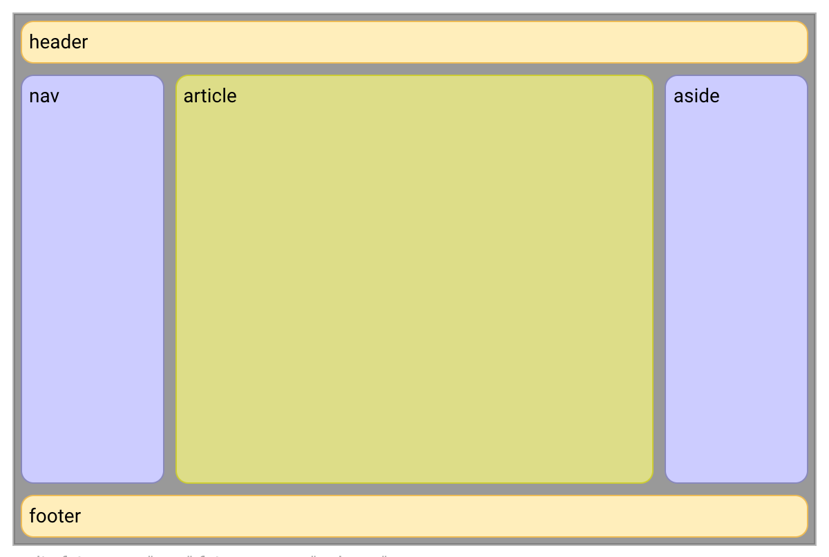
<div>
  <header>header</header>
  <div>

    <nav>nav</nav>

    <article>article</article>

    <aside>aside</aside>

  </div>
  <footer>footer</footer>
</div>
<div fxLayout="column">
<header>header</header>
<div fxLayout="row" fxFlex>
<nav fxFlex="1 6 20%">nav</nav>
<article fxFlex="3 1 60%">article</article>
<aside fxFlex="1 6 20%">aside</aside>
</div>
<footer>footer</footer>
</div>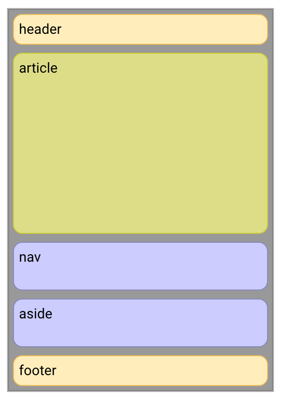
<div fxLayout="column">
  <header>header</header>
  <div fxLayout="row" fxLayout.xs="column"
    fxFlex="1 1 auto">

    <nav fxFlex="1 6 20%" fxFlexOrder
        fxFlexOrder.xs="2">nav</nav>

    <article fxFlex="3 1 60%" fxFlexOrder
        fxFlexOrder.xs="1">article</article>

    <aside fxFlex="1 6 20%" fxFlexOrder
        fxFlexOrder.xs="3">aside</aside>

  </div>
  <footer>footer</footer>
</div>
Resources
Angular Flex-Layout
https://github.com/angular/flex-layout
Visual guide to Flex
http://cssreference.io/flexbox/
Slides
http://slides.com/cherrypick/deck-9
Demo
https://github.com/cheerypick/flex-app
Gitter Chat
https://gitter.im/angular/flex-layout
Quiz time!
Join at kahoot.it
with Game PIN:
121761
Thank you!
Ekaterina Orlova
@cheerypick
github.com/
twitter.com/
Angular Summit: Angular Flex Layout
By cherrypick
Angular Summit: Angular Flex Layout
Angular Flex Layout slides for Angular Summit 2017


