On animating elements as they transition in and out of the DOM (or at least the accessibility tree).
It's easier than it used to be, but still kinda hard.
Chris Coyier
by
We're gonna start with a <dialog> element.
A <dialog> is a reasonable thing to want to animate anyway, but there is a more important reason.
@top-layer is cool. Focus trapping is cool. Opening & closing with HTML is cool...
A <dialog> element is display: none; when it is closed.
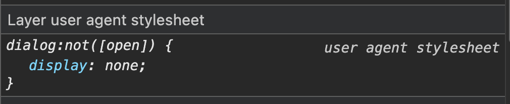
Animating to and away from display: none; has historically sucked.
e.g. not possible without JavaScript schenaigans.
So one thing we're talking about is animating any element to and away from display: none;
.thing {
  display: none;

  &.open {
    display: block;
  }
}
This used to mean, unless you do some serious trickery with many downsides, you just can't animate it.
dialog {
  opacity: 0;
  transition: 1s opacity,

  &:open {
    opacity: 1;
  }
}
❌ Dialog instantly appears
❌ Backdrop instantly appears
❌ Dialog instantly disappears
❌ Backdrop instantly hides
BOOOOOOOOOOOOO
it feels like it should work but just doesn't.
The change from display: none; to display: block; is implied. (User Agent Stylesheet)
dialog {
  opacity: 0;
  transition:
    1s opacity,
    1s display allow-discrete;

  &:open {
    /* as it first renders,
       it's already this. */
    opacity: 1;
  }
}
❌ Dialog instantly appears
❌ Backdrop instantly appears
✅ Dialog fades out
❌ Backdrop instantly hides
Ugjjkaghgh. Rough name.
dialog {
  opacity: 0;
  transition:
    1s opacity,
    1s display allow-discrete;

  &:open {
    opacity: 1;
  }

  @starting-style {
    &:open {
      opacity: 0;
    }
  }
}
✅ Dialog fades in
❌ Backdrop instantly appears
✅ Dialog fades out
❌ Backdrop instantly hides
default
allow-discrete
transition timeline
propery "flips" here
transition timeline
transition timeline
dialog {
  transition: ...;

  /* STATE #3: "On the way out" / After Closed */
  &:not(:open) {

  }

  /* STATE #2: Open */
  &:open {
    opacity: 1;
  }

  /* STATE #1: "On the way in" / Before Open */
  @starting-style {
    &:open {
      opacity: 0;
    }
  }
}
3
2
1
Note the source order!
3
2
1
Source Order
dialog {
  opacity: 0;
  transition:
    1s opacity,
    1s display allow-discrete,
    1s overlay allow-discrete;

  &::backdrop {
    opacity: 0;
    transition: opacity 1s;
  }

  &:open {
    opacity: 1;
    &::backdrop {
      opacity: 1;
    }
  }

  @starting-style {
    &:open {
      opacity: 0;
      &::backdrop {
        opacity: 0;
      }
    }
  }
}
✅ Dialog fades in
✅ Backdrop fades in
✅ Dialog fades out
✅ Backdrop fades out
Not the biggest fan of overlay. It's a mystery keyword you just have to know that makes the backdrop transition work. And even though you need a transition on the backdrop itself, that's now where you put it.
Popovers
Yay popovers are cool. It's a great API. Another thing you can make work with HTML alone. CSS helps style them, but JavaScript isn't needed at all.
Let's do approach it with the same 3, 2, 1 strategy.
<button popovertarget="my-popover">
  Toggle Popover
</button>

<aside popover id="my-popover">
  Content of popover
</aside>
MORE CRIMES plz
Hidden by default (display: none;) and toggled by the button above.
[popover] {
  --timing: .66s;

  transition:
    var(--timing) opacity,
    var(--timing) rotate,
    var(--timing) display allow-discrete,
    var(--timing) overlay allow-discrete;

  opacity: 0;
  rotate: 10deg;
  transform-origin: top left;

  &:popover-open {
    --timing: 0.2s;
    opacity: 1;
    rotate: 3deg;
  }

  @starting-style {
    &:popover-open {
      opacity: 0;
      rotate: -3deg;
    }
  }
}
3
2
1
Rotation here as part of the design instead of translate.
The open state has a different class.
Faster on the way in, slower on the way out.
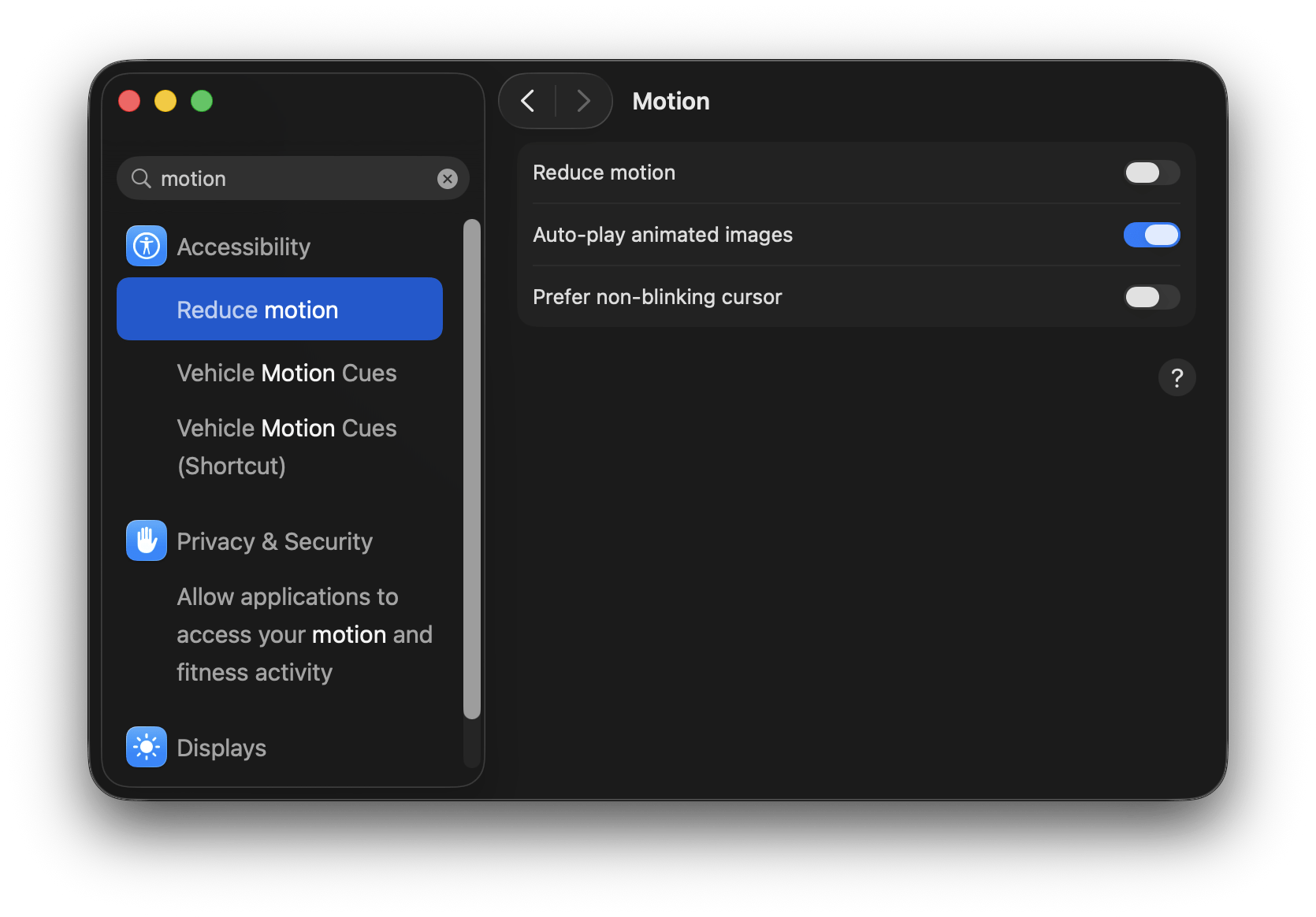
@media (prefers-reduced-motion: reduce) {
  [popover] {
    transition:
      var(--timing) opacity,
      /* rotate is removed! */
      var(--timing) display allow-discrete,
      var(--timing) overlay allow-discrete;

    &, &:popover-open {
      rotate: 0deg;
    }
  }
}
View Transitions
View Transitions are part of this situation as well. They are uniquely qualified to animate elements to entirely new states, but also as they are entering and leaving the DOM entirely.
We're going to look at "same page" view transitions which is most relevant here. But there are also "multi page" view transitions which are arguably more broadly amazing.
addButton.addEventListener("click", () => {
  document.startViewTransition(() => {
    addItemToDOM();
  });
});

removeButton.addEventListener("click", () => {
  document.startViewTransition(() => {
    removeItemToDOM();
  });
});
addButton.addEventListener("click", () => {
if (!document.startViewTransition) {
addItem();
cleanupIncomingItems();
return;
}
const transition = document.startViewTransition(() => {
addItem();
});
transition.finished.then(cleanupIncomingItems);
});::view-transition-group(incoming) {
animation-duration: 320ms;
animation-timing-function: cubic-bezier(0.2, 0.8, 0.2, 1);
}
::view-transition-new(incoming) {
animation-name: incoming-slide-fade;
}
::view-transition-group(outgoing) {
animation-duration: 280ms;
animation-timing-function: ease-in;
}
::view-transition-old(outgoing) {
animation-name: outgoing-shrink-fade;
}
@keyframes incoming-slide-fade {
from {
opacity: 0;
transform: translateX(-64px) scale(0.9);
}
to {
opacity: 1;
transform: translateX(0) scale(1);
}
}
@keyframes outgoing-shrink-fade {
from {
opacity: 1;
transform: scale(1);
}
to {
opacity: 0;
transform: translateX(72px) scale(0.88);
}
}"name selector"
These actions are done in JavaScript, so we can set it when we create the elements.
el.style.viewTransitionName = "incoming";
bonus demos
AIM = "Anchor Interpolated Morph"
The "on the way in" and "on the way out" styles can use anchor positioning and anchor sizing. They can even be different anchors.
OK let's be done!
Fun! Thanks for coming!
Thanks to the Smashing gang.
deck
By chriscoyier


