KERRANG
Banner
Colour themed
Bold Footer
Stickers
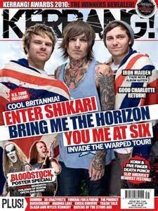
Kerrang have placed a band which are very popular and relevant with the background of the audience they are aiming at, this will intrigue the consumer into buying the issue. The band have been photographed with British jacks to emphasize on British culture which would also persuade the customer to buy the product. They have also made the colour scheme subtly contrast with each other by using the colour from the original photography to supplement the overall piece, this gives the magazine a very professional look but also fun and exciting. Across the cover in bold font and use of bright and dark colours the publishers have presented names of bands with bold and striking fonts to also engage a possible consumer since they know the market they are aiming for are actually interested in that kind of market. The masthead fits in well, it doesn't stick out and cover lots of the page yet hides behind the subjects, this is ok though because the kerrang masthead is so recognisable people will still realise what the actual brand is.
NME
Distinct strapline
Bold stickers
Speech
Large masthead
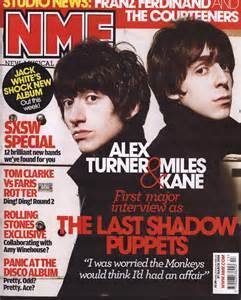
Nme have a very different layout to kerrang, they still have musicians on a large scale in order to intrigue consumers however the masthead is much smaller and doesn't take up a wide area which means there is more space for text. This is where they have introduced the strapline showcasing the topics of the magazine. The publishers also make use of the subjects and the photography, since they are wearing black they can introduce bold colours like white and red. Like kerrang the cover uses large bands and displays their name in order to gain attention which works. It is very structured as the writing down the side is laid out like a list which may interest the people who actually are interested in reading a lot of information, however some may just want a magazine that just jumps straight to the point. They've also included quotes in speech marks to implement that there is some gossip which people would want to find to find out about in the magazine which means more people are likely to buy it.
GUITARIST
Small strapline
Sophisticated masthead
Subtle banner
Dull colour scheme
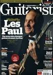
This front cover is a lot more grown up and clearly targets an older audience compared to the other two magazines which uses punchy and bold colours. The layout is very structured and sophisticated with colours that don't stand out . The publisher has chosen a dim background and used a white font to make the important words recognisable. Like with most magazine a subject takes up a large space on the cover but since the man is elderly and dressed in a certain way it implies what type of person will go and purchase, even though it applies to a particular audience it doesn't try and interest a younger audience which they could be missing out on. The strap line is much smaller and not as bold yet still contains a fair amount of information, they may expect that buyers are regular and don't need to engage their attention in order for them to pick up a copy.
deck
By Christian Plummer


