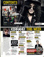
KERRANG
Main subject
Advertisment
Thumbnails engage the consumer and give more depth
Bold banner makes it obvious to the reader for navigate
The contents page on kerrangs issues don't tend to be as stand out as its front cover yet it still gets it's message across in a very structured way, a quarter of the page still has a picture of a band member or solo artist in order to still engage the reader but isn't too large or bold enough to be distracted from the text. Important text is in yellow on top of a black box (also in capitals) which is bold and clearly highlights what the reader may want to know from the page, it has been structured well by adding in smaller images in order to spice up the page instead of leaving it blank with just text, the page numbers are also bold white on top of red to stand out, and are next to each topic so it isn't confusing and the customer can navigate around the magazine well.
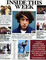
NME
Lots of individual thumbnails makes piece more interactive and engaging
Very large fonts for page numbers make it easily navigable.
Large title doesn't initially say contents and says something that appeals to their audience more
Less interesting pages compressed into smaller box
Varying fonts keep the page interesting for it's target audience
The conents page immediately seems to present lots more information because it has larger pictures and fonts, however it seems very messy and unstructured unlike the front cover. Even though this comes across as messy the contents makes it clear what it is going to be in the issue because in a large bold font it states 'inside this week'. The page numbers are also very bold making it easier for the audience to navigate through the rest of the magazine. The publishers seemed to leave the background and create the feeling of a newspaper as this magazine seems to provide more actual information on stories rather than promotions like kerrang which had quite a few covered on their contents page.
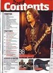
GUITARIST
Bold Contents
Large main image, emphazie
This contents page has a very bold masthead which makes it evident that this is where you can navigate the magazine incase people have poor sight, the background is white with black text which is traditional and stands out nicely, it also has a few images related to the magazine topic in order to engage its reader, the structure is very confined alike the front cover since it is a very mature magazine, since it has a very specific audience which would like a more sophisticated style in their choice of media. The colour scheme is black,white, and red which is bold and effective but doesn't come across as childish.
deck
By Christian Plummer


