Kerrang
Bold font stands out
Vibrant pink makes overall piece pop
Large subject
Enlarged letter makes it easier to spot text
Highlighted questions make it more distinct
Stand out border engages audience
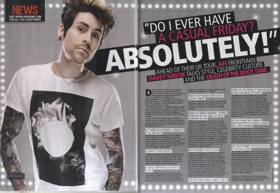
The publisher has again presented the page with another artist on a much larger scale to give the spread more depth and catch the reader, a good use of the double page is how they have had the words extend onto the next page, this enables for larger text and can interest the reader, another trend kerrang seem to do is have bold and colourful text on top of black boxes to emphasize the message they are trying to send across, the border also compliments the background nicely and is very subtle which means the text on the page will stand out more however still looking professional, the only small issue is that the smaller text is hard to read and some readers could miss out or skip the page.
NME
Large subject
Coloured font on top of each other to stand out and pop
Enlarged letter
Small graphics give more depth
Coloured boxes make text pop
Coloured font emphasizes importance
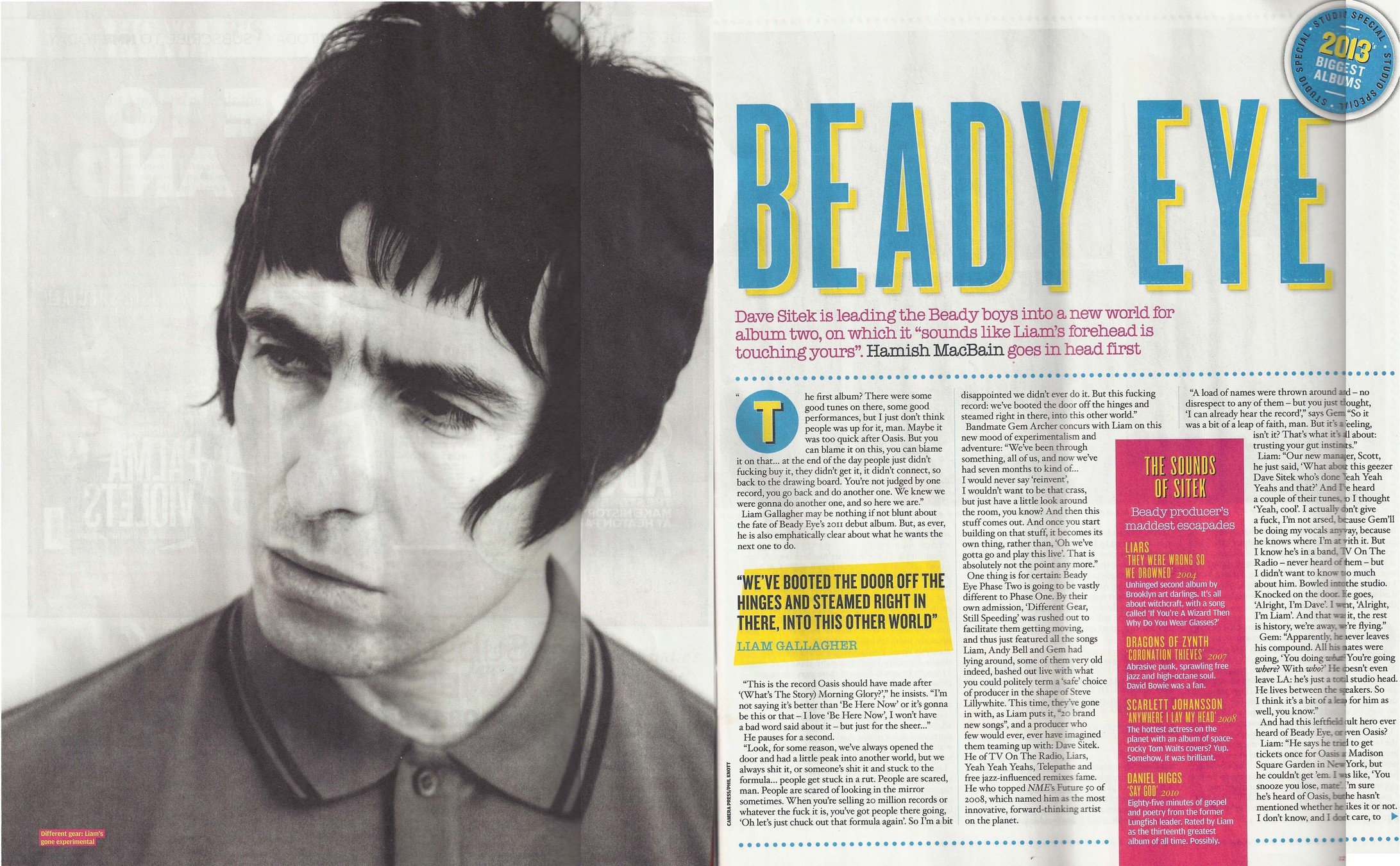
This double spread is quite plain but half the spread is filled with a photograph of an artist to add more depth to the page, the bright colours also add some definition to the page since the background is grey. The tone i get from NME is very indie and rustic, there seems to be lots more information than promotions like on kerrang. The overall piece is subtle and doesn't particularly stand out, yet this might just be their style and that they are just appealing to their audience which may not like stand out fonts and colours.
GUITARIST
Subject takes up entire spread
Small amount of text
Contrast of colours stand out with background
Enlarged font
Additional image to add depth to spread
This double spread focuses on a very large subject (guitar) which the audience wants to see, the type of photography used makes lots of depth and gives a deeper meaning to the magazine, the text in the bottom left hand corner is very small though and quite un noticeable compared to the image, this is why there is a bold white L in order to engage the reader. The use of bold white is needed up against a large image since the massive image distracts you from the actual text in the magazine, yet even though it is trying to catch your attention it still remains professional.
deck
By Christian Plummer


