"How does your media product represent particular social groups?"
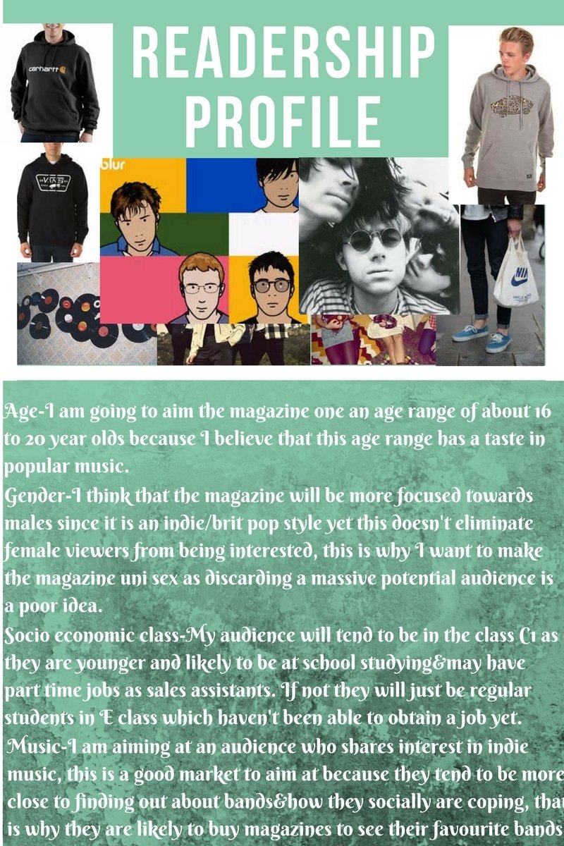
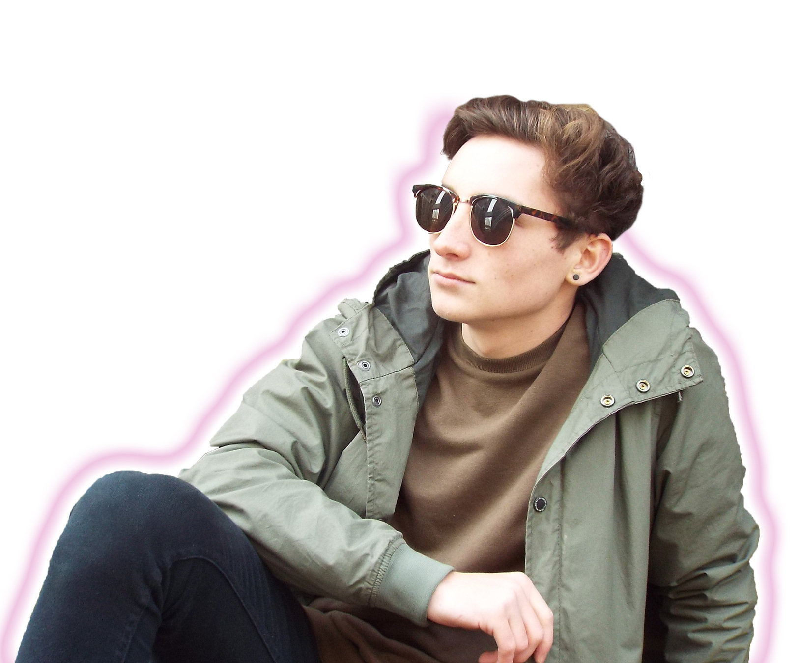
I feel like my product has represented an alternative group quite well. I took some inspiration from bands like The Wombats and Two door cinema club which are an alternative rock/pop band, their band photography is filled with bold and popping colours which exemplify the bands personality. I wanted to re-create a style like this with my own imagery because i feel like it appeals to late teenagers and younger adults typically aged 16-25, however I feel that the light colours can also be seen as inviting towards other audiences and not restrict itself as a niche product. I feel like the models have managed to remain looking cool and edgy but not to the point that it looks like they are trying too hard.
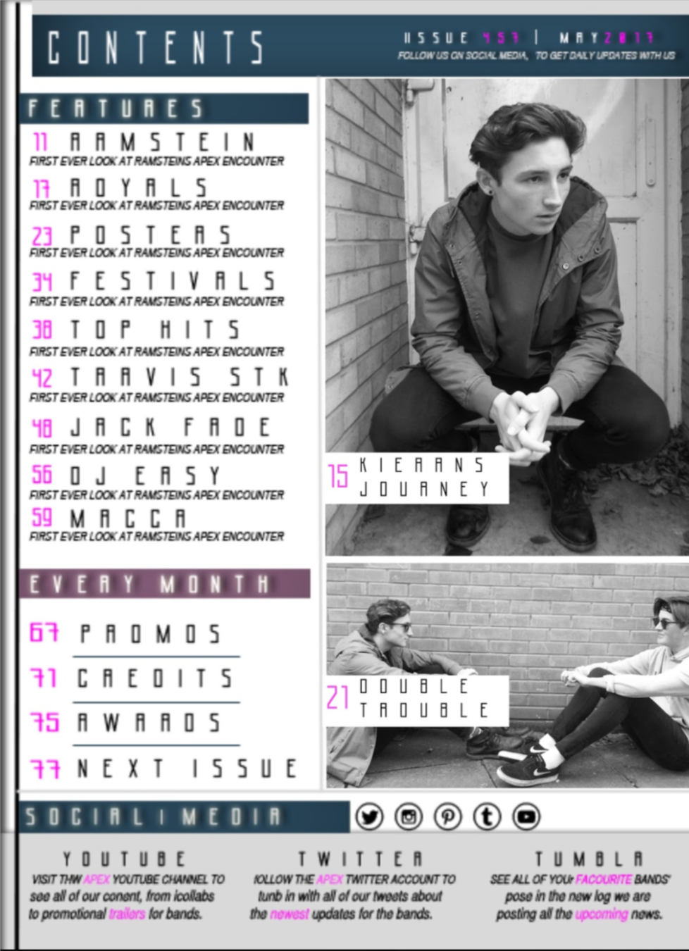
Another way i have tried to represent my younger audience is with the use of social media. I added small icons onto the bottom corner of the page (Facebook, twitter, Instagram and youtube), these sites/apps are used most frequently by my target audience, meaning if the magazine has relations to online media they can gain a larger following. Having a social media platform will make the audience feel more involved with the magazine. I also added bold text to make it obvious that the magazine has social media accounts resulting in the audience becoming intrigued . This can be linked to the gratification theory because social media is another dimension in how the magazine can be recognised, the consumer can expand the magazines popularity through social media so it is important to ensure the company is linked with these apps.
I have looked at the Gratifications theory and have applied a certain mood, they gain a personal aspect because I have promoted youtube, because youtube is a video streaming service you can choose to stream music videos so it can apply to anyone, this offers more enjoyment to the consumer as they are receiving even more aspects of media.
Because most of my target audience are students with little money it's important for them to save. I included stickers and promotions which pull the reader in with the bold wording of the word plus. I believe the use of the word plus is effective as it associates something extra included on top of the price, inevitably this will gain the audiences attention and make them want to purchase issues if they know they're getting deals.

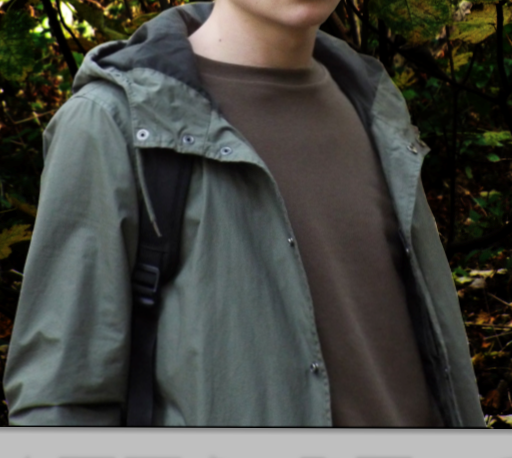
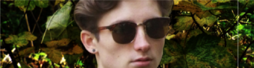
Their clothing will relate to the younger audience with my models by wearing stylish clothes, my model Keiran is wearing a vintage jacket, vintage is what is in style at the moment which looks cool and edgy, I also gave the model props (shades) to mute the emotion to make the character seem more mysterious and reserved. I think that my audience since they are likely in their teens are not going to be overally expressive so I think that they will like this muted look. I did try using bandannas on my models however my audience probably wouldn't wear them, it also made the models seem like they were trying to be a different genre so I decided not to include it.
I feel like my final products match my target groups well since I have managed to acknowledge and apply their socio economic class by offering discounts in order to help them on their lower disposable incomes. I have also taken into consideration their social media uses and incorporated their sites into my magazine in order to help gain a larger following. As well as this I dressed my models in an appropriate way to satisfy and relate to my target audience so that the consumer would have something in common with the magazine, this makes it more engaging for the consumer.
deck
By Christian Plummer


