Interactive Data Visualisations Built with Python

Python

Jesús Martínez Blanco
Principal Data Scientist
@

Before we start:
git pullJake Vanderplas
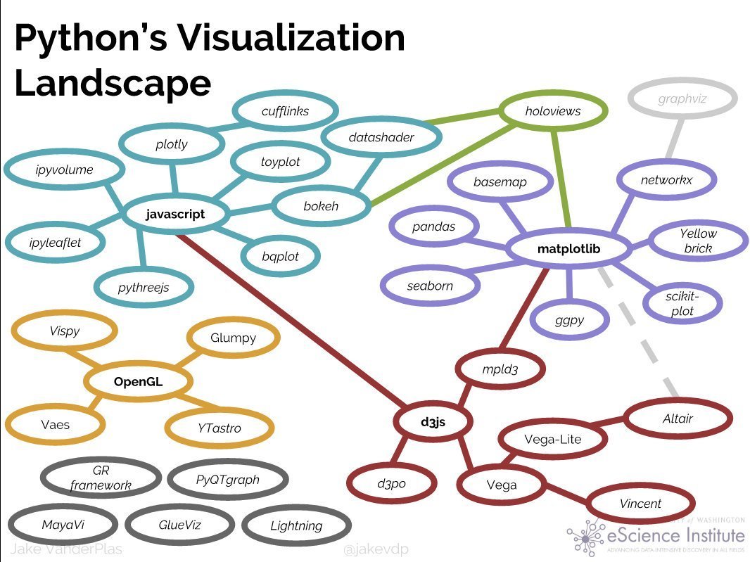

Visit also Anaconda's PyViz.org
Article elaborating on the diagram above
Data Visualisation:
which type to choose?
- Data Visualisation Catalogue
comprehensive list of chart types in data viz.
Pretty much any chart type is possible in Plotly.
RESOURCES:
- From Data to Viz
interactive web with a decision tree to choose visualization type, and with link to code snippets.
- Data Visualisation Guide
A Comprehensive Guide to Unlocking Your Data’s Potential.
- Chart Suggestions (poster)
- Visual Vocabulary (poster)
What is Plotly
A Canadian company building products around data analytics and visualisation tools:
- Charts: Web UI for building plots online.
- Dashboards: Online dashboards with D3.js Plotly charts.
- Slide Decks: Powerpoint-like slide decks online that have interactive Plotly charts.
- Falcon: open-source SQL editor with inline Data visualization.
They make money hosting your plots privately (Chart-Studio) and providing consulting and training services.
Website: https://plot.ly
Disclaimer: I do not hold any professional or commercial relationship with Plotly
A famous example
Video: How Does Income Relate to Life Expectancy? (The Gapminder Foundation)
A nice example
Plotly's open source libraries for Data Science
Apart from their paid products, they have open sourced their plotting libraries:
- Plotly.js: JavaScript library for front-end graphs and dashboards (example here).
- Plotly for R: the Javascript code is generated from R code.
- Plotly for Python: the Javascript code is generated from Python code.
- Dash: Python framework for building analytical web applications (including server side).
- React: component suit for React web applications.
They are free to use and are fully functional OFFLINE
(no need to use their servers).
Contains D3.js
Plotly for Python
Write Python code and get interactive plots rendered in the browser.
You'll need (see Getting Started with Plotly in Python):
- Python > 3.5 installation (for example Anaconda distro)
-
Go to the VIZ_course directory in the terminal and:
Bookmark these (docs):
uv init
uv add pandas nbformat ipykernel plotly kaleido
uv run plotly_get_chrome  # to export images
for static image export
Plotly for Python
If you have Docker, navigate in the terminal to the directory with your notebooks and execute this:
docker run --rm -it -p 1789:8888 -v $PWD:/home/jovyan/HOST chumo/plotly_course run : executes the Docker image chumo/plotly_course.
If you don't have it in your local machine,
it will be downloaded automatically from DockerHub.
--rm : to remove the Docker container after
       finishing the Jupyter notebook server with CTRL+c.

 -it : to be able to stop the JupyterLab server running on the container.

 -p  : to map the port 8888 internal to the running container
       (where the notebook is running) to the port 1789 outside the container.

 -v  : to mount a local directory into the
       directory /home/jovyan/HOST inside the container.
... and then see the Jupyter Notebook at http://localhost:1789
use any available port
Are you all set up?
In JupyterLab you may need the jupyterlab-plotly extension and change the default renderer:
import plotly.io as pio
pio.renderers.default = 'jupyterlab'
Plotly from scratch
# Import the library

import plotly as py
Building blocks
# Import the Plotly building blocks
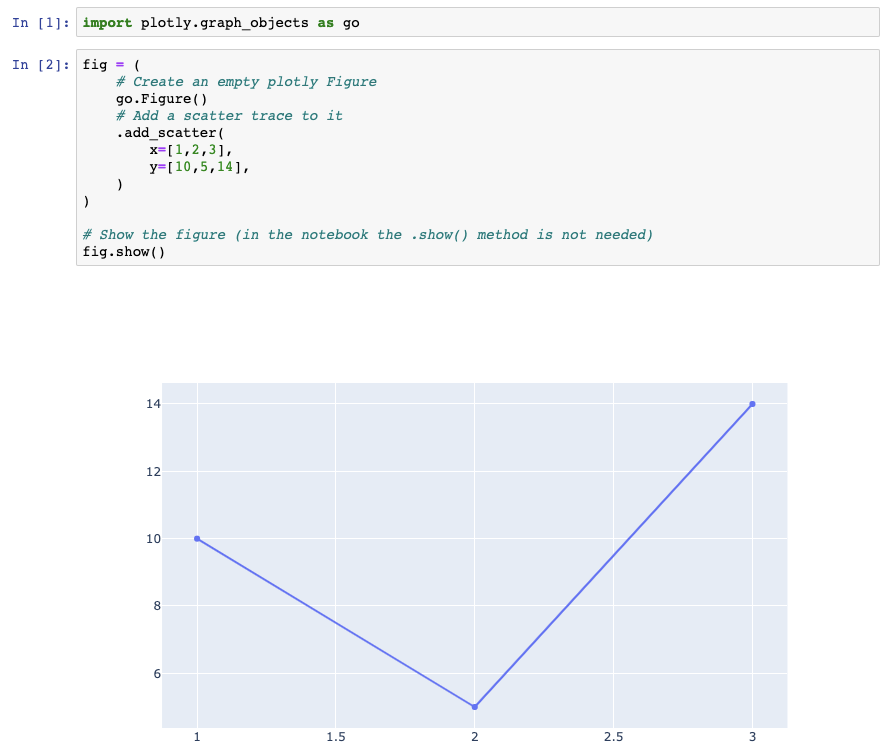
import plotly.graph_objects as goA Plotly figure is built upon objects from plotly.graph_objects
and Python dictionaries and lists.
Examples of such objects are:
go.Scatter(x=X, y=Y)

go.Bar(x=X, y=Y)

go.Histogram(x=X)

go.Layout(title='My Title')
It is possible to use Python dictionaries instead:
dict(type='scatter', x=X, y=Y)

dict(type='bar', x=X, y=Y)

dict(type='histogram', x=X)

dict(title='My Title')
# Display the result in the notebook with...
fig.show()Constructing a figure
import numpy as np
x = np.linspace(0, 2*np.pi)

# Traces
trace0 = dict(type='scatter', x=x, y=np.sin(x))
trace1 = dict(type='scatter', x=x, y=np.cos(x))


# Figure
fig = go.Figure(data=[trace0, trace1]) 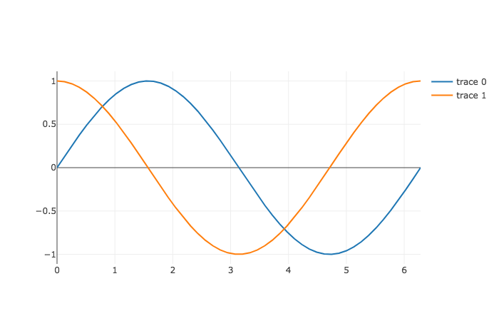
and now with a Layout
import numpy as np
x = np.linspace(0, 2*np.pi)

# Traces
trace0 = dict(type='scatter', x=x, y=np.sin(x), name='sin(x)')
trace1 = dict(type='scatter', x=x, y=np.cos(x), name='cos(x)')

# Layout
layout = dict(
  title='SIN and COS functions',
  xaxis=dict(title='x'),
  yaxis=dict(title='f(x)'),
)

# Figure
fig = go.Figure(data=[trace0, trace1], layout=layout)
# syntactic sugar
xaxis_title='x',
yaxis_title='f(x)',
display with configurations
# For example, remove the Plotly logo for a cleaner layout,
# and make texts editable:
fig.show(
    config=dict(
        displaylogo=False,
        editable=True,
    ),
)
You can set a configuration to alter how the plot is displayed (see configuration options)
Exercise
Reproduce this:
Reproduce this:
Subplots
# Contrary to what we saw so far,
# the figure object with subplots is defined beforehand:

from plotly.subplots import make_subplots

fig = make_subplots(
    rows=1,
    cols=2,
    subplot_titles=('f(x) = sin(x)', 'f(x) = cos(x)'),
    shared_yaxes=True,
)
Modify the fig object
# Once the figure object has been created,
# we can concatenate .add_ methods (to add specific traces)
# or the .update_ methods (to update existing features):

(
    fig

    .add_scatter(...)
    .add_histogram(...)
    .add_box(...)
    .add_bar(...)

    .update_xaxes(...)
    .update_yaxes(...)
    .update_layout(...)
    .update_traces(...)
)
It accepts a selector parameter as well
They accept a row and col parameters
Exercise
vertical_spacing
subplot_titles
shared_xaxes
Reproduce this:
hints
Things you can do with the Figure object
# Display it in the notebook
fig.show()  or  fig.show(renderer='png')
# Export it as static image (done by KALEIDO under the hood)
fig.write_image(file='sin_cos.png', width=700, height=500)# Create a stand-alone html file
fig.write_html(file='sin_cos.html', include_plotlyjs='cdn')# Share it via the Plotly cloud platform (CHART STUDIO)# or just a <div> element with the plot to embed in your web page
fig.write_html(file='mydiv.html', include_plotlyjs=False, full_html=False)# Introspect its dictionary representation
fig.to_dict()
fig.full_figure_for_development(as_dict=True) # includes defaults tooThey accept a config parameter
use .to_html to get the raw stringThe figure, hosted in Plotly
HTML file with the figure
# Generate the HTML code of the plot in a <div> element:

fig.write_html(
    file='mydiv.html',
    include_plotlyjs=False,
    config=dict(displaylogo=False),
    full_html=False,
)
# Then you can use the resulting string in your own HTML code:
with open('mydiv.html', 'r') as f:
div_str = f.read()
html_str = f'''
<!DOCTYPE html>
<html>
<head>
<script src='https://cdn.plot.ly/plotly-3.0.1.min.js'></script>
</head>
<body>
<h1>Simple Dashboard</h1>
<p>The following plot is static and interactive at the same time ;)</p>
{div_str}
</body>
</html>
'''
# The final string can be saved in a file
with open('simple_dashboard.html', 'w') as f:
f.write(html_str)HTML file with the figure
Sharing your
Interactive Visualisations
- Share the stand-alone html generated with
fig.write_html()
- Host your plot in Plotly, after sending it via chart_studio and use the provided sharing link.
- Use a hosting service: for example, GitHub pages (or Netlify if you also want server-less functions available).
Hosting Visualisations in GitHub
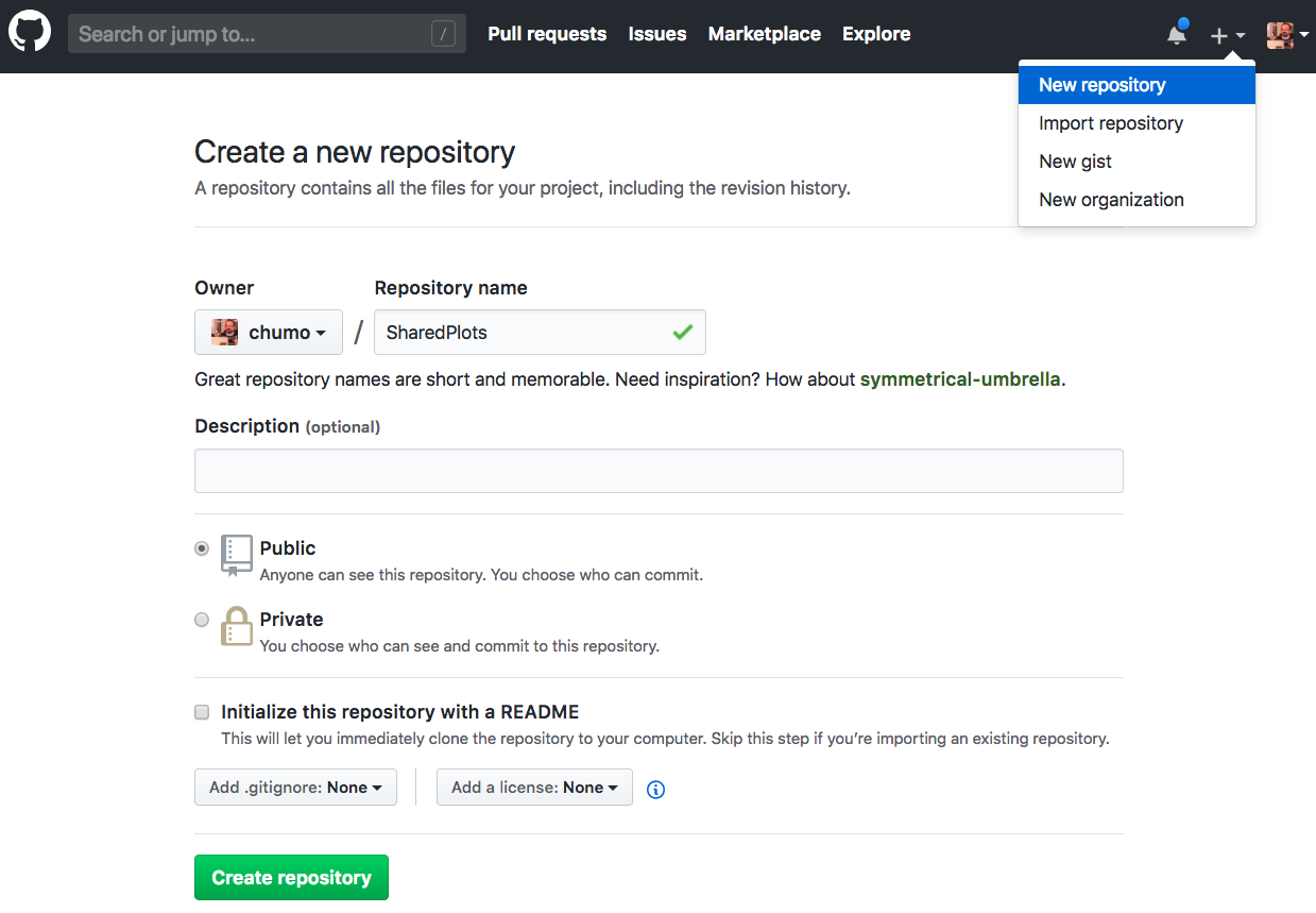
Create a repo in your GitHub called, say, SharedPlots.
1.
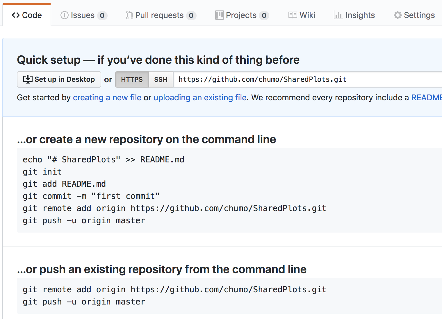
Hosting Visualisations in GitHub
Upload any .html file created with Plotly to this repository:
2.
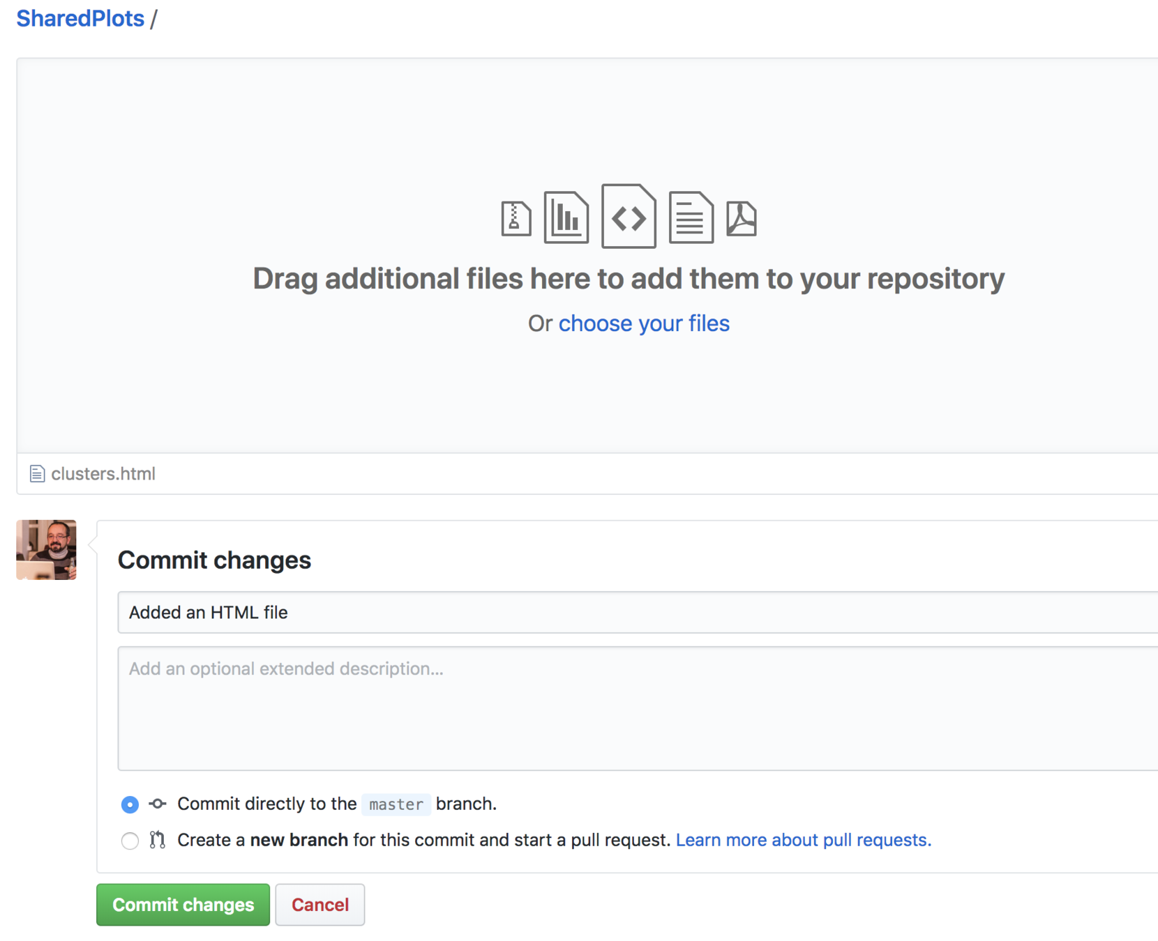
Hosting Visualisations in GitHub
Commit your changes to the repository:
3.
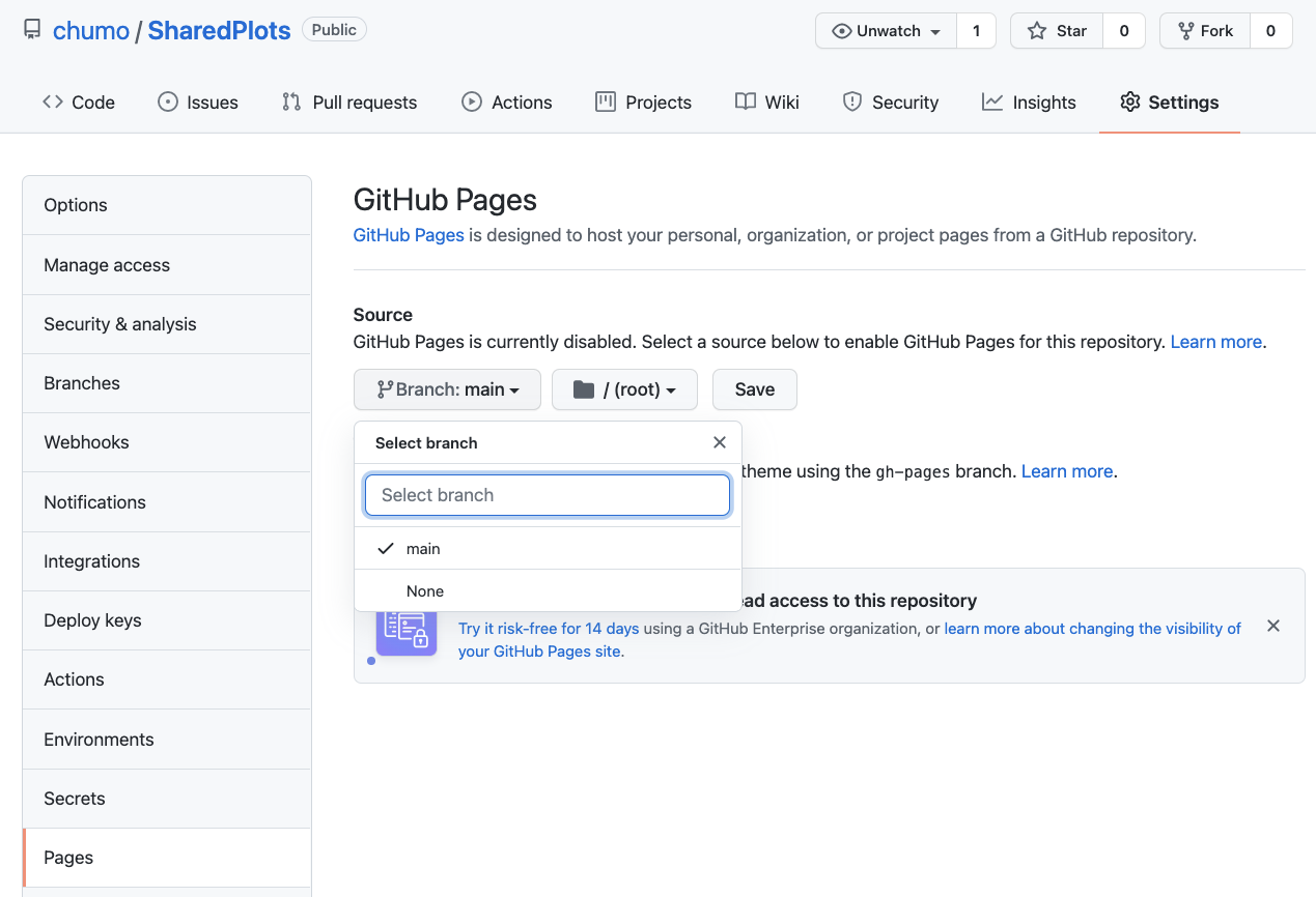
Hosting Visualisations in GitHub
Click on the "Settings" tab, go to menu "Pages", and set the "main" branch to be served. Press "Save"
4.
Hosting Visualisations in GitHub
Your visualisation is automatically served under the URL:
5.
https://USERNAME.github.io/REPOSITORY/FILENAME.html
Ta-dá !!!
where USERNAME is your GitHub username
REPOSITORY is the name of your repository
and FILENAME is the html file that was added to the repo
NOTE 2: it may take a few minutes to be available online.
NOTE 1: if you don't specify FILENAME.html, GitHub Pages is trying to serve index.html or README.md by default.
Plotly Express
Check:
- Presentation post: Introducing Plotly Express
- Documentation: Read the Docs
What is Plotly Express?
- A wrapper for Plotly.py
- Complex interactive visualisations with one-liners (not all chart types are supported yet)
- Inspired by the Layered Grammar of Graphics
- Takes a tidy Pandas dataframe as input
From version 4.8, no longer a requirement!
See this post
Grammar of Graphics
- Leland Wilkinson (1999) publishes a seminal book defining the components (layers) that make up a data visualization.
- Wilkinson's framework got very popular with the R package ggplot2 created by Hadley Wickham (2005) (paper: Layered Grammar of Graphics).
Grammar of Graphics
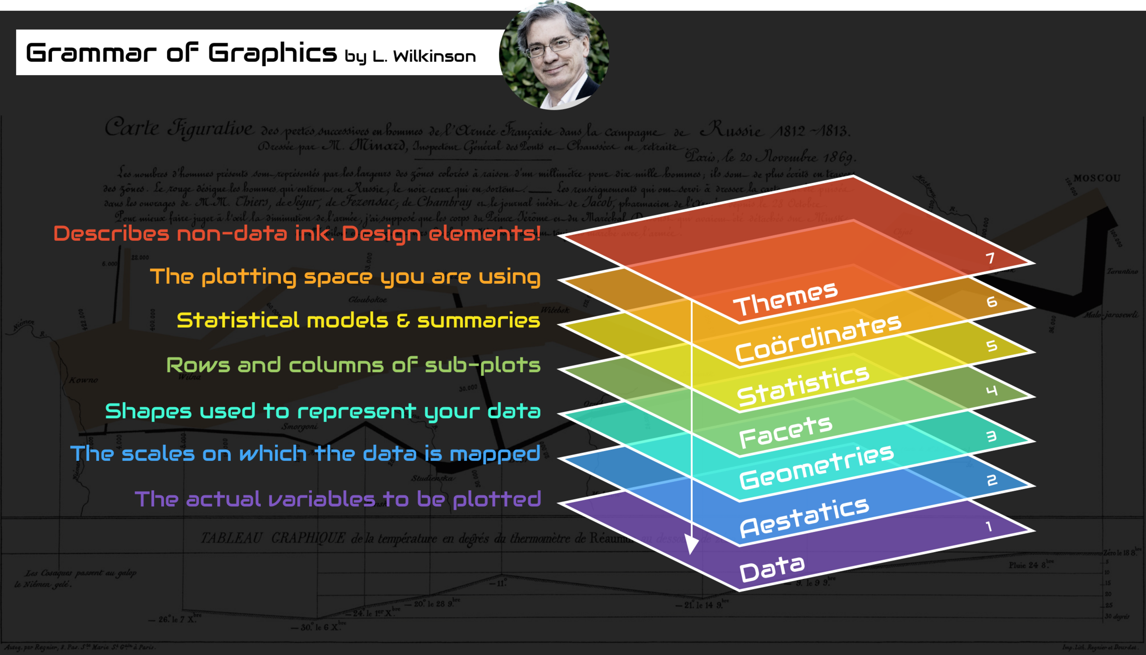
image credit: this post
Grammar of Graphics
The 8th layer: TEMPORAL BINDING
... to handle streaming data
Grammar of Graphics in Plotly Express
import plotly.express as px

px.scatter(
    data_frame= gapminder[gapminder.year.isin([1952, 2007])],
    x= 'gdpPercap',
    y= 'lifeExp',
    log_x = True,
    color= 'continent',
    size= 'pop',
    size_max= 60,
    facet_col='year',
    width= 800,
    height= 500,
    title= 'Life Expectancy vs. GDP per capita',
)
data
aesthetics
geometries
geometries
facets
coordinates
themes
Grammar of Graphics in Plotly Express
The result:
Tidy DataFrames as input in Plotly Express
Tidy Data according to Hadley Wickham: (original paper)
- Each variable forms a column and contains values
- Each observation forms a row
- Each type of observational unit forms a table
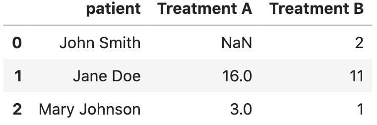
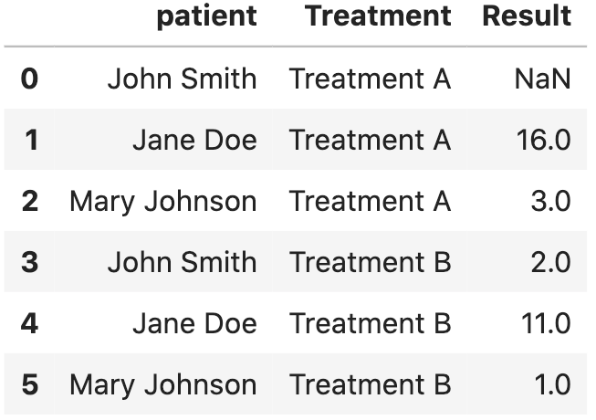
messy (wide-form)
tidy (long-form)
tidy = messy.melt(
    id_vars=['patient'],
    value_vars=['Treatment A', 'Treatment B'],
    var_name='Treatment',
    value_name='Result',
)
Plotly Express powered backend for Pandas plotting
Since Pandas 0.25 it is possible to provide any backend for the .plot plotting API.
Plotly backend (see here) can be set with:
import pandas as pd
pd.options.plotting.backend = 'plotly'
Then you can pass plotly.express parameters to the .plot method of pandas, and get a Plotly figure out of it:
df.plot(
    kind='scatter',
    x='columnA',
    y='columnB',
    log_x=True,
)
Exercise
Reproduce this:
After the figure has been created, you can hide the legend with:
.update_layout(showlegend=False)
Exercise
Reproduce this:
Exercise
Reproduce these:
locations
points
A few solutions that you can consider:
- Bare metal with HTML, CSS and Javascript (Plotly.js).
- Plotly Dash: web based & server assisted Plotly plots.
- Streamlit: from Python scripts to server backed dashboards.
- Pynecone: To build web apps in Python and deploy them.
- nicegui: A Python library to build UIs with simple scripts.
- Voila: from notebooks to standalone apps and dashboards.
- Panel: A high-level app and dashboarding solution for Python.
Building dashboards
DASH
uv add plotly dash gunicornrequired for deployment with Heroku
nice mini tutorial: https://youtu.be/pLU7ZLPhyX8?si=Vvpr_ZERjRW8Hn6i
minimal DASH app
import pandas as pd
import numpy as np
import plotly.express as px
from dash import Dash, callback, html, dcc, Input, Output


external_stylesheets = ['https://codepen.io/chriddyp/pen/bWLwgP.css']

app = Dash(__name__, external_stylesheets=external_stylesheets)

server = app.server

# Some example data and its corresponding Plotly figure
df = pd.DataFrame(np.random.rand(10,2), columns=['A', 'B'])
fig = px.scatter(df, x='A', y='B')

# Structure of my page
app.layout = html.Div([
    html.H1('A simple dashboard'),
    html.Button('Generate Random Data', id='randomize', n_clicks=0),
    html.Div(id='display-value'),
    dcc.Graph(id="myGraph", figure=fig),
])

@callback(
    Output(component_id='display-value', component_property='children'),
    Output(component_id='myGraph', component_property='figure'),
    Input(component_id='randomize', component_property='n_clicks'),
)
def do_something(n_clicks):
    # Regenerate the figure
    df = pd.DataFrame(np.random.rand(10,2), columns=['A', 'B'])
    fig = px.scatter(df, x='A', y='B')

    return [
        f'You have clicked {n_clicks} times',
        fig,
    ]

if __name__ == '__main__':
app.run(debug=True)- Download and install Heroku CLI: https://devcenter.heroku.com/articles/heroku-cli
DASH
see deployment with Heroku for details
heroku create dsr-test # feel free to use any other name
git add . # add all files to git
git commit -m 'Initial app boilerplate'
git push heroku master # deploy code to heroku
heroku ps:scale web=1 # run the app with a 1 heroku "dyno"- Your app should be available at: https://dsr-test.herokuapp.com . See the logs with:
- Initialize Heroku, add files to Git, and deploy:
- Make sure your app has the following files at least:
app.py (with the dash code, including             )

requirements.txt (gunicorn should be included)

Procfile (with the line                  )

.gitignore (with files to ignore in Git)
web: gunicorn app:serverheroku logs --tailserver = app.serverSome more cool stuff
- Machine Learning related charts: charts related to artificial intelligence and machine learning.
- React - PivotTable: React-based drag'n'drop pivot table
Alternatives to Plotly
Plotly for Python
By chumo
Plotly for Python
Introductory workshop on Plotly for Python.


