
CodePamoja
CodePamoja means "Code Together" in Swahili. We are a group of passionate developers in The Netherlands and Kenya working together in virtual teams, transferring the latest software development skills to each other.
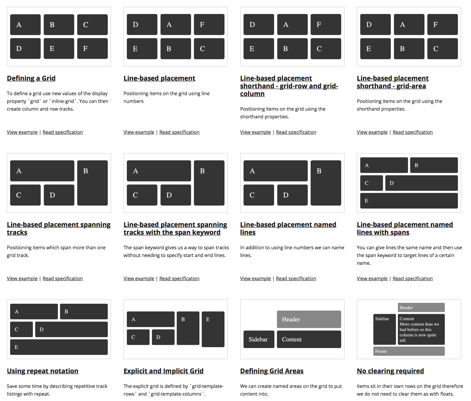
Current versions of Edge, Chrome, FireFox & Safari support CSS Grid Layout v1.0
IE10 & IE11 support a old specification
.wrapper {
  display: grid;
}When we use grid-template-columns and grid-template-rows we create an Explicit Grid.
If we try and place an item outside an explicit grid the browser will create an Implicit Grid line or lines in order to hold that item.
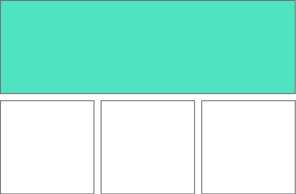
A grid track is the space between two grid lines.
.wrapper {
display: grid;
grid-template-columns: repeat(3, 1fr);
grid-template-rows: repeat(3, 100px);
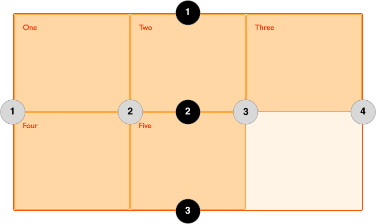
}Grid lines are created when you define tracks
.wrapper {
  display: grid;
  grid-template-columns: repeat(3, 1fr);
  grid-template-rows: repeat(3, 100px);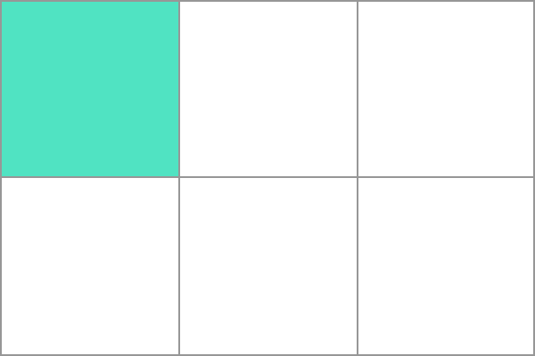
}A grid cell is the smallest unit in the grid layout.
It is the space between four intersecting grid lines and conceptually much like a table cell.
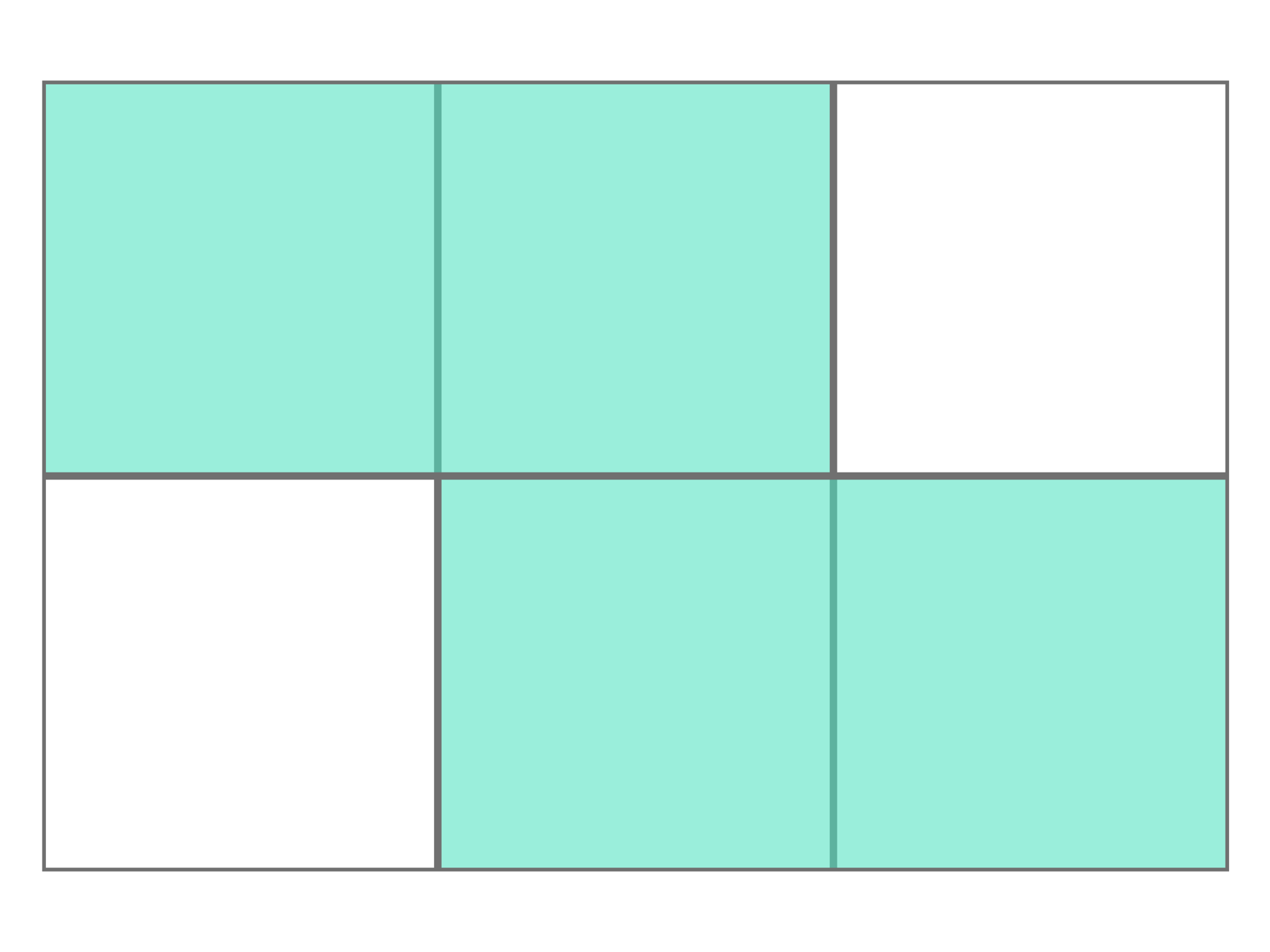
A grid area is one or more grid cells that make up a rectangular area on the grid
.wrapper {
  display: grid;
  grid-template-columns: repeat(3,1fr);
  grid-template-rows: 100px 100px;
  grid-template-areas:
    "a a b"
    "a a b";
}
.item1 {
  grid-area: a;
}
.item2 {
  grid-area: b;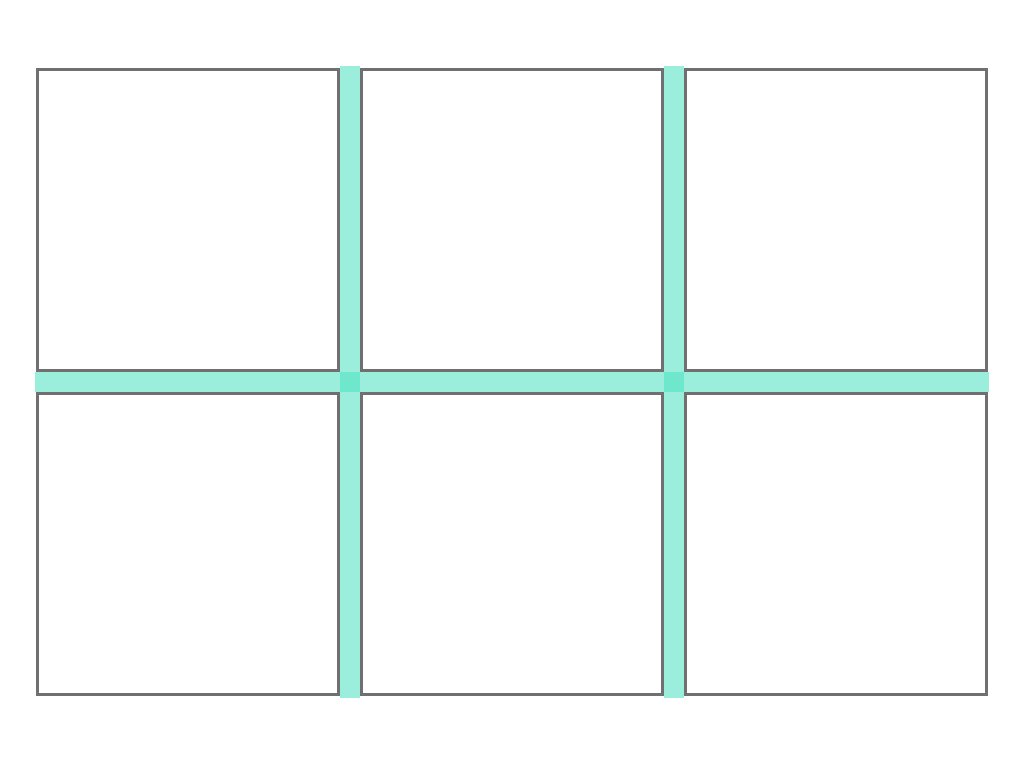
}Gutters are spacing between content tracks.
A grid row is a horizontal track in a CSS Grid Layout, that is the space between two horizontal grid lines.
.wrapper {
  display: grid;
  grid-template-rows: repeat(3, 100px);
  grid-template-rows: 100px 100px 100px;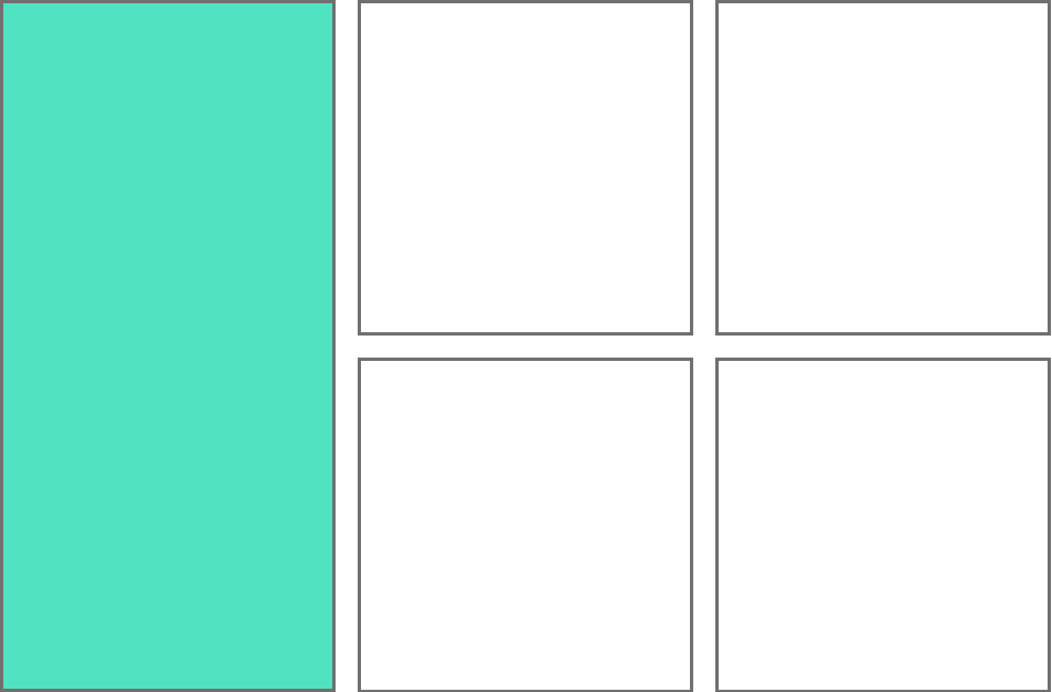
}A grid column is a vertical track in a CSS Grid Layout, and is the space between two vertical grid lines.
.wrapper {
  display: grid;
  grid-template-columns: repeat(3, 100px);
  grid-template-columns: 100px 100px 100px;
}By CodePamoja


