


Content ITV PRO
This is Itvedant Content department
Learning Outcome
6
Design reports that guide users, not confuse them
5
Understand the role of bookmarks and dynamic titles
4
Explain interactivity features such as drill-throughs and tooltips
3
Apply advanced formatting techniques conceptually
2
Understand when and why to use each advanced visual
1
Identify advanced visual types in Power BI
Recall
Basic visualizations
card
Bar
line
table
How visuals respond to slicers and filters
Basic report layout and formatting
That visuals can interact with each other
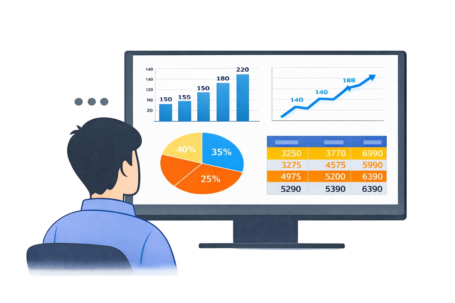
Imagine You open a report.
The charts look clean.
The numbers are correct.
But everything feels... flat.
You click a slicer.
Only numbers change.
You hover.
Nothing explains.
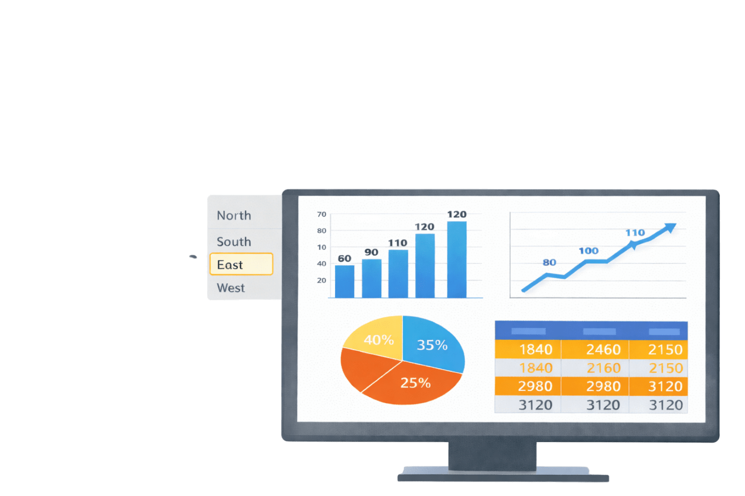
Now imagine another report.
You click a region.
The report focuses.
You hover.
Extra insight appears.
Colors guide your attention before you even start thinking.
The data didn’t change.
The visuals did.
If the data is the same:
Why do some reports feel intuitive,
while others feel confusing?
Why do some reports guide users,
while others leave them guessing?
Good reports don’t just show data.
They respond to the user.
That responsiveness comes from Advanced Visual Crafting.
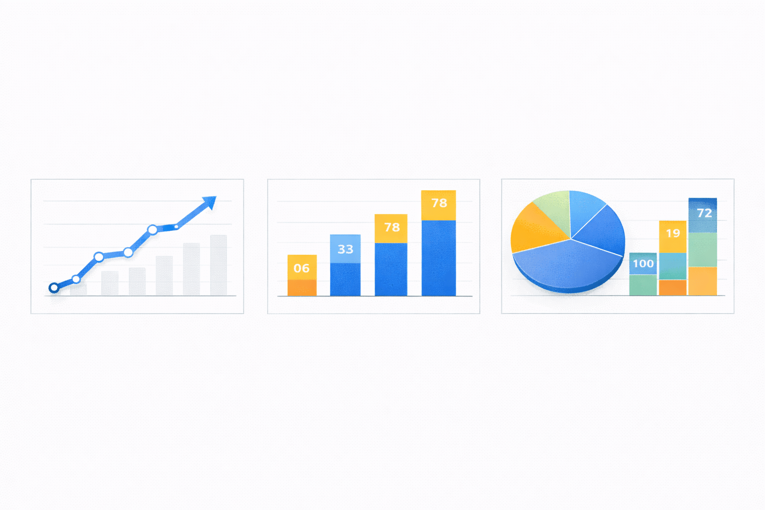
Advanced Visual Types in Power BI
Advanced visual types help represent complex or high-level information more effectively than basic charts.
Advanced Visual Types
Matrices
Tables
Maps
Gauges
Cards
KPI Visuals
Matrices
Multi-dimensional visual similar to pivot tables
Support:
Row and column grouping
Drill-down and expand/collapse
Best used for:
Hierarchical data
Summarised views with detail on demand
Example :
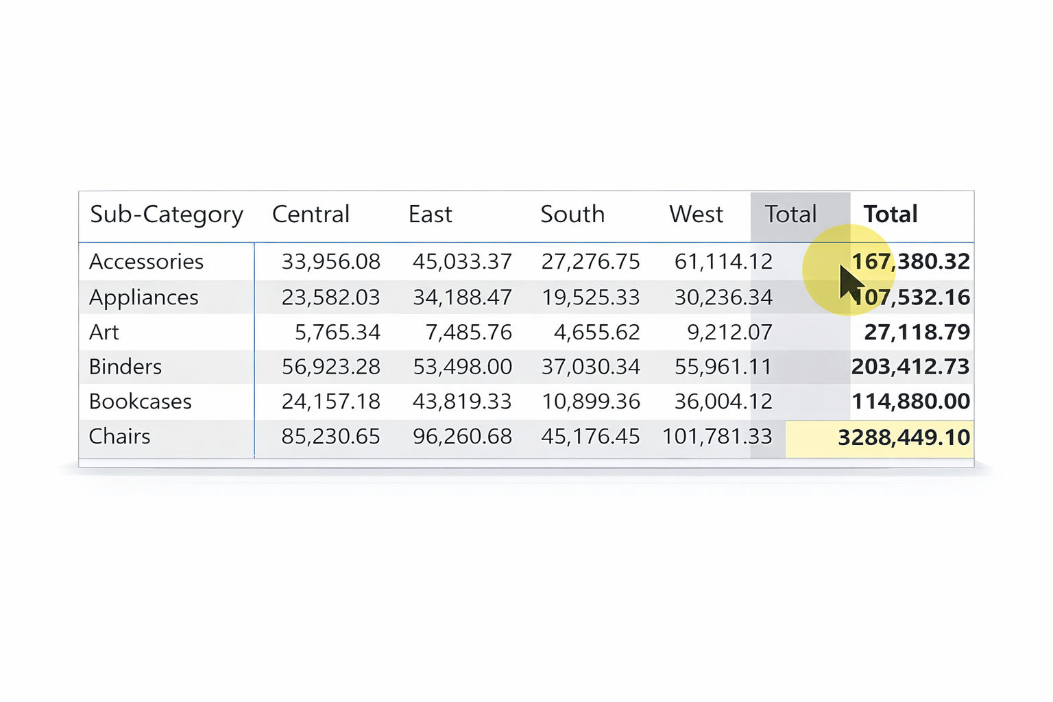
Tables
Grid-based display of data
Best used for:
Can be enhanced with:
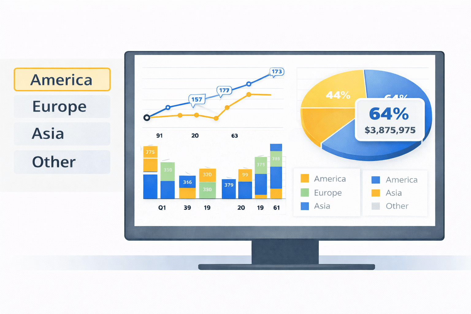
Maps
Used to display geographic data
Useful only when location adds analytical value
Common use cases:
Sales by country/state
Regional performance
Gauges
Show progress toward a target
Best for:
Performance tracking
Should be used sparingly (one metric at a time)
KPIs
Cards
Highlight a single key metric
Used for:
Total sales
Profit
Counts
Provide instant focus for the user
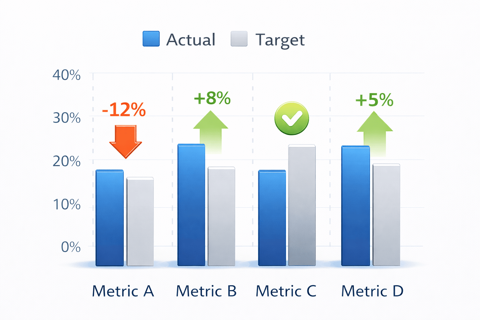
KPI Visuals
Compare actual values against targets
Often include:
Status indicators
Trend direction
Best for performance monitoring
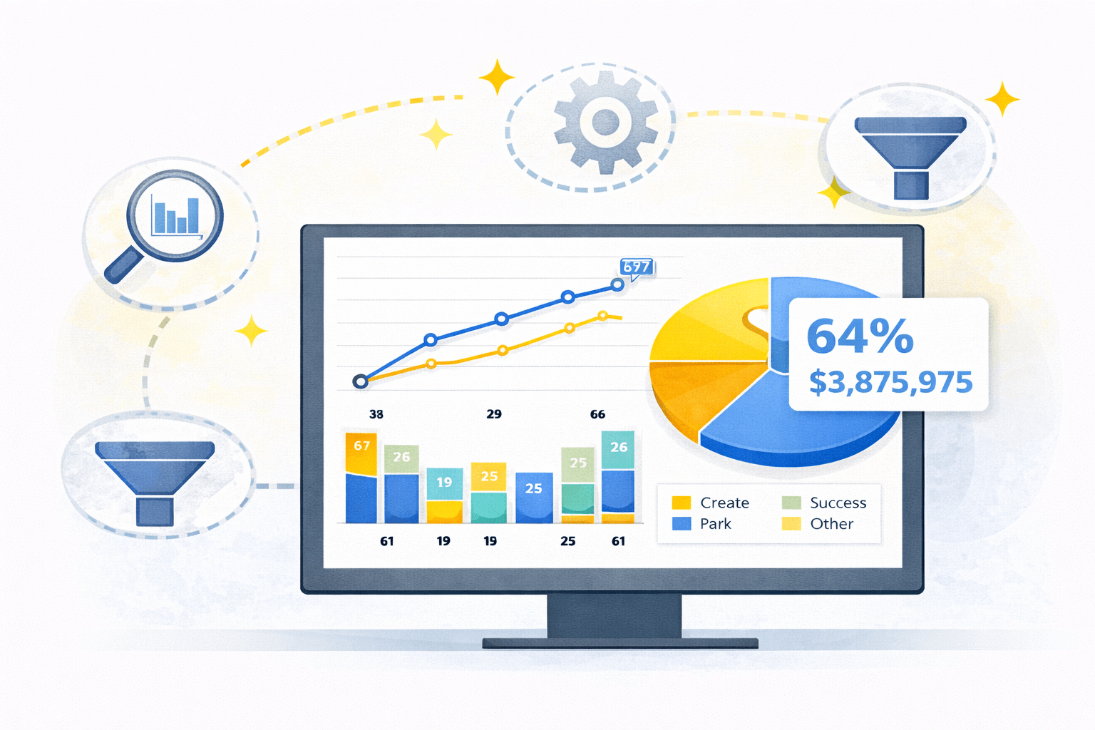
What Is Advanced Visual Crafting ?
Formatting rules
Interactivity
Navigation features
Understand faster
Explore deeper
Make confident decisions
Why Use Advanced Visual Crafting
Enhancing Storytelling
Improving User Experience
Optimizing Data Representation
Supporting Customization
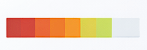
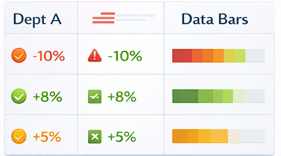
Conditional Formatting
Dynamically changes visual appearance based on values
Common techniques:
Purpose
Direct attention to critical insights
Highlight risks and opportunities
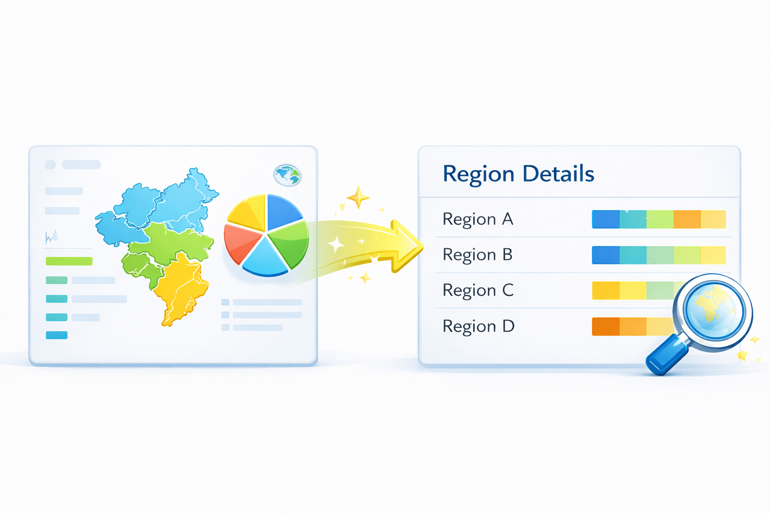
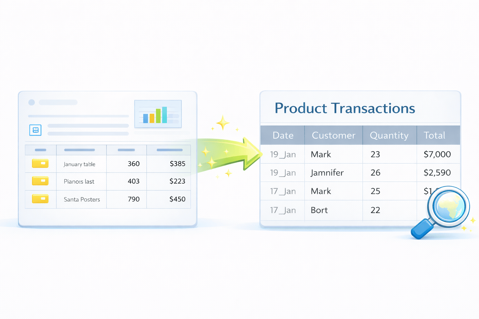
Drill-throughs
Enable navigation from summary to detailed views
Context is passed automatically
Use Cases
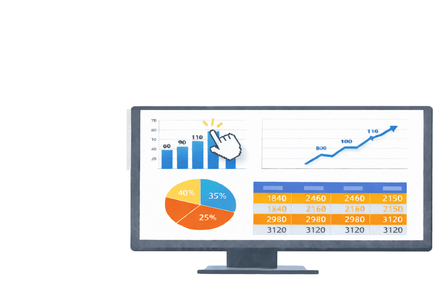
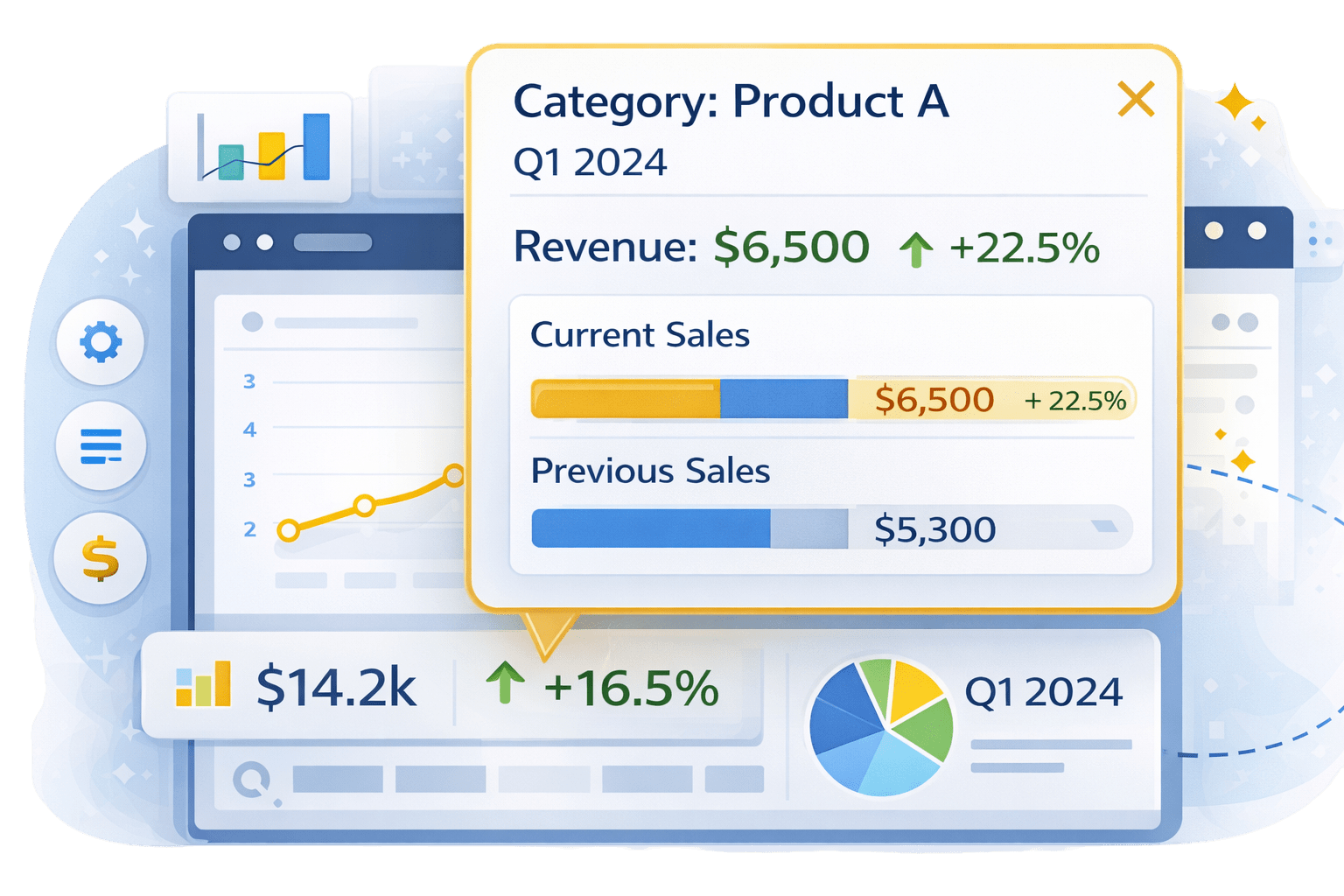
Custom Tooltips
Display rich information on hover
Used for:
Keep main visuals clean
Additional context
Comparisons
Breakdowns
Bookmarks
Navigation
Visual visibility
Save specific report states
Use Cases:
Control:
Filters
Simulated dashboards
Toggle views
How Advanced Visual Techniques Work Together
Formatting highlights it
Drill-throughs expand it
Tooltips explain it
Advanced visual types show information
Bookmarks navigate it
Together, they create intuitive reports
Visual Techniques
Summary
5
Bookmarks improve navigation
4
Drill-throughs and tooltips support exploration
3
Conditional formatting guides attention
2
Advanced crafting improves storytelling and usability
1
Advanced visual types handle complex information
Quiz
Which visual is best for hierarchical data?
A. Bar chart
B. Line chart
C. Matrix
D. Card
Quiz-Answer
Which visual is best for hierarchical data?
A. Bar chart
B. Line chart
C. Matrix
D. Card
By Content ITV


