Heaton Manor Sixth Form Prospectus
FRONT COVER
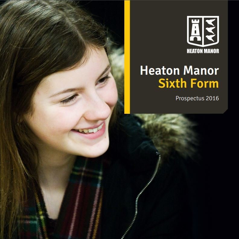
This is a screenshot of a prospectus for a sixth form, as well as looking at university prospectuses I wanted to mainly focus on those created specifically for Sixth Forms.
I like the composition of this front cover, the single image of a student followed by a small portion of the page being taken up by their logo and name, creates a very simplistic effect.
Welcome page
This is a screenshot I took of the Welcome Page of Heaton Manor's prospectus.
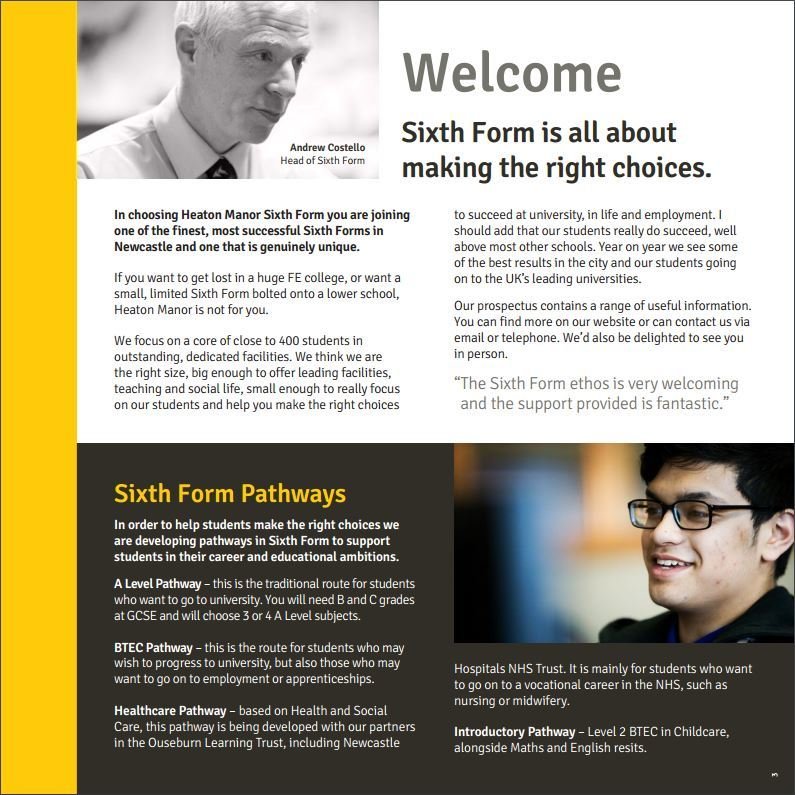
Already we can see that there is a colour scheme and house style developing throughout the booklet. There is a continuous use of yellow, white and black. This allows those reading to find the prospectus more appealing.
This is a page which will include a welcome to the sixth form as well as a few reasons why you should choose to study there.
contents page
I really like the style of this contents page, it is very simplistic yet offers enough for the page to be appealing.
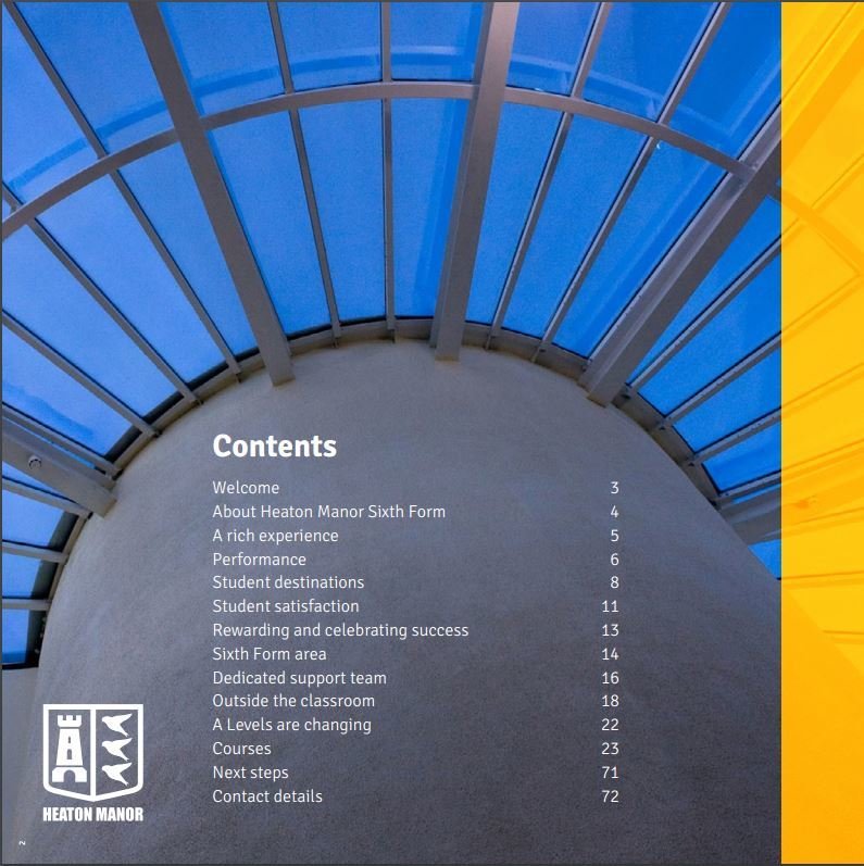
This is a page which is created in order to offer those reading an easily findable page through this guide.
This is the second time that they have featured their logo within the prospectus, I think this is a god feature to include.
ABout US PAGE
As we can see by the title, this is a page which will include a few facts about the sixth form, as well as some statistics. By adding these into the prospectus, it will make Heaton Manor seem more attractive to those reading.
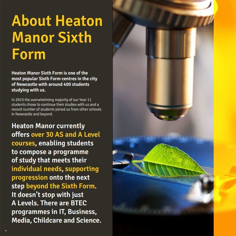
Again we can see that they have followed the house style and colour scheme.
Exam results
This is another feature used in order to make the Sixth Form seem more attractive to further students, this is also a page which can be useful for parents.
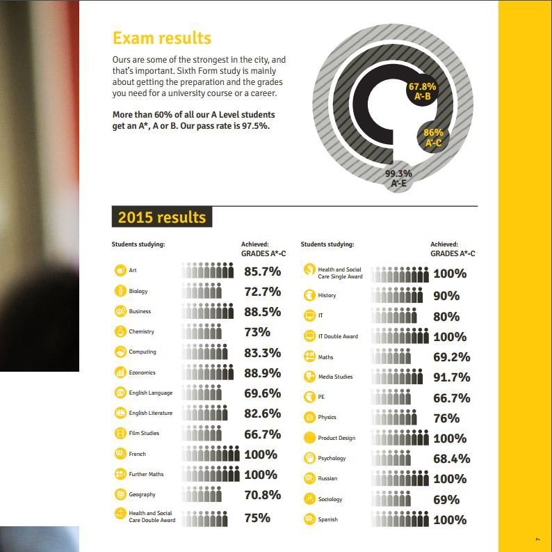
People would rater further their education somewhere they knew would offer them a wide variety of subjects which would follow in good grades.
Student Destinations
This is yet another featured used to attract students. This will give those reading an idea of where they could end up after the two years of studying.
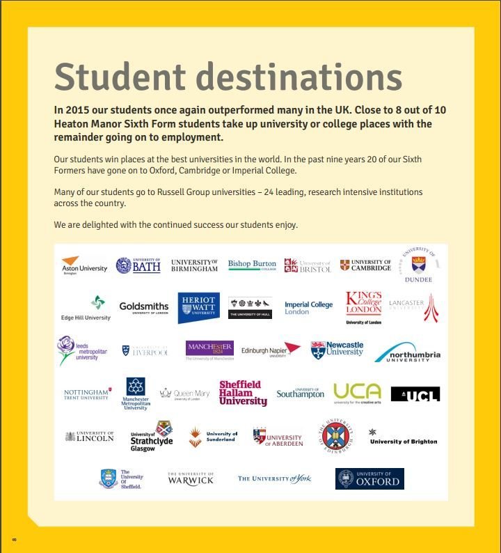
This can also be helpful for students who already know they would like to attend university, because it can allow them to see where they have the chance of attending.
Outside the classroom
This page is giving the potential candidates a sense of what they could be achieving outside of the classroom.

I will be using this feature within my prospectus as I feel like I could definitely add a lot of useful information based upon my current Sixth Form.
It will allow the audience to see that they won't be stuck inside of a classroom learning all day, they will also be participating in organising events such as leavers balls and charity events.
COURSES
This page could also be classed as a second contents page, but purely for courses which are offered.
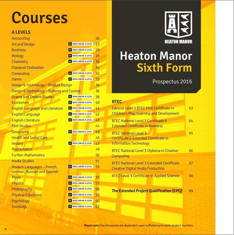
I will be using this feature within my prospectus as I think it would be fairly beneficial to be able to locate the exact courses you wish to study.
I like how there is an image in the background, but it hasn't been used in the same way as the rest of the photographs have been presented. I may include this feature also.
A SUBJECT
This is a page which is focusing purely on one subject, this will include all information regarding to the course.
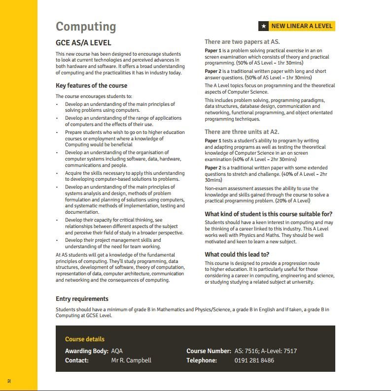
It will be where the potential students can find out about the exam board which will be marking their work, the entry requirements, how will be teaching them, how they can
contact someone about the course, what the course number is as well as all modules with in dept descriptions.
Student satisfaction
This is a page which includes various amounts of comments and reviews from current students about the sixth form.
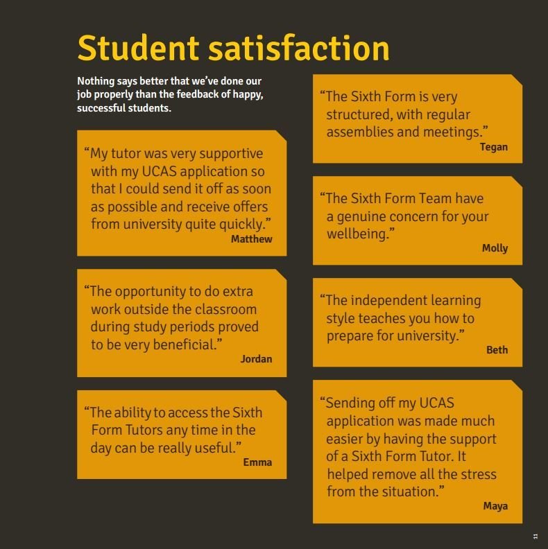
I will definitely be including a page similar to this within my prospectus, I feel like this a very beneficial page for those thinking about attending the
Sixth Form.
However I will also be including comments from members of staff.
deck
By courteneyharding
deck
- 484


