Styling for UX
Forms
Extensions
axe Accessibility Linter

Error Lens
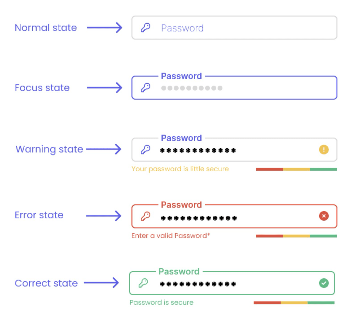
UI States
Pseudo-classes
A CSS pseudo-class is a keyword added to a selector that specifies a special state of the selected element(s). For example, :hover can be used to change a button's color when the user's pointer hovers over it.
Pseudo-classes
Pseudo-classes
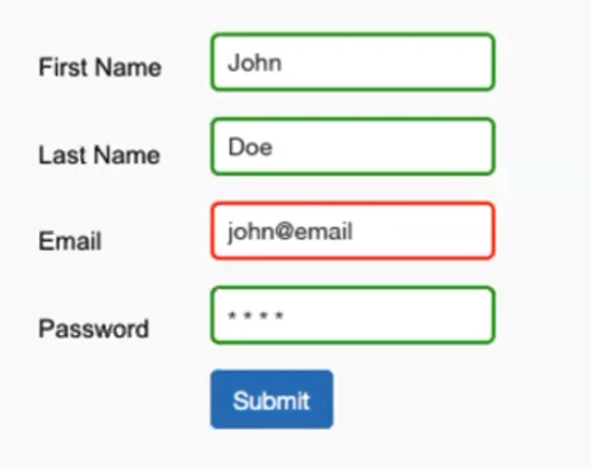
:valid
represents any <input> or other <form> element whose contents validate successfully
input:valid {
  border-color: green;
}
needs "required"
Pseudo-classes
:invalid
any <input> or other <form> element whose contents fail to validate.
input:invalid {
  border-color: red;
}
needs "required"
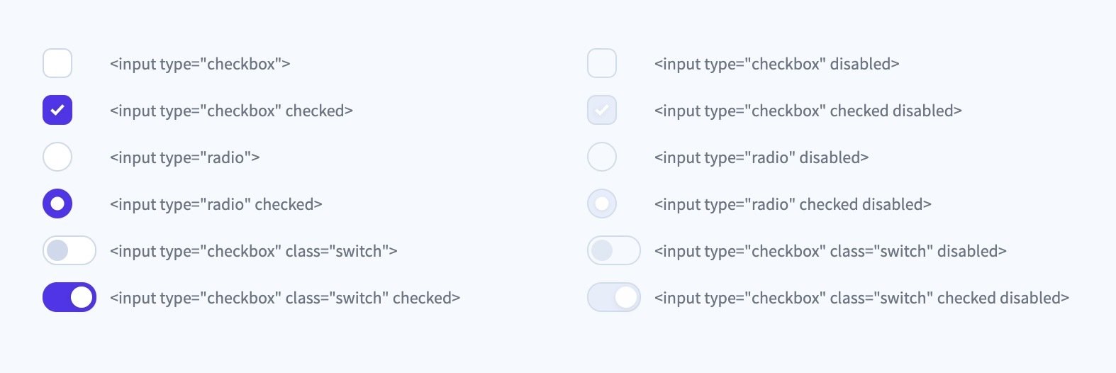
Pseudo-classes = states

Pseudo-classes = states
Pseudo-classes = states
Pseudo-classes / states
:disabled
represents any disabled element
:checked
selector represents any radio, checkbox, or option element that is checked or toggled to an on state
:focus/:focus-visible
represents an element that has received focus
:placeholder-shown
represents any <input> or <textarea> element that is currently displaying placeholder text.
:not(
:not(
:not(
:not(
)
)
)
)
Pseudo-classes / states
:disabled
doesn't represents any disabled element
:checked
selector represents any radio, checkbox, or option element that is not checked or toggled to an on state
:focus/:focus-visible
represents an element that hasn't received focus
:placeholder-shown
represents any <input> or <textarea> element that is currently not displaying placeholder text.
:not(
:not(
:not(
:not(
)
)
)
)
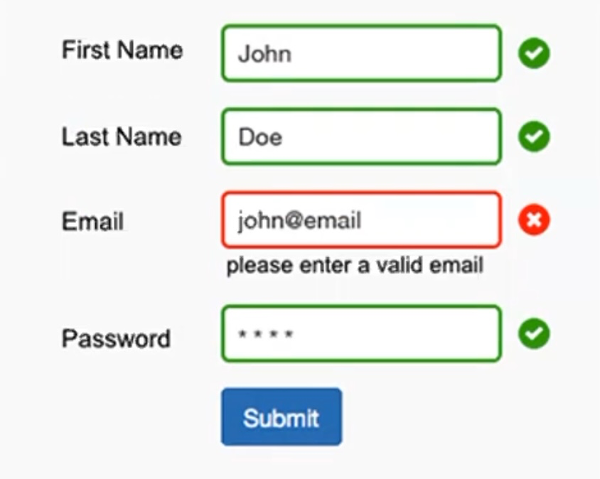
input:invalid:not(:focus, :placeholder-shown) { ... }Placeholder-shown
input:invalid:not(:focus, :placeholder-shown) ~ .error-message { ... }JS er påkrævet for at overholde a11y-guidelines
input:user-invalid { ... }:user-valid/-invalid
input:user-invalid ~ .error-message { ... }@supports (margin: 10px) {...}
@supports selector(:has(+ *)) {...}@supports
Browser-kompatibilitet
if(CSS.supports("margin: 10px"))@supports not (margin: 10px) {...}
@supports not selector(:has(+ *)) {...}@supports
Ikke browser-kompatibel
if(!CSS.supports("margin: 10px")):has()
.form-group:has(:user-invalid) { ... }.form-group:has(:user-invalid) .error-message { ... }.form-group:has(input:not(:focus, :placeholder-shown):invalid) label { ... }:has()
.form-group:has(input:invalid) { ... }.form-group:has(input:not(:focus, :placeholder-shown):invalid) .error-message { ... }label:has( + input:user-invalid) { ... }:has()
label {
  color: var(--color);
}

.form-group:has(:user-invalid) {
  --color: red;
}

.form-group:has(:user-valid) {
  --color: green;
}
:has()
:has()
field-sizing
textarea
field-sizing
Browser compatibility
🫢
field-sizing
Browser compatibility

øvelse
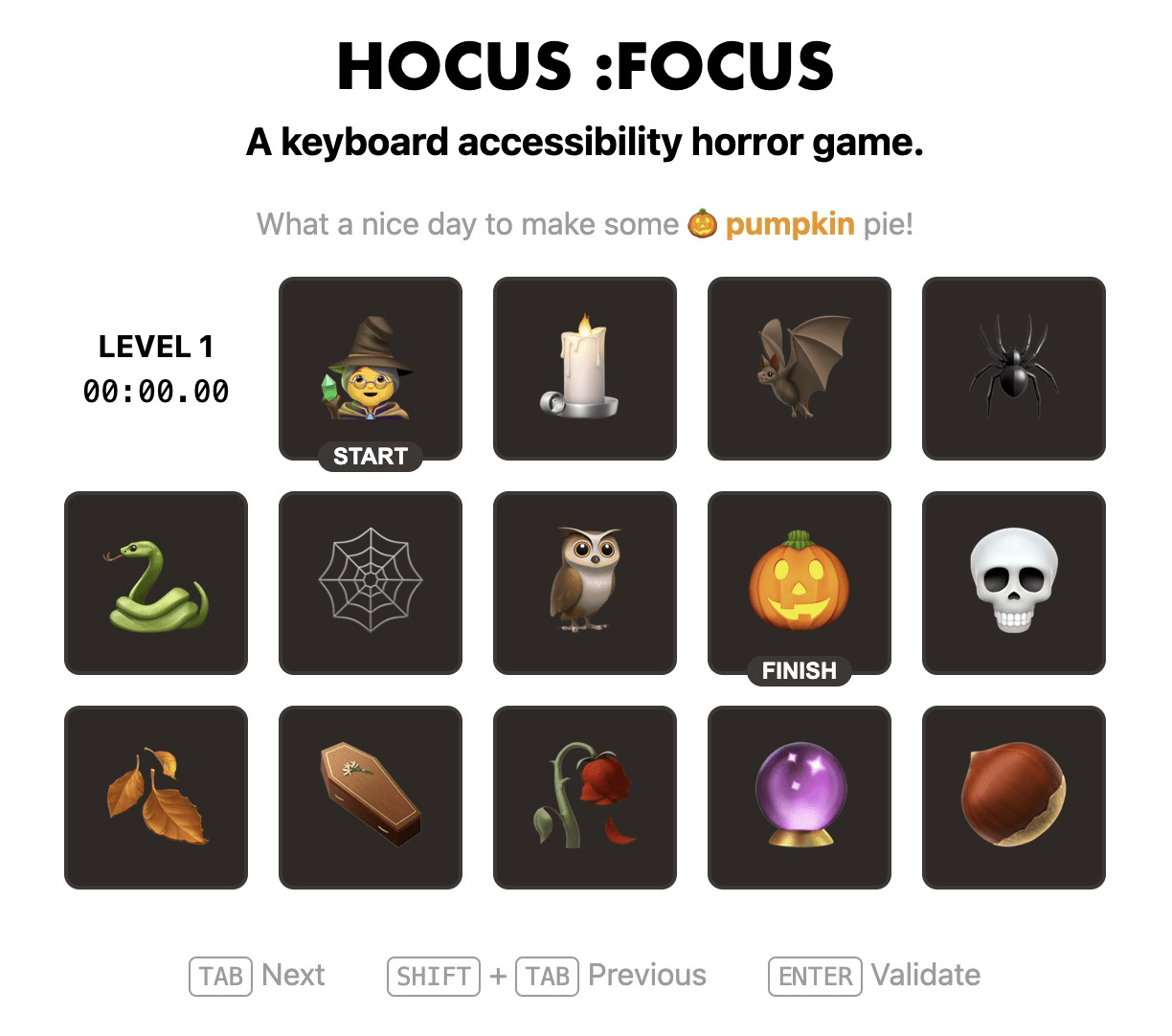
Hocus :focus
Gennemfør alle 8 levels og bliv opmærksom på, hvor vigtige "focus states" er i forhold til keyboard accessibility (link på Fronter).
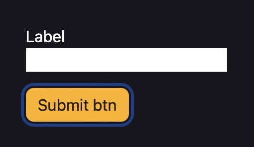
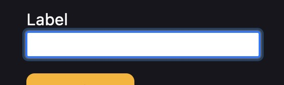
Focus states
Focus states
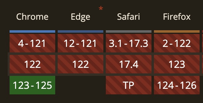
Safari 💩
Focus states
Firefox 💩
Focus states

:focus-visible {
  outline: 2px solid #000;
  outline-offset: -2px;
  box-shadow: 0 0 0 2px #fff, inset 0 0 0 3px #fff;
}

input {
  appearance: none; /* Safari fix */
}
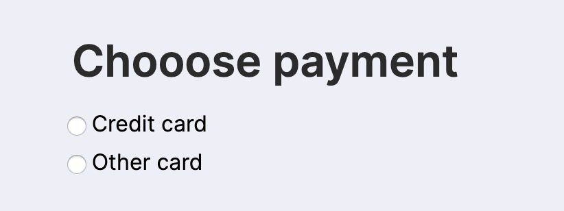
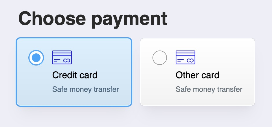
Tilføj "states" (pseudo-klasser) til din formular
- :focus
- :user-valid
- :user-invalid (with error messages)
Tilføj styles for følgende pseudo-klasser:
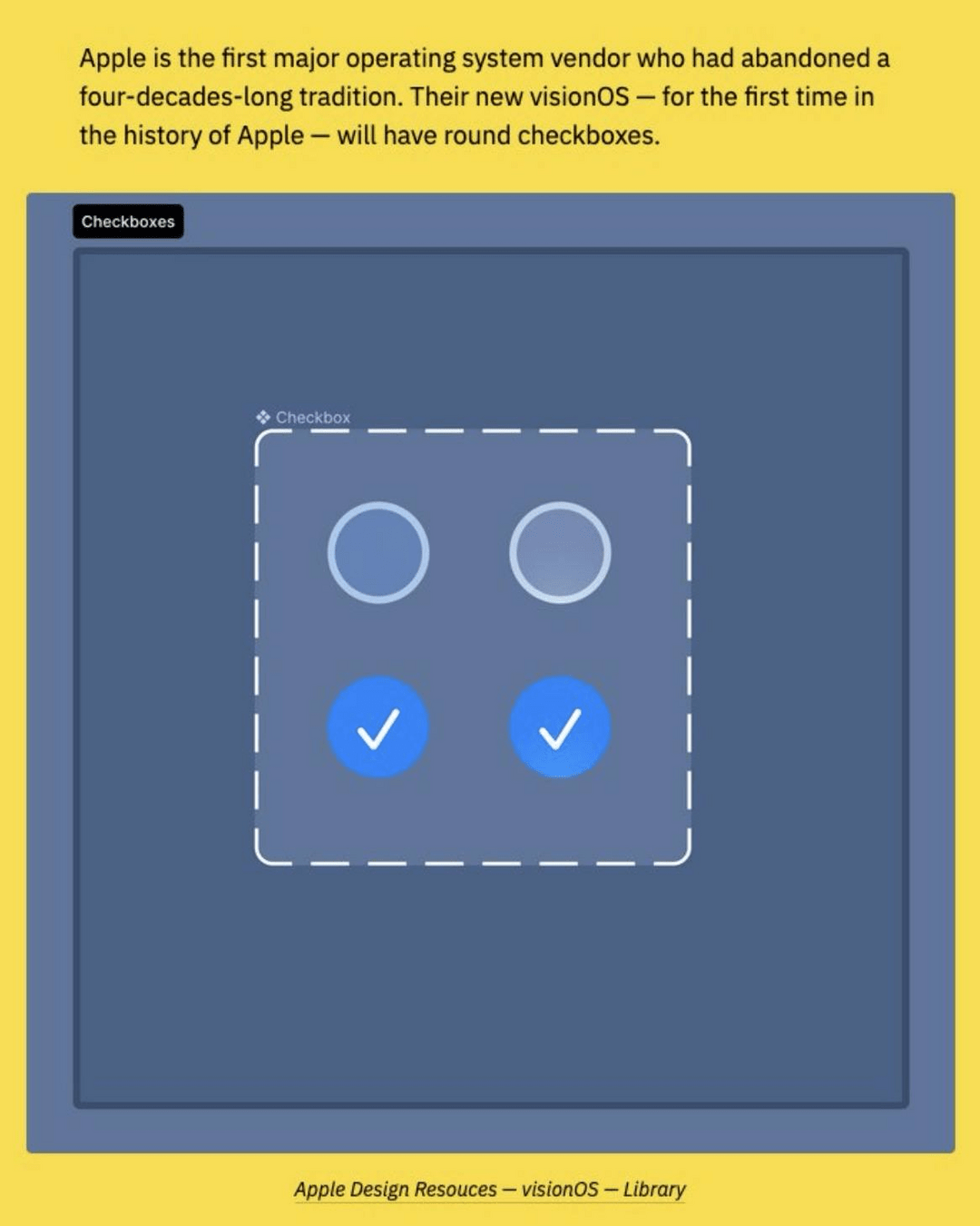
Checkbox "hack"
Custom Checkboxes / Radios
User Agent styles
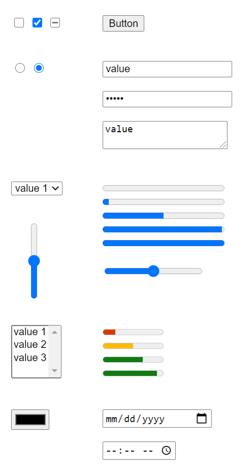


UA styles
form {
  accent-color: deeppink;
}Rule of Least Power
Customize
input[type="checkbox"] {
  appearance: none;
  ...
}

/* Checked state */
input:checked::before {
  ...
}
Remove browser styles
Style custom checkmark with pseudo-elements
Ressourcer
Gør det mere spændende
Reducerer cognitive load
Gør det mere spændende
Animated checkmark
Animated checkmark
Preparing an SVG in Figma / Illustrator
Animated checkmark
Animated checkmark
Animated checkmark
Resources
😭
Cascade layers
@layer reset, components, states;

@layer components {
  /* Buttons, inputs etc. */
}

@layer states {
  /* Make sure stats override, no matter specificity count */
  :disabled {
    background-color: #ddd;
    color: #999;
  }

  :focus-visible {
    outline: 2px solid var(--focus-color, currentColor);
    outline-offset: 2px;
  }
}
Cascade layers
@layer reset, global, components, utilities, states;A sensible CSS reset
Default styling
:root {
  --theme-color: 258 29% 43%;
  --accent-color: 180 50% 43%;
}

input {
  font: inherit;
  font-size: max(16px, 1em);
  padding: 0.25em 0.5em;
  background-color: #fff;
  border: 2px solid hsl(var(--theme-color));
}

input:is(:focus-visible, :hover) {
  border-color: hsl(var(--accent-color));
}
A sensible CSS reset
Default styling
input:is([type="checkbox"], [type="radio"]) {
  appearance: none;
  /* custom styling */
}
A sensible CSS reset
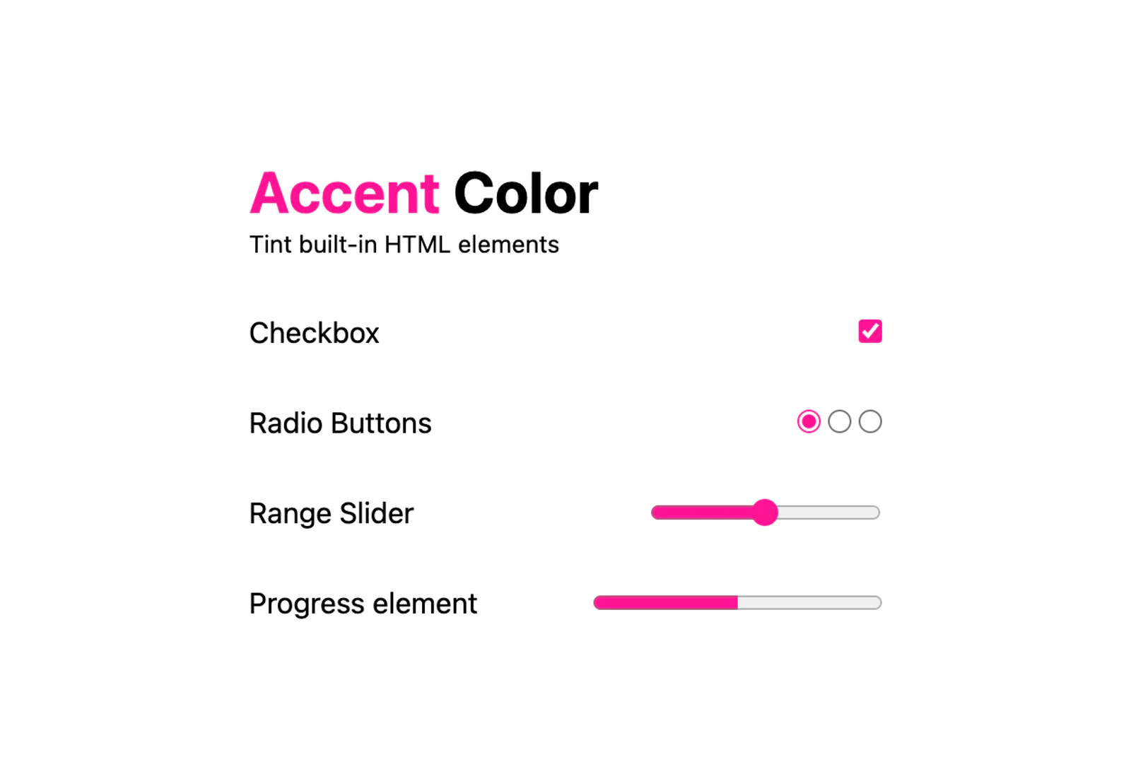
Or with accent-color
form {
  accent-color: var(--theme-color, hotpink);
  /* checkbox, radio, progress, range etc. */
}
A sensible CSS reset
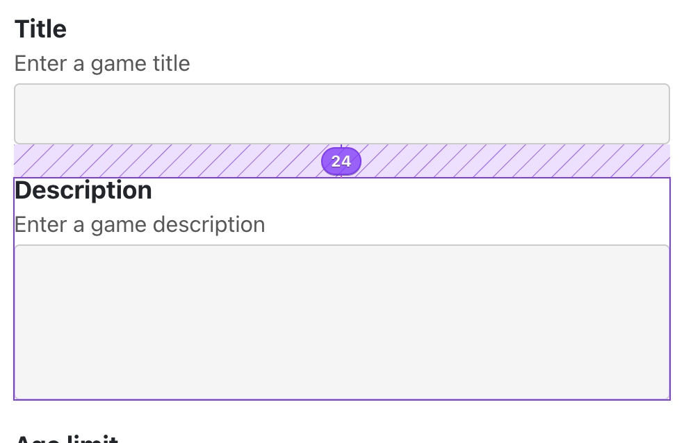
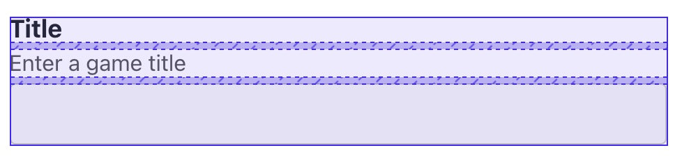
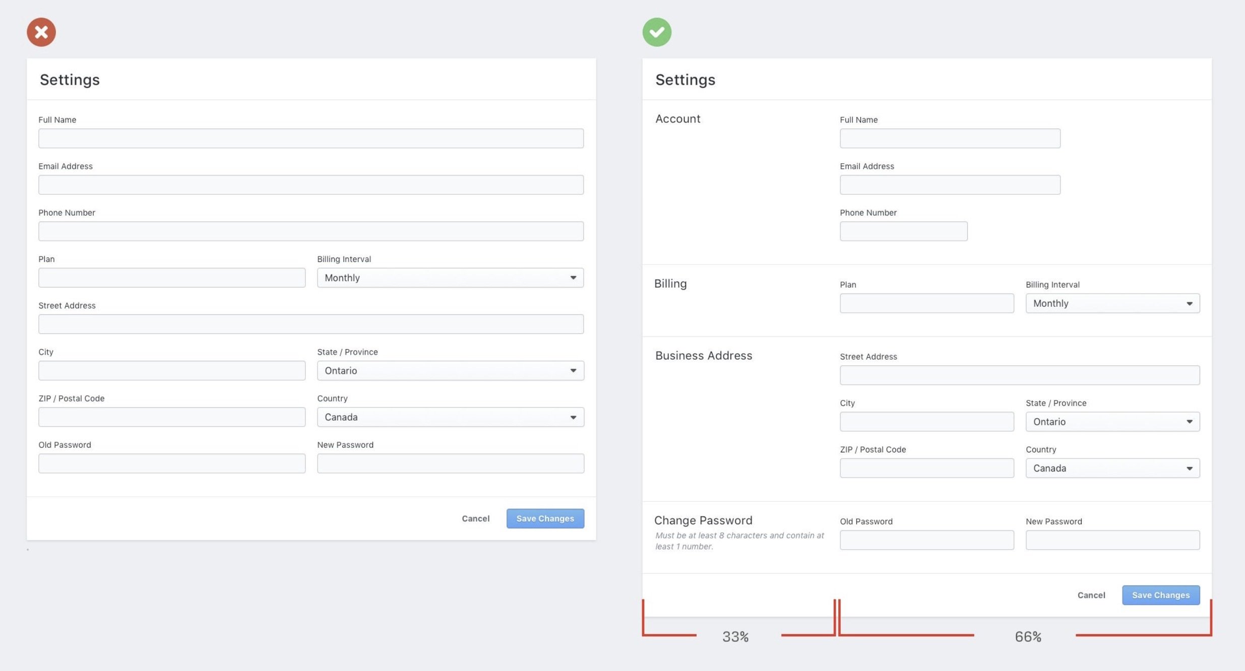
Form layout
form {
  display: grid;
  gap: 1.5rem;
}

.form-group {
  display: grid;
  gap: .3125rem;
}
form {
  display: flex;
  flex-wrap: wrap;
  gap: 1rem;
}

form > input {
  flex: 1 1 10ch;
}

input[type="email"] {
  flex: 3 1 30ch;
}.container {
container-type: inline-size;
}
@container (width > 25rem) {
.newsletter { ... }
}Form Styling & UX
By Dannie Vinther
Form Styling & UX
Styling forms


