Crafting UI
UI-Animation
The pixel pipeline
Style recalculation
Layout
Paint
Composite
Caused by some event
width,
margin,
left...
background,
box-shadow,
color...
transform,
opacity
The pixel pipeline
Style recalculation
Layout
Paint
Composite
width,
margin,
left...
background,
box-shadow,
color...
transform,
opacity
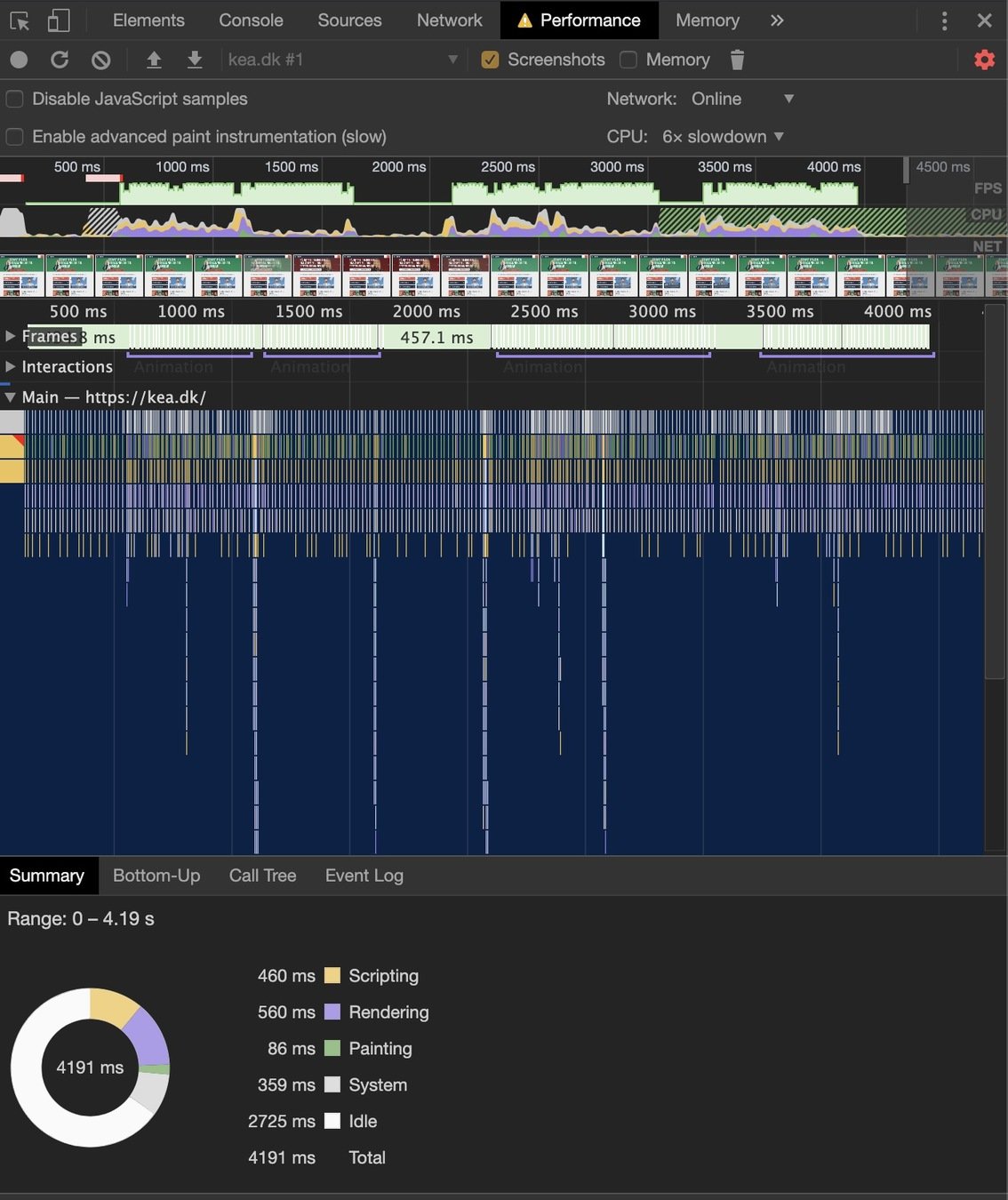
Chrome DevTools: Performance Tab
Expensive
The pixel pipeline
Style recalculation
Layout
Paint
Composite
Caused by some event
width,
margin,
left...
background,
box-shadow,
color...
transform,
opacity
Chrome DevTools: Performance panel
Animer med følgende properties, hvis muligt
div {
  transform: translate(n, n)
	     scale(n)
	     skew(ndeg)
	     rotate(ndeg);
  translate: n n;
  scale:     n;
  rotate:    ndeg;
  opacity:   0..1;
}... bør være et standardvalg til hover, press states, drawers, toasts, cards, modals, view/state-skift og microinteractions.
Transforms & opacity...
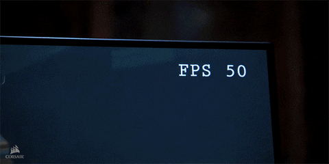
Animation
Subpixel-animation
Using transform
Changing layout properties
Zoomed ind
Animation
Eksempler
.line {
  /*width: 20%;*/
  transform: scaleX(.2);
}.box {
transform: rotate(45deg) translate(-50%, -50%) scale(1.3);
}
.box:hover {
transform: rotate(0deg);
}Transforms
.box {
  rotate: 45deg;
  translate: -50% -50%;
  scale: 1.1;
}

.box:hover {
  rotate: 0deg;
}
Individual Transforms
.box {
  rotate: 45deg;
  translate: -50% -50%;
  scale: 1.1;
}

.box:hover {
  rotate: 0deg;
}
Individual Transforms
Rækkefølgen er prædefineret.
Hvis du skal styre rækkefølgen, så brug transform-funktionen
1
2
3
Individual Transforms
Composition
Composition
Composition
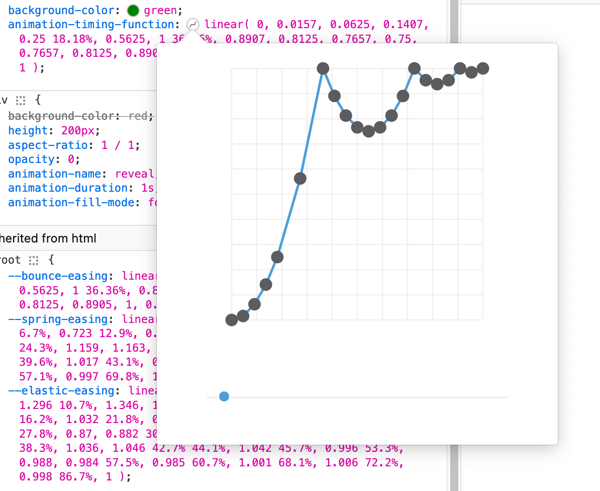
Linear()
Easing
Linear()
Easing
Linear()
Easing
Custom Properties
Boolean Prop
.rotate {
  --intent: 0;

  rotate: calc( var(--intent) * 45deg );
  transition: rotate .3s;

  &:hover {
    --intent: 1;
  }
}
Brug calc() til at gange variablen med 45deg
Custom Properties
Boolean Prop
.slide-out {
  --open: 0;

  translate: calc( var(--open) * 100% );
  transition: translate .4s;

  &.open {
    --open: 1;
  }
}
Brug calc() til at gange variablen med 100%
@property --colorPrimary {
  syntax: '<color>';
}@property
@property --colorPrimary {
  syntax: '<color>';
  initial-value: magenta;
}@property
@property --colorPrimary {
  syntax: '<color>';
  initial-value: magenta;
  inherits: false;
}@property
@property
@property --colorPrimary {
  syntax: '<color>';
  initial-value: magenta;
  inherits: false;
}
— typed Custom Properties
Loading...
@property
@property --colorPrimary {
  syntax: '<color>';
  initial-value: magenta;
  inherits: false;
}
— typed Custom Properties
Loading...
Offset-path & Conic Gradient
Conic-gradient()
Lad os bygge den sammen
(lad den blive åben)
Offset-path
Offset-path
.parent {
  .child {
    offset-path: border-box;
  }
}
Offset-path
Animeret tal
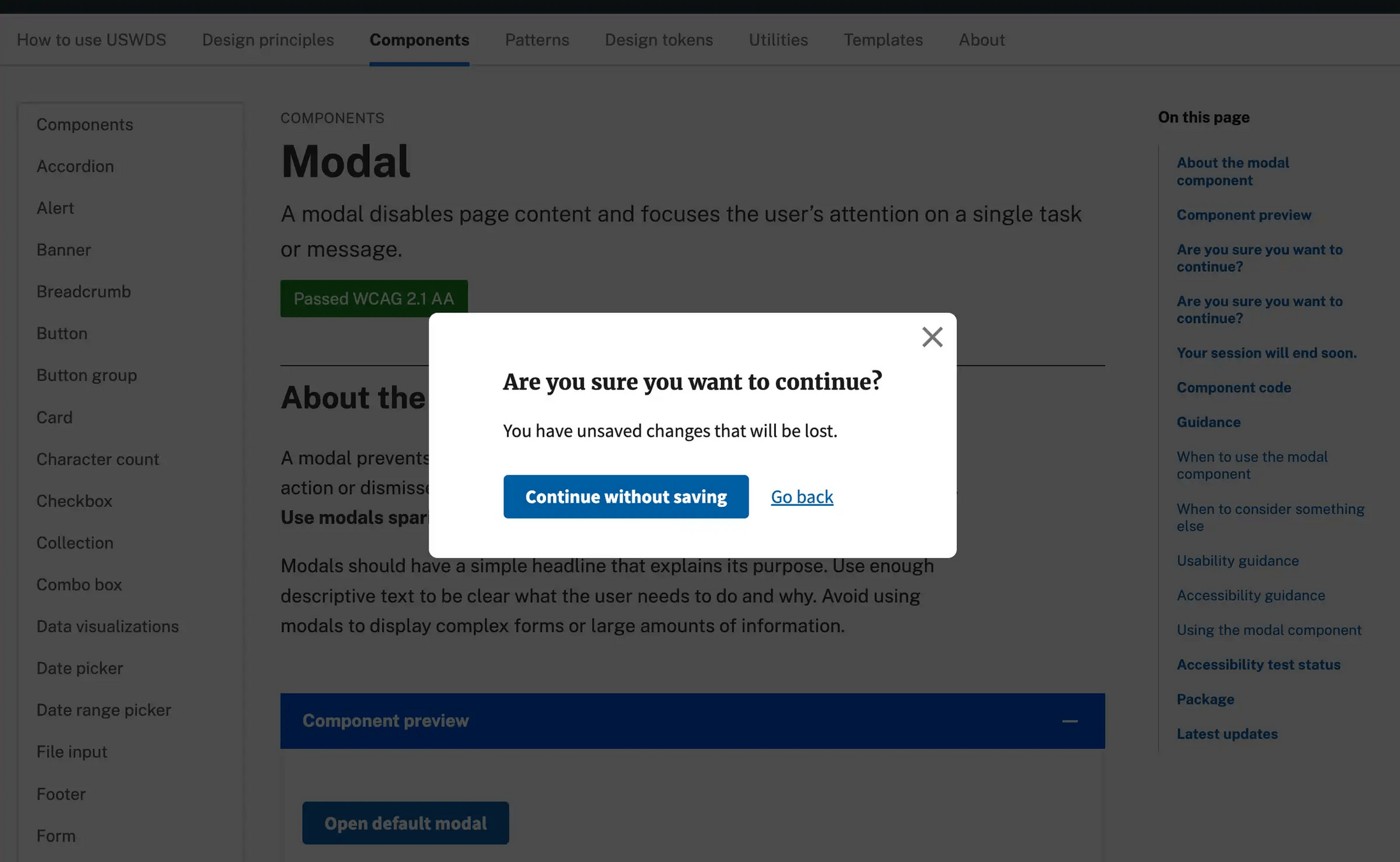
Popover
Popover
Indhold ovenpå indhold

overlay, popup, popover, dialog osv.
popover
backdrop (baggrundslag)
popover
non-modal
modal
vs.
non-modal
modal
vs.
popover
<dialog>
Popover
I sin enkleste form laver du en popover ved at tilføje attributten
popovertil det element, som skal vise selve popover-indholdet.
Du skal også give elementet etid, så det kan kobles sammen med det element, der åbner popoveren.
Popover
popovertarget
peger på id’et af den popover, der skal styres
id
bruges til at identificere popoveren og forbinde den med en kontrol
popover
markerer elementet som en popover
-attributter
popoverpopovertargetidSelectors
<button popovertarget="popup">Open popup</button>

<div popover id="popup">
  <h2>I'm a popup</h2>
  <p>Lorem ipsum dolor sit amet consectetur adipisicing.</p>
</div>popoverSelectors
::backdrop
pseudoelement, der repræsenterer det visuelle lag bag en popover
:popover-open
popover-elementet i åben tilstand
[popover]
popover-elementet
[ ]:popover-open::backdroppopoverattribut-selector
display-egenskab
Ændr ikke display direkte — brug :popover-open til at style, når popover'en er synlig.
[popover] { /* eller #min-popover */
  display: grid;
}
[popover]:popover-open {
display: grid;
}🚫
✅
Popover
<button popovertarget="popup">Open popup</button>

<div popover id="popup">
  <h2>I'm a popup</h2>
  <p>Lorem ipsum dolor sit amet consectetur adipisicing.</p>
</div>@starting-style
Loading...
@starting-style
Når et element vises for første gang – eller går fra display: none; til synligt – starter CSS-transitions ikke automatisk.
Browseren har nemlig ingen tidligere stil at animere fra.
@starting-style
@starting-style løser det ved at give elementet nogle startværdier, som browseren kan animere fra, når det dukker op.
@starting-style
0s
1s
.wrapper:hover .circle {
  scale: 4;
  display: block;
}
@starting-style {
  .wrapper:hover .circle {
    scale: 1;
  }
}
display: block;
Popover
@starting-style {
  ...
}
transition-behavior: allow-discrete;:popover-open {
...
}Animation
Popover
@starting-style {
  ...
}
transition-behavior: allow-discrete;[popover] {
opacity: 0;
translate: 0 -100%;
}
:popover-open {
opacity: 1;
translate: 0 0;
}Animation
Popover
@starting-style {
  ...
}
transition-behavior: allow-discrete;[popover] {
opacity: 0;
translate: 0 -100%;
}
:popover-open {
opacity: 1;
translate: 0 0;
}Animation
Popover
@starting-style {
  opacity: 0;
  translate: 0 100%;
}
transition-behavior: allow-discrete;[popover] {
opacity: 0;
translate: 0 -100%;
}
:popover-open {
opacity: 1;
translate: 0 0;
}Exit state
Entry state
Open state
Popover
Exit state
Entry state
Open state
CSS transitions
0s
1s
CSS transitions
0s
1s
display: none;
Transition-behavior
0s
1s
display: none;
venter 1 sekund
transition-behavior
Loading...
transition-behavior
Popover Pattern
Crafting UI: UI-animation
By Dannie Vinther
Crafting UI: UI-animation
Crafting UI w/ CSS


