design principles
Typography
How understanding typography & hierarchy can help you better convey information
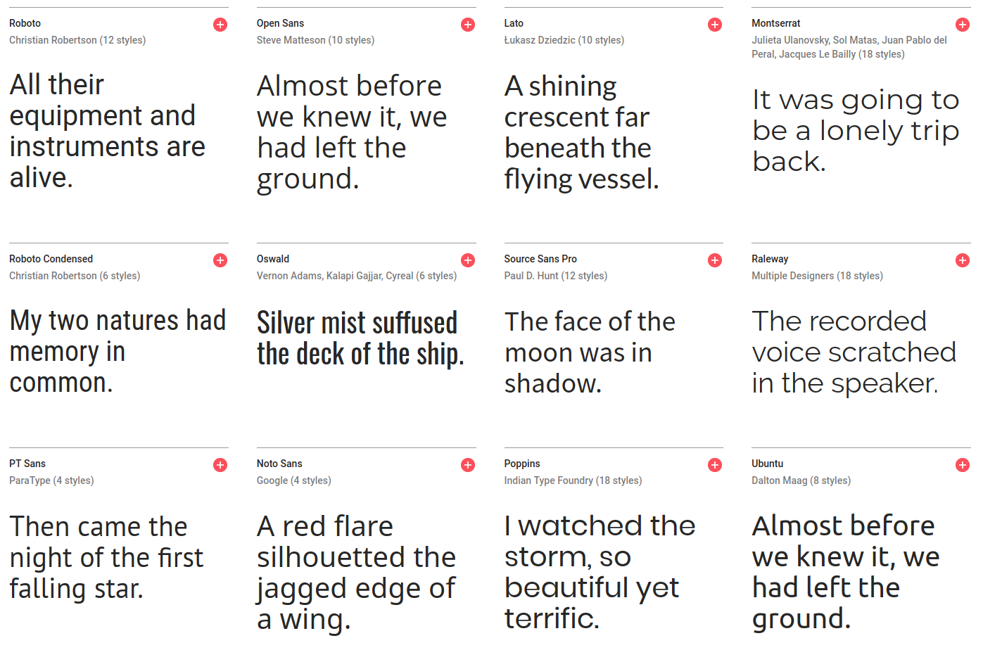
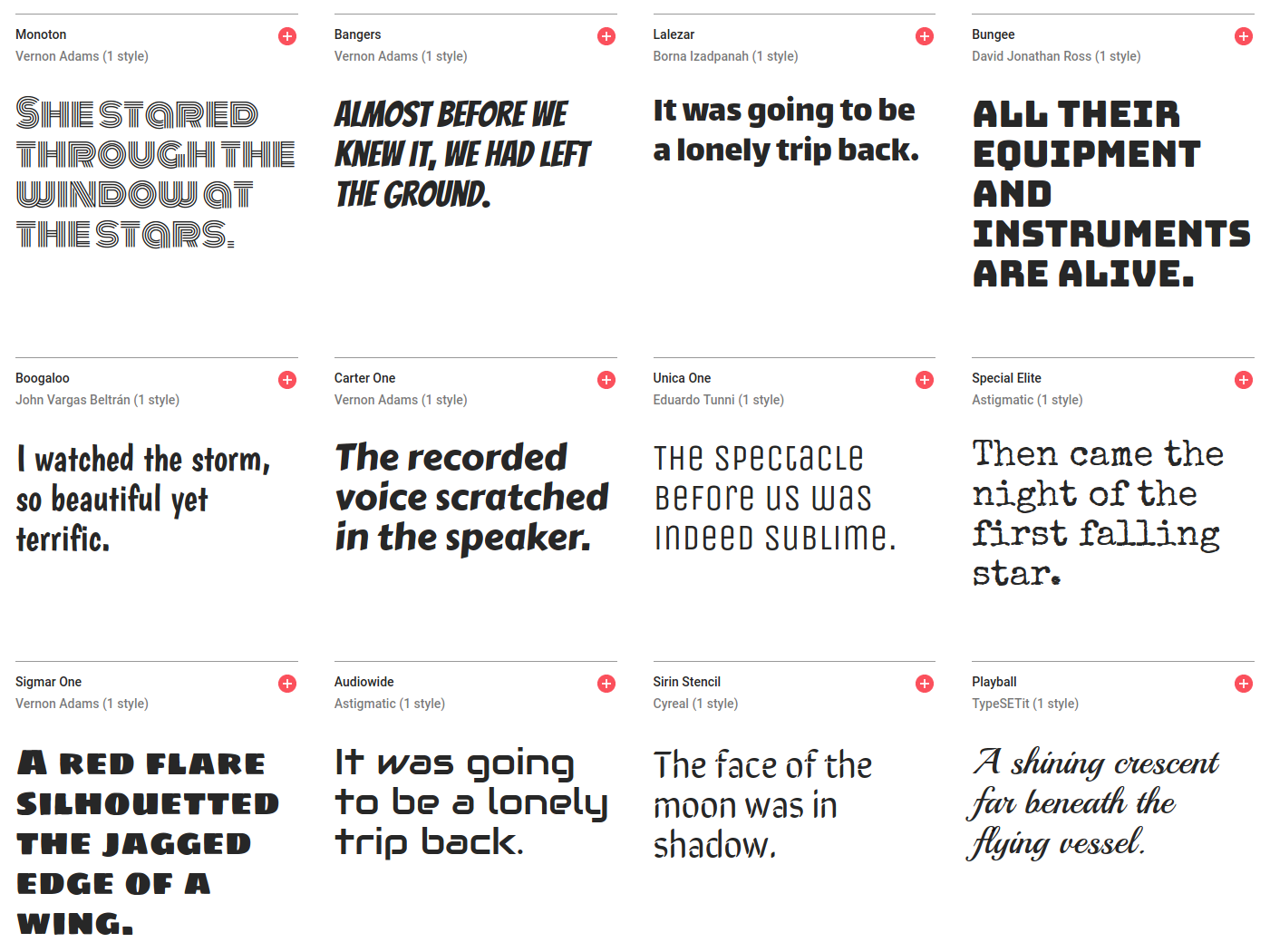
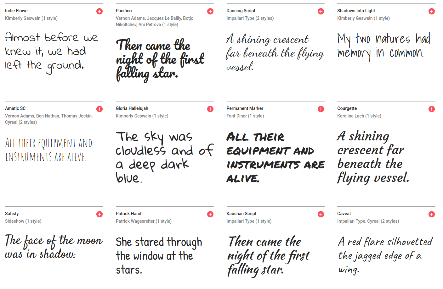
Font families
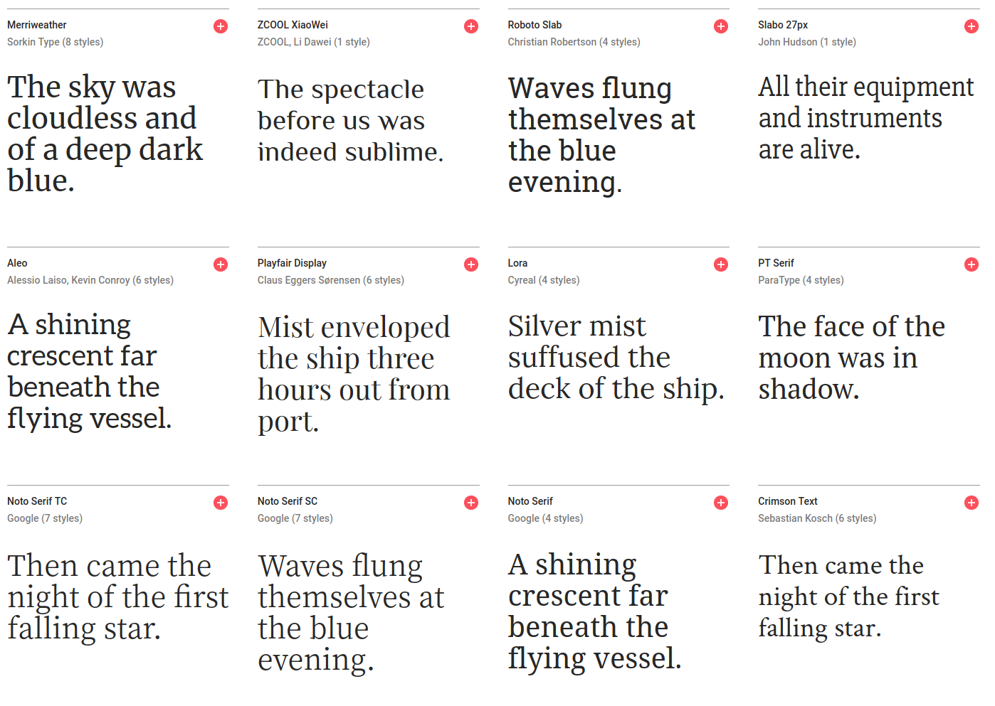
Serif
Sans-serif
Display
Script
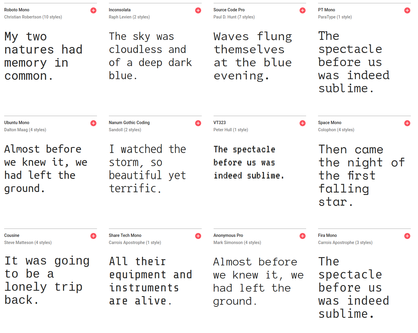
Monospaced
Weights
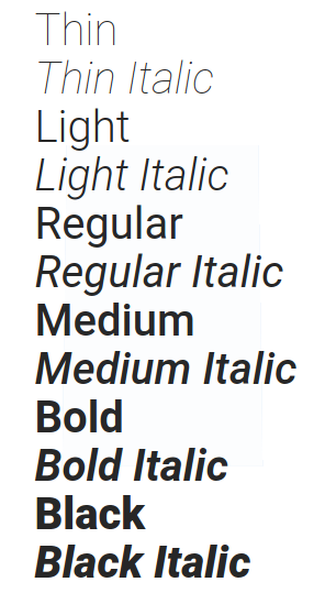
different weights for different emphasis
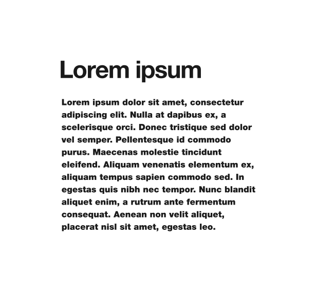
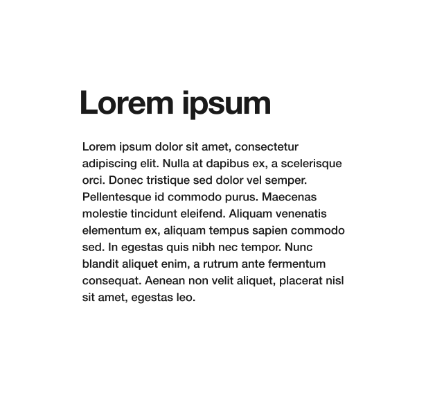


Alignment


Spacing

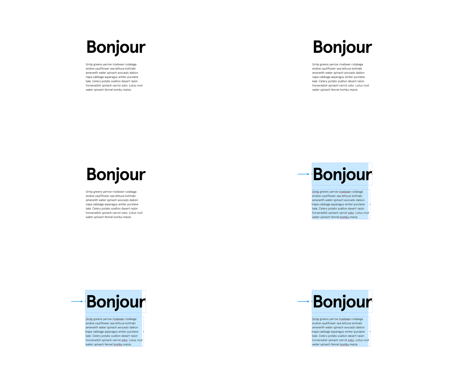
Kerning is the space between letters.
Sometimes, just subtle adjustment can make a whole difference




Don't be afraid
Of adjusting the letter spacing, specially when using headers and titles. Usually, it's necessary !
Don't be afraid
Of adjusting the letter spacing, specially when using headers and titles. Usually, it's necessary !
Sometimes, you can use the extra spacing for a dramatic
EFFECT
specially when going full caps on your titles
Sometimes, you can use the extra spacing for a dramatic
EFFECT
specially when going full caps on your titles
Lorem ipsum dolor sit amet, consectetur adipiscing elit. Nulla at dapibus ex, a scelerisque orci. Donec tristique sed dolor vel semper. Pellentesque id commodo purus.
Lorem ipsum dolor sit amet, consectetur adipiscing elit. Nulla at dapibus ex, a scelerisque orci. Donec tristique sed dolor vel semper. Pellentesque id commodo purus.
Lorem ipsum dolor sit amet, consectetur adipiscing elit. Nulla at dapibus ex, a scelerisque orci. Donec tristique sed dolor vel semper. Pellentesque id commodo purus.
Too much !
Just righ
Too tight !
Big text usually needs the spacing to me manually adjusted
Big text usually needs the spacing to me manually adjusted
Justification
When in doubt, always justify left !
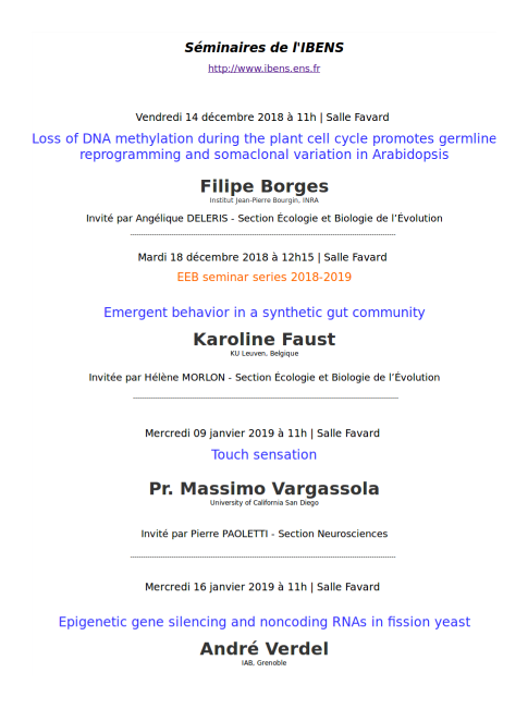

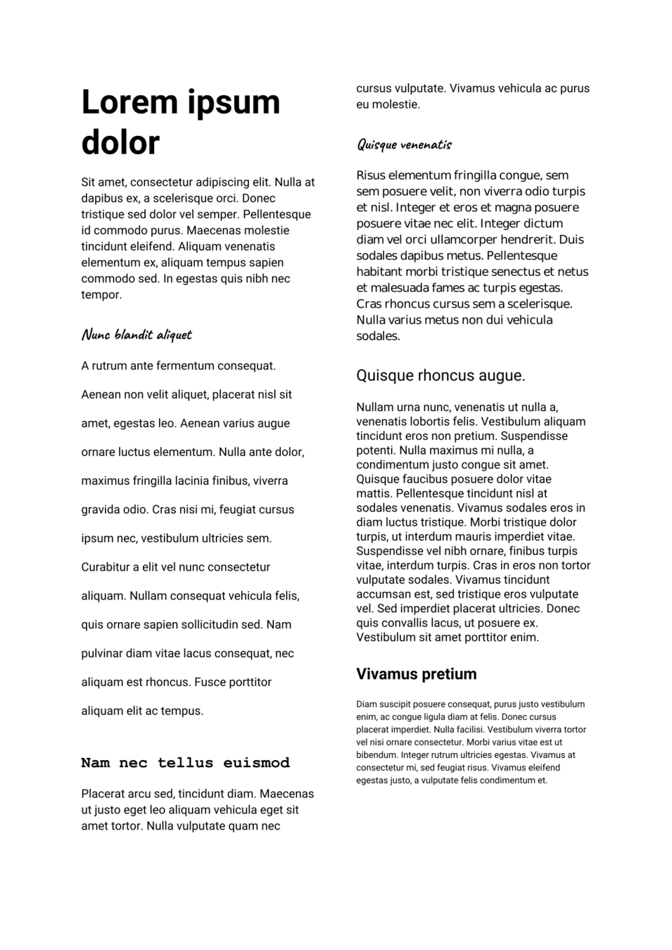
Consistency
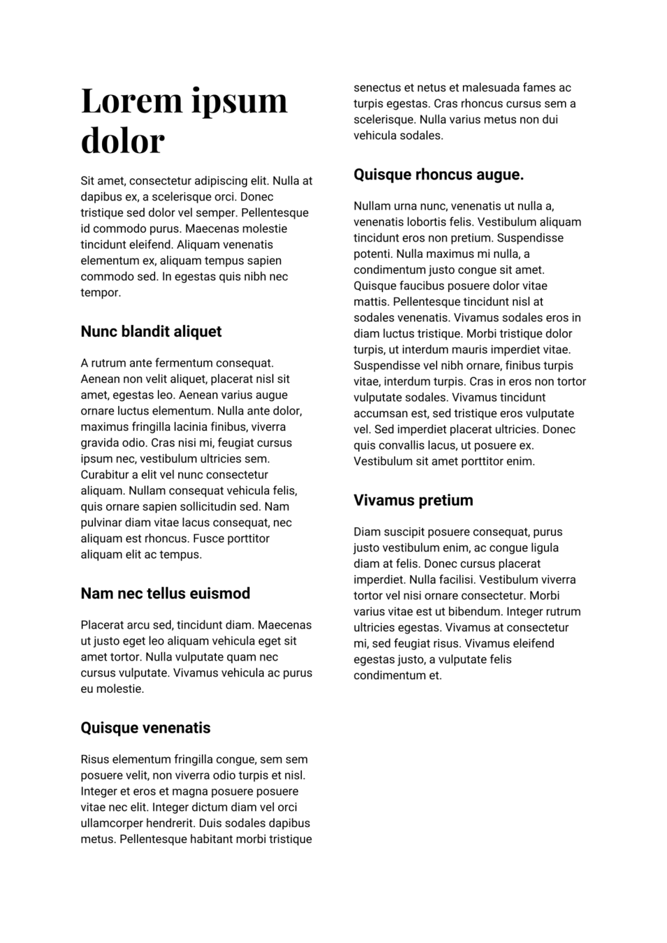


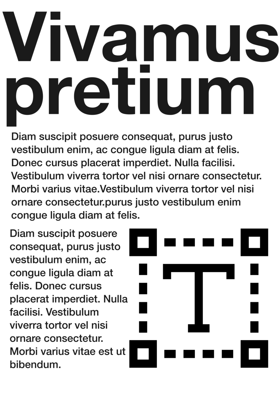
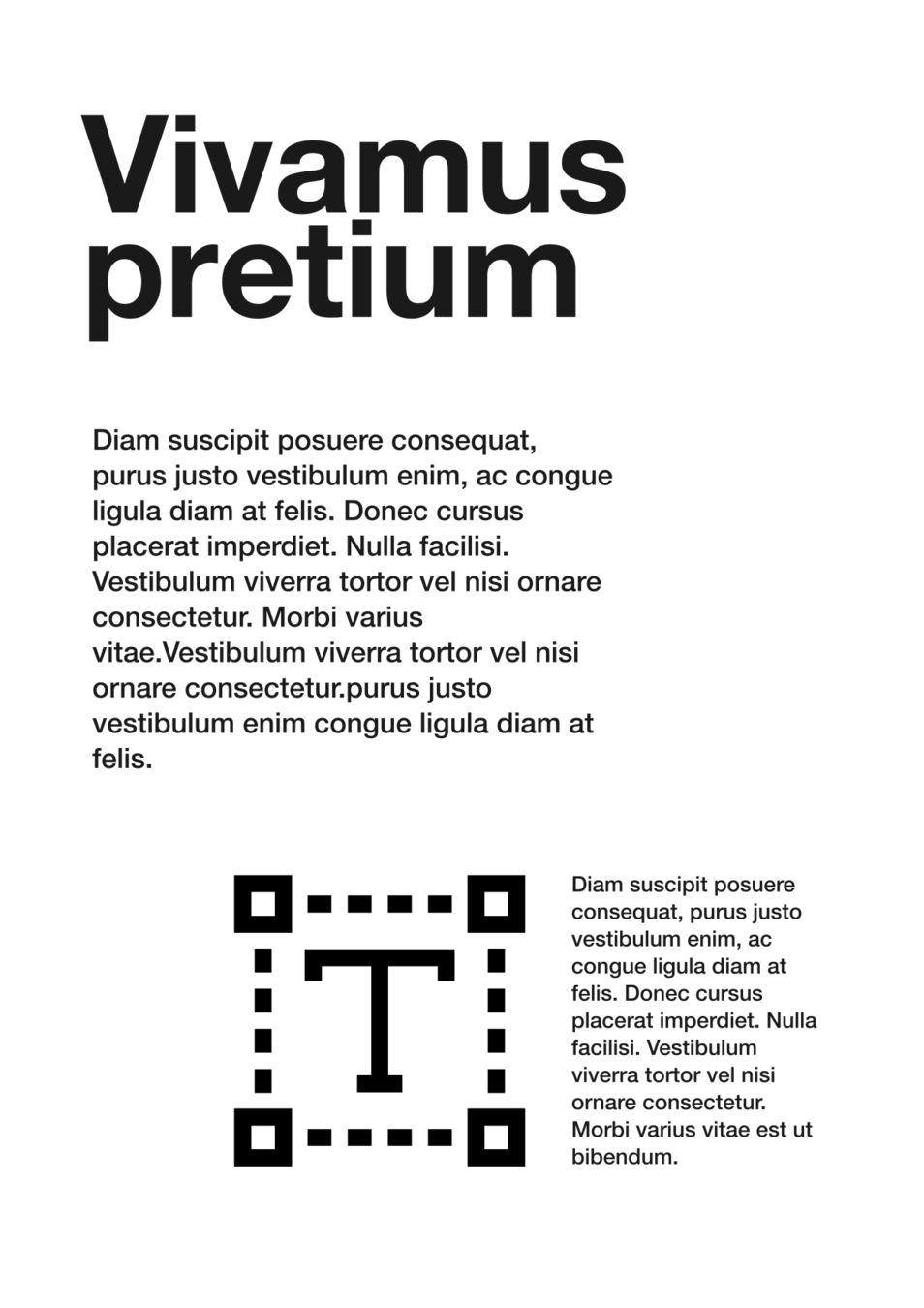
White space


Colors
Black text might be too contrasting in big sizes
Don't be afraid to use dark grays !
In a similar way, black background contrasts too much with white text
Use some more subtle color for the background, or even for the text itself.
Pay attention to contrast when using colors !
There's no need to be too drastic, choose wisely !
https://www.dafont.com/
https://fonts.google.com/
https://www.fontsquirrel.com/
Free font resources
Design principles - typography
By Felipe Delestro
Design principles - typography
- 763


