CSS FUNDAMENTALS
CSS Box Model
- All HTML elements can be considered as boxes. In CSS, the term "box model" is used when talking about design and layout
- The CSS box model is essentially a box that wraps around HTML elements, and it consists of: margins, borders, padding, and the actual content
- The box model allows us to add a border around elements, and to define space between elements
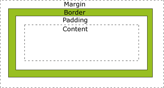
- Margin - Clears an area outside the border
- Border - A border that goes around the padding and content
- Padding - Clears an area around the content
- Content - The content of the box, where text and images appear
Width and Height
When you set the width and height properties of an element with CSS, you just set the width and height of the content area. To calculate the full size of an element, you must also add padding, borders and margins.
div {
    width: 320px;
    padding: 10px;
    border: 5px solid gray;
    margin: 0;
}
Element width = width + left padding + right padding + left border + right border + left margin + right margin = 350px
Element height = height + top padding + bottom padding + top border + bottom border + top margin + bottom margin
Margin collpasing
This definition indicates that when the vertical margins of two elements are touching, only the margin of the element with the largest margin value will be honored, while the margin of the element with the smaller margin value will be collapsed to zero
Size
Margin
The CSS margin properties define the space around elements.
Padding
The CSS padding properties define the space between the element border and the element content.
Border
The CSS border properties allow you to specify the style, size, and color of an element's border
Outline
An outline is a line that is drawn around elements (outside the borders) to make the element "stand out".
@-rules
- The at-rule is a statement that provides CSS with instructions to perform or how to behave.
- Each statement begins with an @ followed directly by one of several available keywords that acts as the identifier for what CSS should do
@font-face
- The @font-face rule allows custom fonts to be loaded on a webpage.
- Once added to a stylesheet, the rule instructs the browser to download the font from where it is hosted, then display it as specified in the CSS.
@import
This rule is inserted at the very top of the file and instructs the stylesheet to request and include an external CSS file as if the contents of that file were right where that line is.
@media
This rule contains conditional statements for targeting styles to specific screens. These statements can include screen sizes, which can be useful for adapting styles to devices
| Value | Description |
|---|---|
| all | Used for all media type devices |
| Used for printers | |
| screen | Used for computer screens, tablets, smart-phones etc. |
| speech | Used for screenreaders that "reads" the page out loud |
@media not|only mediatype and (media feature) {
    CSS-Code;
}
Mediatypes
@media
Media Features
| aspect-ratio | The ratio between the width and the height of the viewport |
|---|---|
| max-height | The maximum height of the display area, such as a browser window |
| max-width | The maximum width of the display area, such as a browser window |
| min-height | The minimum height of the display area, such as a browser window |
| min-width | The minimum width of the display area, such as a browser window |
| orientation | The orientation of the viewport (landscape or portrait mode) |
...
@media
Content
These properties set generated content
Lists
Table
background
Function
Transform
The transform property applies a 2D or 3D transformation to an element. This property allows you to rotate, scale, move, skew, etc., elements.
Transition
CSS3 transitions allows you to change property values smoothly (from one value to another), over a given duration.
Animation
CSS3 animations allows animation of most HTML elements without using JavaScript or Flash
Class work
Create the simmilar page http://codepen.io/NobodyRocks/full/vEKGC
Image with inner shadow

Class work
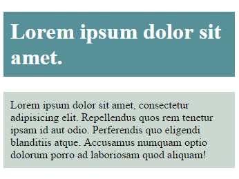
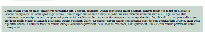
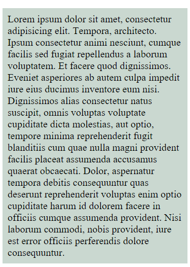
Text with margins and paddings
Class work
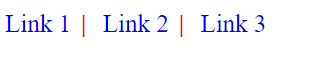
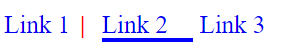
Add links with vertical lines on right except the last
Use pseudo-elements and pseudo-classes
On hover the line should disappear and the bottom line appears smoothly except the last one
Home work
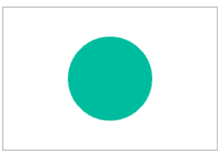
Create this image using gradients and borders
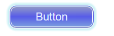
Create this button, pay attention to the shadow. Shadow should appear smoothly
Home work
Such text size in normal mode:
This is for mobiles (500px)
Create adaptive text
Animation
Create at least three animations
Page loader
Circle bouncing between two blocks
Create infinite animation with the steps: Circle with Gradient => Square => Gradient changing => Size and skew changes => Rotate => Gradient changing => Circle
THANKS FOR YOUR ATTENTION
CSS fundamentals
CSS Fundamentals
By Dima Pikulin


