


Dima Vishnevetsky
Front-End Expert
Introduced as part of the HTML5 specification,
📜
📜
👉The placeholder attribute “represents a short hint
(a word or short phrase) intended to aid the user with data entry when the control has no value.
A hint could be a sample value or a brief description of the expected format.”
📐 UX / UI Designer
🖼 Media Developer Expert @Cloudinary
👨🏫 #HackathonMentor
🎓 Lecturer
🗣 International Tech speaker
👨💻 Front End Expert
Co-founder of
Vue.js Israel community leader
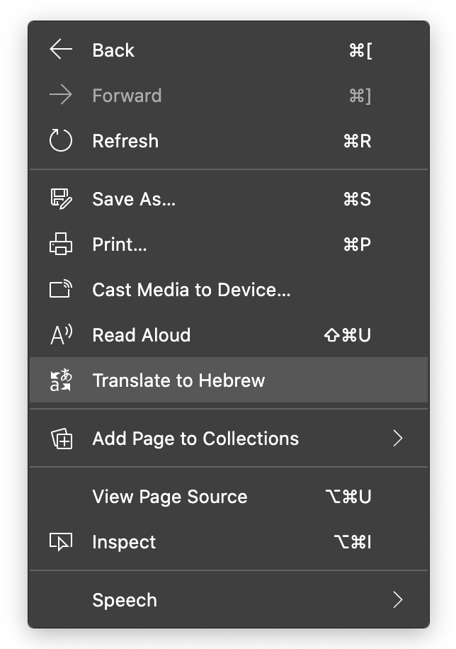
Browsers with auto-translation features might skip over attributes when a request to translate the current page is initiated.
Not all browsers have translation features built-in.
We can't fully rely on third-party add-ons to do the job.
It is a foundational part of both the Internet and assistive technology.
Semantically describing your content makes it interoperable.
Interoperability is the practice of making different systems exchange and understand information.
An interoperable input is created by programmatically associating a label element with it.
<label for="name">Name:</label>

<input type="text" id="name" name="name">
Without for/id pairing, assistive technology will be unable to determine what the input is for.
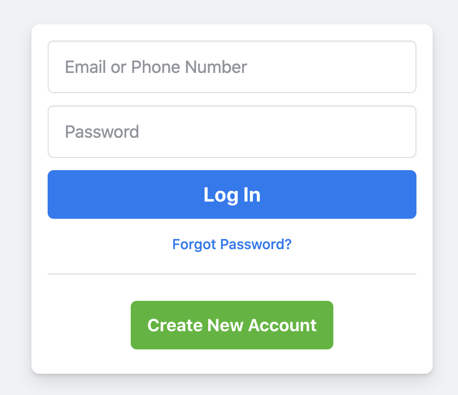
Placeholder are oftentimes used in place of a label element.
Yes, this can be partly solved using the
"aria-label" attribute.
<input type="search" placeholder="Search query" aria-label="Search through site content">
The label text contained in the aria-label attribute is read out when the form input is highlighted.
WAI-ARIA (Web Accessibility Initiative - Accessible Rich Internet Applications)
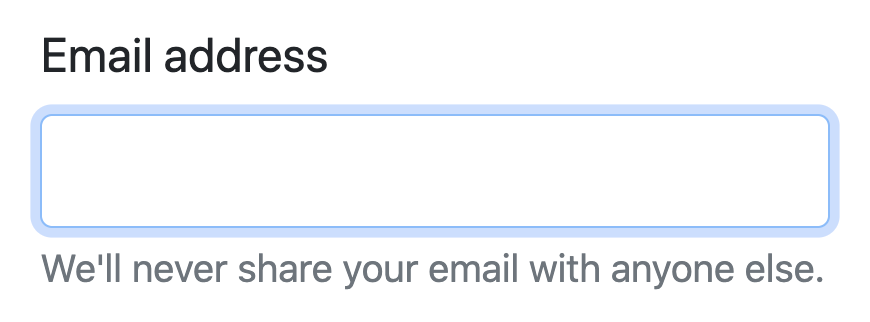
Floating label effect
(adaptive placeholder)
Google Material design does not use a placeholder for this effect.
MATERIAL DESIGN ❓
Clicking or tapping on a label that is programmatically associated with an input, will place focus on the input.
This provides an extra area for interacting with the input, which can be beneficial to people with motor control issues.
Placeholders acting as labels, as well as floating labels, cannot do that.
😕
The umbrella of cognitive concerns covers conditions such as short-term memory loss, traumatic brain injury, and Attention Deficit Hyperactivity Disorder. They can all affect a person’s ability to recall information.
🤔
When a person enters information into an input, its placeholder content will disappear.
Did they want MM/DD/YY or MM/DD/YYYY?
🤷♂️
When your ability to recall information is inhibited, it makes following these disappearing rules annoying.
What’s the minimum length?
🤷♂️
How many numbers do they want?
🤷♂️
Placeholder text that disappears when the cursor is placed in a form field is irritating for users navigating with the keyboard.
⌨️
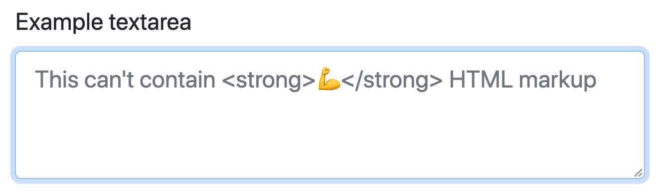
Placeholder help content is limited to just a string of static text, and that may not always be sufficient to communicate the message.
Placeholder text’s length is limited to the width of the input it is contained in.
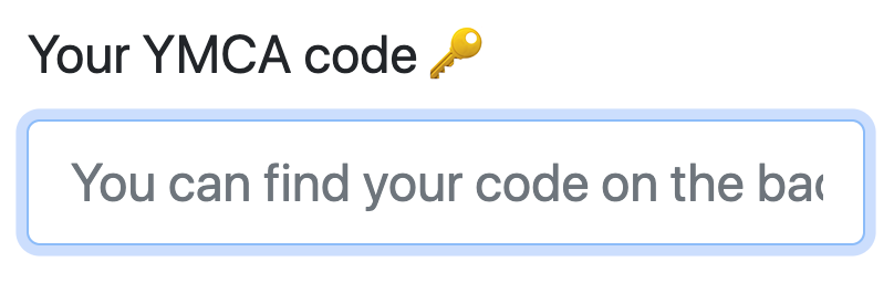
I guess I’ll never know where that code is.
🤦♀️
Like all accessibility concerns, low vision conditions can be permanent or temporary, biological or environmental, or a combination.
Biological disabilities
🎨 Color blindness
👁 Dilated pupils
👁🗨 Cataracts
Environmental conditions
☀️ Sun glare
🔋 Battery-saving mode
🕵️♀️ Privacy screens
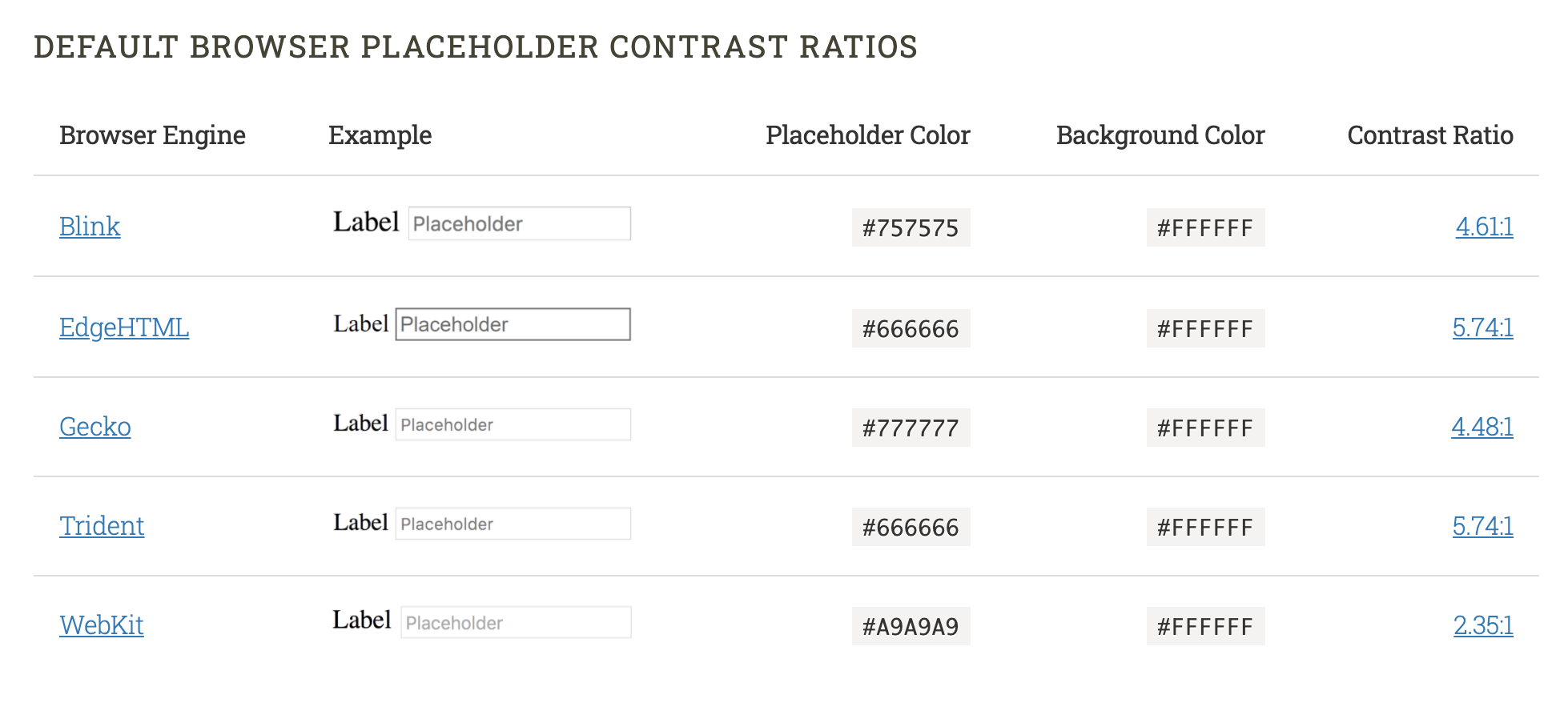
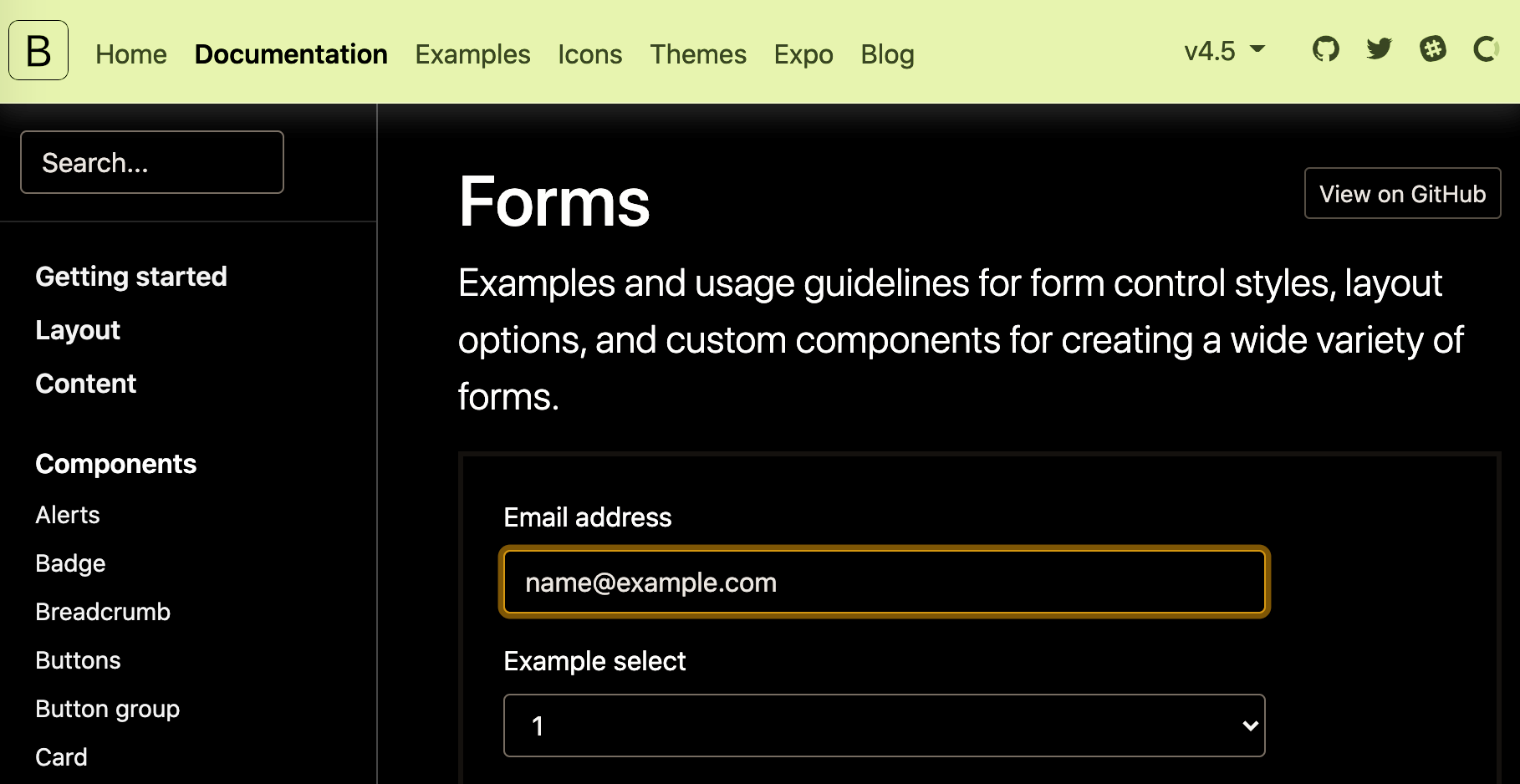
In trying to make placeholder attributes inclusive, the updated higher contrast placeholder content color may become dark enough to be interpreted as entered input
High Contrast Mode
Windows 10 set to use the High Contrast Mode 1 theme running Internet Explorer 11.
Placeholder
Placeholder
Can’t be automatically translated
Is oftentimes used in place of a label, locking out assistive technology
Can hide important information when content is entered
Can be too light-colored to be legible
Has limited styling options
May look like pre-filled information and be skipped over
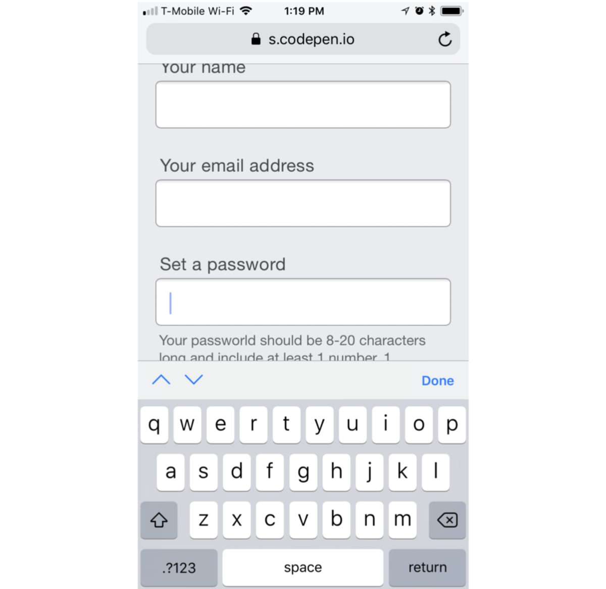
Move the placeholder content above the input, but below the label
The help content will be kept in view when the input is activated on a device with a software keyboard.
* Above the input
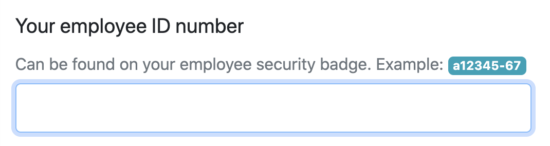
<main>
  <div class="input-wrapper">
    <form id="example" action="">
      <label for="employeeId">
        Your employee <abbr title="Identification">ID</abbr> number
      </label>
      <p
        id="employeeIdHint"
        class="input-hint">
        Can be found on your employee security badge. Example: <samp>a12345-67</samp>.
      </p>
      <input
        id="employeeId"
        aria-describedby="employeeIdHint"
        name="id-number"
        type="text" />
    </form>
  </div>
</main>
The HTML Sample Element (<samp>) is used to enclose inline text which represents sample (or quoted) output from a computer program.
The HTML Abbreviation element (<abbr>) represents an abbreviation or acronym; the optional title attribute can provide an expansion or description for the abbreviation.
By using aria-describedby to programmatically associate the input with the p element, we are creating a priority of information for screen readers that has parity with what a person browsing without a screen reader would experience. aria-describedby ensures that the p content will be described last, after the label’s content and the kind of input it is associated with.
👎
Adding too much information to a label may have the opposite of the desired effect, making it too long to recall or simply too frustrating to listen to all the way through.
Good front end solutions take advantage of special input attributes and accommodating validation practices to prevent offloading the extra work onto the person who simply just wants to use your site or app with as little complication as possible.
Good copywriting creates labels that clearly describe the input’s purpose.
💻
📝
Dima Vishnevetsky
@dimshik100
www.dimshik.com
Read more:
By Dima Vishnevetsky


