CSS
Cascading Style Sheets
Part III
Layout
Layout
- Positioning of elements
- Web page layout
- Different Screen Sizes
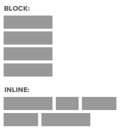
Recap: Block vs Inline
<h1></h1>

<div></div>

<h1></h1>

<div></div>
<em></em>
<input></input>
<input></input>
<button></button>BLOCK:
INLINE:
Container Elements
When one block level element sits inside another
Usually a <div>
Header 1
Image
CSS Positional Schemes
-
Normal Flow
-
Relative Positioning
-
Absolute Positioning
-
Fixed Positioning
-
Floating Elements
Normal Flow
Each block level element Sits on top of the next
Far Far Away
<body>
    <h1>Far Far Away</h1>
    <p>Far far away, behind the word mountains, far from the countries Vokalia and Consonantia, there live the blind texts</p>
    <p>Separated they live in Bookmarksgrove right at the coast of the Semantics, a large language ocean.</p>
    <p>A small river named Duden flows by their place and supplies it with the necessary regelialia.</p>
</body>
Far far away, behind the word mountains, far from the countries Vokalia and Consonantia, there live the blind texts
Separated they live in Bookmarksgrove right at the coast of the Semantics, a large language ocean.
A small river named Duden flows by their place and supplies it with the necessary regelialia.
h1
{
	position: static;
        /*static is default*/
}
Relative Positioning
Move element in relation to where it would have been in normal flow
Far Far Away
<body>
    <h1>Far Far Away</h1>
    <p>Far far away, behind the word mountains, far from the countries Vokalia and Consonantia, there live the blind texts</p>
    <p class="example">Separated they live in Bookmarksgrove right at the coast of the Semantics, a large language ocean.</p>
    <p>A small river named Duden flows by their place and supplies it with the necessary regelialia.</p>
</body>
Far far away, behind the word mountains, far from the countries Vokalia and Consonantia, there live the blind texts
Separated they live in Bookmarksgrove right at the coast of the Semantics, a large language ocean.
A small river named Duden flows by their place and supplies it with the necessary regelialia.
.example
{
	position: relative;
	top: 10px;
	left: 100px;
}
Separated they live in Bookmarksgrove right at the coast of the Semantics, a large language ocean.
Absolute Positioning
Box is taken out of normal flow - Does not affect position of other elements
Box offsets (top, left, bottom, right) used to specify where it should appear relative to container
Far Far Away
<body>
    <h1>Far Far Away</h1>
    <p>Far far away, behind the word mountains, far from the countries Vokalia and Consonantia, there live the blind texts</p>
    <p class="example">Separated they live in Bookmarksgrove right at the coast of the Semantics, a large language ocean.</p>
    <p>A small river named Duden flows by their place and supplies it with the necessary regelialia.</p>
</body>
Far far away, behind the word mountains, far from the countries Vokalia and Consonantia, there live the blind texts
A small river named Duden flows by their place and supplies it with the necessary regelialia.
h1
{
	position: absolute;
	top: 0px;
	left: 500px;
	width: 250px;
}

p
{
	width: 450px;
}
Separated they live in Bookmarksgrove right at the coast of the Semantics, a large language ocean.
450px
500px
Fixed Positioning
Similar to Absolute Positioning
Key Difference: when user scroll, fixed element stays in exact same place
Far Far Away
<body>
    <h1>Far Far Away</h1>
    <p class="firstP">Far far away, behind the word mountains, far from the countries Vokalia and Consonantia, there live the blind texts</p>
    <p>Separated they live in Bookmarksgrove right at the coast of the Semantics, a large language ocean.</p>
    <p>A small river named Duden flows by their place and supplies it with the necessary regelialia.</p>
</body>
Far far away, behind the word mountains, far from the countries Vokalia and Consonantia, there live the blind texts
A small river named Duden flows by their place and supplies it with the necessary regelialia.
h1
{
	position: fixed;
	top: 0px;
	left: 0px;
	padding: 10px;
	margin: 0px;
	width: 100%;
	background-color: #efefef;
}

p.firstP
{
	margin-top: 100px;
}
Separated they live in Bookmarksgrove right at the coast of the Semantics, a large language ocean.
Overlapping Elements
For Relative, Fixed or Absolute Positioning: Boxes can overlap.
Which Box is displayed if they overlap
Box A content goes here
Box B content goes here
Box A content goes here
Box B content goes here
OR
Overlapping Elements
Element "Closest to the front" will be displayed
z-index defines how close to front an element is.
The bigger the z-index, the closer it is to the front
selector
{
    z-index: 1;
}
Overlapping Elements
Box A content goes here
Box B content goes here
Box A content goes here
Box B content goes here
OR
#boxA
{
    z-index: 1;
}

#boxB
{
    z-index: 2;
}
#boxA
{
z-index: 2;
}
#boxB
{
z-index: 1;
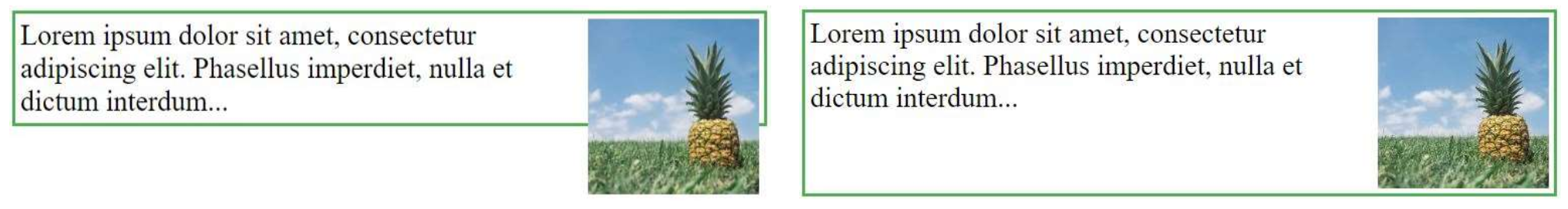
}Floating Elements
Floating allows you to take an element in normal flow and place it as far left or right of the containing element as possible
Anything else that sits inside the containing element flow around the floated element
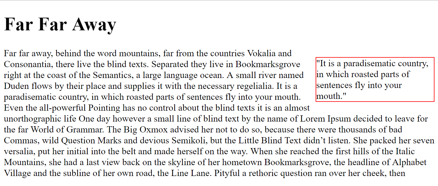
<body>
<h1>Far Far Away</h1>
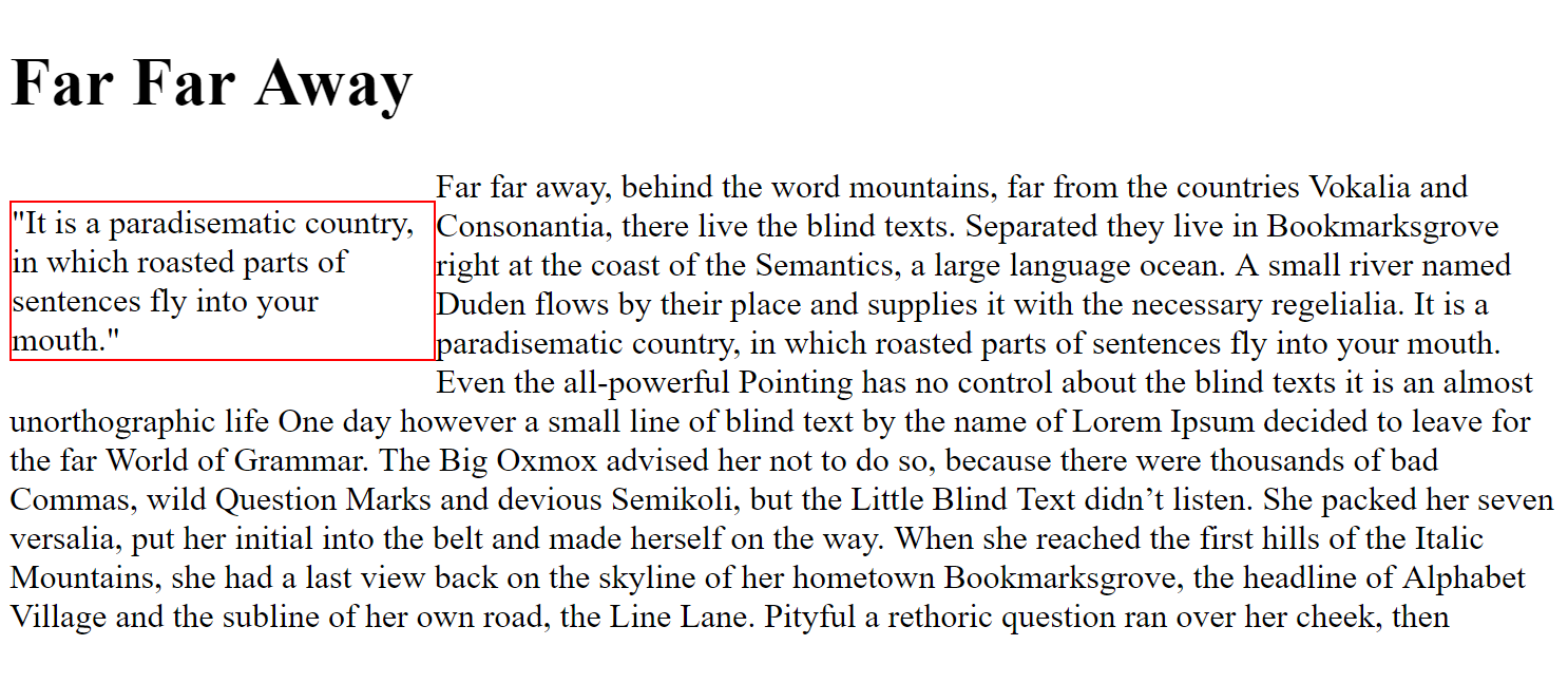
<p class="quote">"It is a paradisematic country, in which roasted parts of sentences fly into your mouth."</p>
<p class="firstP">Far far away, behind the word mountains, far from the countries Vokalia and Consonantia, there live the blind texts. Separated they live in Bookmarksgrove right at the coast of the Semantics, a large language ocean. A small river named Duden flows by their place and supplies it with the necessary regelialia. It is a paradisematic country, in which roasted parts of sentences fly into your mouth. Even the all-powerful Pointing has no control about the blind texts it is an almost unorthographic life One day however a small line of blind text by the name of Lorem Ipsum decided to leave for the far World of Grammar. The Big Oxmox advised her not to do so, because there were thousands of bad Commas, wild Question Marks and devious Semikoli, but the Little Blind Text didn’t listen. She packed her seven versalia, put her initial into the belt and made herself on the way. When she reached the first hills of the Italic Mountains, she had a last view back on the skyline of her hometown Bookmarksgrove, the headline of Alphabet Village and the subline of her own road, the Line Lane. Pityful a rethoric question ran over her cheek, then</p>
</body>.quote
{
float: right;
width: 200px;
border: 1px solid red;
}
Floating Elements
Floating allows you to take an element in normal flow and place it as far left or right of the containing element as possible
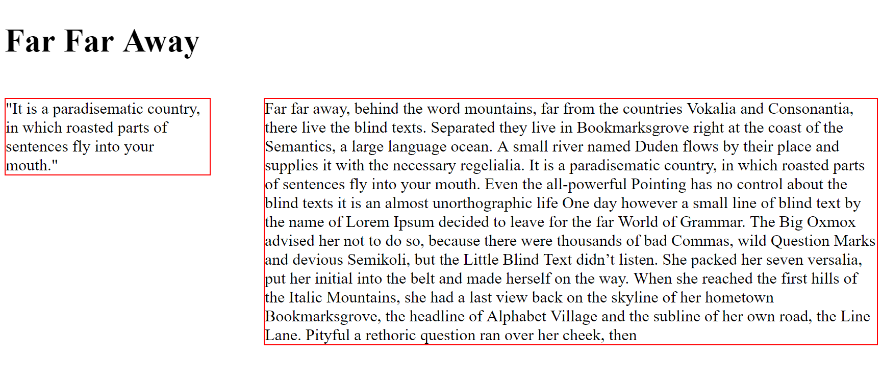
<body>

    <h1>Far Far Away</h1>
    <p class="quote">"It is a paradisematic country, in which roasted parts of sentences fly into your mouth."</p>
    <p class="firstP">Far far away, behind the word mountains, far from the countries Vokalia and Consonantia, there live the blind texts. Separated they live in Bookmarksgrove right at the coast of the Semantics, a large language ocean. A small river named Duden flows by their place and supplies it with the necessary regelialia. It is a paradisematic country, in which roasted parts of sentences fly into your mouth. Even the all-powerful Pointing has no control about the blind texts it is an almost unorthographic life One day however a small line of blind text by the name of Lorem Ipsum decided to leave for the far World of Grammar. The Big Oxmox advised her not to do so, because there were thousands of bad Commas, wild Question Marks and devious Semikoli, but the Little Blind Text didn’t listen. She packed her seven versalia, put her initial into the belt and made herself on the way. When she reached the first hills of the Italic Mountains, she had a last view back on the skyline of her hometown Bookmarksgrove, the headline of Alphabet Village and the subline of her own road, the Line Lane. Pityful a rethoric question ran over her cheek, then</p>
</body>
.quote
{
float: left;
width: 200px;
border: 1px solid red;
}
Floating Elements
Floating allows you to take an element in normal flow and place it as far left or right of the containing element as possible
<body>

    <h1>Far Far Away</h1>
    <p class="quote">"It is a paradisematic country, in which roasted parts of sentences fly into your mouth."</p>
    <p class="firstP">Far far away, behind the word mountains, far from the countries Vokalia and Consonantia, there live the blind texts. Separated they live in Bookmarksgrove right at the coast of the Semantics, a large language ocean. A small river named Duden flows by their place and supplies it with the necessary regelialia. It is a paradisematic country, in which roasted parts of sentences fly into your mouth. Even the all-powerful Pointing has no control about the blind texts it is an almost unorthographic life One day however a small line of blind text by the name of Lorem Ipsum decided to leave for the far World of Grammar. The Big Oxmox advised her not to do so, because there were thousands of bad Commas, wild Question Marks and devious Semikoli, but the Little Blind Text didn’t listen. She packed her seven versalia, put her initial into the belt and made herself on the way. When she reached the first hills of the Italic Mountains, she had a last view back on the skyline of her hometown Bookmarksgrove, the headline of Alphabet Village and the subline of her own road, the Line Lane. Pityful a rethoric question ran over her cheek, then</p>
</body>
.quote
{
float: left;
width: 200px;
border: 1px solid red;
}
.firstP
{
float: right;
width: 600px;
border: 1px solid red;
}
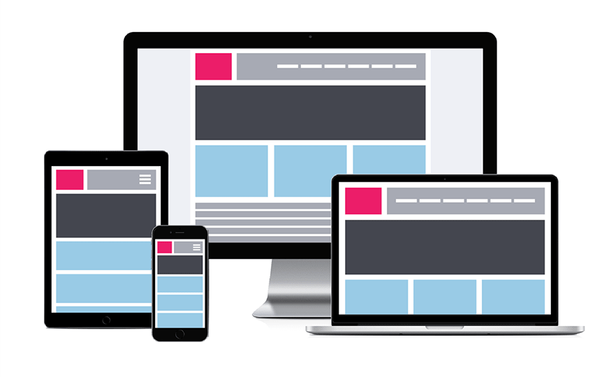
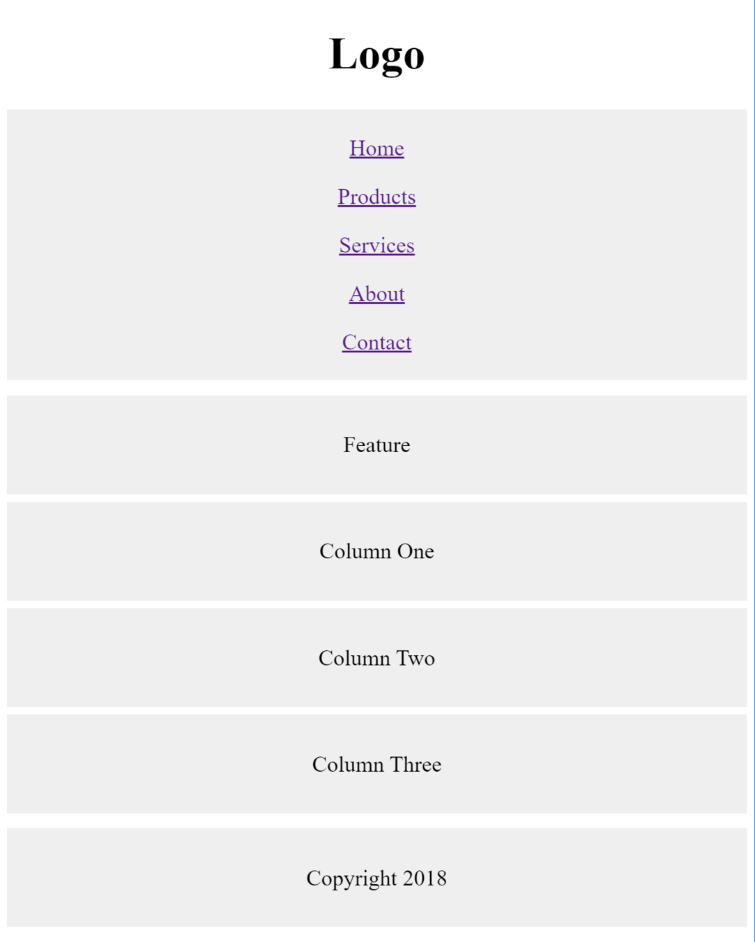
Screen Sizes and Resolutions
| Device | Width x Height |
|---|---|
| Smartphone | approx. 640 x 960 |
| Tablet | approx. 768 x 1024 |
| Laptop | approx. 1280 x 800 |
| Desktop | approx. 2560 x 1440 |
Screen Widths
768px
1440px
1920px
3840px

Smartphones
Tablets
Laptops & Desktops
Screen Height

1000 px
570 px
Users are required to scroll to see content beyond screen height
Design should consider important content should be seen without the need for scrolling
Studies have shown that users judge a site in a few seconds. It is therefore important to show that the site is relevant to the user in that top 570px
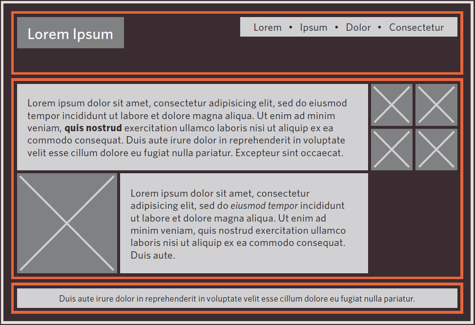
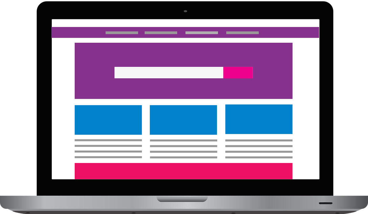
<!DOCTYPE html>
<html>
<head>
  <title> </title>
  <link rel="stylesheet" type="text/css" href="template.css">
</head>
<body>
  <div id="header">
    <h1>Logo</h1>
    <div id="nav">
      <ul>
        <li><a href="">Home</a></li>
        <li><a href="">Products</a></li>
        <li><a href="">Services</a></li>
        <li><a href="">About</a></li>
        <li><a href="">Contact</a></li>
      </ul>
    </div>
  </div>
  <div id="content">
    <div id="feature">
      <p>Feature</p>
    </div>


    <div class="column1">
      <p>Column One</p>
    </div>
    <div class="column2">
      <p>Column Two</p>
    </div>
    <div class="column3">
      <p>Column Three</p>
    </div>
  </div>
  <div id="footer">
    <p>Copyright 2018</p>
  </div>
</body>
</html>
Edit CSS to replicate the page below
body
{
	width: 90%;
	margin: 0 auto 0 auto;
}
Hint:
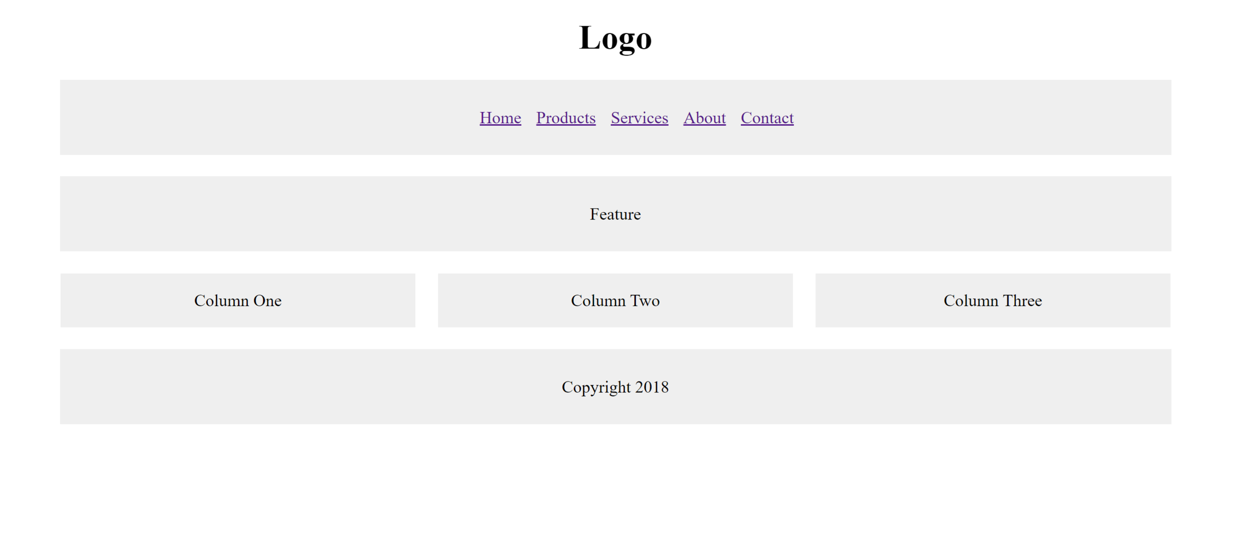
<!DOCTYPE html>
<html>
<head>
  <title> </title>
  <link rel="stylesheet" type="text/css" href="template.css">
</head>
<body>
  <div id="header">
    <h1>Logo</h1>
    <div id="nav">
      <ul>
        <li><a href="">Home</a></li>
        <li><a href="">Products</a></li>
        <li><a href="">Services</a></li>
        <li><a href="">About</a></li>
        <li><a href="">Contact</a></li>
      </ul>
    </div>
  </div>
  <div id="content">
    <div id="feature">
      <p>Feature</p>
    </div>


    <div class="column1">
      <p>Column One</p>
    </div>
    <div class="column2">
      <p>Column Two</p>
    </div>
    <div class="column3">
      <p>Column Three</p>
    </div>
  </div>
  <div id="footer">
    <p>Copyright 2018</p>
  </div>
</body>
</html>
body
{
width: 90%;
margin: 0 auto 0 auto;
}Hint:
overflow: auto;Edit CSS to replicate the page below
rules in CSS
@mediaThe @media rule is used in media queries to apply different styles for different media types/devices.
In other words, apply these extra styles for small screens to make them fit better on the screen
<!DOCTYPE html>
<html>
<head>
  <title> </title>
  <link rel="stylesheet" type="text/css" href="template_responsive.css">
</head>
<body>
  <div id="header">
    <h1>Logo</h1>
    <div id="nav">
      <ul>
        <li><a href="">Home</a></li>
        <li><a href="">Products</a></li>
        <li><a href="">Services</a></li>
        <li><a href="">About</a></li>
        <li><a href="">Contact</a></li>
      </ul>
    </div>
  </div>
  <div id="content">
    <div id="feature">
      <p>Feature</p>
    </div>


    <div class="column1">
      <p>Column One</p>
    </div>
    <div class="column2">
      <p>Column Two</p>
    </div>
    <div class="column3">
      <p>Column Three</p>
    </div>
  </div>
  <div id="footer">
    <p>Copyright 2018</p>
  </div>
</body>
</html>
body
{
width: 90%;
margin: 0 auto 0 auto;
text-align: center;
}
#content
{
overflow: auto;
}
#nav, #feature, #footer
{
background-color: #efefef;
padding: 10px;
margin: 10px;
}
.column1, .column2, .column3
{
background-color: #efefef;
float: left;
width: 31.33333%;
margin: 1.0%;
}
li
{
display: inline;
padding: 5px;
}1. Create new "template_responsive.html"
2. Create new "template_responsive.css"
3. Edit the css such that style changes to shown image when width is below 768px
css-3
By D.Kelly


