Analysing band/artist posters
Taylor Swift - Bad Blood
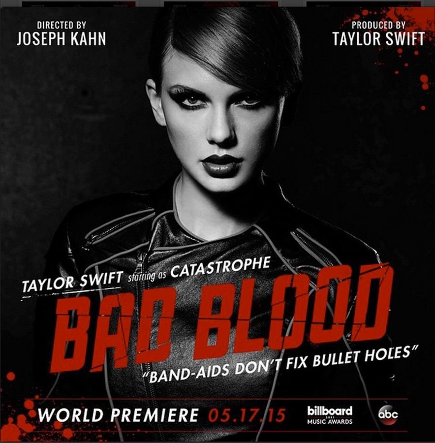
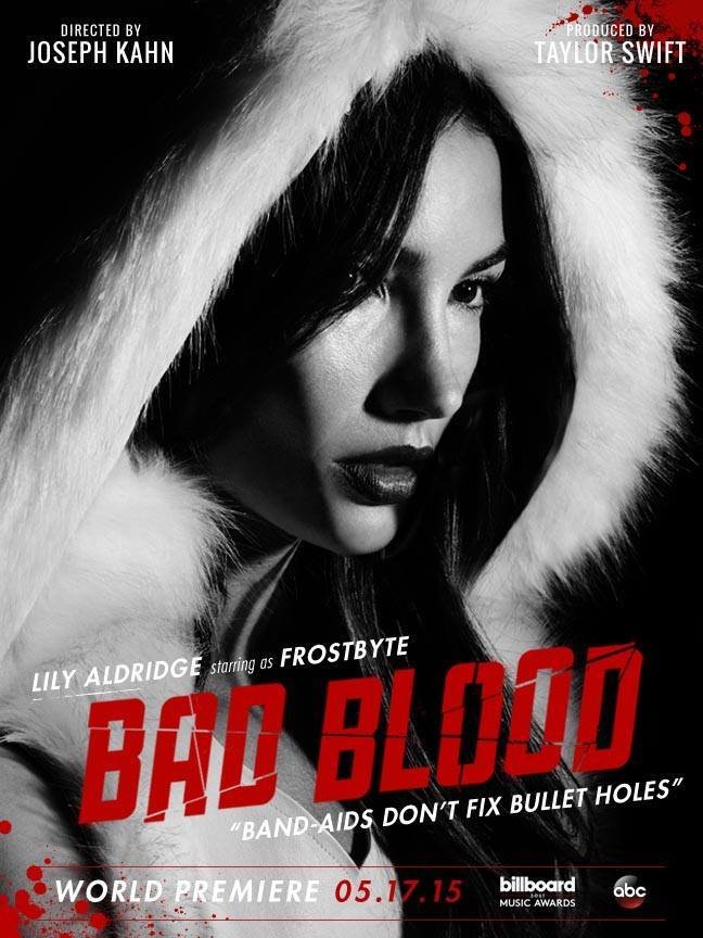
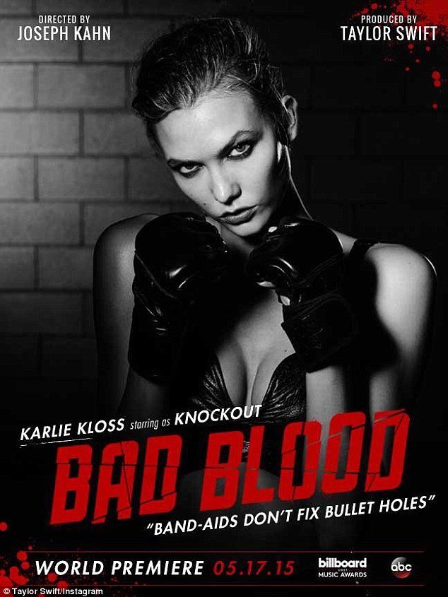
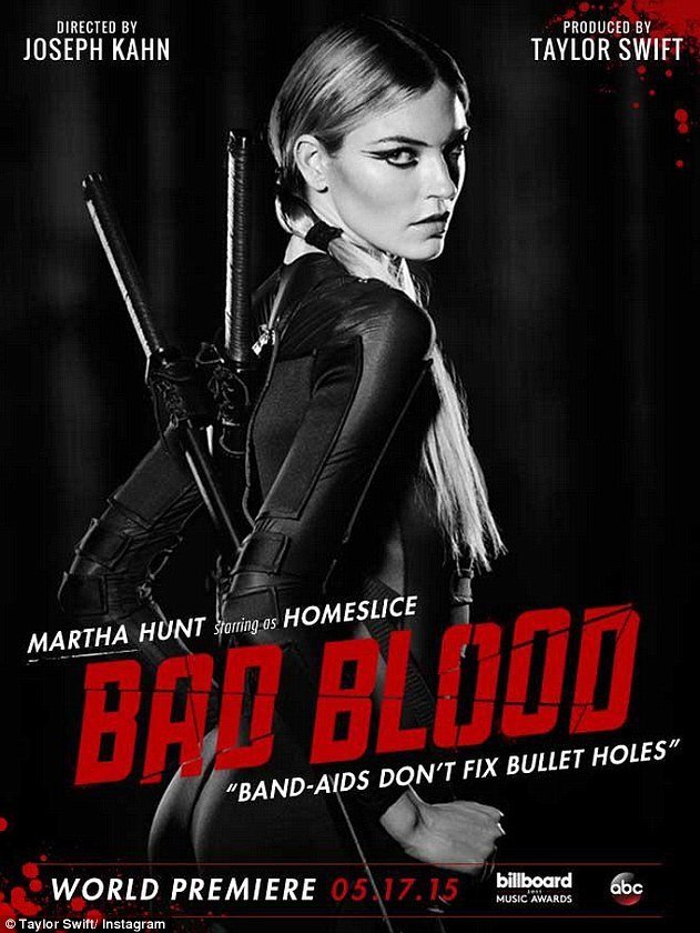
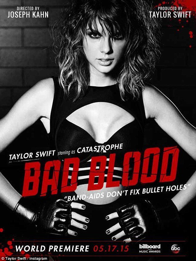
The picture to the left is the original image used to promote Taylor Swift's single Bad Blood. The unique thing about this promotion was that the singer released an image, like the ones below, daily.



Taylor Swift - Bad Blood
The image looks like a movie poster as it includes the person in the centre of the picture, often looking directly at the camera. Below it is the title of the single in bold, red font which contrasts against the black and white.


Taylor Swift - Bad Blood
Also, underneath the title of the song are lyrics from the song. The fact that a new poster/image was released daily builds up the suspense for the single and music video. But also, the use of different celebrities in the video brought more attention to the song.


Taylor Swift - Bad Blood
I feel that this poster does fit the genre because noticeably Taylor Swift has strayed away from her typical country sound to something a lot more different for her - pop. You can see the clear difference between these two posters.



Taylor Swift - Bad Blood
Also, the poster does in fact fit the music because it relates to her music video.


Take That - The Circus
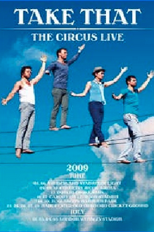
This Take That poster is evidently a tour poster and is therefore advertising the tour. The poster shows the band members on a tightrope which is a reference to the title of the album as you see tightropes at circuses.

Take That - The Circus
But from this image we are also able to see that Gary is the main person/lead singer of the band as he's on the highest tightrope which suggests that maybe he's the most important.

Take That - The Circus
The colour scheme to the poster is mainly blue and white. The band members are dressed in dark blues and white which contrasts and makes them stand out against the light blue and white sky.

Take That - The Circus
Tour information is seen at the bottom of the poster but it's a lot smaller than everything else on the poster which implies it's less important and that the band is the more significant part of the poster.

Lady Gaga - Born This Way
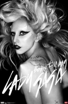
The black and white effect on the image challenges the typical codes and conventions of a pop artist as they typically use bright and colourful colours.

Lady Gaga - Born This Way
The typography is edgy and wrote in rough typeface showing that her personality isn't perfect and faultless. Also, the way she's looking at the camera makes the audience feel like she's looking at the, it makes the poster more personal.

Lady Gaga - Born This Way
Due to Lady Gaga wearing no clothing, it could refer to the title of the song Born This Way. It's how she is, it's natural. Additionally, showing her tattoos could represent her not caring what people think because she's 'born this way'.

Lady Gaga - Born This Way
This poster links to her music because a lot of her songs are about being yourself and loving who you are. She's showing her true self to the audience, her hair a mess with no clothing.

Paramore - Paramore
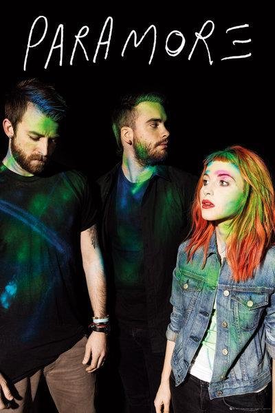
The poster has all three band members positioned in the centre of the image and they fill up most of the frame. The font used is edgy and reflects the music genre as they're a rock band.

Paramore - Paramore
The band members are well lit by low-key lighting and stand out against the black background. Although, the lighting is aimed more at the female band member which suggest she's the main singer.

Paramore - Paramore
Also, the fact that the female band member is looking left and the others are looking right suggest that she's the important one out of the three.

Paramore - Paramore
The clothing that the band members are wearing is casual looking and suits their music and genre. The colours that we see over their clothes and face make them stand out even more from the background.

Analysing band/artist posters
By Ellie Horne
Analysing band/artist posters
- 1,432


