Website Analysis 2
Eri Connors
Homepage
This is an example of a homepage from the website of Mumford and Sons. I've used examples of parts of this website previously, but because I quite like its layout and style, I thought it'd be a good idea to analyse it. The website is all mainly black and white and it follows the same, sans serif, indie style font throughout. It has its conventional widgets underneath its heading. But unlike some band websites, its band logo isn't as obvious as some. So it is as if they want you to listen to their music first even before they let you know what they're called. They use the shiny light blue colour to anything they want exaggerated so people will be eager to click on it. Unlike the previous band website, this one has a very short page. It is very compact and easy to
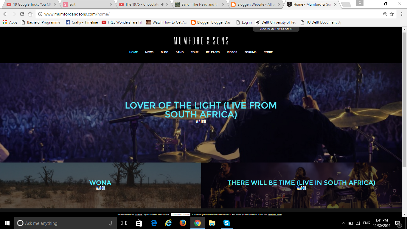
look at and easy to search for anything. This page, breaks the page into two columns, making it nice to look at. The use of the band images without showing close up shots of the band members give a certain amount of surprise for when people go and look at them later. It makes people want to click the image and know more about them.
I personally don't think I'll use black as my theme colour, but it makes it slightly cosy - looking and quite in a pleasing way, and not just cold and dark. The contrast between the blue font/ white font and the black makes it look quite nice.
Band Biography
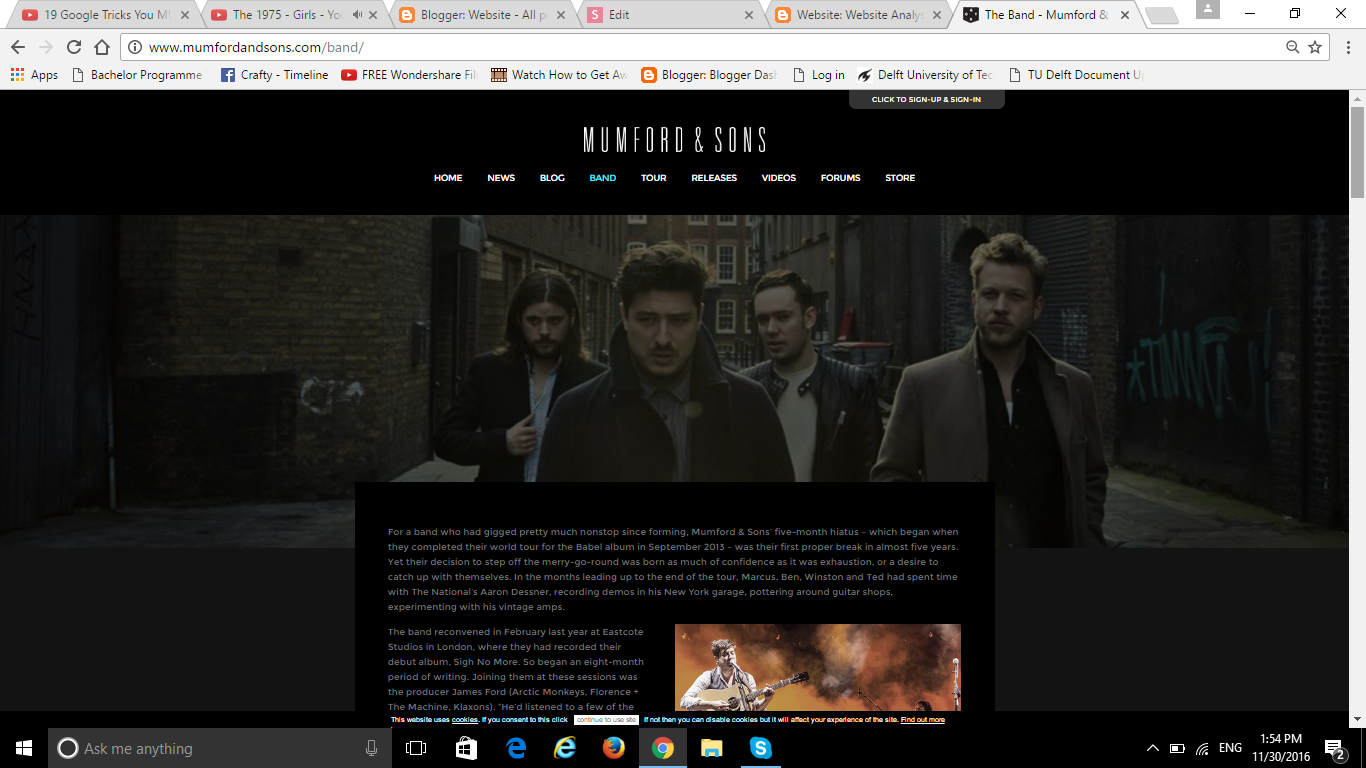
Here is the band biography page on Mumford and Sons. Unlike the previous website, this page has its main image (slightly opaque so it doesn't stand out as much) and smaller images together inside the column. This is the idea I had for my biography page as well. I like how they don't show so much of the face of the band members, like the homepage. It maybe saying "like our music not how we look like".
The font is kept constant and is sans serif like the rest of the website. I like this idea too because consistency is important and looks more professional in my opinion.
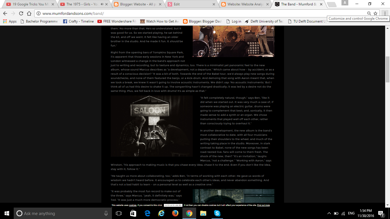
At the end of this page, there is a comment area where fans can comment on what they think of the band. I like that idea because it gives a chance for the fans interact with the band members.
And its conventional contact details were at the bottom of the page too. I think I can steal ideas from parts of this website as well as the previous website because some ideas I like and some I don't.
deck
By eri connors