Website Analysis
The Head and the Heart
Home Page
This shows the home page of the band called The Head and the Heart who are also an indie folk band like my song choice genre. Unlike the two examples I showed during the evaluation of the conventions of websites, this website is mainly white with an orange heading. The rest of the page is in black font and occasionally the same orange. This shows consistency and could relate to professionalism. The bold letters for the heading, and the thin letters for the rest are following the conventions of the band genre so people will immediately tell
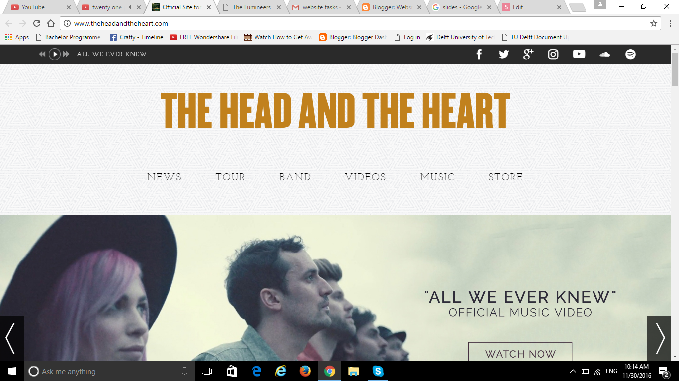
what genre the band is. The top of the homepage has the conventional social network hyperlinks on the top right and the widgets underneath the heading that go to different parts of the website. On the top left you can see a "Play" button which let's you listen to their songs automatically. This is rare, and yet very smart because people will click immediately and will find out more about the songs they create. The image below is conventional because it let's you watch their new music video and it is very obvious.
Home Page
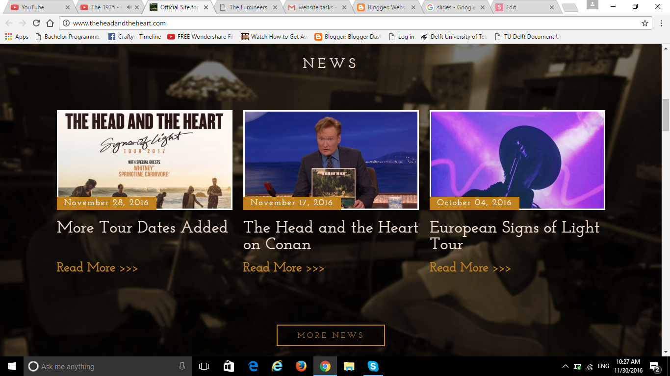
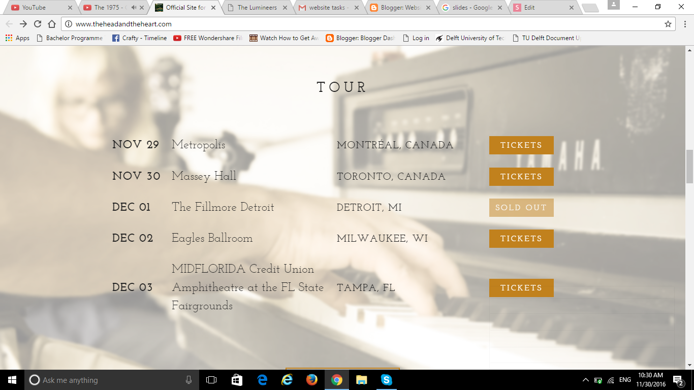
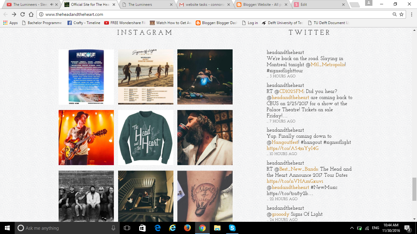
Here are the screenshots of the rest of the homepage. The main page I've shown previously leads to these when you scroll down. It shows the news, social accounts, tour dates very briefly so people can have a quick look at it. And if you clock on it, it goes to its official news/tour dates page.
This is a very conventional feature in the website, as many have their main page in the top, then have brief information on the rest of the website. You can see opaque images as the background image which makes it look professional and nice to look at. The pages also follow the rule of three, where the page is divided into three equal columns. This is one of the secrets to making a website look professional and aesthetically pleasing so I may incorporate this idea.
Band Biography
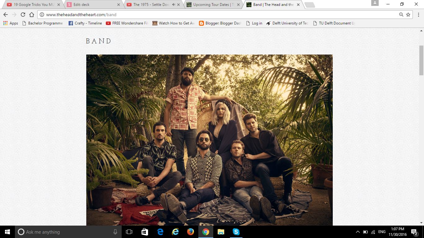
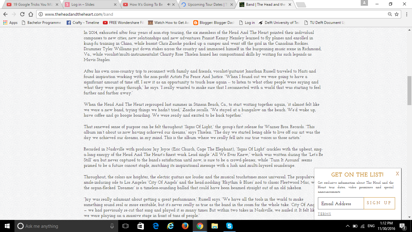
This is an example of their band biography page. I personally don't like this page because of how much text there is and how boring the representation is. Although it's a conventional way to represent it, and it looks quite plain and follows the conventions of indie folk rock, it looks very plain. I may add images to make it more interesting to look at. And maybe create more columns, rather than just one.
Showing the main image of the band is useful because you can read the column while looking at the main image to see who is who.
Once you go below the column, there are contact information you can check. So that may be another website convention.
The thin font is consistent throughout the website, however for the biography, the font has become serif font to make it look proper. I may try and keep the font as persistent as much as possible.
Thank you!
deck
By eri connors