


federica bianco PRO
astro | data science | data for good
federica bianco
@fedhere
a few historical plots and why they made history
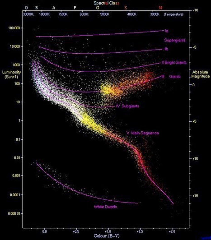
H-R diagram:
the life of a star
https://en.wikipedia.org/wiki/Hertzsprung%E2%80%93Russell_diagram
we visualize to
communicate (Tufte)
and to
explore
(Thorp)
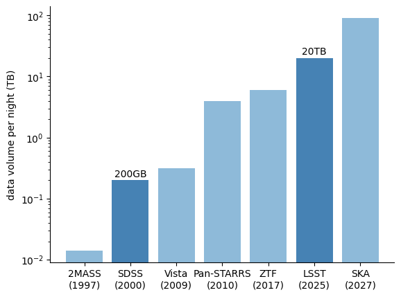
increased data volume
Big data:
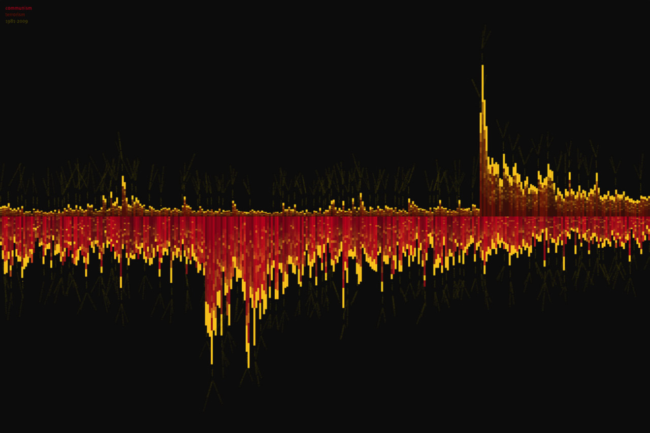
One of Thorp’s projects is a visualization of the number of times the terms “communism” (bottom) and “terrorism” (top) appeared in The New York Times, from 1981 until 2009. The spike for “terrorism” is the reflection of 9/11. As the word “terrorism” is used more and more, the use of the word “communism” decreases. (Image courtesy Jer Thorp; flickr.com/photos/blprnt/)
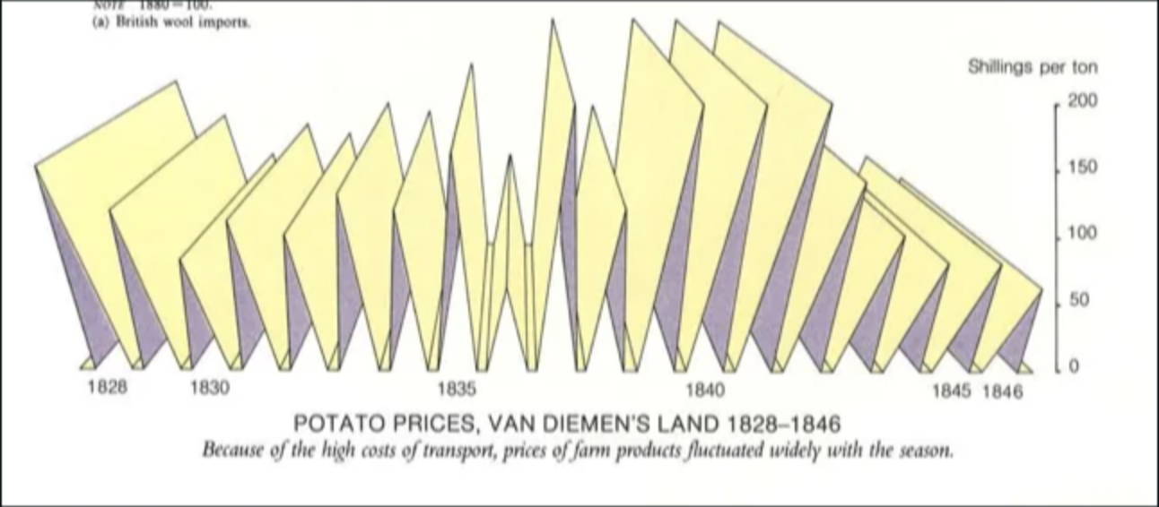
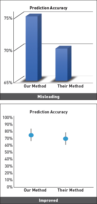
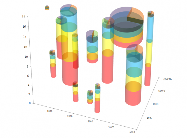
Ambiguity | distortion | distraction.
An example of ambiguity in visualizations that is common in peer review physics
different stretch
Ambiguity | distortion | distraction.
I would say this plot is at the limit of confusion (information saturation)
Ambiguity | distortion | distraction.
((=misleading)
obstruction
clutter
deformation
No Unjustified 3D
from private communication...
No Unjustified 3D
Mollweide projection
equirectangular projection
necessary distortions
An example of ambiguity in visualizations that is common in peer reviewed physics
duplication of data: commonly planet transit and eclipsing binary dataset are repeated twice (consecutively along the x axis)
A highly unequal-mass eclipsing M-dwarf binary in the WFCAM Transit Survey
Nefs, S.V. et al. MNRAS. 431 (2013) 3240 arXiv:1303.0945 [astro-ph.SR]
sometimes we use distortion
sometimes we use distortion
Sometime the distraction is a consequence of the complexity of the data.
Tufte's rules
Edward Tufte
Tufte’s rules:
Lie factor =
size of the effect in the graphic
size of the effect in the data
Tufte’s rules:
Lie factor =
size of the effect in the graphic
size of the effect in the data
SKA
(2025)
(original graphics: Leanne Guy)
Necessary lie factor:
log scale plots!
(think about your audience, will they understand it?)
Tufte’s rules:
effect size ~ 1
data/ink -> large
no chart junk
use small-multiples
avoid redundancy in communication
Tufte’s rules:
effect size ~ 1
data/ink -> large
no chart junk
use small-multiples
avoid redundancy in communication
Tufte’s rules:
Chart Junk
the excessive and unnecessary
use of graphical effects
Tufte’s rules:
effect size ~ 1
data/ink -> large
no chart junk
use small-multiples
avoid redundancy in communication
Tufte’s rules:
effect size ~ 1
data/ink -> large
no chart junk
use small-multiples
avoid redundancy in communication
Tufte’s rules:
Small multiples
encourage comparison
sparkline graph
Tufte’s rules:
Small multiples
encourage comparison
sparkline graph
Tufte’s rules:
Small multiples
work really well with maps!
https://mahb.stanford.edu/whats-happening/167-tiny-maps-tell-major-story-climate-change/
Galileo Galilei, Jupiter moons, 1610
Tufte’s rules:
Galileo Galilei, Jupiter moons, 1610
Tufte’s rules:
every feature should be associated with only 1 graphical element
(here color is redundant with length)
Tufte’s rules:
effect size ~ 1
data/ink -> large
no chart junk
use small-multiples
avoid redundancy in communication
Tufte’s rules:
Tufte’s rules:
chart junk
2 graphical elements for frequency
(color and position)
low data/ink ratio
no comparison
Tufte’s rules:
chart junk
2 graphical elements for frequency
(color and position)
no comparison
Tufte’s rules:
chart junk
2 graphical elements for frequency
(color and position)
low data/ink ratio
no comparison
comparison but scale out of context
high effect-size due to the choice of color map (more on this later)
Continuous data may be:
Discrete data may be:
Data may also be:
graphical elements work differently on different data types
Stevens 1975
response to length:
when shown something 4x as long we perceive it as being 4x as long
response to brightness:
when shown something 4x as bright we perceive it as being 2x as bright
response to saturation:
when shown something 4x as saturated we perceive it as being 11x as saturated
Heer and Bostock 2010
modern version gets uncertainties to these quantities by crowdsourcing the tests
Stevens 1975
Heer and Bostock 2010
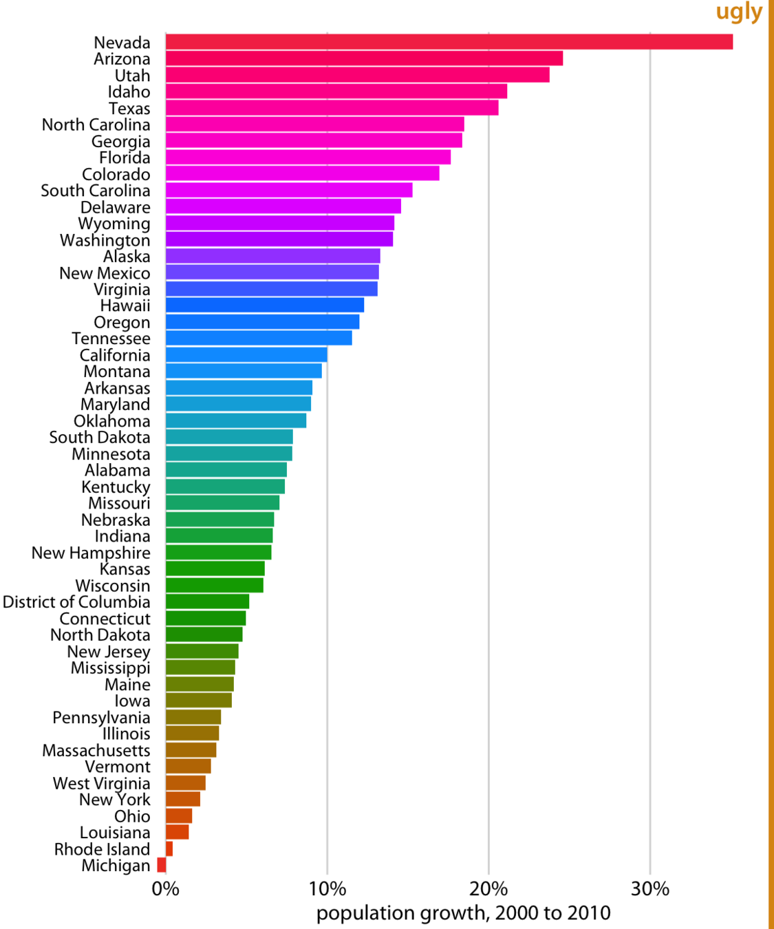
too many time series
too many time series
Tufte's small multiples and
spakrlines
enable comparison by giving the data center stage
too many time series
Time series heatmaps
enable comparison by giving the data center stage
A common problem: too many points
plt.plot(Teff, logg, 'k.')A common problem: too many points
solution: subsample
plt.plot(Teff[::10], logg[::10], 'k.')plt.plot(Teff, logg, 'k.')A common problem: too many points
plt.plot(Teff, logg, 'k.')plt.plot(Teff, logg, 'k.', alpha=0.1)solution: alpha
solution: subsample
plt.plot(Teff[::10], logg[::10], 'k.')A common problem: too many points
plt.plot(Teff, logg, 'k.')solution: scatter contours
solution: subsample
plt.plot(Teff[::10], logg[::10], 'k.')astroml
A common problem: too many points
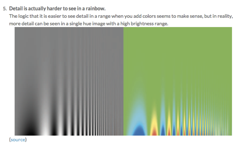
Bad Color Choice!
theory
(and good practice)
Borkin et al. 2011
Borkin et al. 2011
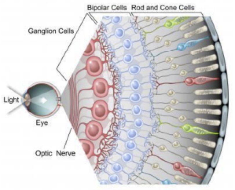
Eye Physiology and color perception deficiencies
Rods | Cones
80M
Rods | Cones
80M
Brightness | Color
Rods | Cones
80M
Brightness | Color
80M | 5M
Rods | Cones
80M
Brightness | Color
80M | 5M
RODS
+
CONES
RODS
Rods | Cones
80M
Brightness | Color
R
G
B
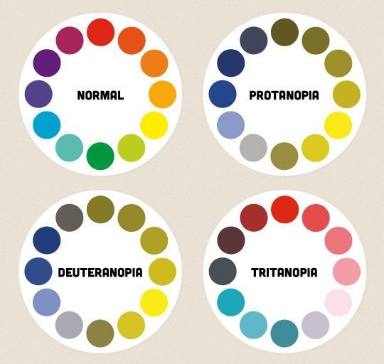
Color blindness (color vision deficiency, CVD) affects approximately
1 in 12 men (8%) and 1 in 200 women
in the world.
Worldwide, there are approximately 300 million people with colour blindness, almost the same number of people as the entire population of the USA!
Protanopia
Protanopia (red-blind)
Protanopia (green-blind)
Tritanopia (blue-blind)
use the http://colororacle.org/ app to test your plots for color-blindness
Kelly 1965 designed a list of 22 maximally contrasting colors for colorblind compliance (the “Kelly colors”):
"#023fa5", "#7d87b9", "#bec1d4", "#d6bcc0", "#bb7784", "#8e063b", "#4a6fe3", "#8595e1", "#b5bbe3", "#e6afb9", "#e07b91", "#d33f6a", "#11c638", "#8dd593", "#c6dec7", "#ead3c6", "#f0b98d", "#ef9708", "#0fcfc0", "#9cded6", "#d5eae7", "#f3e1eb", "#f6c4e1", "#f79cd4"
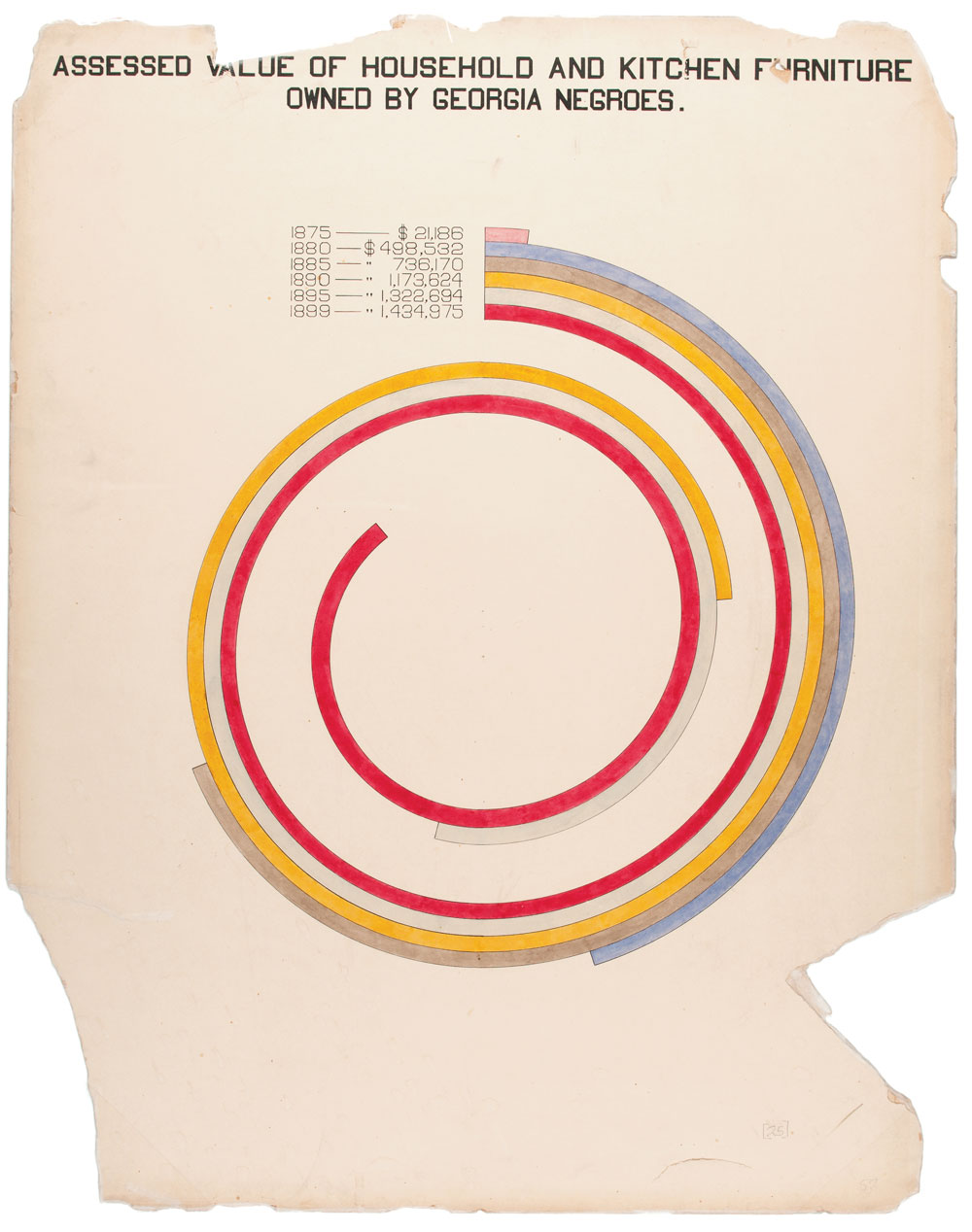
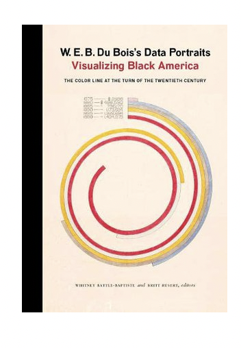
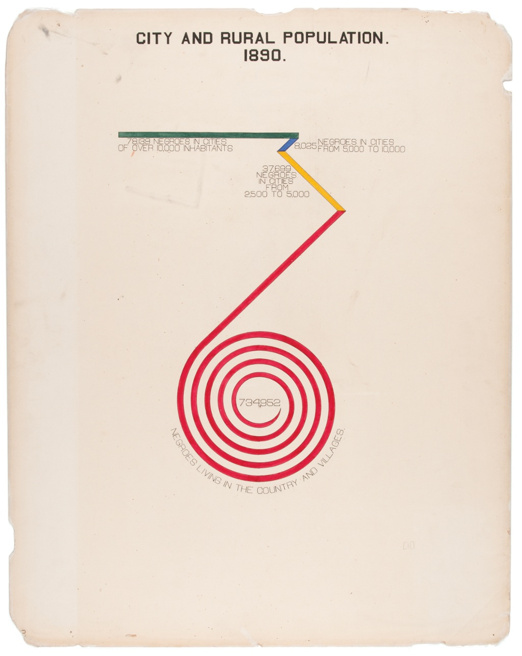
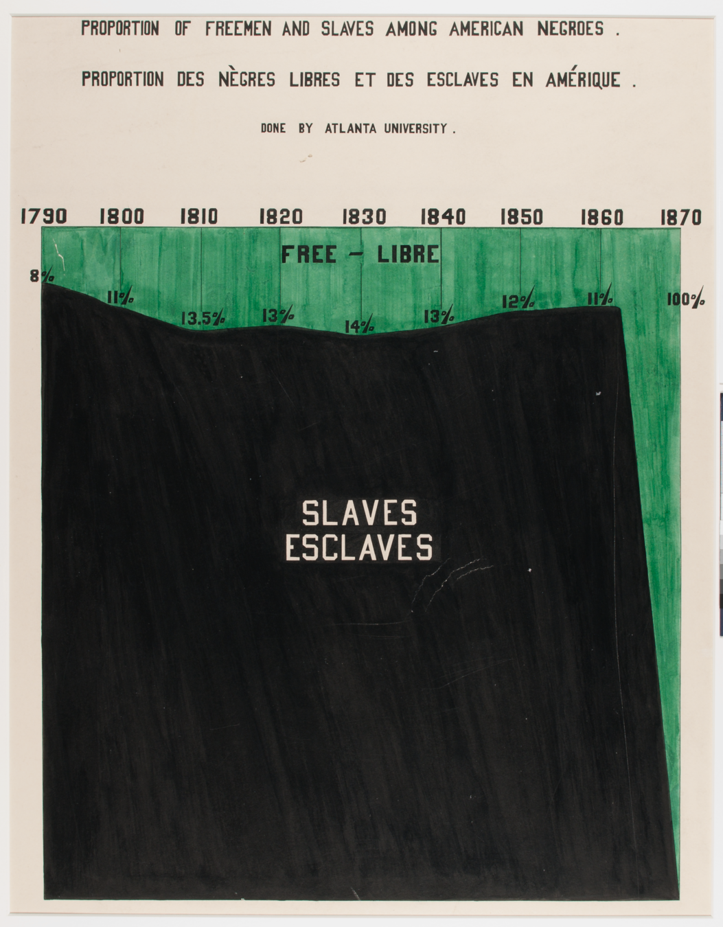
“Du Bois was aware that while unmoving prose and dry presentations of charts and graphs might catch attention from specialists, this approach would not garner notice beyond narrow circles of academics,” Aldon Morris writes in the essay “American Negro at Paris, 1900.” “Such social science was useless to the liberation of oppressed peoples. Breaking from tradition, Du Bois was among the first great American public intellectuals whose reach extended beyond the academy to the masses.”
https://hyperallergic.com/476334/how-w-e-b-du-bois-meticulously-visualized-20th-century-black-america/
“The colorful charts, graphs, and maps presented at the 1900 Paris Exposition by famed sociologist and black rights activist W. E. B. Du Bois offered a view into the lives of black Americans, conveying a literal and figurative representation of 'the color line'."
After graduating with a Ph.D. in history from Harvard University, W.E.B. Du Bois, the prominent African-American intellectual, sought a way to process all this information showing why the African disapora in America was being held back in a tangible, contextualized form.
W.E.B. Du Bois 1868-1963, sociologist, black right activist, graphic designer ante litteram
a few historical plots and why they made history
W.E.B. Du Bois
February 23, 1868 – August 27, 1963
American sociologist, socialist, historian, civil rights activist, Pan-Africanist, author, writer and editor
https://inspirehep.net/record/1082448/plots
a few historical plots and why they made history
W.E.B. Du Bois
Smithsonian Magazine
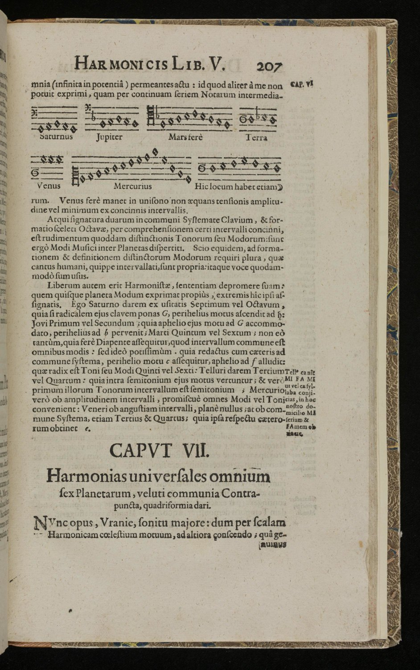
The theory that the planets and stars in their (circular) motion (around the earth) would produce a sound (and that that sound would be pleasant and harmonious) originate in ancient Greece with Pythagora (that guy must have never slept cause so many things "originate" from him.... (I'm suspicious)), and later formalized with notes by Kepler (him too.... must have never slept!)
"Kepler did not believe this "music" to be audible, but felt that it could nevertheless be heard by the soul" https://en.wikipedia.org/wiki/Musica_universalis
musica universalis
(perhaps related philosophy parenthesis)
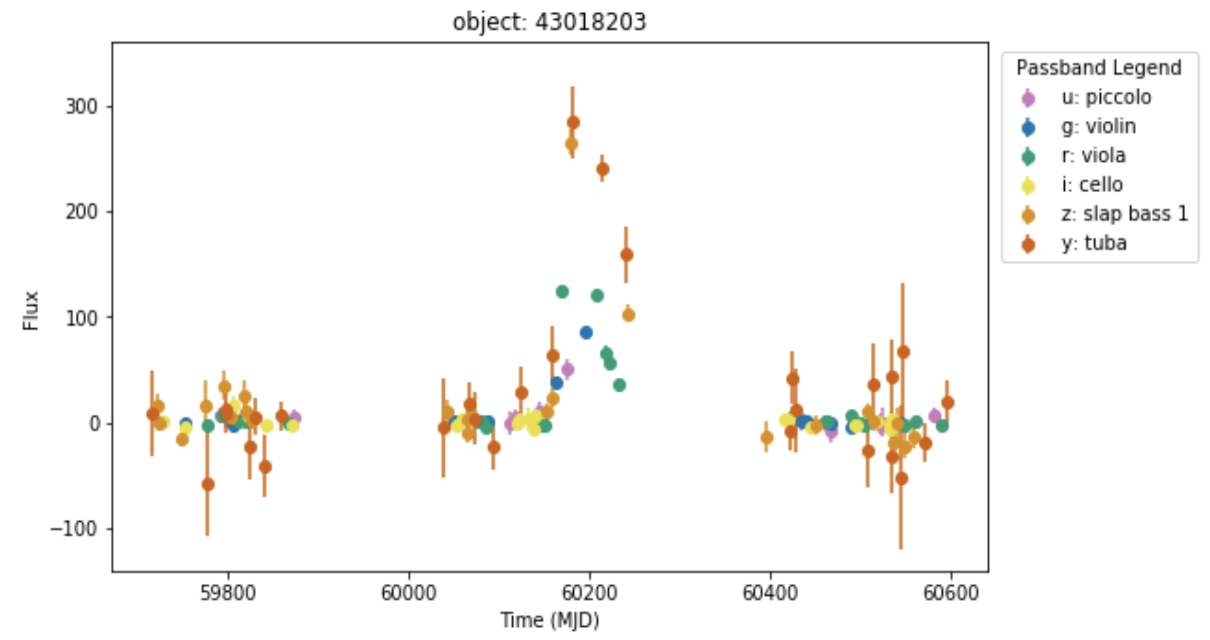
Research Inclusion: sonification of astrophysical time series from the Rubin LSST
Sid Patel, UD undergrad summer research project
Sonification: Data → Sound
New way of understanding data
Gives access to people who cannot
interpret data visually
Sounds cool! Good for public outreach
while eyesight is the most developed sense for humanity in general consider perceptual differences to assure accessibility and equality!
sonification, tactile data 3D printed, and accessible colors and visual properties
By federica bianco
some notes on visualizations


