Media Evaluation Question 2
How effective is the combination of your main product and the ancillary tasks?
What could be improved?
I believe that overall, our use of texts, pictures and colours across our three products was effective in making a brand for the film.
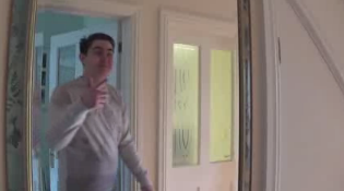
Although, upon reflection I have noticed that even though the font for the title of the film 'vanity' is the same across the marketing campaign, the font on the trailer wasn't put in bold, whereas the others were, so there is a slight difference in the final look, however I still believe that it was effective in creating a brand.


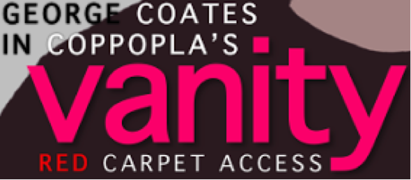
With the pictures for the magazine and poster, we decided that we would use the same filter across both products in order to further the branding of the films marketing campaign. However, we did not apply anything of this sort to the trailer, so the branding doesn't stretch across all three elements of the marketing.
How have other films done it?
From the research that I did into other films, I noticed that they too follow similar conventions in order to create a successful brand for their film through the use of synergy and transferring the same styles between their marketing campaign.
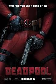
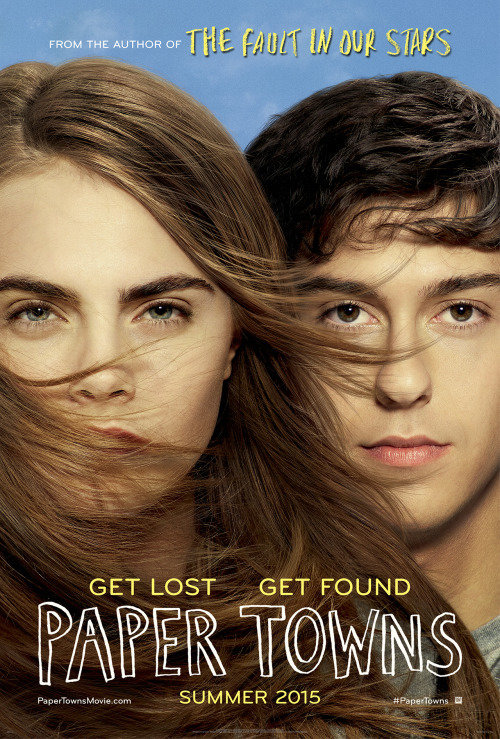
This is not genre specific; I found it whilst researching romance films such as 'Paper Towns' but it can also be seen in other genres such as action/adventure with 'Deadpool'.
It is also worth noting that the promotional campaign for 'Deadpool' is good for using the same colours across the multiple platforms which is also effective for branding purposes.
How do the three products link together?
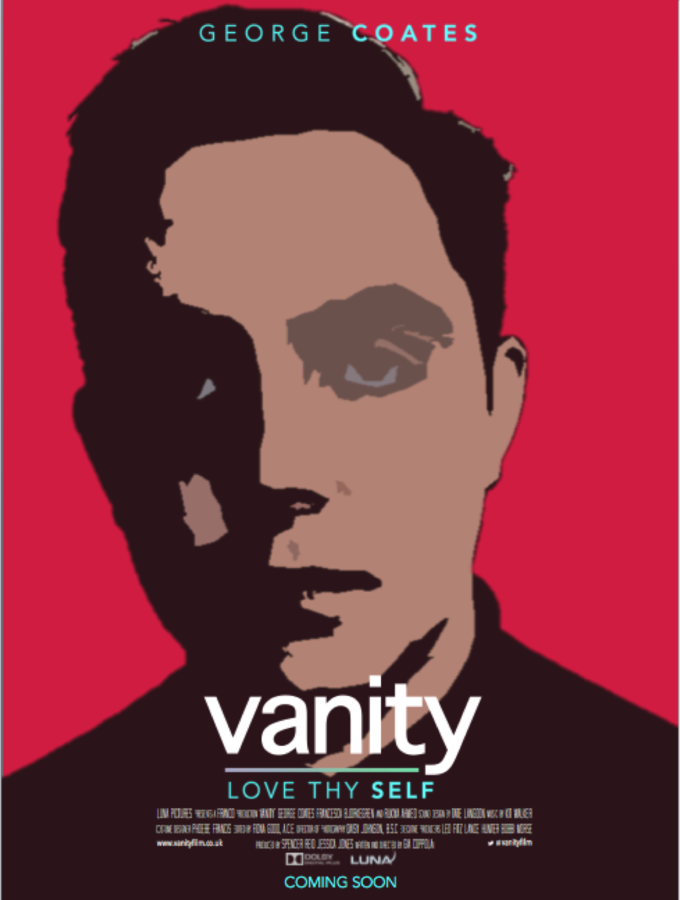
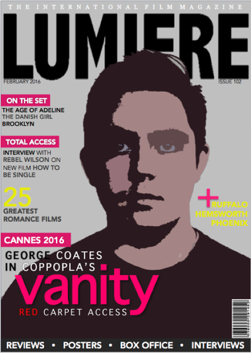
Across both the main product, the film trailer, as well as the ancillary tasks, the poster and the magazine, I wanted to create a clear link between all three products. I attempted to do this by using the same fonts, colour palette (pink's, white's, blue's) image styles (filters, facial expressions).
For example, we made the inter-title screen pink so that we could make a link between the three products. Across the poster and magazine, I also used the same facial expressions for the pictures in order to set the tone for the film.
I did this to show professional use of conventions in order to connect the products together and establish a clear link, even when used on separate occasions.
What lets the audience know?
At the start of the process, the group decided we would have a male lead; that in mind, we decided that we would use myself as the main character. Therefore it was important that we ensured that the pictures across the marketing campaign featured me and that my character of Zac got the most screen time in the trailer.


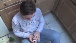
This means that I was able to create a figure that the audience could become familiar with and associate with the film across the whole campaign.
Following conventions:
Whilst there are other romance films that have a male protagonist as the lead such as 'The Vow' and 'Eternal Sunshine of the Spotless Mind', there are no films, to my knowledge, that follow the relationship of a man and himself.
I decided that it was essential as part of my product branding to establish to the audience the genre of the film. Therefore I applied the typical conventions found in numerous 'romance' films to all platforms of my promotional campaign. For example, I found that many romance films employ a light/bright colour palette. I have ensured this is present in both examples of the print work (pinks, whites, blues and yellows) and is also evident in the trailer (pink lights in the intertitles and a soft filter on the footage). However, there are other elements that I implemented to try and portray the uniqueness of the film's plot. - I wanted part of the brand identity to suggest that this is not your average 'romance'. Therefore, I have used a filter on the photography to give the image an artistic/abstract feel. It suggests something different/unique about this character. I have also stayed away from featuring a male and female lead on the poster/magazine - so the audience get a sense that this is not your typical 'romance'.
Overall...
I think that on the whole, the branding for my film has been very successful and it seems to be quite recognisable. This is due to the use of synergy across all three platforms of the film's promotional campaign in areas such as fonts, colours and imagery.
From other research I have done, it became apparent that my target audience was able to make a link between both the main product and the ancillary tasks, even when viewing them on separate occasions.
This is due to many elements, including the distinctive filter I used for the imagery on the poster and magazine as well as the title font and the bright pink colours becoming almost a logo for the film.
deck
By gcoates2805