


Guillermo Rodas
Google Developer Expert in Web Technologies, Community Organizer, and Online Teacher.
@glrodasz
Guillermo Rodas
Engineer at Auth0
Organizer of Medellín CSS, CSS Conf CO
and Medellín Identidad y Seguridad
@glrodasz
GDE Web Technologies
Curso de Autenticación con OAuth
Curso de Express.js
HTML is about content
CSS is about your styling decisions
<p class="text-center">
    Hello there!
</p>
What about this class?
Centering text is a design decision.
There are not "separation of concerns" here.
Because we've let styling information bleed into our HTML.
<style>
.greeting {
    text-align: center;
}
</style>

<p class="greeting">
    Hello there!
</p>You can completely redesign a site just by swapping out the stylesheet.
<div>
<img src="https://cdn-images-1.medium.com/max/1600/0*o3c1g40EXj65Fq9k." alt="">
<div>
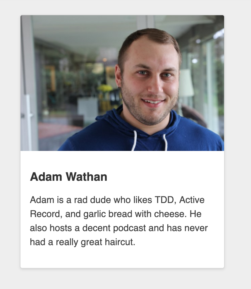
<h2>Adam Wathan</h2>
<p>
Adam is a rad dude who likes TDD, Active Record, and garlic bread with cheese. He also hosts a decent podcast and has never had a really great haircut.
</p>
</div>
</div>1. Write the markup
- <div>
+ <div class="author-bio">
    <img src="https://cdn-images-1.medium.com/max/1600/0*o3c1g40EXj65Fq9k." alt="">
    <div>
      <h2>Adam Wathan</h2>
      <p>
        Adam is a rad dude who likes TDD, Active Record, and garlic bread with cheese. He also hosts a decent podcast and has never had a really great haircut.
      </p>
    </div>
  </div>
2. Add a descriptive class
+ <div class="author-bio">
- <div>
    </div>
  </form>
.author-bio {
background-color: white;
border: 1px solid hsl(0,0%,85%);
border-radius: 4px;
box-shadow: 0 2px 4px rgba(0,0,0,0.1);
overflow: hidden;
> img {
display: block;
width: 100%;
height: auto;
}
> div {
padding: 1rem;
> h2 {
font-size: 1.25rem;
color: rgba(0,0,0,0.8);
}
> p {
font-size: 1rem;
color: rgba(0,0,0,0.75);
line-height: 1.5;
}
}
}3. Use those classes as "hooks" in CSS
Block
Element
Modifier
Standalone entity that is meaningful on its own.
A part of a block that has no standalone meaning and is semantically tied to its block.
A flag on a block or element. Use them to change appearance or behavior.
<div class="author-bio">
  <img class="author-bio__image" src="https://cdn-images-1.medium.com/max/1600/0*o3c1g40EXj65Fq9k." alt="">
  <div class="author-bio__content">
    <h2 class="author-bio__name">Adam Wathan</h2>
    <p class="author-bio__body">
      Adam is a rad dude who likes TDD, Active Record, and garlic bread with cheese. He also hosts a decent podcast and has never had a really great haircut.
    </p>
  </div>
</div>
.author-bio {
background-color: white;
border: 1px solid hsl(0,0%,85%);
border-radius: 4px;
box-shadow: 0 2px 4px rgba(0,0,0,0.1);
overflow: hidden;
}
.author-bio__image {
display: block;
width: 100%;
height: auto;
}
.author-bio__content {
padding: 1rem;
}
.author-bio__name {
font-size: 1.25rem;
color: rgba(0,0,0,0.8);
}
.author-bio__body {
font-size: 1rem;
color: rgba(0,0,0,0.75);
line-height: 1.5;
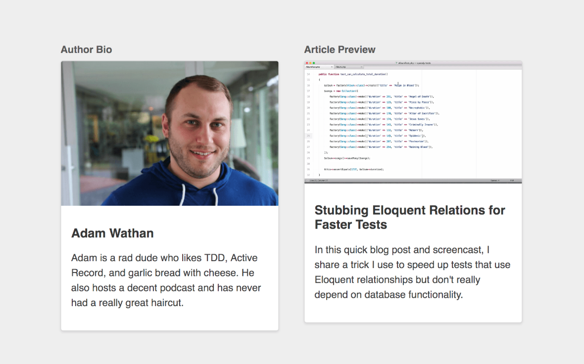
}We can't apply our .author-bio classes to our article preview.
That wouldn't be semantic.
So we need to create .article-preview.
<div class="article-preview">
  <img class="article-preview__image" src="https://i.vimeocdn.com/video/585037904_1280x720.webp" alt="">
  <div class="article-preview__content">
    <h2 class="article-preview__title">Stubbing Eloquent Relations for Faster Tests</h2>
    <p class="article-preview__body">
      In this quick blog post and screencast, I share a trick I use to speed up tests that use Eloquent relationships but don't really depend on database functionality.
    </p>
  </div>
</div>
Markup
.article-preview {
  background-color: white;
  border: 1px solid hsl(0,0%,85%);
  border-radius: 4px;
  box-shadow: 0 2px 4px rgba(0,0,0,0.1);
  overflow: hidden;
}
.article-preview__image {
  display: block;
  width: 100%;
  height: auto;
}
.article-preview__content {
  padding: 1rem;
}
.article-preview__title {
  font-size: 1.25rem;
  color: rgba(0,0,0,0.8);
}
.article-preview__body {
  font-size: 1rem;
  color: rgba(0,0,0,0.75);
  line-height: 1.5;
}
Option 1: Duplicate
.article-preview {
  @extend .author-bio;
}
.article-preview__image {
  @extend .author-bio__image;
}
.article-preview__content {
  @extend .author-bio__content;
}
.article-preview__title {
  @extend .author-bio__name;
}
.article-preview__body {
  @extend .author-bio__body;
}
Option 2: @extend
.media-card {
  background-color: white;
  border: 1px solid hsl(0,0%,85%);
  border-radius: 4px;
  box-shadow: 0 2px 4px rgba(0,0,0,0.1);
  overflow: hidden;
}
.media-card__image {
  display: block;
  width: 100%;
  height: auto;
}
.media-card__content {
  padding: 1rem;
}
.media-card__title {
  font-size: 1.25rem;
  color: rgba(0,0,0,0.8);
}
.media-card__body {
  font-size: 1rem;
  color: rgba(0,0,0,0.75);
  line-height: 1.5;
}
Option 3: Agnostic
<div class="media-card">
  <img class="media-card__image" src="https://cdn-images-1.medium.com/max/1600/0*o3c1g40EXj65Fq9k." alt="">
  <div class="media-card__content">
    <h2 class="media-card__title">Adam Wathan</h2>
    <p class="media-card__body">
      Adam is a rad dude who likes TDD, Active Record, and garlic bread with cheese. He also hosts a decent podcast and has never had a really great haircut.
    </p>
  </div>
</div>
<div class="media-card">
<img class="media-card__image" src="https://i.vimeocdn.com/video/585037904_1280x720.webp" alt="">
<div class="media-card__content">
<h2 class="media-card__title">Stubbing Eloquent Relations for Faster Tests</h2>
<p class="media-card__body">
In this quick blog post and screencast, I share a trick I use to speed up tests that use Eloquent relationships but don't really depend on database functionality.
</p>
</div>
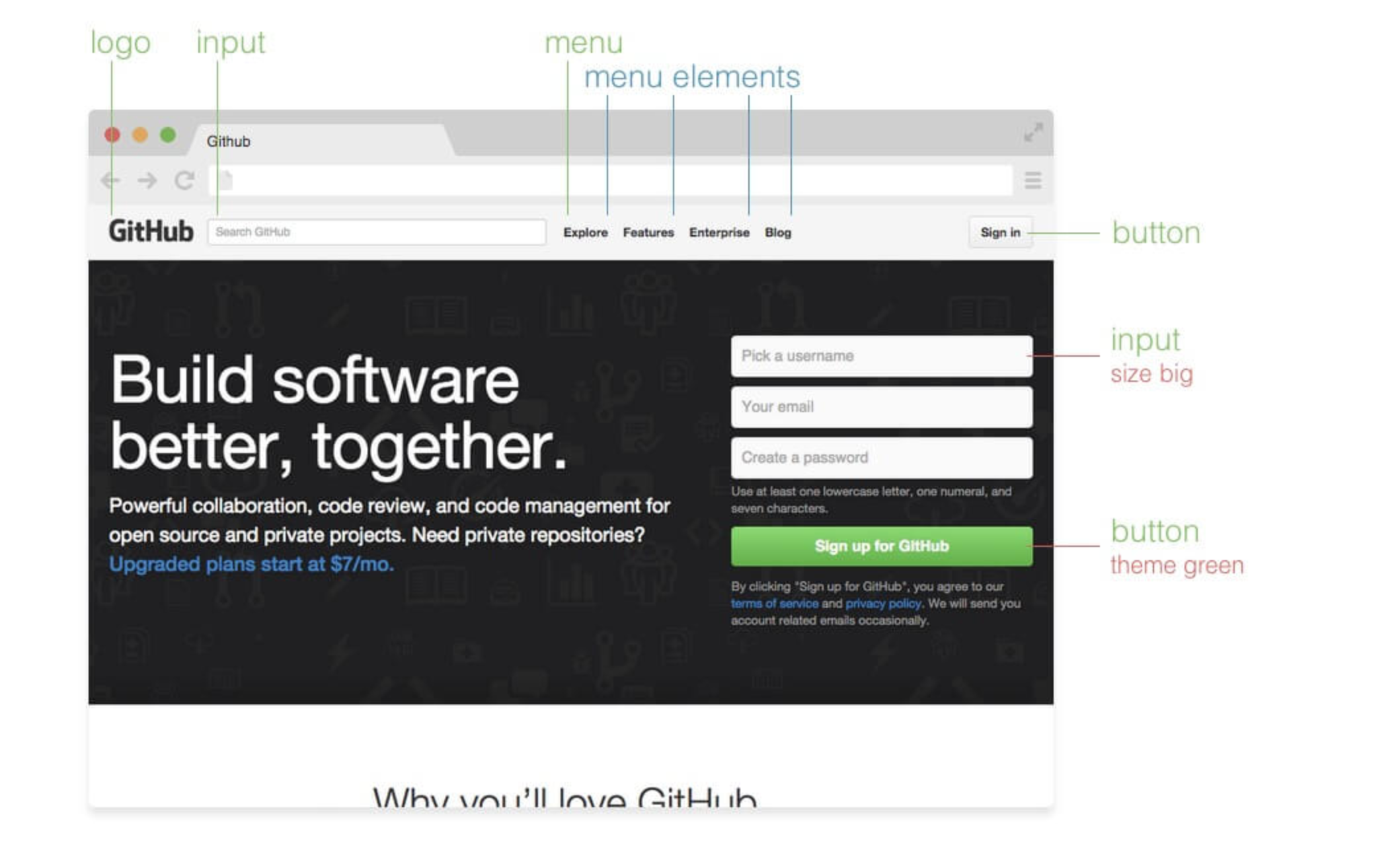
</div>Relationship between HTML and CSS in terms of "separation of concerns", it's very black and white.
You either have separation of concerns (good!), or you don't (bad!).
This is not the right way to think about HTML and CSS.
Instead, think about dependency direction.
"Separation of Concerns"
CSS that depends on HTML.
Naming your classes based on your content .author-bio.
The HTML is independent.
Your CSS on the other hand is not independent.
In this model, your HTML is restyleable, but your CSS is not reusable.
"Mixing Concerns"
HTML that depends on CSS.
Naming your classes in a content-agnostic like .media-card.
The CSS is independent.
Your HTML is not independent.
In this model, your CSS is reusable, but your HTML is not restyleable.
CSS Zen Garden takes the first approach.
Frameworks like Bootstrap or Bulma take the second approach.
Restyleable HTML or Reusable CSS?
Avoid creating classes that are based on the content
The more specific a component is, the harder it is to reuse.
<form class="stacked-form" action="#">
  <div class="stacked-form__section">
    <!-- ... -->
  </div>
  <div class="stacked-form__section">
    <!-- ... -->
  </div>
  <div class="stacked-form__section">
    <button class="stacked-form__button">Submit</button>
  </div>
</form>
Maybe there's another button on our site that's not part of a form that we need to style the same way.
<form class="stacked-form" action="#">
    <!-- ... -->
    <div class="stacked-form__section">
-     <button class="stacked-form__button">Submit</button>
+     <button class="btn btn--primary">Submit</button>
    </div>
  </form>
+ <button class="btn btn--primary">Submit</button>
-     <button class="stacked-form__button">Submit</button>
    </div>
  </form>
- <form class="stacked-form" action="#">
+ <form class="stacked-form stacked-form--card" action="#">
<!-- ... -->
</form>+ <form class="stacked-form stacked-form--card" action="#">
- <form class="stacked-form" action="#">Now say we wanted this stacked form to look like it was in a floated card.
+ <div class="card">
    <form class="stacked-form" action="#">
      <!-- ... -->
    </form>
+ </div>
+ <div class="card">But if we already have a .card class, why don't we compose this new UI?
+ </div>By taking this approach, we have a .card that can be a home for any content, and an unopinionated .stacked-form that can be used inside of any container.
We don't have to write any new CSS.
<form class="stacked-form" action="#">
  <!-- ... -->
  <div class="stacked-form__section">
    <button class="btn btn--secondary">Cancel</button>
    <!-- Need some space in here -->
    <button class="btn btn--primary">Submit</button>
  </div>
</form>
Add a second button some space between them and stacked to the right
<form class="stacked-form" action="#">
    <!-- ... -->
-   <div class="stacked-form__section">
+   <div class="stacked-form__section stacked-form__footer">
-     <button class="btn btn--secondary">Cancel</button>
-     <button class="btn btn--primary">Submit</button>
+     <button class="stacked-form__footer-item btn btn--secondary">Cancel</button>
+     <button class="stacked-form__footer-item btn btn--primary">Submit</button>
    </div>
  </form>
+   <div class="stacked-form__section stacked-form__footer">


+     <button class="stacked-form__footer-item btn btn--secondary">Cancel</button>
+     <button class="stacked-form__footer-item btn btn--primary">Submit</button>
- <button class="btn btn--secondary">Cancel</button>
- <button class="btn btn--primary">Submit</button>- <div class="stacked-form__section">
-     <button class="btn btn--secondary">Cancel</button>
- <button class="btn btn--primary">Submit</button>.stacked-form__footer {
text-align: right;
}
.stacked-form__footer-item {
margin-right: 1rem;
&:last-child {
margin-right: 0;
}
} <header class="header-bar">
<h2 class="header-bar__title">New Product</h2>
+   <div class="header-bar__actions">
+     <button class="header-bar__action btn btn--secondary">Cancel</button>
+     <button class="header-bar__action btn btn--primary">Save</button>
+   </div>
</header>+ <div class="header-bar__actions">
+ <button class="header-bar__action btn btn--secondary">Cancel</button>
+ <button class="header-bar__action btn btn--primary">Save</button>
+ </div>
But what if we had this same problem in a subnav somewhere, or a header?
.actions-list {
  text-align: right;
}
.actions-list__item {
  margin-right: 1rem;
  &:last-child {
    margin-right: 0;
  }
}
Maybe we make something like an .actions-list:
<!-- Stacked form -->
<form class="stacked-form" action="#">
  <!-- ... -->
  <div class="stacked-form__section">
    <div class="actions-list">
      <button class="actions-list__item btn btn--secondary">Cancel</button>
      <button class="actions-list__item btn btn--primary">Submit</button>
    </div>
  </div>
</form>

<!-- Header bar -->
<header class="header-bar">
  <h2 class="header-bar__title">New Product</h2>
  <div class="actions-list">
    <button class="actions-list__item btn btn--secondary">Cancel</button>
    <button class="actions-list__item btn btn--primary">Save</button>
  </div>
</header>
But what if one of these actions lists was supposed to be left justified, and the other was supposed to be right justified?
Do we make .actions-list--left and .actions-list--right modifiers?
When you make modifiers like .actions-list--left, you're creating a whole new component modifier just to assign a single CSS property
We prefer composition to duplication.
align-left {
  text-align: left;
}
.align-right {
  text-align: right;
}<form class="stacked-form" action="#">
<!-- ... -->
<div class="stacked-form__section">
<div class="actions-list align-left">
<button class="actions-list__item btn btn--secondary">Cancel</button>
<button class="actions-list__item btn btn--primary">Submit</button>
</div>
</div>
</form><header class="header-bar">
<h2 class="header-bar__title">New Product</h2>
<div class="actions-list align-right">
<button class="actions-list__item btn btn--secondary">Cancel</button>
<button class="actions-list__item btn btn--primary">Save</button>
</div>
</header>If seeing the words "left" and "right" in your HTML makes you feel uncomfortable, remember we have been using components named after visual patterns in our UI for ages at this point.
There's no pretending that .stacked-form is any more "semantic" than .align-right
- .actions-list {
-   text-align: right;
- }
  .actions-list__item {
    margin-right: 1rem;
    &:last-child {
      margin-right: 0;
    }
  }
- .actions-list {
- text-align: right;
- }- .actions-list {
- text-align
- }But now it's a little weird to have an .actions-list__item without an .actions-list.
Is there another way we can solve our original problem without creating an .actions-list__item component?
- .actions-list__item {
-   margin-right: 1rem;
-   &:last-child {
-     margin-right: 0;
-   }
- }
+ .mar-r-sm {
+   margin-right: 1rem;
+ }
- .actions-list__item {
- margin-right: 1rem;
- &:last-child {
- margin-right: 0;
- }
- }
+ .mar-r-sm {
+ margin-right: 1rem;
+ }<!-- Stacked form -->
<form class="stacked-form" action="#">
<!-- ... -->
<div class="stacked-form__section align-left">
<button class="btn btn--secondary mar-r-sm">Cancel</button>
<button class="btn btn--primary">Submit</button>
</div>
</form>
<!-- Header bar -->
<header class="header-bar">
<h2 class="header-bar__title">New Product</h2>
<div class="align-right">
<button class="btn btn--secondary mar-r-sm">Cancel</button>
<button class="btn btn--primary">Save</button>
</div>
</header>By Guillermo Rodas
How CSS usage has some bias in the way we use today, and how we can start using another approach like Tailwind CSS.