Bootstrap Grid

p.s 請自備好計算機
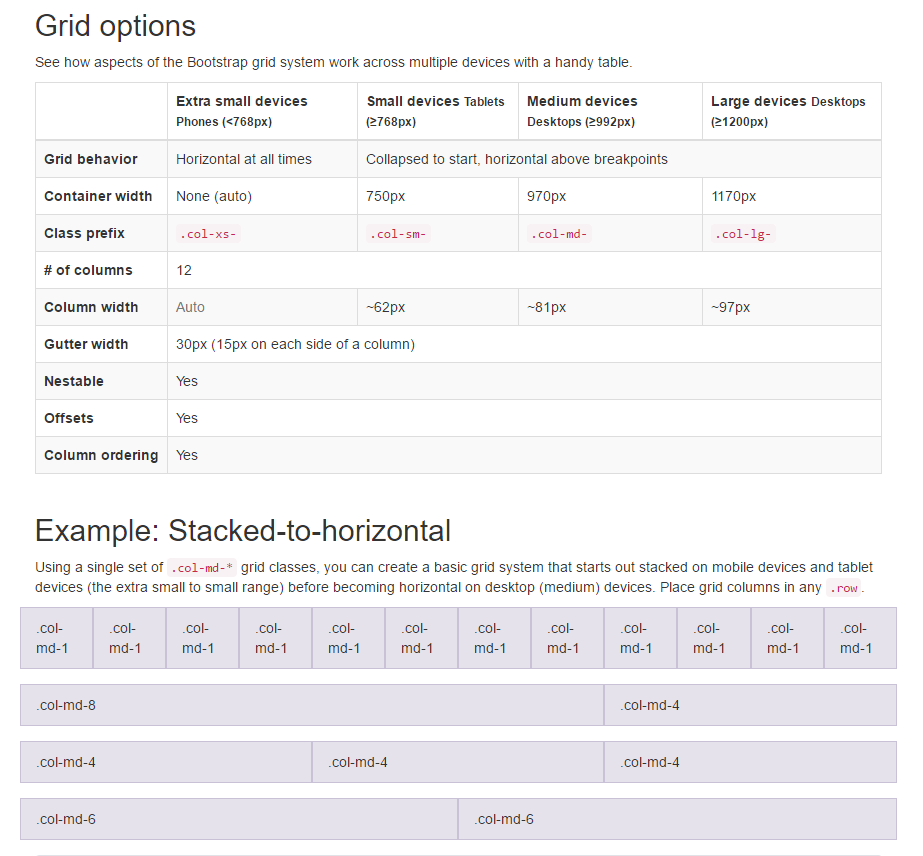
80.83*12 = 970
<div class="container">

    <div class="row">

        <div class="col-md-3 col-sm-4 col-xs-6">...</div>
        <div class="col-md-3 col-sm-4 col-xs-6">...</div>
        <div class="col-md-3 col-sm-4 col-xs-6">...</div>

    </div><!-- row -->

</div><!-- container -->
Grid


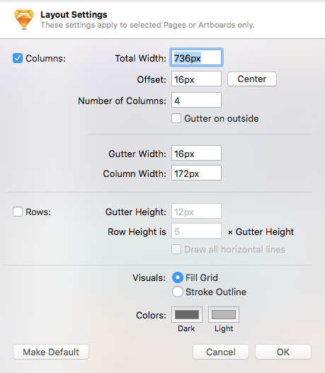
172*4+16*3 = 736 / 736+16*2 = 768
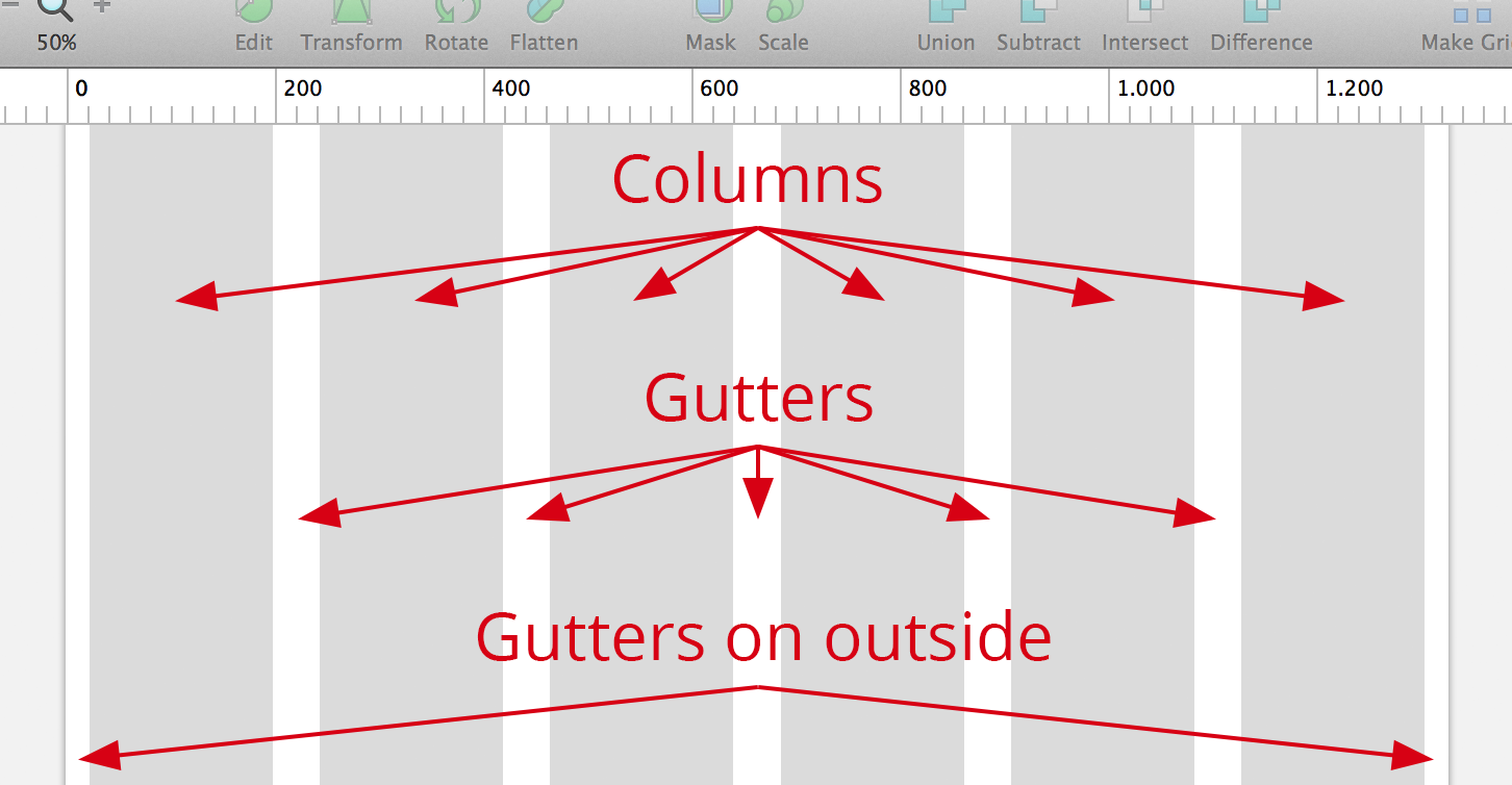
Not suggest 768px, because scrollbar have 12px, so bootstrap is 750px
Column
Container
Gutter
Total W
Sketch
Bootstrap
Total:
736+16*2 = 768
col-sm-3: 172
Total:
62.5*3*4 = 750
col-md-3: 187.5
736+16*2= 768
(Need to modify)
// -------------------------------------
//   Bootstrap
// -------------------------------------

$grid-gutter-width: 16px;
$container-tablet: 736px + $grid-gutter-width*2;
Code
752
768
736
sketch total width
bootstrap origin container
what we need
(container padding: 0 8px)
Practice
終於來到練習時間了
30
30
150
30
690
(690 - 30*3)/4
750 - 30*2
StyleGuild
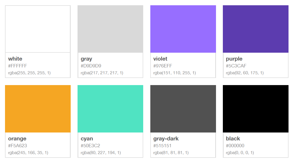
Color Palette
// -------------------------------------
//   Color
// -------------------------------------
$white: #fff;
$gray: #D9D9D9;
$gray-dark: #515151;
$black: #000;
$violet: #976EFF;
$purple: #5C3CAF;
$orange: #F5A623;
$cyan: #50E3C2;
Code
Fonts
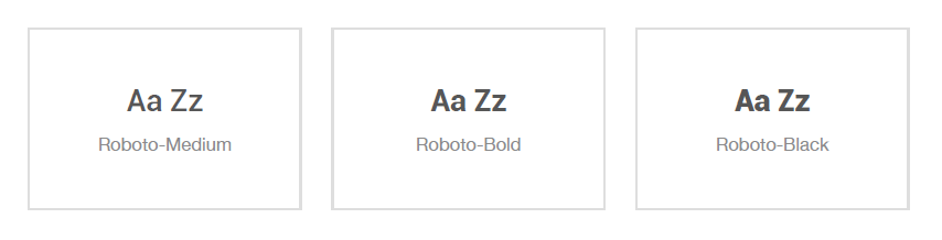
// -------------------------------------
//   Font
// -------------------------------------
@font-face {
	font-family: Roboto;
	src: url('fonts/Roboto-Medium.ttf');
	font-weight: normal;
};
@font-face {
	font-family: Roboto;
	src: url('fonts/Roboto-Bold.ttf');
	font-weight: bold;
};
@font-face {
	font-family: Roboto;
	src: url('fonts/Roboto-Black.ttf');
	font-weight: 700;
};
Code
Breakpoint
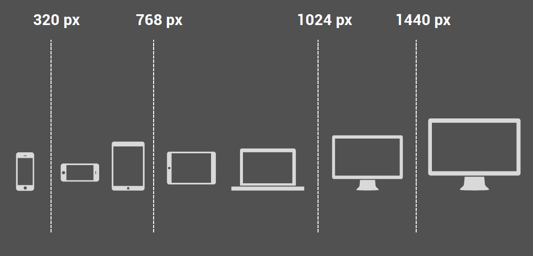
992px
>1200px
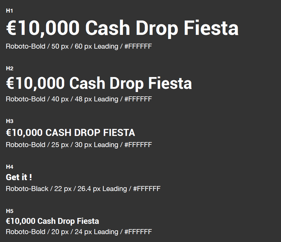
Text Styles
// -------------------------------------
//   Typography
// -------------------------------------
$b-fontSize-h1: em(50);
$b-fontSize-h2: em(40);
$b-fontSize-h3: em(25);
$b-fontSize-h4: em(22);
$b-fontSize-h5: em(20);
$b-fontSize-h6: em(18);
$b-fontSize-m: em(16);
$b-fontSize: em(14);
Code
Q&A
I have to mark % or px ?
除了要給尺寸顏色的規範之外,還需要注意什麼嗎?
text length(especially multi language),
hover effect, box shadow, in ie8...
想了解svg files在網頁上的應用, 給檔案的方式
提供的圖檔有沒有建議的大小?
在同一個 breakpoint 的寬度範圍內,字型大小會隨著裝置寬度越大,字型變得越大嗎?
其實是一樣大的,除非特別設定
Other Questions?
工程師與設計師其實可以變best friend
By hannahpun