Web Components
Agenda
What are Web Components?
Web Platform APIs
Libraries & Tools
Patterns & Techniques
Hands-on
What are Web Components?
Web components are a set of web platform APIs that allow you to create new custom, reusable, encapsulated HTML tags to use in web pages and web apps. Custom components and widgets build on the Web Component standards, will work across modern browsers, and can be used with any JavaScript library or framework that works with HTML.
Quelle: webcomponents.org
Goals
APIs for UI components*
Available everywhere
Future-ready
No lock-in
Interoperable
No frameworks & compilers
*complex HTML with associated JS & CSS
State of the art?
Support in all mainstream browsers since January 2020 🎉
Evolving standards
Thriving ecosystem
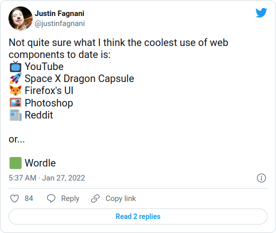
👉 und Cryptopus, Puzzle Docs, ...
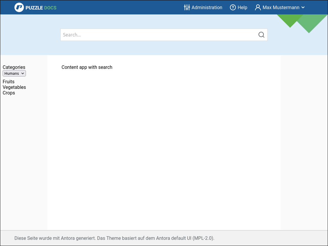
Use Case: Puzzle Shell
Custom Elements
What is it?
Register custom "HTML tag"
Behaves like built-in HTML element
Input: attributes/properties
Output: DOM events
What do I do with it?
Render something:
Add children to host element
(internal DOM tree)
Implement logic:
Add event listeners, update children etc.
Autonomous Element
class MyComponent extends HTMLElement {
  constructor() {
    super();
    // ...
  }
}

window.customElements.define(
  "my-component", // Must contain hyphen!
  MyComponent
)
Markup:
<my-component></my-component>Extended Built-in Element
class MyComponent extends HTMLButtonElement {
  // ...
}

window.customElements.define(
  'my-component',
  MyComponent,
  { extends: "button" }
)
Markup:
<button is="my-component"></button>Lifecycle Callbacks
class MyComponent extends HTMLElement {
  connectedCallback() {} // Added to DOM
  disconnectedCallback() {} // Removed
                            // from DOM
  adoptedCallback() {} // Moved to new
                       // document

  // Attribute changed
  static get observedAttributes() {
    return ['x', 'y'];
  }
  attributeChangedCallback(
    name, oldValue, newValue) {}
}
When defined
customElements.whenDefined("my-component")
  .then(() => {
    console.log("my-component is defined");
  });
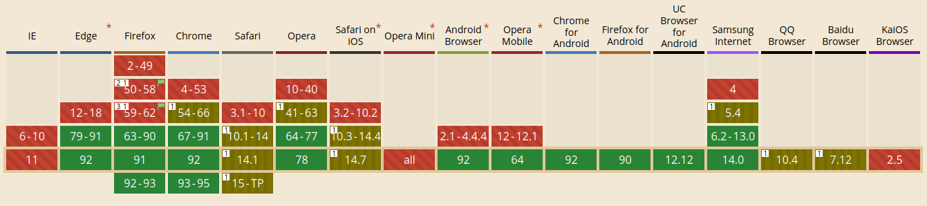
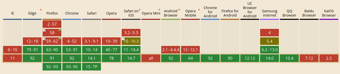
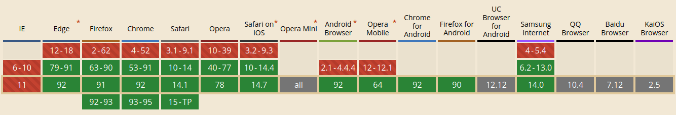
Browser Support
tl;dr:
All evergreen browsers, Safari only autonomous elements
Shadow DOM
What is it?
"Old thing" → <video>
Encapsulation
Hide markup structure & style
Avoid clashes & leaking
Optional
Light DOM
Regular DOM we see
Shadow DOM
DOM that is hidden
How does it work?

Source: MDN
class MyComponent extends HTMLElement {
  constructor() {
    super();

    this.append(
      document.createElement("p")
    );
  }
}
Without Shadow DOM
class MyComponent extends HTMLElement {
  constructor() {
    super();

    this.attachShadow({ mode: "open" });

    // Use shadow root
    // like regular DOM node
    this.shadowRoot.append(
      document.createElement("p")
    );
  }
}
Using Shadow DOM
class MyComponent extends HTMLElement {
  constructor() {
    super();

    this.attachShadow({ mode: "open" });

    // Use shadow root
    // like regular DOM node
    this.shadowRoot.append(
      document.createElement("p")
    );
  }
}
Mode closed means no access to Element.shadowRoot
👉 irrelevant in practice
Using Shadow DOM
class MyComponent extends HTMLElement {
  constructor() {
    super();
    this.attachShadow({ mode: "open" });
    // ...

    const style = document.createElement("style");
    style.textContent = `
      .red {
        color: red;
      }
    `;
    this.shadowRoot.append(style);
  }
}
How to style?
// Host element itself
:host {}

// Host element with "active" class
:host(.active) {}

// When element has ancestor with "dark" class
:host-context(.dark) {}
Special selectors
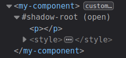
Dev Tools
Shadow Tree can be inspected:
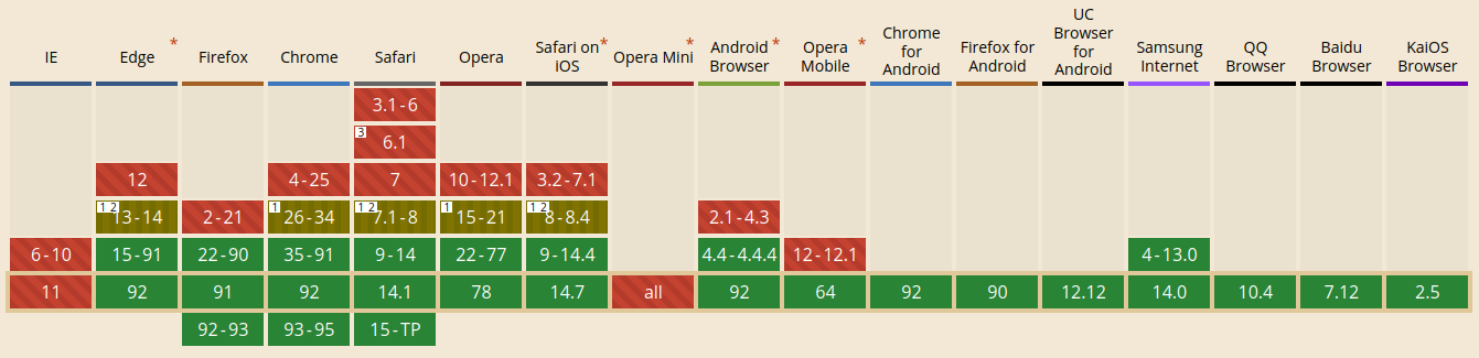
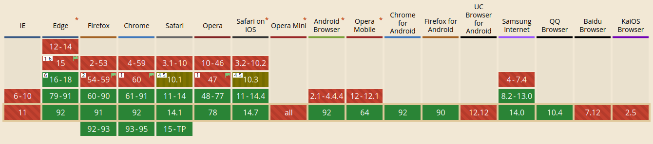
Browser Support
tl;dr:
All evergreen browsers
HTML Templates
& Slots
<template> Element
Contents not rendered in the DOM
Can be referenced with JS
Useful besides Web Components
How to use?
<template id="my-template">
  <p>My Component</p>
</template>

<script>
  class MyComponent extends HTMLElement {
    constructor() {
      super();
      this.attachShadow({ mode: "open" });

      const template =
        document.getElementById('my-template');
      this.shadowRoot.append(
        template.content.cloneNode(true)
      );
    }
  }
</script>
Include Shadow Styles
<template id="my-template">
  <style>
    :host {
      display: block;
      background: gray;
    }
    .red {
      color: red;
    }
  </style>
  <p class="red">My Component</p>
</template>
<template> Browser Support
tl;dr:
All evergreen browsers
<slot> Element
Project custom element's content into template
Unnamed or named
Unnamed Slot
<!-- Text node: -->
<my-component>Hello</my-component>

<!-- Children tree: -->
<my-component>
  <ul>
    <li>Hello</li>
  </ul>
</my-component>

<template id="my-template">
  <div class="container">
    <slot></slot>
  </div>
</template>
Named Slots
<my-component>
  <p slot="message">Hello</p>
  <img slot="image" src="img.png" />
</my-component>

<template id="my-template">
  <div class="container">
    <slot name="image"></slot>
    <slot name="message"></slot>
  </div>
</template>
What happens?
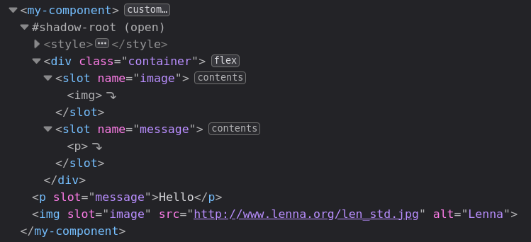
What happens?
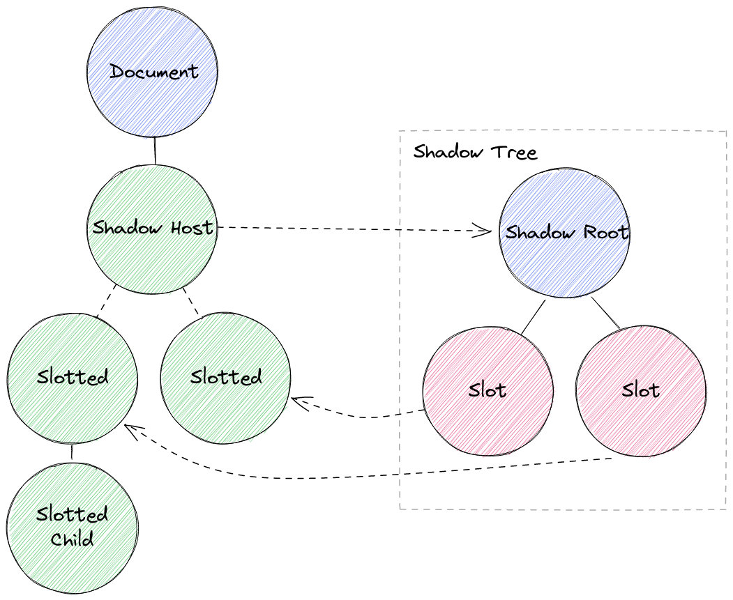
👉 Slotted elements are outside of Shadow Tree
(in light DOM)
Styling
/* Style slotted element itself */
::slotted {}
::slotted([slot="image"]) {}

/*
 Won't work:
 style children of slotted element
*/
::slotted li {}

/*
 Won't work:
 style slot itself
*/
slot {}
slot[name="image"] {}
Slots Programmatically
const slot = this.shadowRoot
  .querySelector('#slot');

const nodes = slot.assignedNodes();

slot.addEventListener(
  'slotchange',
  (event) => {
    console.log('Light DOM children changed');
  }
);
<slot> Browser Support
tl;dr:
All evergreen browsers
That's it —
these are the Web Component APIs
🙋 Wait —
there is one more thing...
ES Modules
Native JavaScript Modules
import { add } from "./utils.js";
import add from "./utils/add.js";
import { uniq } from "lodash-es";
export function add(a, b) { return a + b; }
export default function add(a, b) {}<script type="module" src="main.js"></script>Browser Support
tl;dr:
Script tag & dynamic import → all evergreen browsers
Less support for ESM in workers

🚀 Build modern web apps with interactive JavaScript components
❌ JavaScript framework
❌ bundler
❌ transpiler
👉 Just browser APIs
Libraries
& Tools
Lit
Why Lit?
Native Web Components
Less boilerplate
Shadow DOM per default
Reactive properties & declarative templates
Fast rendering
~5kb footprint
Lit JavaScript Example
import {html, css, LitElement} from 'lit';

export class SimpleGreeting extends LitElement {
  static get styles() {
    return css`p { color: blue }`;
  }

  static get properties() {
    return {
      name: {type: String}
    }
  }

  constructor() {
    super();
    this.name = 'Somebody';
  }

  render() {
    return html`<p>Hello, ${this.name}!</p>`;
  }
}

customElements.define('simple-greeting', SimpleGreeting);
Source: lit.dev
Lit TypeScript Example
import {html, css, LitElement} from 'lit';
import {customElement, property} from 'lit/decorators.js';

@customElement('simple-greeting')
export class SimpleGreeting extends LitElement {
  static styles = css`p { color: blue }`;

  @property()
  name = 'Somebody';

  render() {
    return html`<p>Hello, ${this.name}!</p>`;
  }
}
Source: lit.dev
Modern Web:
Web Dev Server
https://modern-web.dev/docs/dev-server/overview/
ES Modules support & resolving
Fast reloads
Extensible
esbuild/Rollup Plugins
👉 ...or Vite
Open Web Components
npm init @open-wcGenerator by open-wc.org
Scaffold app or component
Best practices
Build setup
Linting
Testing
Demo & documentation
👉 ...or the scaffolding tool of your lib
Custom Elements Manifest
https://github.com/open-wc/custom-elements-manifest
Spec to describe custom elements (JSON)
For tooling/IDEs etc.
Analyzer:
npm i -D @custom-elements-manifest/analyzer
custom-elements-manifest analyze
Patterns & Techniques
Avoid Imports with Side Effects
Communicate with
custom events
export class Menu extends LitElement {
  // ...

  connectedCallback() {
    super.connectedCallback();
    document.addEventListener(
      "pzsh-menu-toggle",
      this.toggleMenu,
      true
    );
  }

  toggleMenu(e) {
    this.open = !this.open;
  }

  // ...
}
export class Topbar extends LitElement {
// ...
toggleMenu() {
this.dispatchEvent(
new CustomEvent(
"pzsh-menu-toggle"
)
);
}
// ...
}Style Hooks
<my-component
  style="--paragraph-bg: gold;"
></my-component>

<template id="my-template">
  <style>
    p {
      background: var(--paragraph-bg, salmon);
    }
  </style>
  <p>My Component</p>
</template>
Host Display
:host {
  display: block;
}

:host([hidden]) {
  display: none;
}
Server Side Rendering
We're done*
*with theory
Let's do some hacking...

This work is licensed under a
Creative Commons Attribution 4.0 International License.

Web Components
By Mathis Hofer


