CSS
Introduction to CSS
What is CSS and its purpose
- CSS stands for Cascading Style Sheets
- Used for styling and layout of HTML webpages
- Allows separation of content (HTML) and presentation (CSS)
- Improves consistency and accessibility of webpages
- CSS provides visual and interactivity enhancements to webpages
- Can be written and applied to multiple pages for consistency throughout a website.
Adding CSS StyleSheet
<style></style>
Adding internal CSS to your webpage
<!DOCTYPE html>
<html>
  <head>
    <title>You Are Here</title>
    <style>
      /* This is where you would put your CSS */
      /* Inside the style tags */
      p {
        color: blue;
      }
    </style>
  </head>
  <body>
    <p>This text should be blue.</p>
  </body>
</html>
Internal styles are not the best practice for the following reasons:
-
Maintenance: If you have multiple pages using the same styles, making changes to those styles becomes difficult as you will have to make the changes on every page.
-
Reusability: Internal styles cannot be reused on other pages or websites, making it difficult to maintain consistency across multiple pages and sites.
-
File size: Internal styles increase the size of the HTML file, making it slow to load and increasing the bandwidth required to load the page.
-
Separation of concerns: It is considered best practice to separate the HTML, CSS, and JavaScript code, making it easier to maintain and modify each piece of code individually.
Adding Inline Styles with the style attribute
<!DOCTYPE html>
<html>
  <head>
    <title>You Are Here</title>
  </head>
  <body>
    <h1 style="color: blue;">Hello World!</h1>
    <p style="font-size: 20px;">This is an example of inline styles in HTML.</p>
  </body>
</html>
<link/ >
Adding CSS StyleSheet file to your webpage
(optimal way)
<!DOCTYPE html>
<html>
  <head>
    <title>You Are Here</title>
    <link rel="stylesheet" href="path/to/styles.css">
  </head>
  <body>
    <p class="message">Press <code>alt+command+i</code> Mac /
      <code>ctrl+shift+i</code> Windows to open your Dev Tools.
      Make sure the CSS styles are applied correctly.</p>
  </body>
</html>
p{
color:red
}CSS file
HTML file
Basic Syntax and Selectors
// STEP 1 Target
<button id="button">SAVE</button>


// STEP 2 Target and adjust Styles
#button {
  background-color: blue;
  color: white;
  padding: 10px 20px;
  border-radius: 5px;
}
CSS Selectors
Save
button {

}

#myId {

}

.myClass {

}


[type="checkbox"] {

}
Common CSS Selectors
Element Selector: Selects elements based on their HTML tag name, such as "p" for paragraphs, "h1" for headings, etc.
Element Selectors
p {
  color: blue;
  font-size: 16px;
}
Pros of Element Selector:
- Easy to use and understand
- Quickly select and apply styles to multiple elements
- No need to add classes or IDs to HTML elements
Cons of Element Selector:
- It can lead to specificity issues and unexpected styling.
- It can override the styles of other selectors that have higher specificity.
- It can increase the size of the CSS file if used excessively.
Best practices:
- Use Element Selectors sparingly and only when necessary
- Avoid using overly broad element selectors like
div,body, orhtml - Use class and ID selectors for more specific styling, when needed.
Using Class Selectors in CSS
<p class="message">This is a paragraph with a class selector.</p>CSS
.message {
  background-color: blue;
  color: white;
  padding: 10px 20px;
  border-radius: 5px;
}
Text
Using ID Selectors in CSS
<p id="message">This is a paragraph with a class selector.</p>CSS
#message {
  background-color: blue;
  color: white;
  padding: 10px 20px;
  border-radius: 5px;
}
Pseudo Selectors.
- Pseudo-selectors are CSS selectors that select elements based on their state or behavior. They allow you to select and style elements based on information that is not available in the HTML.
- Some common examples of pseudo-selectors include hover: active, and:first-child.
-
:hover- used to select and style an element when a user hovers over it with a mouse. -
:active- used to select and style an element when it is being actively clicked. -
:focus- used to select and style an element that has focus, such as a form input field. -
:first-child- used to select and style the first child element within a parent element. -
:last-child- used to select and style the last child element within a parent element.
:hover - used to select and style an element when a user hovers over it with a mouse.
    <style>
      h1:hover {
        background-color: yellow;
      }
    </style>
:active - used to select and style an element when it is being actively clicked.
<style>
  a:active {
    color: red;
    font-weight: bold;
  }
</style>
<a href="#">Click me!</a>
:focus - used to select and style an element that has focus, such as a form input field.
<style>
  input[type="text"]:focus {
    background-color: lightblue;
    outline: none;
  }
</style>


<label for="name">Name:</label>
<input type="text" id="name">
:first-child - used to select and style the first child element within a parent element
<html>
  <head>
    <style>
      li:first-child {
        font-weight: bold;
      }
    </style>
  </head>
  <body>
    <ul>
      <li>First item</li>
      <li>Second item</li>
      <li>Third item</li>
    </ul>
  </body>
</html>
What is CSS Specificity?
The specificity of a style rule is calculated based on the number of each type of selector in the rule.-
Inline styles have the highest specificity, as they are directly applied to an element.
-
ID selectors have a higher specificity than class selectors and pseudo-class selectors.
-
Class selectors and pseudo-class selectors have a higher specificity than element selectors. A class selector is denoted with a "." symbol.
-
Element selectors have the lowest specificity. They select elements based on the HTML tag name.
-
When two or more styles have the same specificity, the last style declared in the CSS wins.
<h3 style='color: red'>Hello</h3><h3 id="sub-header">Hello</h3> <h3 class="hello-header">Hello</h3> <p>This is an element selector</p><div class="container">
<p class="text">Hello World</p>
<p id="text">Goodbye World</p>
</div>
.text {
color: blue;
}
#text {
color: red;
}In this example, both the .text and #text selectors are targeting the same element, which is the second p tag. However, the #text selector has higher specificity than the .text selector. This means that the text color of the second p tag will be red, because the styles defined in the #text selector will override the styles defined in the .text selector.
In CSS, the !important rule is used to increase the specificity of a declaration and to override any conflicting styles from other stylesheets or inline styles. When a declaration is marked with !important, it takes precedence over any other conflicting styles, regardless of their specificity.
Flexbox
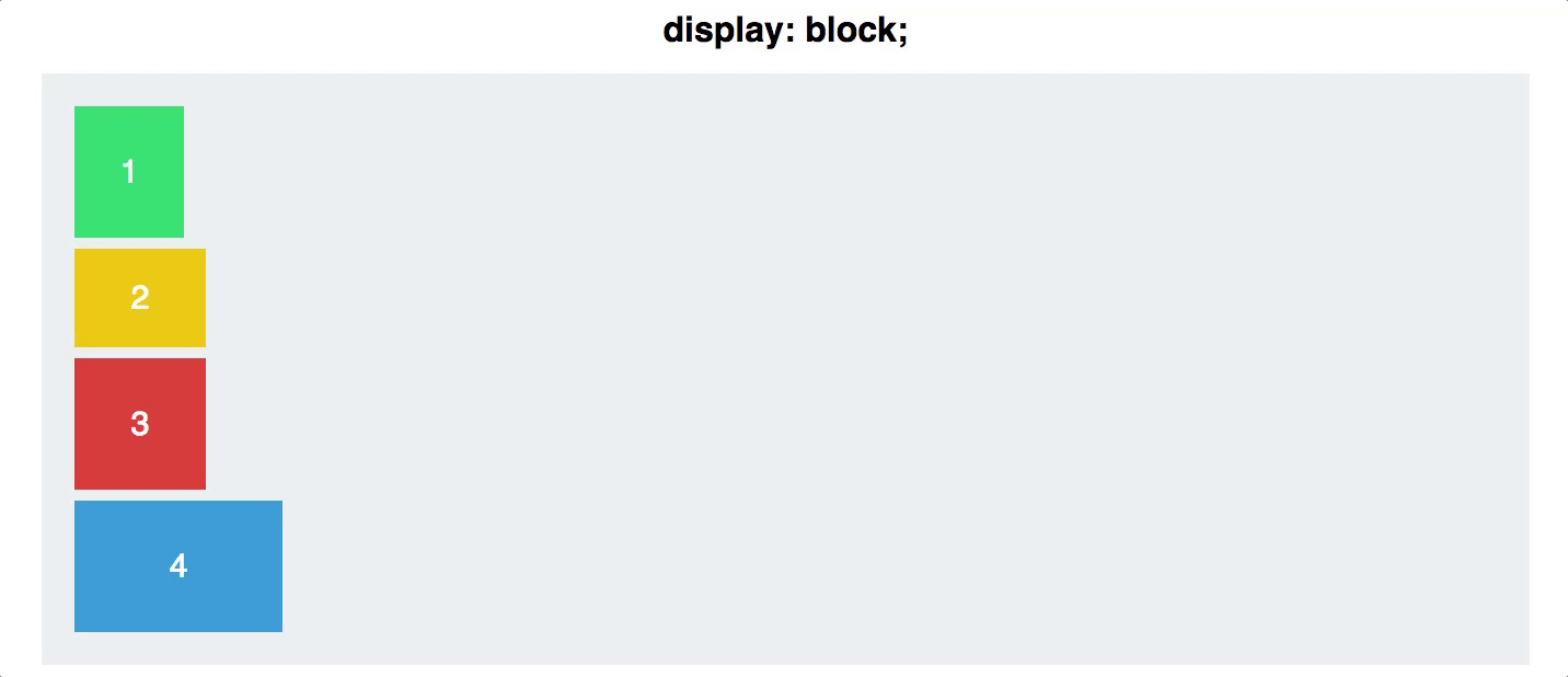
Display Block
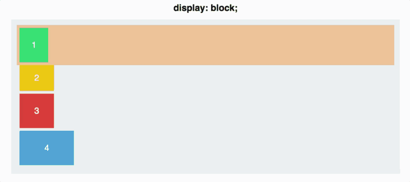
Each square takes up the full width of its line.
FIRST BIT OF MAGIC
.container {
   display:flex
  }
Setting up a container
<div class="container">
  <div class="item">1</div>
  <div class="item">2</div>
  <div class="item">3</div>
</div>
.container {
display: flex;
align-items: center;
justify-content: center;
height: 300px;
background-color: lightgray;
}
.item {
background-color: steelblue;
color: white;
padding: 20px;
margin: 10px;
}What is Flexbox?
Flexbox is a layout system in CSS that provides a flexible way to arrange elements within a container.
Why use flexbox?
Flexbox allows us to put elements inside of a container, and have that container decide how to shrink/expand/wrap those elements to fill the space available. It also allows us to specify how the items are arranged and ordered.
Flexbox Axis
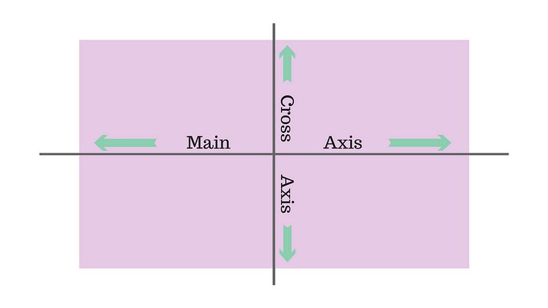
1. The main axis is the primary axis along which items are laid out. It runs either horizontally (left to right)
2. The cross axis runs perpendicular to the main axis, and is used to align the items along this axis
Flexbox Axis
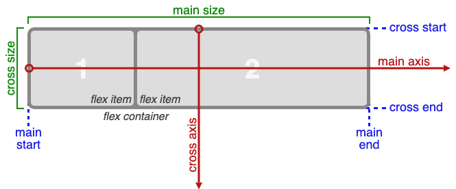
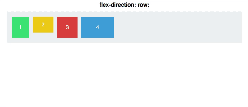
- main-axis: The main axis of a flex container is the primary axis along which flex items are laid out. The direction is based on the flex-direction property.
- main-start | main-end: The flex items are placed within the container starting on the main-start side and going toward the main-end side.
Container properties
- display: flex
- flex-direction
- flex-wrap
- justify-content
- align-items
- align-content:
FlexItem Properties
order
flex
flex-grow
flex-shrink
align-self
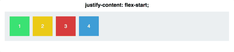
justify-content: flex-start | flex-end | center | space-between | space-around
Flex-Direction
Specifies how items are placed in flex- container, defining the main axis and its direction.
-
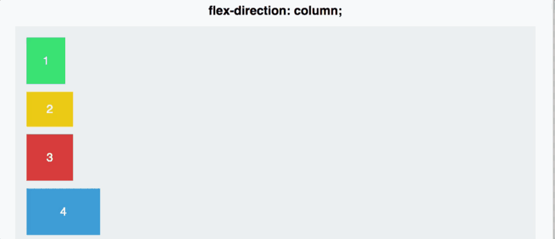
flex-direction: columnthis will switch the main and cross axis
align-items: flex-start | flex-end | center | baseline | stretch
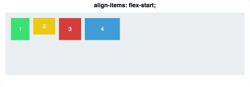
allows us to align items along the cross axis (see terminology diagram above). This allows content to be positioned in many different ways using justify content and align items together
flex-direction: column-reverse
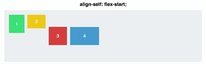
align-self: allows you to adjust the alignment of a single element.
It has all the same properties of align-items
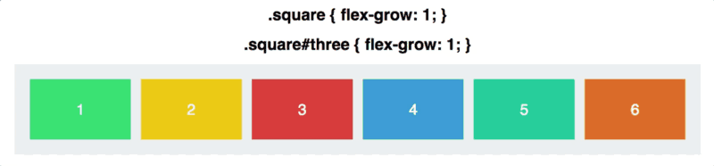
Flex-grow allows an item to grow relative to the rest of the items in the same container, filling up any remaining space.
specifies whether items are forced into
a single line OR can be wrapped into multiple lines.
flex-wrap is the property that deals with the flex items when space in the container isn’t big enough to fit them all
Week 2
By Jamal Taylor


