Digipak Inspiration
What inspiration can you draw from this digipak?
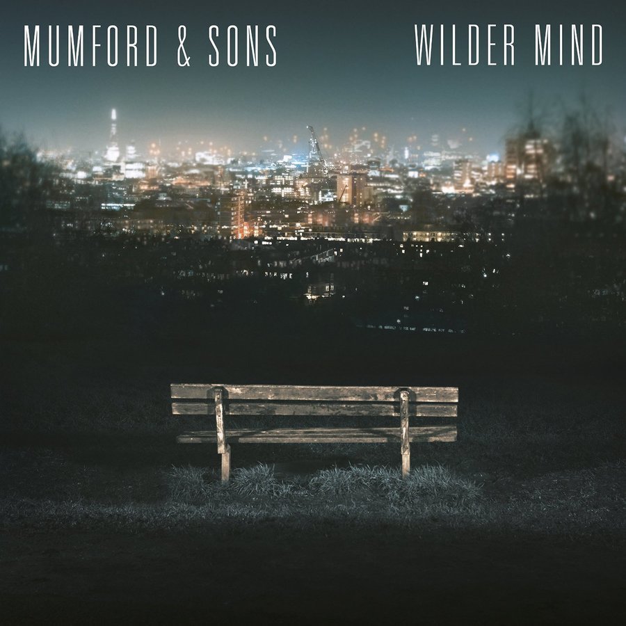
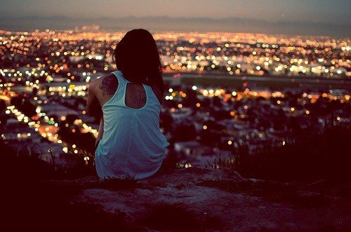
I love the overall simplicity of this album cover as it makes the audience think and take part actively rather than deliver a straight message. I love the artwork of the city night lights and it is very relevant to one of our scenes. Furthermore, I like the whole layout of the overall cover as it just has the album title and artist and draws most of the attention to the photo and admiring the world and its beauty instead of promoting the artist/actors, it makes the video feel more general and aimed at people's own personal experiences. I feel this is important for our digipak to highlight themes.
Mumford & Sons- Wilder Mild
Once again the night view setting/location is effective for the Indie genre as this can represent many different meanings such as the passing of time or the embracing of nature's beauty. Furthermore, the simplicity and minimalistic style is something also to draw out and again I like the use of the font and how it has been laid out. I also like the way it looks like a drawing but also a photo at the same time which combines the artistic and reality elements into one.
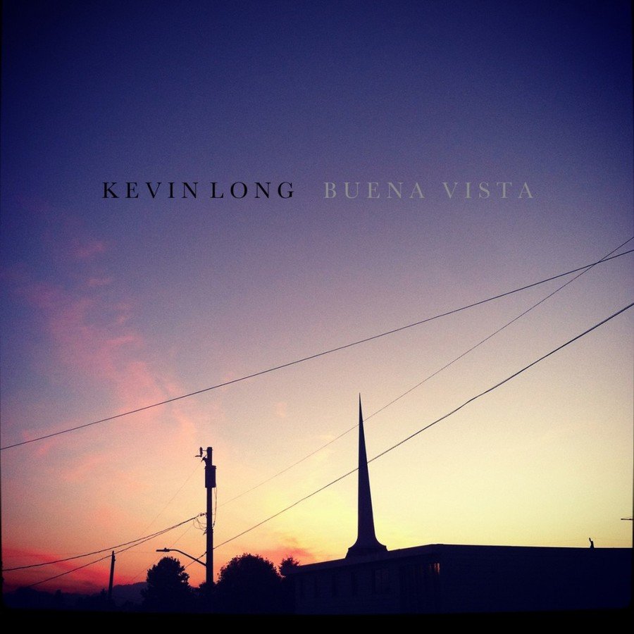
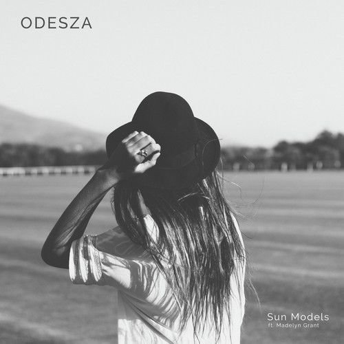
The inspiration I can draw from this album cover is the photo of the sunset which is simple yet effective as it brings an artistic element to make the audience feel something, the image itself is kind of breath-taking through its simplistic style. Once again, I really like the layout and font used for the artist and the album name. I think this cover art is overall very effective and once again it does relate to our music video, as our music video illustrates the ideas of capturing moments in our everyday lives . The colours used are often associated with the Indie genre and how it is a photo of something so ordinary also helps to meet the Indie genre
Kevin Long- Buena Vista
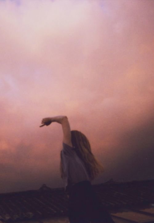
I think this may be the best inspiration for our album cover because the band are promoted however though they are a focal point, the photo massively focuses on the beauty and vastness of the outdoor world. I think this kind of image would be good for our album cover as it helps portray the idea of a wide world but highlights the couple and their relationship against the vast world that is out there. I also like the colours used, from the research conducted of Indie digipaks it is clear the pastel colours (similar to those in sunsets) are the most common such as the pastel blues, purples and pinks (this combination seems to be most common). Moreover, where the album and band text is placed is effective as it placed dead centre so this is the first thing the audience sees.
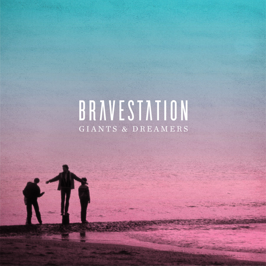
Bravestation- Giants & Dreamers
This album cover still includes features stereotypical to those found on an indie album cover however the overall vibe and atmosphere of this cover is a lot different to the over covers I have taken inspiration from. I think this kind of cover would be interesting, as the main girl in our music video could be photographed in a similar position and setting as this artist, implying to audiences this is a point of view shot from the boyfriend's perspective. In addition to this, I think the ideal is for our cover to have the album name/artist in centre of the cover as this draws most attention, this type of font is also useful and eye-catching because of the wide-spacing between each letters and also the quite organic and pure feel it has to it.
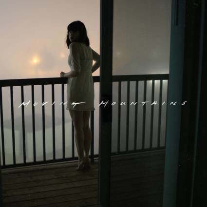
Moving Mountains
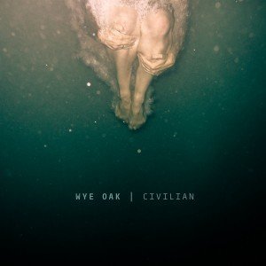
When I saw this album cover, it instantly reminded me of our planned scene which is set in the lake. This album cover is effective in appealing to the indie genre through its simplicity and artistic feeling. The photography is effective and conducts the artistic element delivered on the album cover and it illustrates the human form in nature, also I like the fact the cover album is not straight forward and the active audiences have to participate and interpret the meaning in its own way. I think the way the font is set out is successful and I the use of the '|' helps to make it look more clear cut and distinguishes between the album name and artist name, the boldness of the artist's name "Wye Oak" also is effective and it highlights the artist as the focal point.
Wye Oak - Cover for Civilian
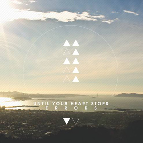
I think this album cover is also effective because of the shapes used in the centre of the cover. The use of shapes helps to make the cover look more artistic but is also a stereotypical feature used in many Indie album covers. Furthermore, I like the use of the colours and the white helps to make the overall tone of the album look pure and genuine. I like the layout of the font and the use of the spaced out font for 'Errors'. Yet again this album cover is simple yet meets the Indie genre through the photography choice and the use of the natural lighting, editing and the use of the shapes and how they are coloured and arranged.
Errors- Until Your Heart Stops
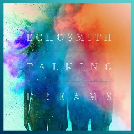
I love the blending of colours and the explosion of them on this album cover and it instantly reminded me of our potential colour bomb scene in our music video. I also like the use of the colour bombs covering the faces of the artists however they are still visible, it leaves a idea of mystery to the audience. Furthermore, I think the album name and artist being the main focal point is something to draw inspiration from. I like how clean cut it look and I love the font type, it would be a good font for our Indie inspired music video. Yet again, this cover is simple yet effective as it is a simple concept but just used the colour splatters to enhance it.
Echosmith- Talking Dreams
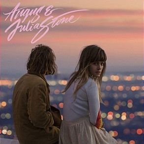
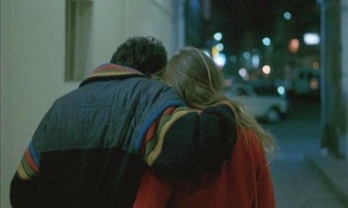
This album cover reminded me of our music video the most and how we want to represent our couple. I like the location setting of this photo as it is a sunset cityscape which is blurred which highlights the couple as the main focus. I also like the way one of the artists looks directly into the camera. I think a photo like this would be most effective for our album cover as we want to promote our artists however not reveal too much about our video. The location of a city scape is stereotypical to the Indie genre so would be successful. However I do not like the placement of the font and the font style used, as I do not think they suit the type of image and tone we want to represent.
Angus And Julia Stone
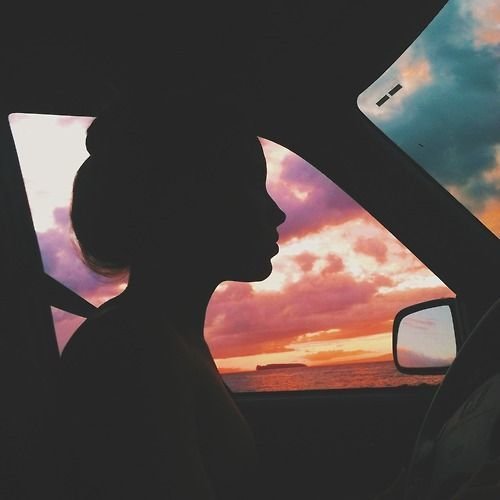
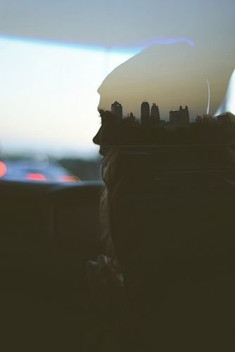
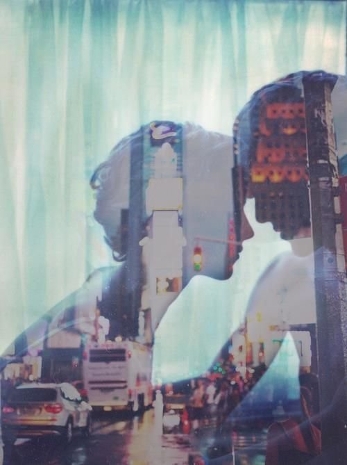
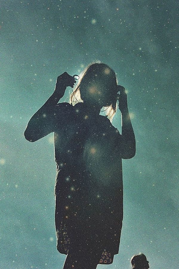
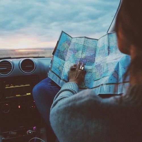
Photography Inspiration From Pinterest

Digipak Inspiration
By janepipkin