In what ways does your Media Product use, develop or challenge forms and conventions of real media products?
The Digipak
Our Digipak
Inside
Back
Front
Real Indie Style Digipaks

Stereotypical forms & conventions of real Indie style digipaks
-
Minimalism -
Simplistic -
Artistic -
Abstract -
Neutral Colour Palette -
Rarely has a photo of the actual artist -
Bold and simple text -
Mysterious -
Focuses on natural beauty (e.g. location choices) -
Structured
In what ways does your Media Product use, develop or challenge forms and conventions of real Media Products?
The Front Cover
Forms and Conventions we have used
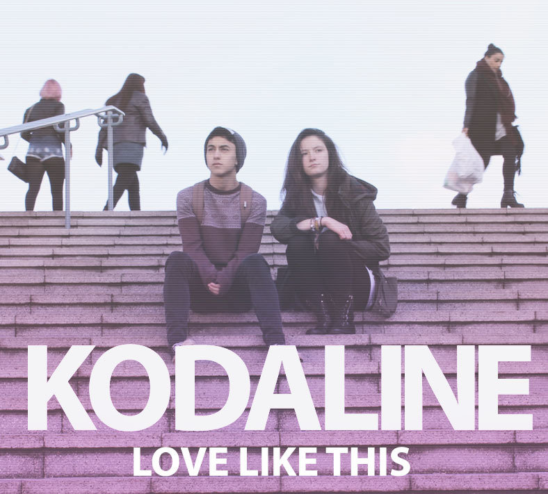
The front of our digipak has used forms and conventions of real Indie digipaks through the choice and positioning of font. The font we decided to use for our masthead is similar to those used in real Indie style digipaks as it is simplistic with no complicated detailing on the letters themselves. The bold and simplistic font is eye-catching and makes the artist/album name a focal point and helps us to conform to our audience's expectations and follow the stereotypical minimal Indie style. In addition to this, the text can be seen to help create a strong brand identity because of its boldness and size. It makes the album name more memorable to our audiences and making the album title 'Love Like This' significant as it helps trigger audiences' memories to think about their own experiences because of the impact the title maintains. It was important for us to ensure the text was bold enough to make a powerful statement about the artist and the essence of the album. The central/main image used is inspired by the album cover of George Ezra's 'Wanted on Voyage' and employs the idea of the 'star' being the focal point of album and expresses an idea how they are moving away from the 'mainstream' route of life through the use of the blur effect on the background people. This could be also seen as challenging as most Indie digipak front covers tend to head for my abstract and artistic messages rather than promoting the artists themselves. The photo implies they are seen as 'outsiders' from society which fits the themes of the Indie genre because of the way the photograph is taken. The contrast of the size of the text compared to the 'stars' could imply ideas how 'love' is bigger/stronger than most people.

George Ezra: Wanted on Voyage
Masthead font is similar to the one we used showing we conformed to the Indie genre
Simple and abstract ideas but also an indicator of narrative
Central image use similar to ours, the idea of being an 'individual/outsider' in society. Here Ezra's red top helps him stand out, where as in ours it is the blurring of the people in the background which make the stars the focal point
Inspiration for our front cover
Forms and conventions we have developed
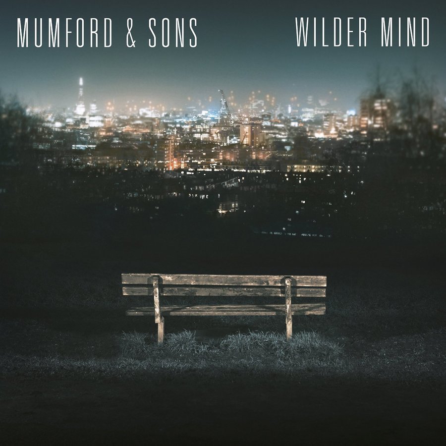
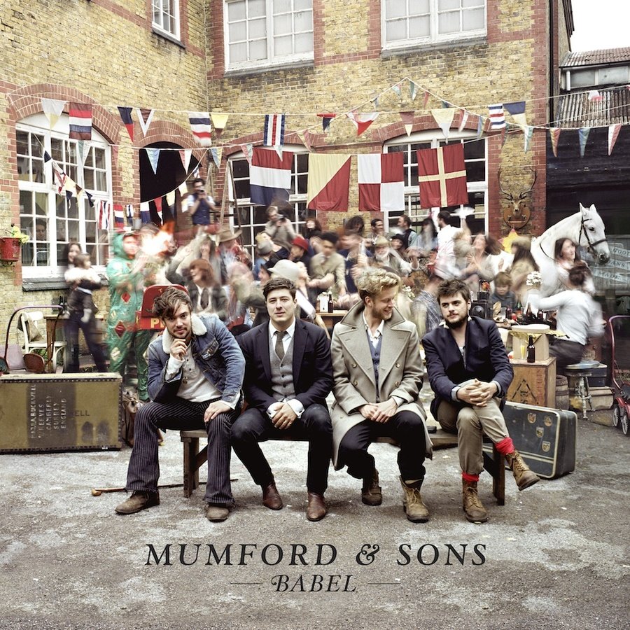
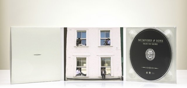
In the front of our digipak we have developed forms and conventions by changing the position of the album/artist name slightly. Many stereotypical Indie digipak front covers exhibit the album/artist title on the top or middle in a smaller but still bold text. Some album covers such as the Mumford & Sons displayed below do position their text on the bottom of the cover however unlike our digipak it does not use a significantly large font, to them the title can be seen as the last thing the audience sees whereas with our front cover, the title is the first thing which will grab audience's attention. We have developed this and made the text significantly bigger and positioned it at the bottom because of the nature of our central photo and because of our desire to make the album title a lot more eye-catching and memorable to our audiences.
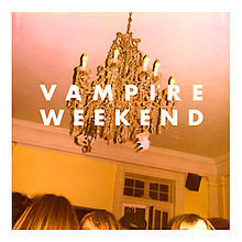
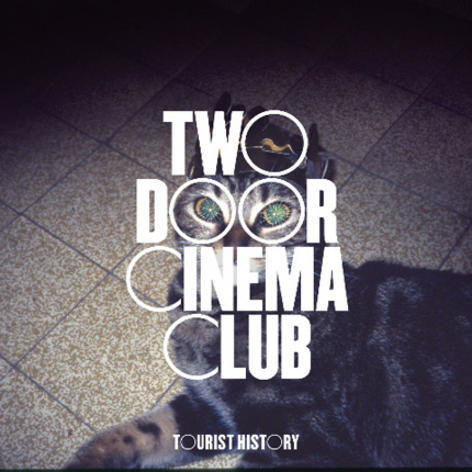
Examples such as the front cover of the Vampire Weekend and Two Door Cinema Club albums show that the use of bold and spaced out text is a convention popular to the Indie genre. The 'Two Door Cinema Club' front cover shows how artistic type fonts are also popular to this genre however this is something we did not conform to.
An example of a front cover which positions the album/artist at the bottom however is kept relatively simple as the main focus here is on the image
Forms & conventions we have challenged
We may have challenged conventions as our front cover is not as abstract looking as other Indie styled ones are. For example, many Indie digipak front covers feature something artistic (e.g. like a drawing) or bold text/symbols and ideas to demonstrate the motifs and help audiences to identify the star's image . Though our central photo does employ some abstract ideas (e.g. being the focal point and outsiders of society) it is mainly a self-explanatory as its purpose it to introduce our audience to the 'star' couple together rather than exhibiting abstract ideas behind the meaning of the song and other connotations. Furthermore, although some Indie digipaks do use a bold font (e.g. George Erza's), a few also use a more handwritten or artistic style font to convey the personal and unique vibe that Indie artists want to achieve however we have challenged that idea in a way by using a plain, spaced out and structured font which still attracts the Indie audience. Our main focus is in the photo and its use of effects making it the most attractive point for audiences to establish
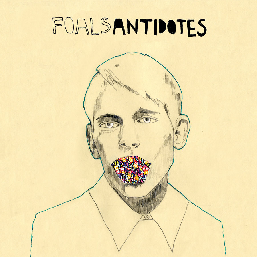
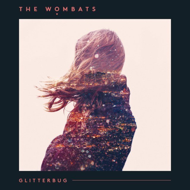
Album covers such as these ones from the Foals and Wombats use artistic and abstract ideas to convey messages. However similarly to ours, Glitterbug has used the idea of a purple gradient/tone
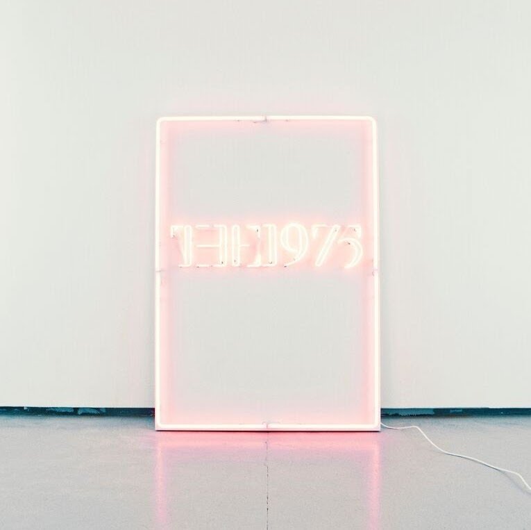
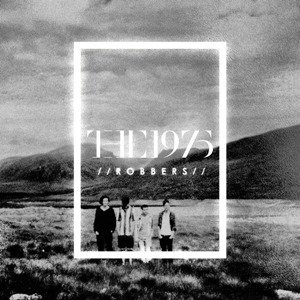
The use of pink and the use of lighting (e.g. the use of the signboard which is associated with a pop culture) helps to display the new feel to the 1975 album, a more abstract idea than our digipak displayed
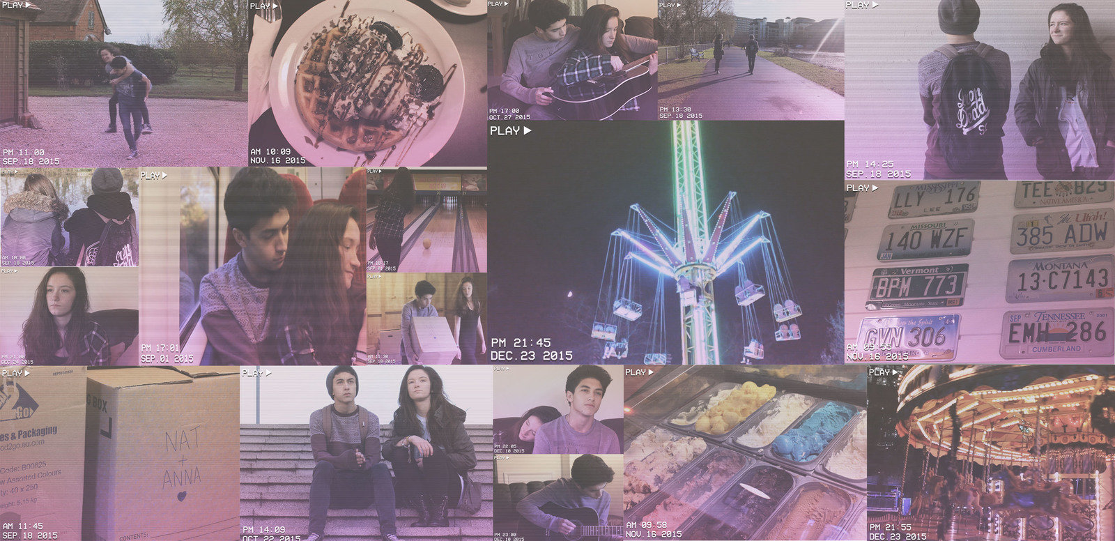
Inside to our digipak
Inspiration for our digipak
Stereotypical inside of Indie digipak
Forms & conventions we have used
The idea of using the video shots from our music video is something which conforms to the Indie genre and shows that we have used forms and conventions of the Indie style as these types of old equipment (e.g. video tapes) are something which are coming back into fashion and are popular among the Indie followers as it is seen as unique, different and a form of self expression. Furthermore, the video screenshots deliver the idea that the couple (stars) are giving an insider to audiences on their most personal moments, which is also something which the Indie genre focuses on, the idea of real life events and ideals. The inside of our digipak helps to present the idea of individuality which is something the Indie fashion is also very focused on. From research we realised that many Indie styled digipak insides do not have any text on them instead however focus on the beauty and symbolic meaning of the photo used. We have conformed to this and decided not to use text in the inside of our digipak as well, instead we want our audience to focus on relating themselves to the stars and think about their own love lives, the significance of having the screen shots from everyday locations (e.g. park, someone's house) helps to make the video seem more personal and relating helping to make audiences feel something towards the characters and preparing themselves for the video. Although we have challenged the stereotypical neutral colour scheme, we have kept the purple tone consistent throughout our digipak meaning they blend way together. It was important for us to have the effect subtle but eye-catching so the use of the purple colour helped us with this while still creating a bleached look.
Forms and conventions we have developed
We have developed the Indie themes of individuality and sense expression, even if we have laid it out in a different format and not used as much symbolism. All the photos used our part of personal experiences and in some ways are abstract as there are emotions and memories placed behind every photo however we have just made them more narrative. We have incorporated the idea of memories into our digipak throughout, again showing continuity. The colour scheme is again the same showing continuity and we have further developed the conventions by using more than one image. Tis is not common inside Indie style digipaks and stereotypically either an establishing or wide shot is used to fill both sides of the inside of the digipak but we felt it was important to exhibit the couple in much more detail and make the inside more interesting and help tell the story.
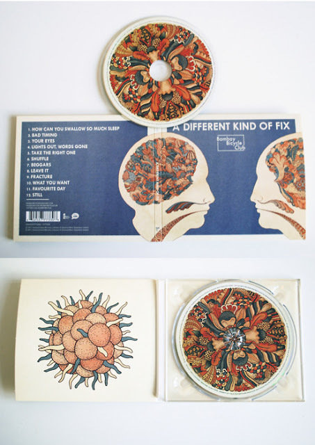
Bombay Bicycle Club's digipak inside using one central image which is an artistic pattern which probably displays abstract meaning of the creative mind. We have delivered the artistic style but formatted it in a different way and used more images to make our inside of the digipak look more busy looking however we have been careful to ensure it still looks simplistic.
Forms and conventions we have challenged
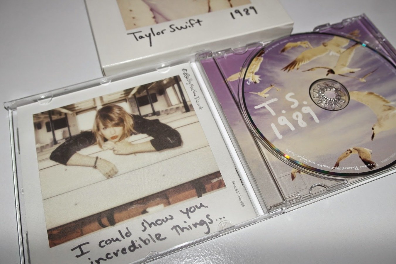
The inside of our digipak has challenged the forms and conventions of a stereotypical Indie digipak. The inside of the Mumford & Sons digipak yet again succeeds in meeting the conventions of the Indie genre as the design focuses on simplicity and artistic ideas. One part is even left white maybe to convey the abstract and symbolic meaning but overall it conducts a stereotypically minimalistic style. The inside of Taylor Swift's 1989 album which although is a pop album has been one of the main inspirations for the inside of our digipak. This is where our digipak has challenged the conventions as we used more than one image and the idea of video shots from the couple's relationship to make the video more intimate for the audience. The inside of our digipak links with the rest of our digipak because the front cover introduces the couple and the inside of the digipak further develops this to show the personal moments of the relationship and it also helps to achieve continuity of the progression of the couple's relationship throughout the digipak. This kind of concept of having a busy and more complex inside of a digipak is non-stereotypical of the Indie genre and again, we have decided to go for a more 'narrative' perspective than an abstract/symbolic one which many Indie digipaks conform too. Furthermore, many Indie digipaks stereotypically using more neutral colours but we have used purple to add more colour and to portray a more digital look and additionally help to exhibit an artistic tone than a subtle vintage/retro look which many Indie digipaks stereotypically go for. The fact also that the photos used inside the digipak differ so much (e.g. location) further helps to create a personal and 'home style' video feeling which are ideas which many Indie artists use.
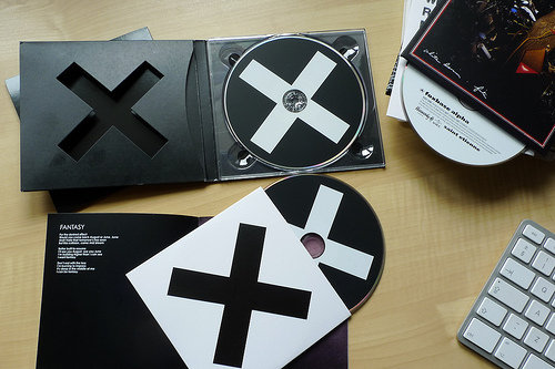
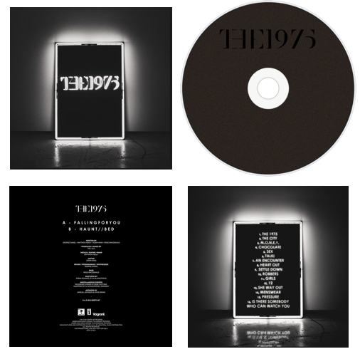
These stereotypical Indie style digipak insides show that the style focuses a lot on minimalism and abstract ideas. The XX album and the inside shows continuity of the logo therefore continuity brand identity. Whereas The 1975 album uses the stereotypical dark colour scheme and place text in the middle however still adopting a minimalistic idea. This differs to our digipak, as it has more photos and tells much more of a narrative through the photos rather than abstract ideas
The XX continue there 'X' to show brand identity and an artistic element
The 1975 album displays simplicity in the inside of their digipak by placing the copyright information in there instead
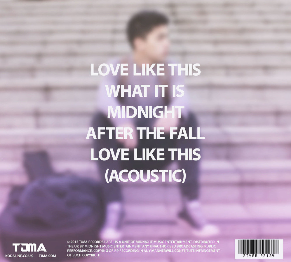
The Back Cover
Forms & conventions we have used
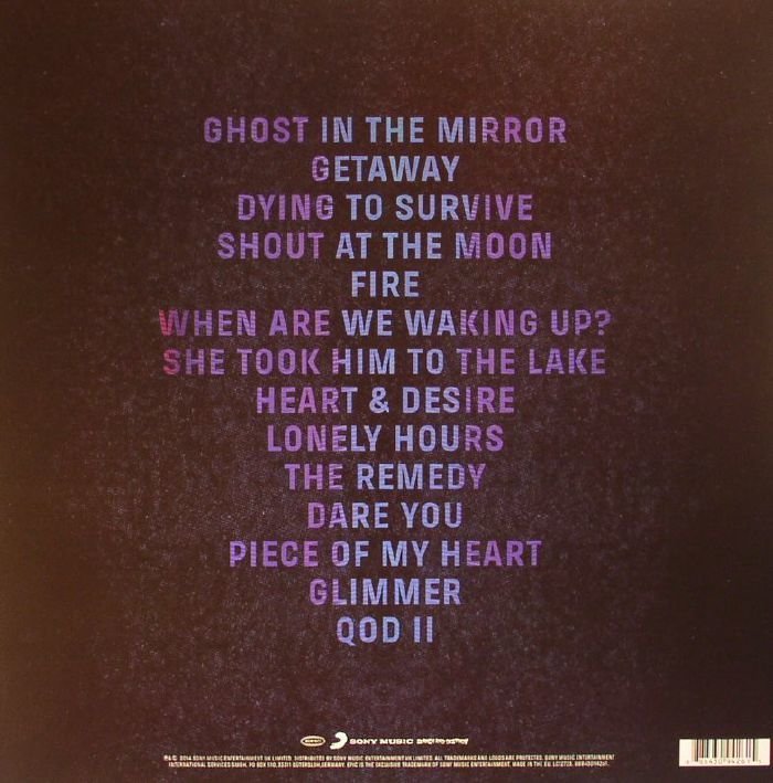
The back of our digipak does use the forms of existing Indie ones, the back of the Deaf Havana digipak is similar to ours as it uses the idea of blurring the image of the main character which has been created, this helps to exhibit the idea of time going pass quickly and also implies they form a different part of society because of this out of focus look. We have kept to a simplistic and minimal approach similar to the stereotypical Indie digipak backs and we have centred our tracklist and showed continuity by using the same simplistic and bold font throughout, since this font has been used throughout it helps to create 'brand identity' and is a recognisable font for audiences. The overall layout is clean cut and structured and helps to complete the story of the digiak of the star being alone after whatever event occurred between the couple. Furthermore, there is a continuity with the colour scheme. We have also used a barcode to help make our digipak look as legitimate as possible and additionally created our own record label and directed audiences to the official website and more. We have further created the realistic look by having the written copyright at the bottom of the cover.
Examples of real Indie style digipak backs
Similar to the back of the Mallory Knox digipak, we have centred on tracklist at the bottom and furthermore placed a barcode on the bottom right hand side and also the copyright information, we have also ensured the tracklist is not numbered to help create a genuine look
Forms & conventions we developed
The back to our digipak can be seen to develop the forms and conventions of real Indie style digipaks. Most Indie digipak backs follow a very minimalistic and structured look which includes either just one background colour or has a photo of some sort of object as seen in the example from the Foals' album below. Although, some album backs from the Indie genre do use an image (seen from the Deaf Havana one in the slide before) it is never a focus point so we have developed the forms and conventions by making the blurred out photo of the star the central focus of the back of our digipak. The stereotypical back of an Indie style digipak conveys ideas of being mysterious and minimalistic and although we have stayed with this idea, once again our back also helps to tell a narrative to the audience rather than develop abstract or artistic ideas. We have further developed forms and conventions of a stereotypical digipak back by once again using a significantly bigger and bolder font making the overall digipak stand out more.
These digipaks aimed for an Indie style audience are stereotypical as they use a block colour as the background helping the text to stand out more and use bold and spaced out texts in a white colour to make an impact on the audience. These are minimalistic and can be seen throughout the genre. We developed this by using a central image instead of a block colour but kept the same layout and structure
Forms and conventions we challenged
The main aspect which we have challenged from existing stereotypical Indie digipak backs in the idea of again illustrating the 'star' and 'star identity'. This is consistent throughout and it helps the audiences feel they know our main male actor more personally as they see his story throughout the digipak. The examples below of real Indie style digipaks show the use of 'star identity' is not common but abstract photography. Although the central image of the star has a blur effect on it, this almost helps to make him stand out more too audiences and the effect could deliver different symbolic/abstract messages which is an idea which we have used from existing stereotypes. Furthermore, the record label text at the bottom is made more significant and a lot bolder and bigger than it is on most existing digipak backs showing how important the actual music and producers are to the overall album helping to also draw focus to the music industry and the record company.
These digipaks are similar to ours in the sense that they both use effects and have positioned their tracklist dead centre however we have developed ours to make the record label more significant. As seen in these examples the record name is not as in big or bold font.
Labelling the forms & conventions
Title is bold at the bottom and significantly a lot larger than those used on other stereotypical Indie digipaks. The font is well spaced out and easily readable. This type of simple font is common among the Indie genre. Furthermore, this text type has now become part of our brand identity
The purple gradient effect is something which is consistent throughout, the subtleness of it helps to provide an artistic look helping our digipak conform to the Indie genre.
Central Image focuses purely on the characters and promotes them as the 'stars'. Though some Indie albums do use the idea of promoting the star, stereotypically Indie front covers convey more abstract ideas. Furthermore, the use of scan lines helps to make the image look like its a 'video' giving it a personal and home-made feel
Image use throughout
The effect of the scan lines helps to provide a genuine feel to the video screen shots, alongside this the use of the date, time and play text helps to further make the video shots look realistic. The idea of video shots, help to attract the Indie audience expressing ideas of intimacy and individuality alongside delivering an artistic vibe
The photo collage idea shows that we challenged forms and conventions of a stereotypical inside of a digipak. Most real life Indie digipaks use one central image which is simplistic however the collage in ours helps to make it more complicated and busy looking
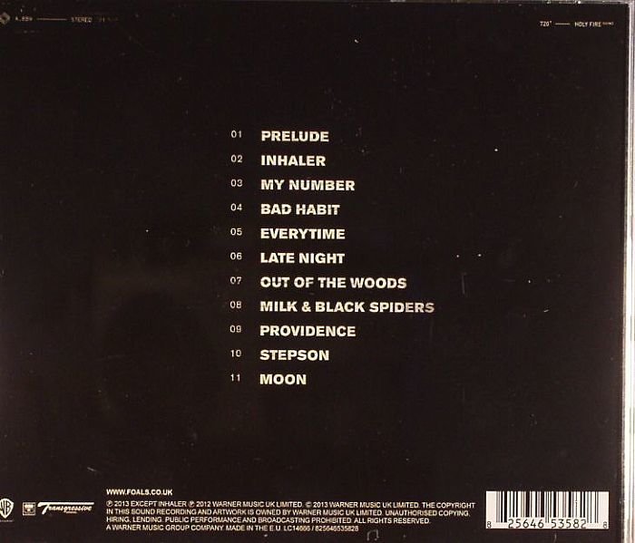
Tracklist is centred in the middle of the back and uses a simple but bold font, this is stereotypical of Indie style digipaks
A central photo of the star is used which develops/challenges the forms and conventions of an Indie style digipak as most backs use either a block colour or a symbol whereas we have used a central image with an effect on the star to help create this out of focus and out of society look and feel
The barcode on the bottom right hand corner helps to make the digipak look more authentic
Copyright information is placed on the bottom alongside our own record label
Continuity shown through the consistent use of the purple gradient tone
In what ways does your Media Product use, develop or challenge forms and conventions of real media products?
By janepipkin