Statistics: Bar Graphs
Date:
Time Remaining:
Aim:
Understand how bearings can be used to describe relative directions and journeys.
How you'll know that you've been learning today:
Can measure bearings with a protractor, and use them with changes-of-scale to calculate distances traveled in journeys.
Date:
Time Remaining:
Bearings Rules Reminder
1. Start from North
2. Measure Clockwise
3. Write 3 Figures
Starter:
Time Goal: 5min
Date:
Time Remaining:
Write down in your own opinion a description of what is happening. Try to use mathematical language.
Starter:
Time Goal: 5min
Date:
Time Remaining:
Feedback
If it doesn't work, scroll to the pages below for troubleshooting and alternatives
Settings Troubleshooting
There might be some issues with using Mentimeter on iPads.
You will need to 'enable cookies'.
Go to iPad settings, scroll down to 'Safari', and under the 'Privacy & Security' settings disable "Prevent Cross-Site Tracking" and disable "Block all Cookies."
If you are blocked from editing iPad settings, you'll need to show your parents this Slide and ask for permission to change the settings, so that you can use it interactively for class.
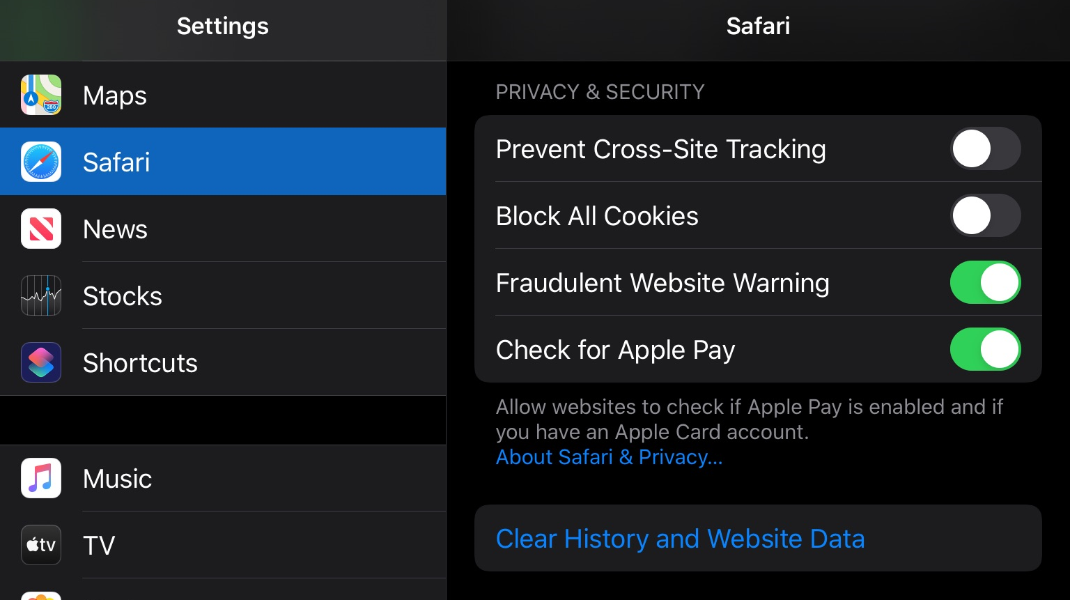
Click to Show Settings Screenshot
Feedback Bakcup (input code: 14 39 18) :
Feedback: Class Results
Hidden link to the poll dashboard (need to be logged-in as me to view/edit):
https://www.mentimeter.com/s/4ee455c137bd939842ebe1ef1c1a7ee2/b38ec70a0b9e/edit
Statistics Bar Graphs & Histograms
By Jay Teach
Statistics Bar Graphs & Histograms
·# Starter: ·Video of a Galton board (physical simulation of Normal Distribution histogram) ·Task: Write down in your own opinion a description of what is happening. Try to use mathematical language. · ·# Bar Graph: Categorical (Discrete) Data ·Interactive example of coin toss bar graph https://seeing-theory.brown.edu/basic-probability/index.html ·An example of a very simple Bar Graph. ·This one only has two categories: Heads OR Tails. The Category is shown below the bars and the bars are separate. · · ·# Interactive worksheet to input tally data, which will be automatically plotted. https://www.desmos.com/calculator/g1khyxce0d · ·Demonstrate a simple live tally: class’s number of Girls vs. number of Boys ·Demonstrate refreshing the page to reset the table · ·Demonstrate more tallies: favorite food (pick from a few options), number of siblings, enjoyment of maths class (1-5), etc. · ·Task: input numbers between 1-6 to recreate the shape at the beginning of the lesson (a “bell curve”) · · ·# Worksheet: Reading info from Tables and Plotting a Bar Graph · ·# Worksheet 2: Plot a Bar Graph, interpret Tally Table · ·Exercises from the Book (summarizing data tallies, plotting bar graphs, and interpreting bar graphs) · · ·# Histogram: Numerical (Continuous) Data ·Revisit the Desmos activity, but set the histogram bin width to “1”. · ·Use real-life examples of continuous data: hand length (they can measure with rulers), height, favorite day of the week (1-7), month of year born (1-12), etc. · ·Exercises from the Book (plotting Histograms, interpreting Histograms) · · ·# Plenary: Examine “Scotland’s Population is Ageing” Histogram ·Identify it as a Histogram ·Compare 2008 with 2018 results.


