Statistics: Pie Charts
Date:
Time Remaining:
Aim:
Understand how data is collected and presented in pie charts.
How you'll know that you've been learning today:
For pie charts, can create them digitally and by hand, and can answer questions and find unknowns by calculating fractions, percentages, and angles.
Date:
Time Remaining:
Date:
Time Remaining:
Introduction
The first ever pie chart was invented in 1805 by William Playfair, a Scotsman born near Dundee.
He also lead a successful 1793 plot to bankrupt the French Government and cause their civil war (by counterfeiting their currency).
Date:
Time Remaining:
What’s the point?
Different charts aim to tell different stories.
Pie charts are useful to compare different numbers as a ratio of the whole.
They use angle and area (not length, and not so much numbers or position).
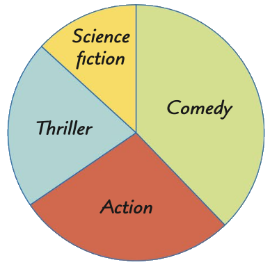
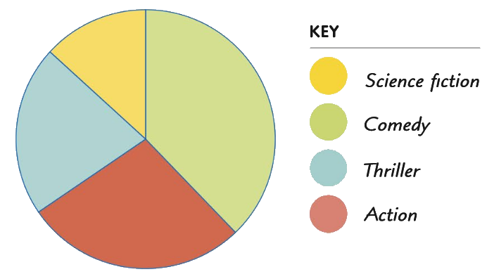
How to Read A Pie Chart?
Pie charts can either be labeled with a “Key” (a.k.a. a “Legend”), or directly on the diagram
Date:
Time Remaining:
Real Life Example 1: World Population (2017)
This area map of world population stretches land size to tell us the size of the country's population

Date:
Time Remaining:
The same information presented in a pie chart gives a much clearer comparison of the numbers, but makes the individual values harder to read.
The UK isn't even on the list!

Date:
Time Remaining:
Real Life Example 2: CO₂ Emissions
Be careful! Avoid thinking “pretty = informative”. This graph is artistic, but it doesn’t tell a clear story.
Instead, if we use a pie chart we can have a very clear comparison ranking the top CO₂ producing countries.

Date:
Time Remaining:
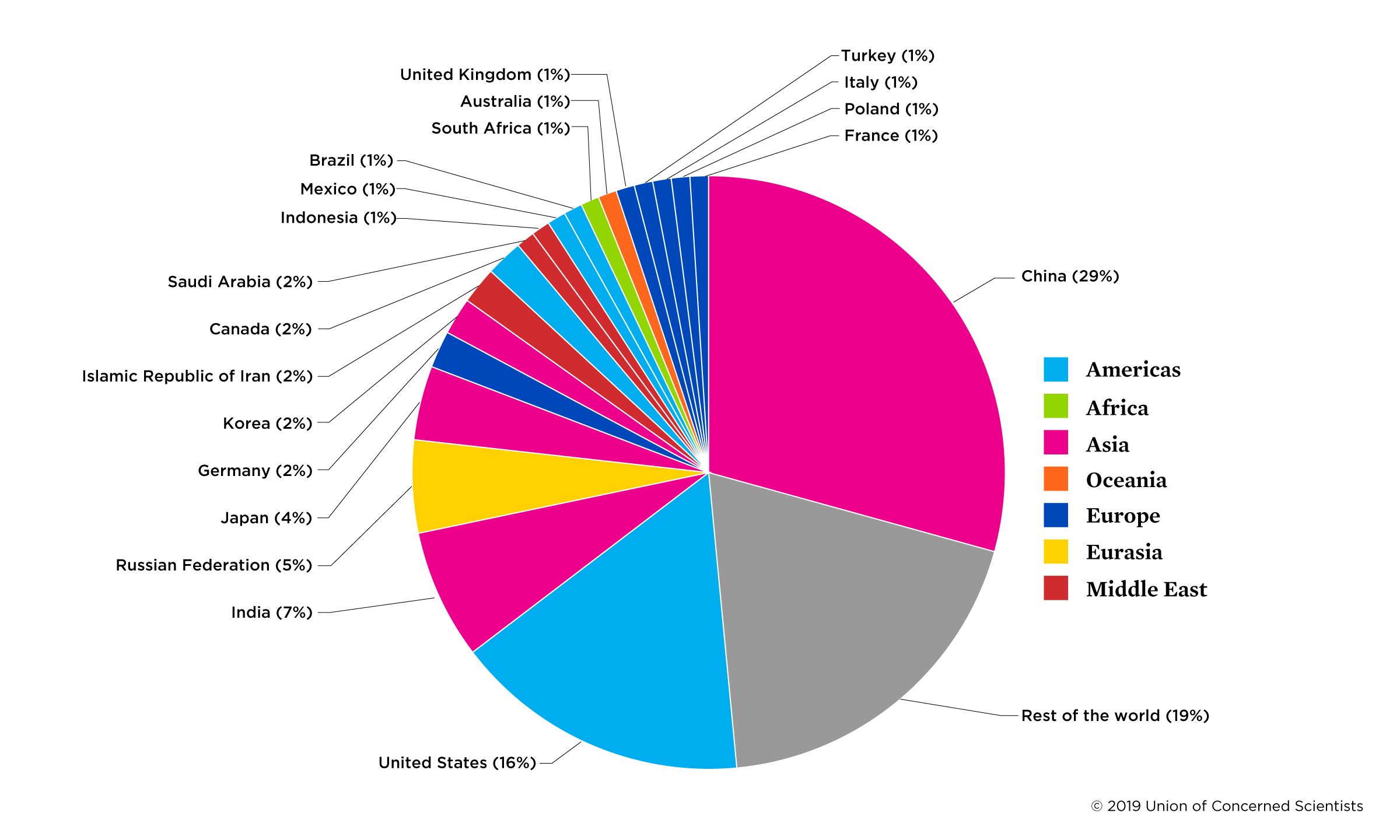
Pie chart showing the top CO₂ Emitting Countries of 2016
Instead, using a pie chart, we can have a very clear comparison ranking the top CO₂ producing countries.
(Note how the UK accounts for merely ~ 1.2%)
Date:
Time Remaining:
Make Your Own Pie Chart: Digitally
On the slide below there is a DESMOS Pie Chart Worksheet.
Simply type in numbers and it will display them as a Pie Chart for you.
Experiment with using whole numbers (e.g. how many pupils in the class were born in each month), or using fractions that all add up to 1, or using percentages.
Make Your Own Pie Chart: Manually
Before we can make them ourselves, we have to learn how to calculate what angles to draw.
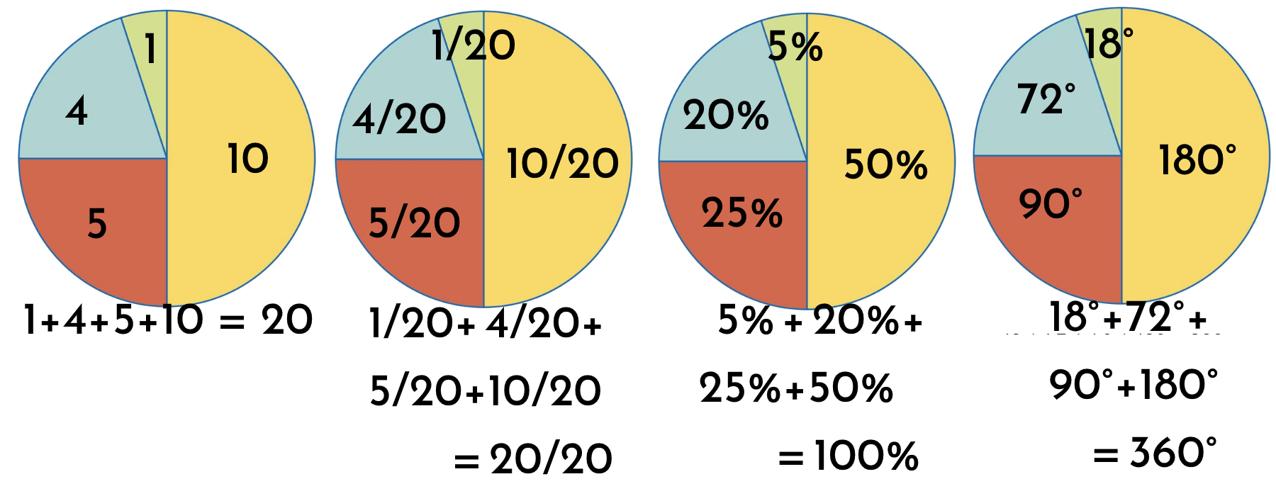
Tallies ⇔ Fractions ⇔ Percentages ⇔ Angles
Date:
Time Remaining:
The equation to calculate angle:
angle = 360°*(number/total)
angle = 360°*(fraction)
angle = 360°*(percentage/100)
Time Goal: 15min
Date:
Time Remaining:
Exercises
Work through TeeJay 2b Exercise 10.5 Q1-3 . Draw in the circle cutouts (they have marks every 10°) to speed up the process.
Only AFTER you’ve completed an exercise, you can check to see what it should look like, by typing the numbers into the DESMOS worksheet.
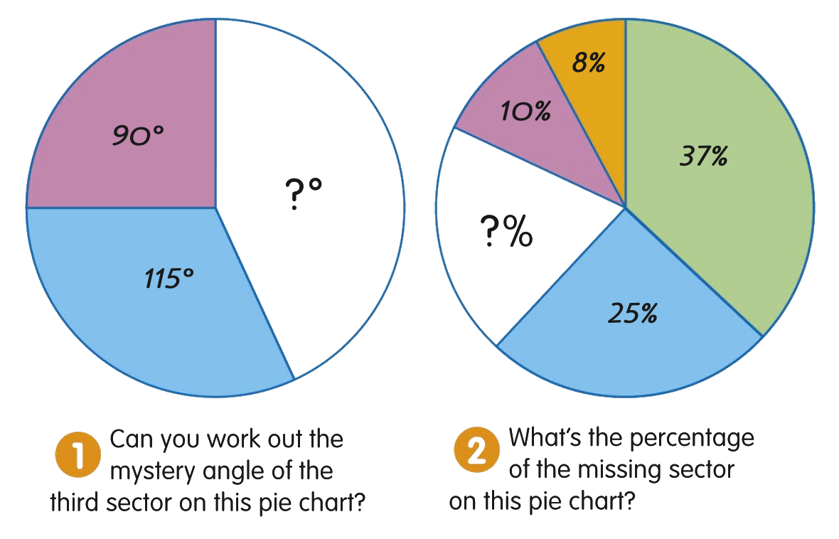
Once we are good at making Pie Charts, we can also fill in the gaps to answer questions about Pie Charts.
Work through the two questions on the page below, thenTeeJay 2b Exercise 10.6 Q1–5
Feedback
If it doesn't work, scroll to the pages below for troubleshooting and alternatives
Settings Troubleshooting
There might be some issues with using Mentimeter on iPads.
You will need to 'enable cookies'.
Go to iPad settings, scroll down to 'Safari', and under the 'Privacy & Security' settings disable "Prevent Cross-Site Tracking" and disable "Block all Cookies."
If you are blocked from editing iPad settings, you'll need to show your parents this Slide and ask for permission to change the settings, so that you can use it interactively for class.

Click to Show Settings Screenshot
Feedback Bakcup (input code: 68 81 51) :
Feedback: Class Results
Hidden link to the poll dashboard (need to be logged-in as me to view/edit):
https://www.mentimeter.com/s/4ee455c137bd939842ebe1ef1c1a7ee2/b38ec70a0b9e/edit
Statistics Pie Charts
By Jay Teach
Statistics Pie Charts
·# Introduction ·The first ever pie chart was invented in 1805 by William Playfair, a Scotsman born near Dundee. ·He also lead a successful 1793 plot to bankrupt the French Government and cause their civil war (by counterfeiting their currency). ·https://link.springer.com/content/pdf/10.1007/s00180-009-0170-z.pdf · ·# What’s the point? ·Different charts aim to tell different stories. ·Pie charts are useful to compare different numbers as a *ratio* of the whole. They use *angle* and *area* (not *length*, and not so much *numbers* or *position*). · ·# How to Read A Pie Chart? ·Pie charts can either be labeled with a “Key” (a.k.a. a “Legend”), or directly on the diagram · ·# Real Life Example 1: World Population (2017) ·This area map of world population stretches land size to tell us the size of the country's population ·https://ourworldindata.org/uploads/2018/09/Population-cartogram_World-2.png · ·The same information presented in a pie chart gives a much clearer *comparison* of the numbers, although it makes the individual values harder to read. ·https://en.wikipedia.org/wiki/World_population#/media/File:World_population_percentage.png · ·# Real Life Example 2: CO₂ Emissions (2016) ·Be careful! Avoid thinking “pretty = informative”. This graph is artistic, but it doesn’t tell a clear story. · ·# Pie chart showing the top CO₂ Emitting Countries of 2016 ·Instead, using a pie ch


