Advanced CSS
Content
- Replaced Element
- Formating Context
- Collapsing margins
- Shrink to fix
Replaced element
The only replaced elements are those that embed external content, such as an image, video, applet, or HTML5 canvas into an HTML document.
- <img>
- <video>
- <audio>
- <textarea>
- <input>
- <select>
Flow
-
Normal flow
-
Block formatting contexts
-
Inline formatting contexts
-
Relative positioning
-
-
Floating a box
-
Absolute positioning
Formating Context
- BFC
- IFC
- FFC
FFC
display值为flex或者inline-flex的元素将会生成自适应容器(flex container)
IFC
A block container box that contains no block-level boxes.
- IFC中的line box一般左右都贴紧整个IFC
- IFC中时不可能有块级元素的,当插入块级元素时(如p中插入div)会产生两个匿名块与div分隔开,即产生两个IFC,每个IFC对外表现为块级元素,与div垂直排列。
BFC
Block Formatting Contexts就是页面上的一个隔离的渲染区域
float的值不为none。
overflow的值不为visible。
absolutely positioned elements ( absolute or fixed)
display的值为table-cell, table-caption, inline-block。
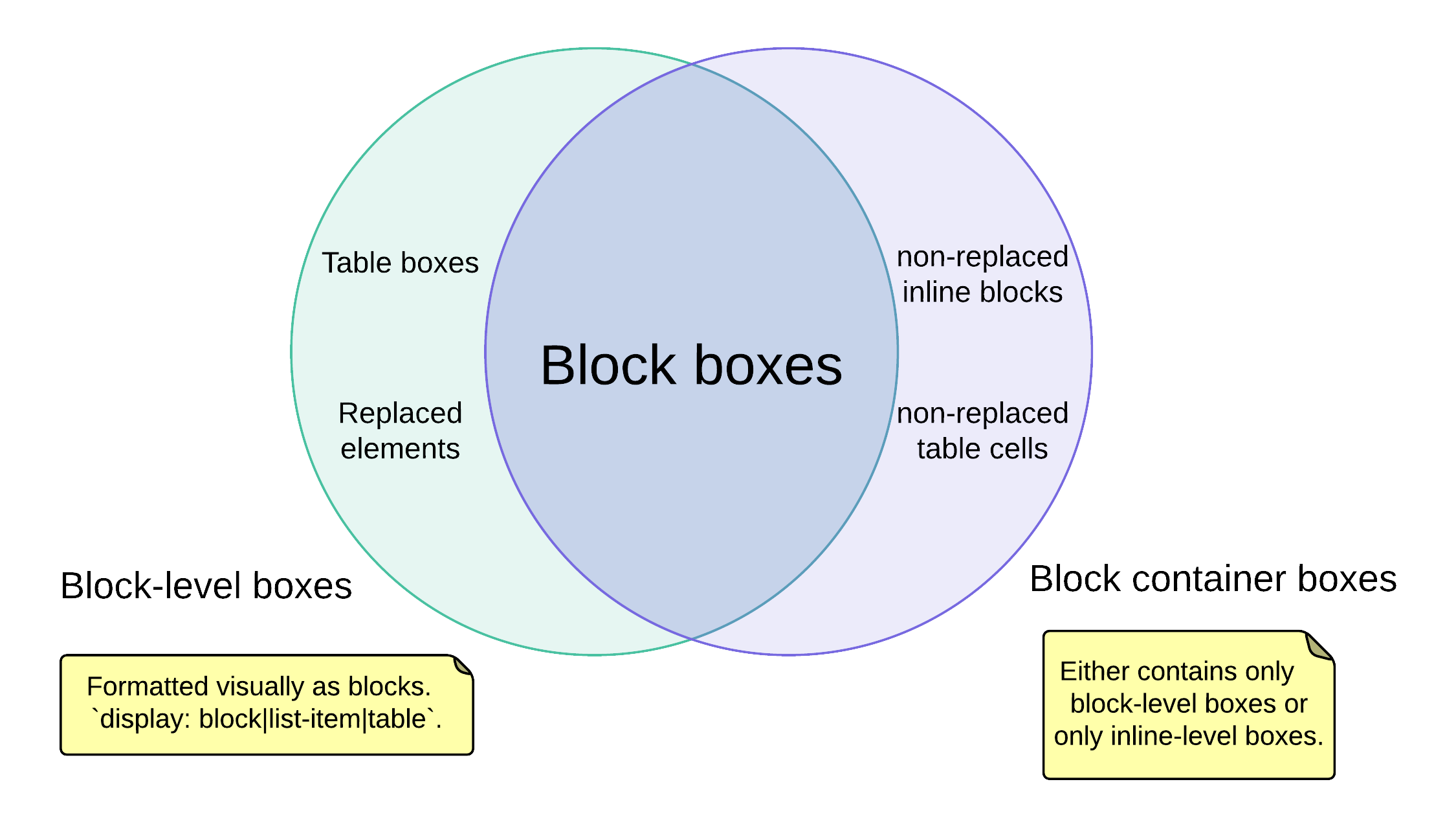
Boxes
- Block level box
- Block container box
- Block box
Collapsing margins
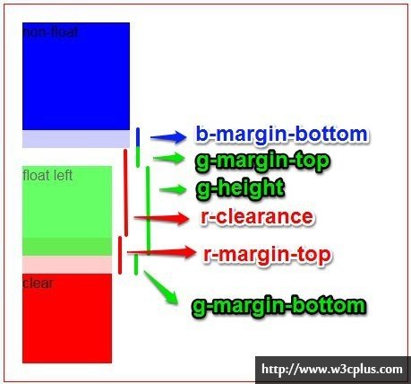
The adjoining margins of two or more boxes can combine to form a single margin. Margins that combine this way are said to collapse.
-
折叠的结果:

两个相邻的外边距都是正数时,折叠结果是它们两者之间较大的值。
两个相邻的外边距都是负数时,折叠结果是两者绝对值的较大值。
两个外边距一正一负时,折叠结果是两者的相加的和。
产生折叠的必备条件:margin必须是邻接的!
Adjoining vertical margins collapse, except:
- Margins of the root element's box do not collapse.
- If the top and bottom margins of an element with clearance are adjoining, its margins collapse with the adjoining margins of following siblings but that resulting margin does not collapse with the bottom margin of the parent block.
- If the top margin of a box with non-zero computed 'min-height' and 'auto' computed 'height' collapses with the bottom margin of its last in-flow child, then the child's bottom margin does not collapse with the parent's bottom margin.
Two margins are adjoining if and only if:
- 必须是处于常规文档流(非float和绝对定位)的块级盒子,并且处于同一个BFC当中。
- 没有line-box,没有空隙(clearance),没有padding和border将他们分隔开
- 都属于垂直方向上相邻的margin,可以是下面任意一种情况
-
元素的margin-top与其第一个常规文档流的子元素的margin-top
-
元素的margin-bottom与其下一个常规文档流的兄弟元素的margin-top
-
height为auto的元素的margin-bottom与其最后一个常规文档流的子元素的margin-bottom
-
高度为0并且最小高度也为0,不包含常规文档流的子元素,并且自身没有建立新的BFC的元素的margin-top和margin-bottom
-
The above rules imply that:
-
创建了新的BFC的元素(例如浮动元素或者'overflow'值为'visible'以外的元素)与它的子元素的外边距不会折叠
- 浮动元素不与任何元素的外边距产生折叠(包括其父元素和子元素)
- 绝对定位元素不与任何元素的外边距产生折叠
- inline-block元素不与任何元素的外边距产生折叠
-
一个常规文档流元素的margin-top 与其第一个常规文档流的子元素的margin-top产生折叠,条件为父元素不包含 padding 和 border ,子元素不包含 clearance。
闭合浮动的元素的border-top会紧贴着相应的浮动元素的margin-bottom。
Shrink to fix
自适应宽度是指当未明确设定容器的宽度(或margin设为auto)时,在特定的情况下容器的宽度会根据情况自行设定,而设定的结果往往并不是我们想要的。
几种Shrink-to-fix的情况
Example
对于浮动或者特殊的定位方式,推荐显式的设置容器宽度,避免出现意想不到的结果
min(max(preferred minimum width, available width), preferred width)
Shrink-to-fix width
- 将内容中非明确的换行外的其他部分强制不换行来计算 preferred width;
- 尝试将内容尽可能的换行,以得到 preferred minimum width;
- available width 即该元素的包含块的宽度减去 'margin-left','border-left-width','padding-left','padding-right','border-right-width','margin-right' 的值以及任何存在的纵向滚动条的宽度。
如何理解CSS规范
Advanced-css
By jingliu
Advanced-css
understand CSS standards, and solve CSS tricky issues