Techniques for
mobile and responsive
cross-browser testing
Jordan Lewis
Front End Developer at Envato
Goals and Challenges
The ultimate goal is to deliver a consistent experience
to users on a variety of devices and browsers
What to test for?
Does the site look ok?
Are there any bugs?
Does the user interaction feel good?
Is the site optimised for mobile?
How can I test my
mobile/responsive website?
Synchronised Testing
Web-based services
Browser Developer Tools
Remote Debugging
Viewport Resizers
Automated Screenshots
Simulators & Emulators
Open Device Labs
Which devices and browsers
should I test?
Analytics
Research
Survey results
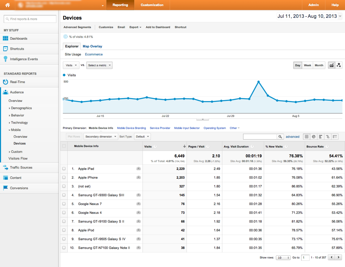
www.google.com/analytics
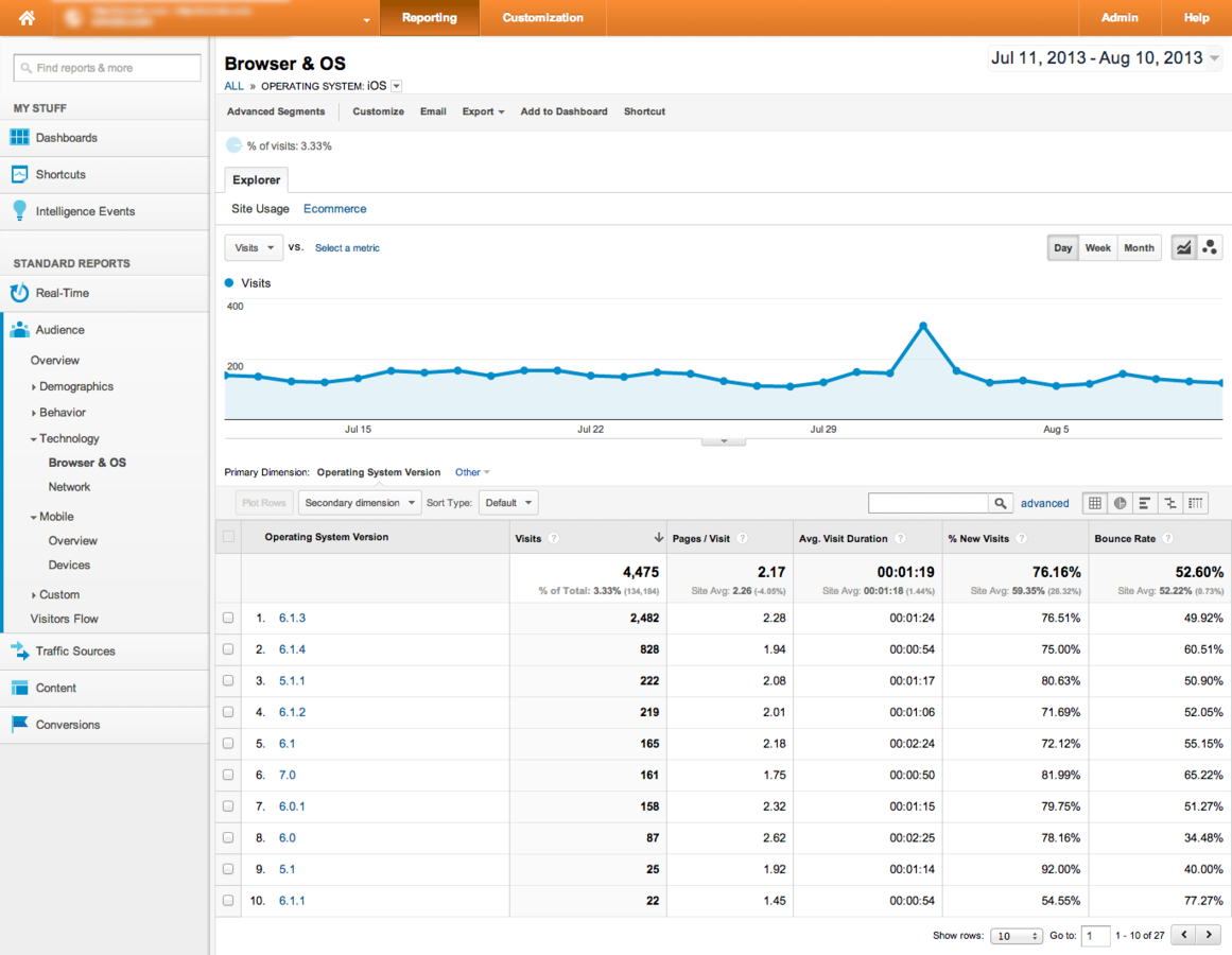
www.google.com/analytics
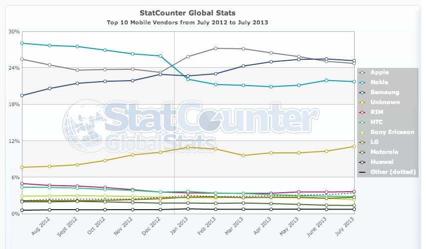
http://gs.statcounter.com
Synchronised Testing
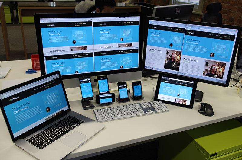
Synchronised testing is an efficient way to automatically perform the same action across a variety of browsers and devices simultaneously.
Ghostlab

“synchronizes scrolls, clicks, reloads and form input across all connected clients.”
vanamco.com/ghostlab
Adobe Edge Inspect CC

“Wirelessly pair multiple iOS and Android devices to your computer. With Edge Inspect, you browse in Chrome, and all connected devices will stay in sync.”
html.adobe.com/edge/inspect
Web-based Services
Web-based services offer the ability to test
your site across a massive collection of
mobile OS and browser combinations.
BrowserStack

“Live, Web-Based Browser Testing.
Instant access to all desktop and mobile browsers.”
browserstack.com
CrossBrowserTesting.com

“Cross browser test your website in dozens of browsers with instant results”
crossbrowsertesting.com
Browser Developer Tools
Emulate mobile devices
Override device settings
Set viewport
Google Chrome
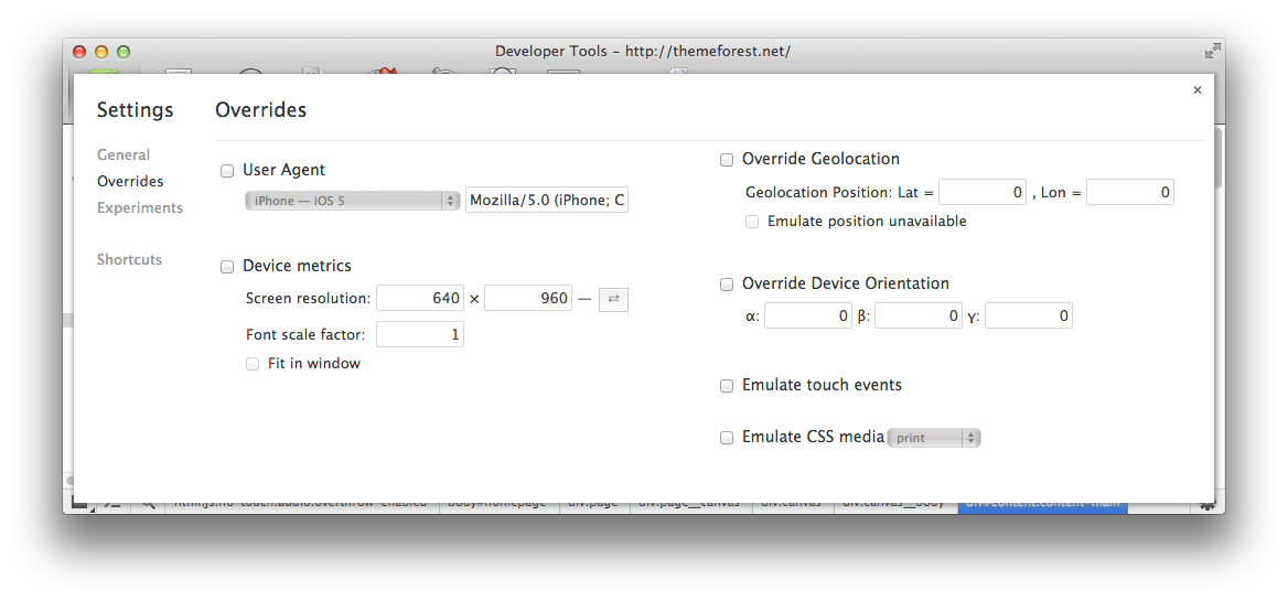
- On the keyboard, press ctrl-shift-I on Windows or Linux, or cmd-option-I on Macintosh.
- Click on the Settings cog  and open up the Overrides panel
Firefox
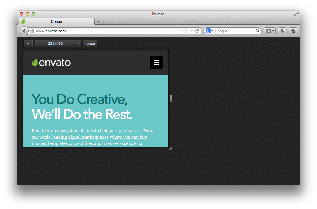
- On the Tools menu, choose Web Developer, and then Responsive Design View.
- On the keyboard, press ctrl-shift-M on Windows or Linux, or cmd-option-M on Macintosh.
Internet Explorer 11
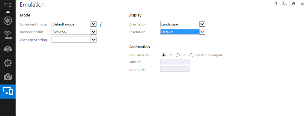
- F12 tools are available on any page you are viewing from within Internet Explorer 11.
- Press F12 then ctrl+8
Remote Debugging
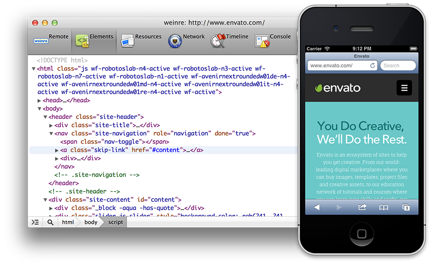
How on earth do I inspect my
HTML, CSS and Javascript?
Ghostlab
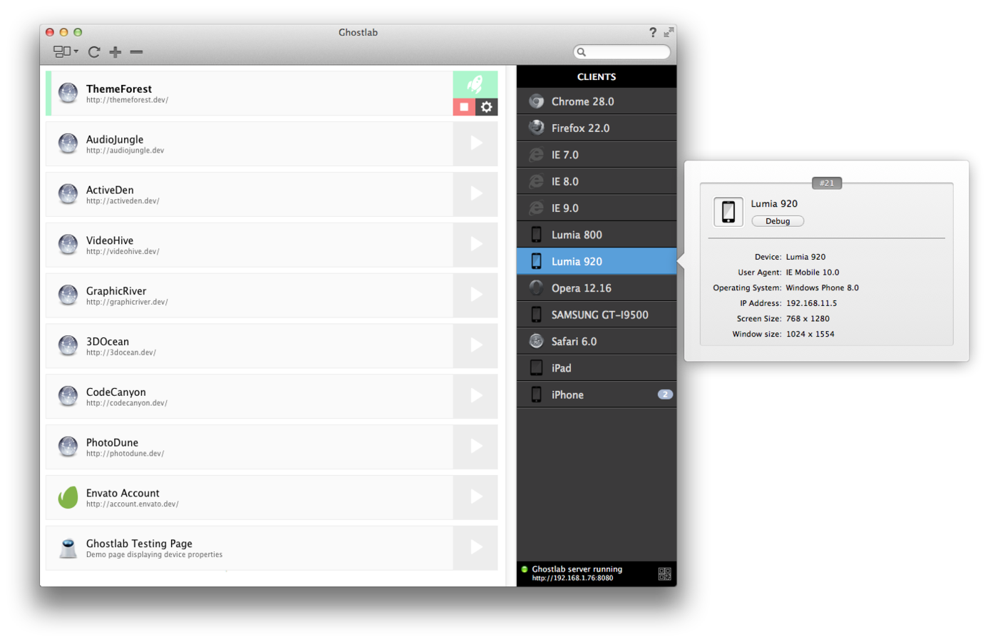
Vendor Tools
Viewport Resizers
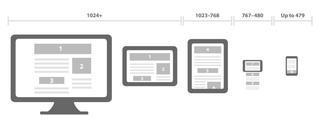
Source: www.eacsoft.com
Stop resizing that browser!
Bookmarklets
Interactive resizers
Side-by-side comparison
Automated Screenshots
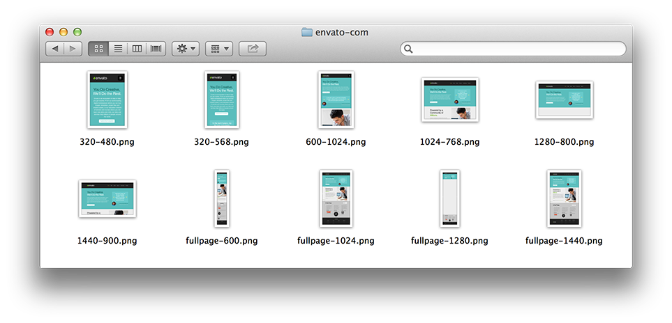
BrowserStack Screenshots
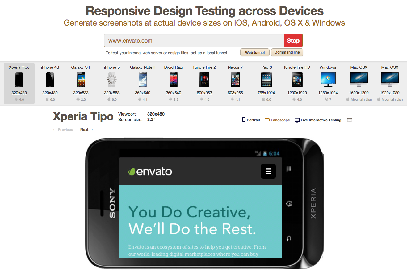 browserstack.com/screenshots
BrowserStack Responsive
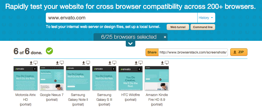
browserstack.com/responsive
Casper & PhantomJS

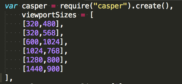
Responsive Screenshots With Casper (tutsplus.com)
Wraith

github.com/bbc-news/wraith
Simulators & Emulators

Whats the difference?
Device Emulators
Desktop application
Emulates mobile device hardware
Emulates mobile device OS
Operating System Emulators
Don’t represent any real device hardware
Respresents OS as a whole
Simulators
Desktop application
Less complex
Simulates some of the behavior of a device
Does not emulate hardware
Does not work on real OS
mobilexweb.com/emulators
Mobile Emulators & Simulators: The Ultimate Guide (By Maximiliano Firtman)
Open Device Labs

Source: coverupaccessories.com
Open Device Labs (ODLs) are a non-profit community driven collection of devices that are open to developers to visit so that they can physically test their work on a broader range of devices.
67 ODLs
22 countries
1073 devices
 opendevicelab.com
Conclusion
Many ways to test a responsive/mobile website
All depends on what you want to test
Don't necessarily need physical devices
Plenty of free resources
Ghostlab is amazing!!
More detail:
Techniques for mobile and responsive cross-browser testing: An Envato case study.
Thank you!
30% off Ghostlab
Questions?
Techniques for mobile and responsive cross-browser testing
By Jordan Lewis
Techniques for mobile and responsive cross-browser testing
- 4,568


