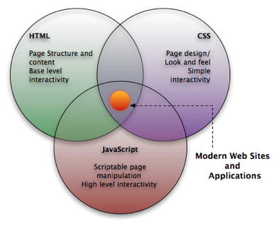
HTML, CSS & JS (jQuery)
The three techniques for creating websites!

Study Material
-
Interactive
- Freecodecamp.org (aanrader!!!, huiswerk)
- Codecademy (aanrader maar kost geld)
- https://www.khanacademy.org/computing/computer-programming/html-css
- https://www.khanacademy.org/computing/computer-programming/html-js-jquery
- Video course
- Tutorial / examples https://www.w3schools.com/html
-
Reference material
- https://www.w3schools.com/tags/default.asp
- MDN (aanrader om eens te bekijken ook veel uitleg)!!
- Online book
Choose what works for you!
Blackboard
- Studiehandleiding
- opdrachten (huiswerk) -> aftekenen in Werkcollege
- uitleg
- Proeftentamen
- Slides
- Video's
Core Web Technologies (Browser)
Demo, code is in slide below!
Demo Code
<!DOCTYPE html>
<html lang="en">

<head>
    <meta charset="UTF-8">
    <meta name="viewport" content="width=device-width, initial-scale=1.0">
    <title>Document</title>

    <style>
        h1 {
            background-color: blue;
            color: hotpink;
        }
    </style>
    <script src="jquery-3.5.1.js"></script>
    <script>
        $(document).ready(function () {
            $("h1").click(function () {
                $(this).hide();
            });
        });
    </script>
</head>

<body>
    <h1>Lorem, ipsum dolor.</h1>

    <p>Lorem ipsum, dolor sit amet consectetur adipisicing elit. Repudiandae, enim.</p>

</body>

</html>
Learn by doing: exercises (freecodecamp.org, w3schools), assignments, internetingishard (follow along)
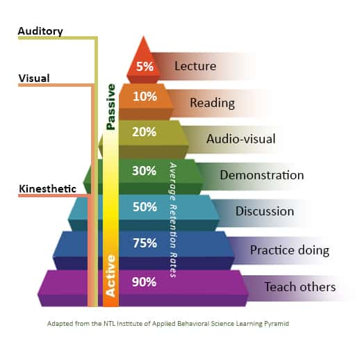
% is retention rate after 24 hours
How to learn
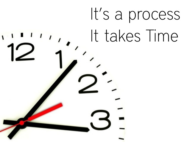
How to learn
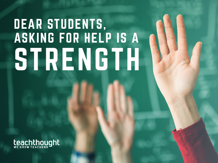
Stuck, ask for help!!!!
- Mdm (google) of W3Schools
- fellow students
- teacher (ondersteuningsuren)
How to learn
Relax
- it can be overwhelming
- make a selection


Week 1 - HTML =
Structure/Content
-
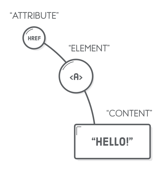
HyperText Markup Language
- HyperText = link to another page or part of page
- Consist of tags (elements)
- Tags can have attributes
- Structure/content of a webpage

<!DOCTYPE html>
<html>
<head>
<title>Page Title</title>
</head>
<body>
<h1>This is a Heading</h1>
<p>This is a paragraph.</p>
<img src="cat.png"/>
</body>
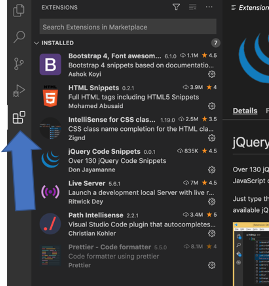
</html>IDE = Text editor for programmers
Install Extension for VSC
- Some useful extensions:
HTML Example
<!DOCTYPE html>
<html lang="en">
<head>
    <meta charset="UTF-8">
    <meta name="viewport" content="width=device-width, initial-scale=1.0">
    <meta http-equiv="X-UA-Compatible" content="ie=edge">
    <title>Example</title>
</head>
<body>
    <h1>Hello World!</h1>
</body>
</html>
Tip: In Visual Studio Code: Press !, then tab
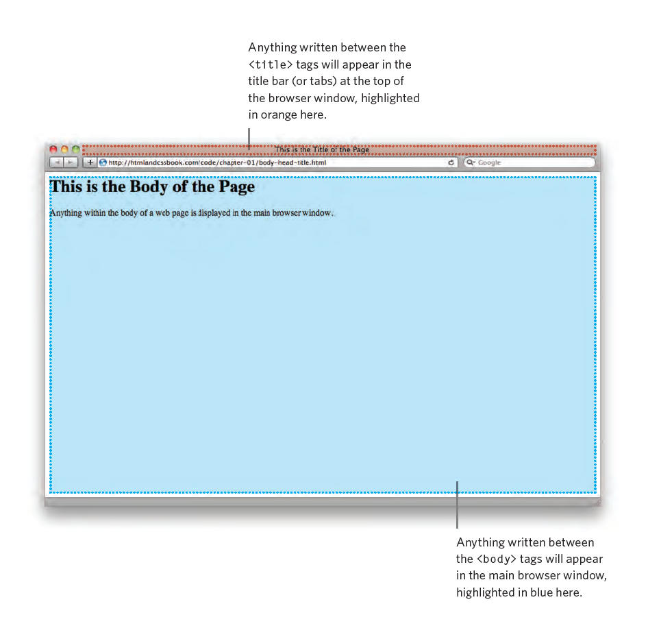
- Metadata: between the head tags
- title,
- CSS stylesheets
- and other things that are required to render the page
- Content: between the body tags
- visible content
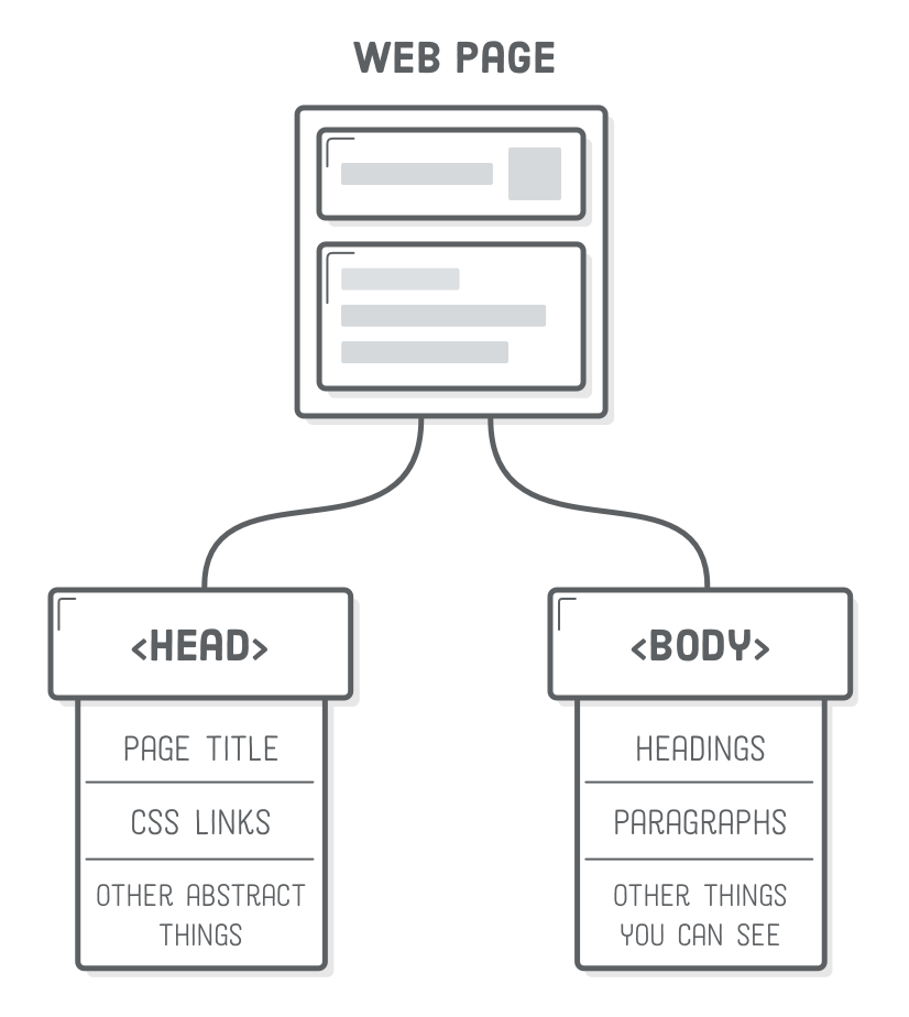
Structure of Webpage
Head Tag
- Information about the page (not shown on main browser window)
- Displayed in the main window of the browser
<!DOCTYPE html>
<html>
    <head>
        <title>Page Title</title>
    </head>
<body>
    <h1>This is a Heading</h1>
    <p>This is a paragraph.</p>
</body>
</html>
Tag, Element & Attribute Syntax
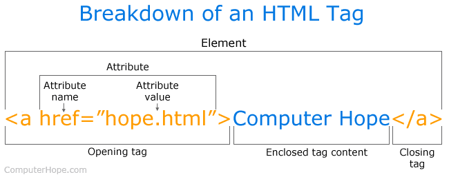
Attribute Syntax
- Multiple attributes
- Multiple values per attribute
- separated by a space
    <p>Lorem, ipsum dolor.
        <img src="images/nhlstenden.png" alt="Logo of NHLStenden">
    </p>
<p class="rood scheef">Lorem, ipsum dolor.</p>
<p class="groen">Adipisci, aliquam soluta.</p>
<style>
.rood {
color: red;
}
.scheef {
font-style: italic;
}
.groen {
color: green;
}
</style>Nesting
- Nesting of child (content)
    <p>Lorem, ipsum dolor.
        <a href="www.nhlstenden.com">
            <img src="images/nhlstenden.png" alt="Logo of NHLStenden">
        </a>
    </p>
Common HTML Tags
Inspired by book press terminology.
Categories:
- Text & formatting
- Links
- Img
- Table
- Lists
- Form (send data to server)
- Grouping (div, span)
Text markup
Increases readability - findability (SEO)
- Structural markup
- Headers
- Paragraphs
- Line Break
- Horizontal Rule
- Semantic markup
bold,italic, (sup) superscript, (sub) subscript, strong, (em) emphasis, quote, blockquote, (abr) abbreviations, cite, dfn (definition), address, ins (inserted), del (delete), s (incorrect)
- Special characters (character entities)

Text Markup Code Example
    <h1>Heading 1</h1>
    <h2>Heading 2</h2>
    <h3>Heading 3</h3>
    <h4>Heading 4</h4>
    <h5>Heading 5</h5>
    <h6>Heading 6</h6>

    <p>Lorem    ipsum dolor <strong>sit</strong> <em>amet consectetur</em>
        <blockquote>adipisicing</blockquote> elit. Laborum ea, dignissimos
        quod E=MC
        <sup>2</sup>, C
        <sub>1</sub>
        animi <span style="color:red;"> nobis magnam!</span> Temporibus <address> officia, harum corrupti assumenda laboriosam
        </address>ab numquam <br/>asperiores, eius <del>consectetur</del>
        <ins>nobis. At, vitae.</ins>
    </p>
    <hr/>
Links
- Link to other document or tag of the same page!
- Url is specified in the href attribute
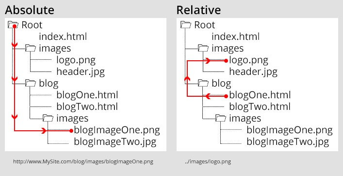
- Absolute vs Relative Url
<a href="url">link text</a>

<!-- Absolute URL -->
<a href="https://support.google.com/?hl=en">Google Help</a>


<!-- Relative URL's -->
<a href="contact.html">Contact</a>


<!-- Image as Link -->
<a href="index.html">
  <img src="logo.png" alt="MyCompany Logo" style="width:42px;height:42px;border:0;">
</a>

<!-- Bookmarks (link to a section (id) on the same page) -->
<a href="#kite">Kiten</a>
<a href="#programming">Programming</a>

<div id="kite">...</div>
<div id="programming">...</div>

<!-- mail address link -->
<a href="mailto:mies@aapnoot.com">Mies</a>

<!-- Open in new window/tab -->
<a href="https://support.google.com/?hl=en" target="_blank">Google Help</a>
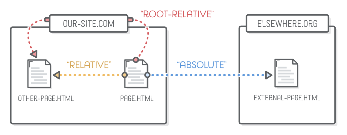
Absolute & Relative URL's
URL's
To refer to those files from inside of another file, the Internet uses “uniform resource locators” (URLs).
- Relative (used most of the time)
- Absolute (to external website)
- Root-Relative
Absolute Link (url)

<li>Absolute links, like to
    <a href='https://developer.mozilla.org/en-US/docs/Web/HTML'>Mozilla
    Developer Network</a>, which is a very good resource for web
    developers.</li>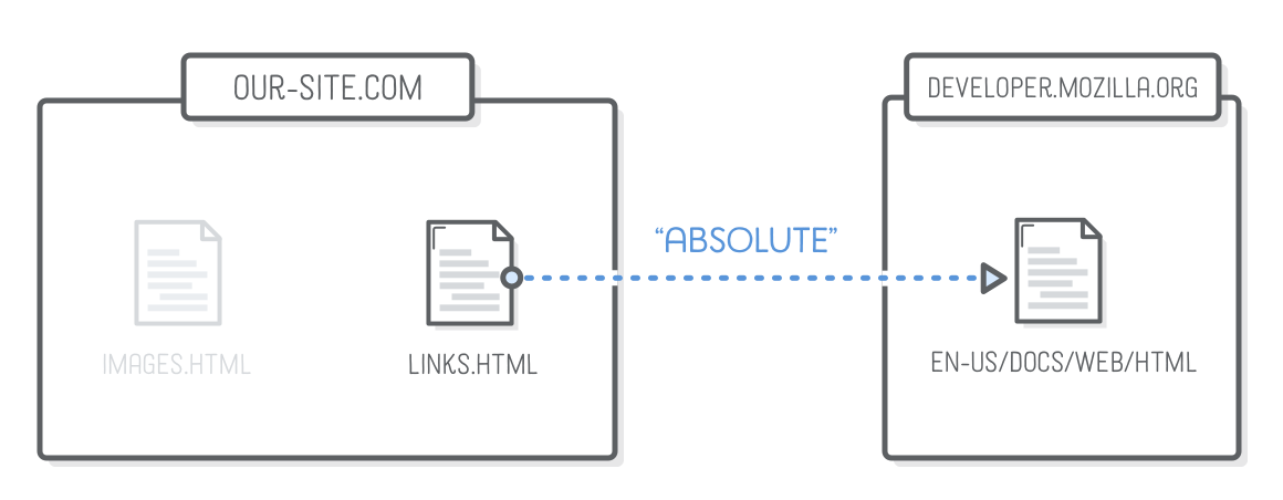
Only use for directing users to a different website
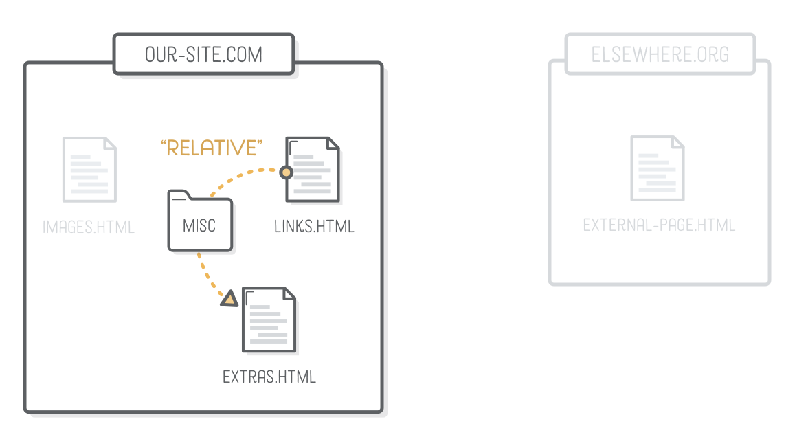
Relative URL
<li>Relative links, like to our <a href='misc/extras.html'>extras
page</a>.</li>- path to a file
- images.html
-
Each folder and file in a path is separated by a forward slash (/)
- called a child folder
-
misc/extras.html
!Do not use spaces or tabs inside folder names!
Relative URL - Parent Folder
<p>This page is about miscellaneous
  HTML things, but you may also be
   interested in <a href='../links.html'>links</a>
  or <a href='../images.html'>images</a>.</p>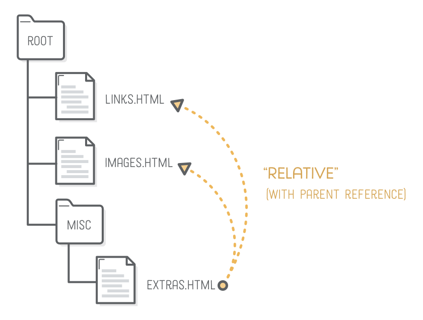
-
Two consecutive dots in a file path represent a pointer to the parent director
- ../links.html
- ../images.html
- ../../elsewehere.html
- Is this possible?
- ../images/hello.png
<!-- Same folder -->
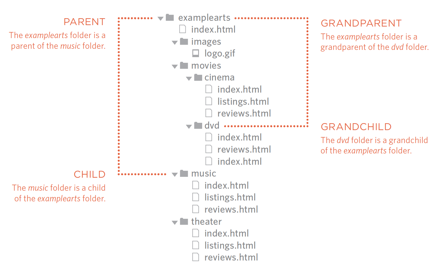
<a href="reviews.html">Reviews</a>
<!-- Child folder -->
<a href="music/lisitings.html">Listings.html</a>
<!-- Child/Child folder (grandchild folder) -->
<a href="movies/dvd/reviews.html">Reviews</a>
<!-- Parent fodler -->
<a href="../index.html">Home</a>
<!-- Parent/Parent folder (granparent folder) -->
<a href="../../index.html">Home</a>
<!-- Root folder -->
<a href="/index.html">Home</a>Relative URL's - Recap
Images
<img src="img_girl.jpg">

<!-- The alt attribute provides an alternate text for an image,
if the user for some reason cannot view it
(because of slow connection, an error in the src attribute,
or if the user uses a screen reader). -->
<img src="img_girl.jpg" alt="Girl in a jacket">

<!-- Image Size -->
<img src="img_girl.jpg" alt="Girl in a jacket" style="width:500px;height:600px;">

<!-- To use an image as a link -->
<a href="index.html">
  <img src="logo.png" alt="My Company Logo">
</a>-
scr attribute of img tag is an URL
- specifies the location of the image
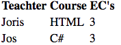
Tables
<table>
  <tr>
    <th>Teacher</th>
    <th>Course</th>
    <th>EC's</th>
  </tr>
  <tr>
    <td>Joris</td>
    <td>HTML</td>
    <td>3</td>
  </tr>
  <tr>
    <td>Jos</td>
    <td>C#</td>
    <td>3</td>
  </tr>
</table>
- Table tags
- Table is row orientated <tr>
- Header <th>
- Table (cell) data <td>
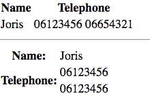
Tables - Merge cells
<table>
    <tr>
        <th>Name</th>
        <th colspan="2">Telephone</th>
    </tr>
    <tr>
        <td>Joris</td>
        <td>06123456</td>
        <td>06654321</td>
    </tr>
</table>
<hr/>
<table>
    <tr>
        <th>Name:</th>
        <td>Joris</td>
    </tr>
    <tr>
        <th rowspan="2">Telephone:</th>
        <td>06123456</td>
    </tr>
    <tr>
        <td>06123456</td>
    </tr>
</table>- Merge column cells
- colspan attribute
- Merge rows cells
- rowspan attribute
Lists
- Ordered List (numbers)
- <ol>
- <li>
- <ol>
- Unordered List (bullets)
- <ul>
- listitem: <li>
- <ul>
- Definition List
- <dl>
- <dt>term
- <dd>explanation
- <dl>
- Nested Lists
<!-- Ordered List -->
<ol>
    <li>Chop potatoes into quarters</li>
    <li>Simmer in salted water for 15-20
minutes until tender</li>
</ol>
<!-- Unordered List -->
<ul>
<li>1kg King Edward potatoes</li>
<li>100ml milk</li>
</ul><!-- Definition List -->
<dl>
<dt>Sashimi</dt>
<dd>Sliced raw fish that is served with
condiments such as shredded daikon radish or
ginger root, wasabi and soy sauce</dd>
<dt>Scale</dt>
<dd>A device used to accurately measure the
weight of ingredients</dd>
</dl><!-- Nested Lists (li nested in ul) -->
<ul>
<li>Mousses</li>
<li>Pastries
<ul>
<li>Croissant</li>
<li>Mille-feuille</li>
<li>Palmier</li>
<li>Profiterole</li>
</ul>
</li>
<li>Tarts</li>
</ul>Forms
- Send information from client to server
- server can process input from user
- Replacement of traditional form
- tax-form, multiple-choice test, survey, etc.
- Search-form, buttons
Forms - Example
- send information from client to server
- to test this use: formspree.io
- action attribute is a url to a "page" that processes the form
-
method attribute is the HTTP Verb
- Get is the default HTTP Verb
- Use POST for one-time actions
- Use GET for information retrieval (for example search-form, can be bookmarked)
-
name attribute is important
- must be unique in form
- must be unique in form
<form action="https://formspree.io/your@email.com"
      method="POST">
    <input type="text" name="name">
    <input type="email" name="_replyto">
    <input type="submit" value="Send">
</form>
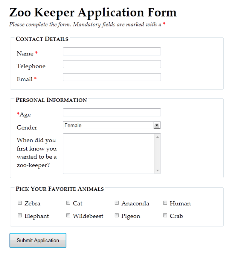
Forms
Check W3Schools for all input elements and attributes
- Useful exercise:
- Try to recreate the form on the right
-
Validation (input types + required)
- check input for correctness.
<input type="date">- required
-
Group form elements (fieldset)
Div & Span Tag - Structure Document
- The <div> tag defines a division or a section in an HTML document. (grouping of tags)
- Next week it will become clear how they are used
<div style="background-color:lightblue">
  <h3>This is a heading in a div element</h3>
  <p>This is some text in a div element.</p>
</div>-
The <span> tag is used to group inline-elements in a document.
-
used to target a piece of text
-
css or add behaviour (JavaScript/JQuery)
-
-
<p>My mother has <span style="color:blue">blue</span> eyes.</p>Div
- The <div> tag defines a division or a section in an HTML document.
- For styling & layout
<!DOCTYPE html>
<html lang="en">

<head>
    <meta charset="utf-8" />
    <meta name="viewport" content="width=device-width, initial-scale=1.0" />
    <title>Cafe Menu</title>
    <link href="coffeepageDivs.css" rel="stylesheet" />
</head>

<body>
    <div class="menu">
        <div id="header">
            <h1>CAMPER CAFE</h1>
            <p class="established">Est. 2020</p>
        </div>
        <hr>
        <div id="main">
            <div class="section">
                <h2>Coffee</h2>
                <img src="https://cdn.freecodecamp.org/curriculum/css-cafe/coffee.jpg" alt="coffee icon" />
                <div class="item">
                    <p class="flavor">French Vanilla</p>
                    <p class="price">3.00</p>
                </div>
                <div class="item">
                    <p class="flavor">Caramel Macchiato</p>
                    <p class="price">3.75</p>
                </div>
                <div class="item">
                    <p class="flavor">Pumpkin Spice</p>
                    <p class="price">3.50</p>
                </div>
                <div class="item">
                    <p class="flavor">Hazelnut</p>
                    <p class="price">4.00</p>
                </div>
                <div class="item">
                    <p class="flavor">Mocha</p>
                    <p class="price">4.50</p>
                </div>
            </div>
            <div>
                <h2>Desserts</h2>
                <img src="https://cdn.freecodecamp.org/curriculum/css-cafe/pie.jpg" alt="pie icon" />
                <div class="item">
                    <p class="dessert">Donut</p>
                    <p class="price">1.50</p>
                </div>
                <div class="item">
                    <p class="dessert">Cherry Pie</p>
                    <p class="price">2.75</p>
                </div>
                <div class="item">
                    <p class="dessert">Cheesecake</p>
                    <p class="price">3.00</p>
                </div>
                <div class="item">
                    <p class="dessert">Cinnamon Roll</p>
                    <p class="price">2.50</p>
                </div>
            </div>
        </div>
        <hr class="bottom-line">
        <div id="footer">
            <p>
                <a href="https://www.freecodecamp.org" target="_blank">Visit our website</a>
            </p>
            <p class="address">123 Free Code Camp Drive</p>
        </div>
    </div>
</body>

</html>
Semantic Elements
<!DOCTYPE html>
<html lang="en">

<head>
    <meta charset="utf-8" />
    <meta name="viewport" content="width=device-width, initial-scale=1.0" />
    <title>Cafe Menu</title>
    <link href="coffeepage.css" rel="stylesheet" />
</head>

<body>
    <div class="menu">
        <header>
            <h1>CAMPER CAFE</h1>
            <p class="established">Est. 2020</p>
        </header>
        <hr>
        <main>
            <section>
                <h2>Coffee</h2>
                <img src="https://cdn.freecodecamp.org/curriculum/css-cafe/coffee.jpg" alt="coffee icon" />
                <article class="item">
                    <p class="flavor">French Vanilla</p>
                    <p class="price">3.00</p>
                </article>
                <article class="item">
                    <p class="flavor">Caramel Macchiato</p>
                    <p class="price">3.75</p>
                </article>
                <article class="item">
                    <p class="flavor">Pumpkin Spice</p>
                    <p class="price">3.50</p>
                </article>
                <article class="item">
                    <p class="flavor">Hazelnut</p>
                    <p class="price">4.00</p>
                </article>
                <article class="item">
                    <p class="flavor">Mocha</p>
                    <p class="price">4.50</p>
                </article>
            </section>
            <section>
                <h2>Desserts</h2>
                <img src="https://cdn.freecodecamp.org/curriculum/css-cafe/pie.jpg" alt="pie icon" />
                <article class="item">
                    <p class="dessert">Donut</p>
                    <p class="price">1.50</p>
                </article>
                <article class="item">
                    <p class="dessert">Cherry Pie</p>
                    <p class="price">2.75</p>
                </article>
                <article class="item">
                    <p class="dessert">Cheesecake</p>
                    <p class="price">3.00</p>
                </article>
                <article class="item">
                    <p class="dessert">Cinnamon Roll</p>
                    <p class="price">2.50</p>
                </article>
            </section>
        </main>
        <hr class="bottom-line">
        <footer>
            <p>
                <a href="https://www.freecodecamp.org" target="_blank">Visit our website</a>
            </p>
            <p class="address">123 Free Code Camp Drive</p>
        </footer>
    </div>
</body>

</html>
<div class="header">
same as
<header>
Semantic = Meaning
Freecodecamp example
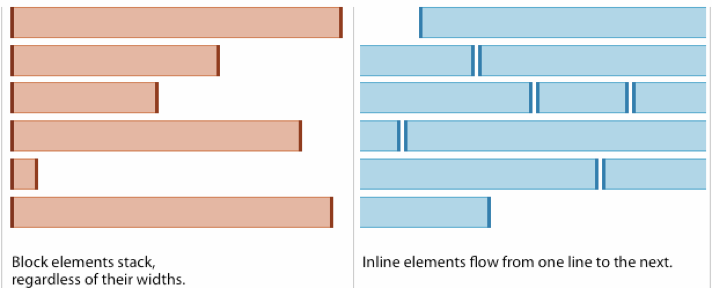
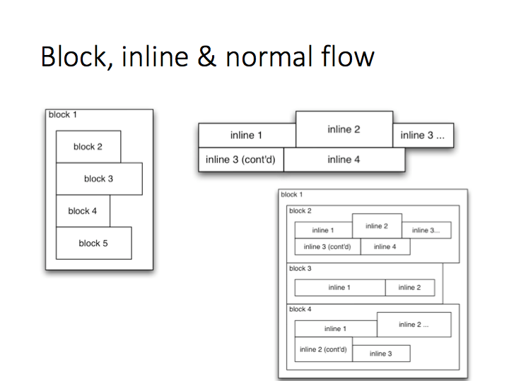
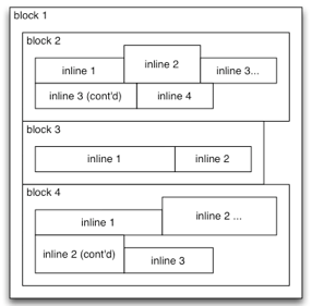
Inline vs Block Elements
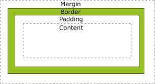
Box Model
Chrome Development Tools
Debug web pages -- Right mouse click on the page --> Inspect
You can prototype in the browser!
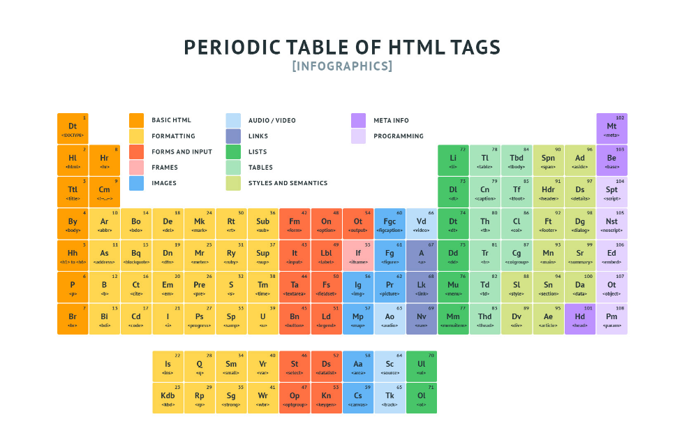
HTML Tags
werkcollege
Succes met de opdrachten.
Graag per week aftekenen in werkcollege!
Mocht je hulp nodig hebben:
Week 2 - CSS = Layout / Style
- Cascade Style Sheet
- CSS is a language that describes the style of a HTML document.
- CSS describes with rules how elements (tags) should appear.
- Selector select element(s)
<!DOCTYPE html>
<html>
    <head>
        <style>
        body {
            background-color: lightblue;
        }

        h1 {
            color: white;
            text-align: center;
        }

        p {
            font-family: verdana;
            font-size: 20px;
        }
        </style>
    </head>
<body>
    <h1>My First CSS Example</h1>
    <p>This is a paragraph.</p>
</body>
</html>
Week 2 - CSS Subjects
- Cascade Style Sheet Introduction *
- CSS Rule Syntax *
- Selectors (really important) *
- CSS Locations *
- Inheritance *
- Color *
- Font (text)
- Units of length *
- Demo table styling
- Box Model *
- Week 3
- Layout Modes: Normal flow (block level & inline elements)*, floats *, positioning*, flexbox*
-
Demo how to build a website with Flexbox - Cascade, Specificity, Dev Tools
* = Blackboard Video
CSS Introduction
- To disable all css run in the development console (chrome devtools)
document.querySelectorAll('style,link[rel="stylesheet"]').forEach(item => item.remove())CSS Introduction
- CSS = Difficult/Tricky
- same look and feel across browsers & screen sizes
- We will later use a library that makes life easier!
- Bootstrap By Twitter
- Material Design By Google
- Many others
How to (try) to learn
- freecodecamp.org
- CSS Diner
- W3schools (lot of tutorials, exercise, examples, template & reference)
- Practice (exercise / assignment)
- MDN CSS
- https://www.internetingishard.com/html-and-css/
- Be realistic (know when to stop, accept it's not perfect)
- website design is an art
- Google a lot
- I can't remember all the css properties
- Get inspired
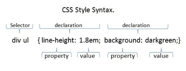
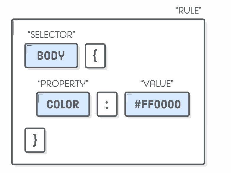
CSS - Rule Syntax
<html lang="en">
<head>
    <style type="text/css">
        h1 { color: red; }
        h2 { color: green; }
        h1, h2 {
            background-color: lightgray;
            text-decoration: underline;
        }
    </style>
</head>
<body>
    <h1>Heading 1</h1>
    <h2>Heading 2</h2>
    <p>Lorem ipsum dolor</p>
</body>
</html>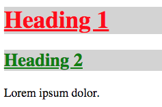
Example
CSS rules locations
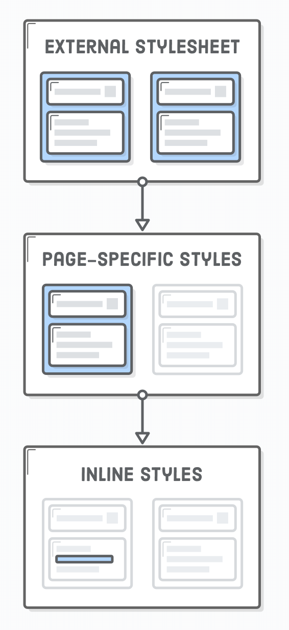
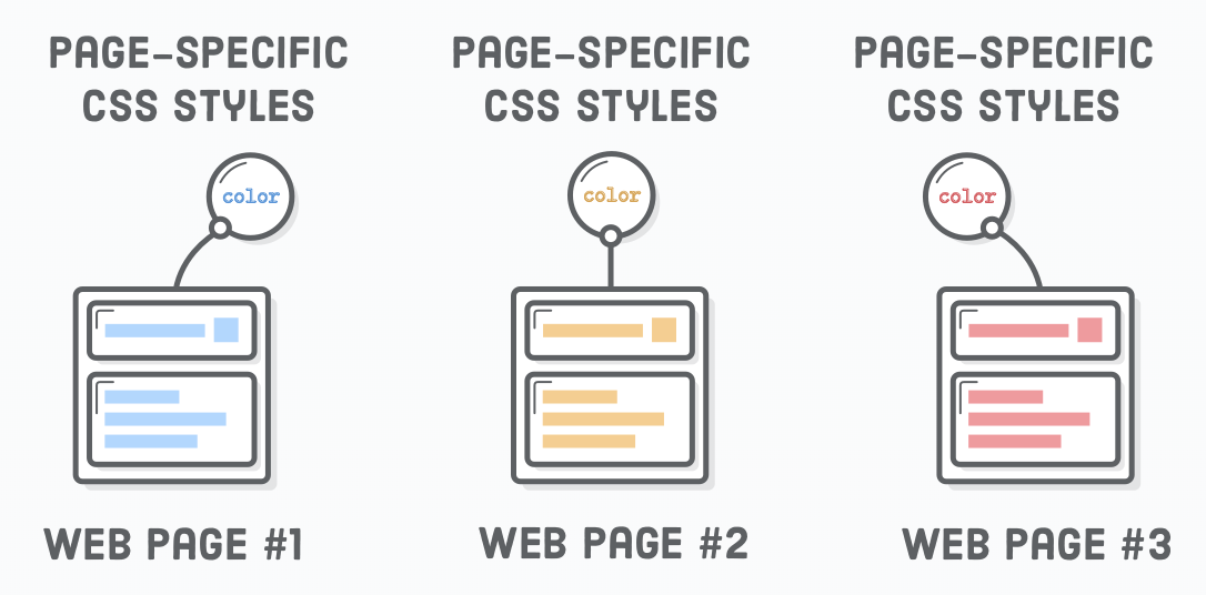
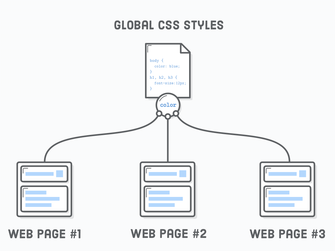
- Preferred (high to low)
-
External file(s)
- maintainability across multiple pages
- Style element
- for one page
- Inline
- for one element
- don't use inline styling, I use this for examples, not in real applications!
-
External file(s)
<!DOCTYPE html>
<html lang="en">
<head>
    <title>CSS rule locations</title>

  	<!-- External (global) stylesheet) -->
    <link href="CSSLocations.css" type="text/css" rel="stylesheet" />

    <!-- page specific -->
    <style type="text/css">
        h2 { background-color: green; }
    </style>
</head>
<body>
    <!-- element specific -->
    <h1 style="background-color: red;">Inline</h1>
    <h2>Style Tag</h2>
    <h3>External Stylesheet</h3>>
</body>
</html>
/* CSSLocations.css */
h3 { background-color: blue; }
CSS rules locations
CSS rules locations
<!DOCTYPE html>
<html lang="en">
<head>
    <title>CSS rule locations</title>

  	<!-- External (global) stylesheet) -->
    <link href="CSSLocations.css" type="text/css" rel="stylesheet" />

    <!-- page specific -->
    <style type="text/css">
        h2 { background-color: green; }
    </style>
</head>
<body>
    <!-- element specific -->
    <h1 style="background-color: red;">Inline</h1>
    <h2>Style Tag</h2>
    <h3>External Stylesheet</h3>>
</body>
</html>
CSS - Selectors
- Not only used for CSS styles, also by other tools/techniques (Emmet & jQuery, testing frameworks (E2E = Selemium, etc), etc)
- Read
- Reference
- Game to learn selectors

Important CSS-Selectors
CSS - Selectors
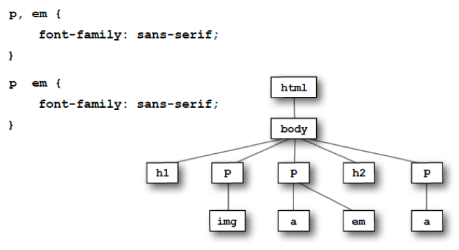
An HTML Document is actually a Tree (inverted), in which we can select nodes with CSS - Selectors
CSS - Inheritance
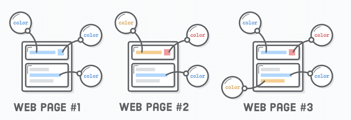
Inheritance causes the element to take the computed value of the property from its parent (ancestors) element.
- Color is an example of inheritance
- Not all properties inherit, for example: border
<!DOCTYPE html>
<html lang="en">

<head>
    <meta charset="UTF-8">
    <meta name="viewport" content="width=device-width, initial-scale=1.0">
    <title>Inheritance</title>
    <style>
        .first {
            /* color is inherited */
            color: red;

            border: 1px solid red;
        }

        .second {
            color: green;
        }
    </style>
</head>

<body>
    <ul class="first">
        <li>Lorem.</li>
        <li>Nulla.</li>
        <li>Lorem:
            <ol class="second">
                <li>Lorem, ipsum.</li>
                <li>Lorem:
                    <ul>
                        <li>Lorem, ipsum dolor.</li>
                        <li>Sequi, rem cupiditate?</li>
                        <li>Earum, officiis dolorum.</li>
                    </ul>
                </li>
            </ol>
        </li>
    </ul>
</body>

</html>
CSS - Colors
<!-- 140 Colors names in HTML -->

<!-- Background-color -->
<h1 style="background-color:DodgerBlue;">Hello World</h1>
<p style="background-color:Tomato;">Lorem ipsum...</p>

<!-- text-color -->
<h1 style="color:Tomato;">Hello World</h1>
<p style="color:DodgerBlue;">Lorem ipsum...</p>
<p style="color:MediumSeaGreen;">Ut wisi enim...</p>

<!-- border-color -->
<h1 style="border:2px solid Tomato;">Hello World</h1>
<h1 style="border:2px solid DodgerBlue;">Hello World</h1>
<h1 style="border:2px solid Violet;">Hello World</h1>

<!-- colors with rgb, hex & hsl codes -->
<h1 style="background-color:rgb(255, 99, 71);">...</h1>
<h1 style="background-color:#ff6347;">...</h1>
<h1 style="background-color:hsl(9, 100%, 64%);">...</h1>

<!-- transparancy (a after rgb, hsl) -->
<h1 style="background-color:rgba(255, 99, 71, 0.5);">...</h1>
<h1 style="background-color:hsla(9, 100%, 64%, 0.5);">...</h1>Text
<!-- Font color -->
<h1>Color</h1>
<p style="color: red">Lorem ipsum dolor</p>
<!-- Backgroun -->
<h1>Background Color</h1>
<p style="background-color: red">Lorem ipsum dolor</p>

<h1>Text-align (how the text is aligned in the box)</h1>
<p style="text-align:left">Lorem ipsum dolor</p>
<p style="text-align:right">Lorem ipsum dolor</p>
<p style="text-align:center">Lorem ipsum dolor</p>
<p style="text-align:justify">Lorem ipsum dolor sit amet consectetur adipisicing elit. Nobis suscipit minus aperiam delectus
    laboriosam ullam vero aut magni architecto, ipsa dolore impedit, commodi quidem vitae in dignissimos sit, quas aspernatur?</p>
<hr/>

<!-- Text decaration -->
<h1>Text decoration</h1>
<p>Lorem, <a style="text-decoration: none;" href="ipsumdolor.html">ipsum dolor</a></p>
<p style="text-decoration: overline;">Lorem, ipsum dolor.</p>
<p style="text-decoration: underline;">Lorem, ipsum dolor.</p>
<p style="text-decoration: line-through;">Lorem, ipsum dolor.</p>
<hr/>

<!-- Text transformation -->
<h1>Text transformation</h1>
<p style="text-transform: uppercase;">Lorem, ipsum dolor.</p>
<p style="text-transform: lowercase;">Voluptas, nulla itaque?</p>
<p style="text-transform: capitalize;">Enim, eveniet ducimus!</p>
<hr/>

<h1>Letter spacing</h1>
<p style="letter-spacing: 6px;">Lorem, ipsum dolor.</p>
<p style="letter-spacing: -2px;">Voluptas, nulla itaque?</p>
<hr/>

<!-- Text Indentation -->
<h1>Text Indentation</h1>
<p style="text-indent: 50px;">Lorem ipsum dolor sit amet consectetur adipisicing elit. Recusandae quae animi, provident suscipit
    quos, distinctio pariatur, eum error commodi illum perspiciatis architecto magni? Explicabo sunt repellendus odio nulla
    doloribus quasi mollitia optio at cumque sed, distinctio natus quia quidem suscipit corrupti aut obcaecati fuga facilis
    placeat quod magnam laboriosam quis.</p>
<hr/>

<h1 style="text-shadow: 3px 3px red;">Text Shadow</h1>

<h1>Line Height</h1>
<p style="line-height: 0.8;">Lorem ipsum dolor sit amet consectetur adipisicing elit. Recusandae quae animi, provident suscipit
    quos, distinctio pariatur, eum error commodi illum perspiciatis architecto magni? Explicabo sunt repellendus odio nulla
    doloribus quasi mollitia optio at cumque sed, distinctio natus quia quidem suscipit corrupti aut obcaecati fuga facilis
    placeat quod magnam laboriosam quis.</p>
<p style="line-height: 1.2;">Lorem ipsum dolor sit amet consectetur adipisicing elit. Recusandae quae animi, provident suscipit
    quos, distinctio pariatur, eum error commodi illum perspiciatis architecto magni? Explicabo sunt repellendus odio nulla
    doloribus quasi mollitia optio at cumque sed, distinctio natus quia quidem suscipit corrupti aut obcaecati fuga facilis
    placeat quod magnam laboriosam quis.</p>
<hr/>
Fonts
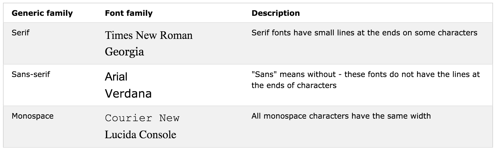
<h1>Font Family</h1>
<p style="font-family:'Courier New', Courier, monospace">The font-family property should hold several font names as a "fallback"
    system. If the browser does not support the first font, it tries the next font, and so on. Start with the font you want,
    and end with a generic family, to let the browser pick a similar font in the generic family, if no other fonts are available.</p>
<hr/>

<h1>Font Style</h1>
<p style="font-style: normal;">Lorem ipsum dolor sit.</p>
<p style="font-style: italic;">Fugiat fugit facilis similique!</p>
<p style="font-style: oblique;">Exercitationem sint voluptas ipsam!</p>
<hr/>

<h1>Font Size - Default is 16px</h1>
<p style="font-size: 25px;">Lorem ipsum dolor sit.</p>
<p style="font-style: 2.5em;">40px/16=2.5em - To allow users to resize the text (in the browser menu), many developers use
    em instead of pixels. The em size unit is recommended by the W3C. 1em is equal to the current font size. The default
    text size in browsers is 16px. So, the default size of 1em is 16px.</p>
<p style="font-style: 10vw;">Resize the browser window to see how the font size scales. Viewport is the browser window size.
    1vw = 1% of viewport width. If the viewport is 50cm wide, 1vw is 0.5cm.</p>
<hr/>

<h1>Font Variant</h1>
<p style="font-variant: normal">Lorem ipsum dolor sit.</p>
<p style="font-variant: small-caps">Lorem ipsum dolor sit.</p>
<hr/>
Units of Length
<!DOCTYPE html>
<html lang="en">

<head>
    <meta charset="UTF-8">
    <meta name="viewport" content="width=device-width, initial-scale=1.0">
    <meta http-equiv="X-UA-Compatible" content="ie=edge">
    <title>Units Of Length</title>
    <style type="text/css">
        .container {
            background-color: red;
            width: 300px;
        }

        .box {
            background-color: green;
            border: 1px solid red;
            width: 50%;
            height: 50px;
        }
    </style>
</head>

<body>
    <div class="container">
        <div class="box"></div>
    </div>
</body>

</html>- Absolute:
- px (pixels), cm, mm, in, pt, pc
- Relative:
-
em, ex, ch, rem, vw, vh, vmin, vmax, %
- 1 em = 16px
-
em, ex, ch, rem, vw, vh, vmin, vmax, %
Table Styling: demo
Psuedo-Selectors: nth-child, :hover
CSS - Display Boxes in browser
document.querySelectorAll("*").forEach((el) => el.style.border = "1px solid black")
CSS - Boxes (Block/Inline)
<!DOCTYPE html>
<html lang='en'>
<head>
<meta charset='UTF-8' />
<title>Boxes Are Easy!</title>
<style type="text/css">
h1,
p {
background-color: #DDE0E3;
/* Light gray */
}
em,
strong {
background-color: #B2D6FF;
}
</style>
</head>
<body>
<h1>Headings Are Block Elements</h1>
<p>Paragraphs are blocks, too. <em>However</em>, <em> and <strong> elements are not. They are <strong>inline</strong>
elements.</p>
<p>Block elements define the flow of the HTML document, while inline elements do not.</p>
</body>
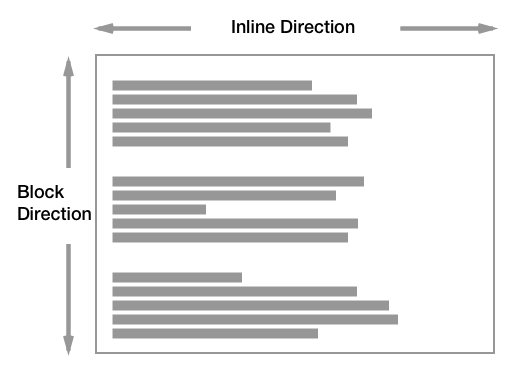
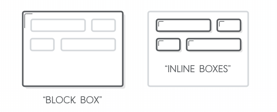
</html>- Block (vertical spaced):
- new line
- fill width
- height determined by the content
- Inline (horizontal spaced)
- width determined by the content
Display Property

- <div>
- <h1> - <h6>
- <p>
- <form>
- <header>
- <footer>
- <section>
- <span>
- <a>
- <img>
Display Property
- display property: changes elements to block or inline element or hide the elements
    <style>
        p {
            display: inline;
        }

        p:last-child {
            display: block;
        }

        p:first-child {
            display: none;
            /* hide element(s) */
        }

        span {
            display: inline;
        }

        #blockspan {
            display: block;
        }
    </style>
<div>
<p>Lorem Ipsum</p>
<p>Distinctio, deleniti.</p>
<p>Aliquid, nobis.</p>
<p>Quaerat, nemo.</p>
<p>Reiciendis, placeat!</p>
</div>
<p>
<span>Item 1</span>
<span>Item 2</span>
<span>Item 3</span>
<span id="blockspan">Item 4</span>
<span>Item 5</span>
</p>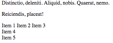
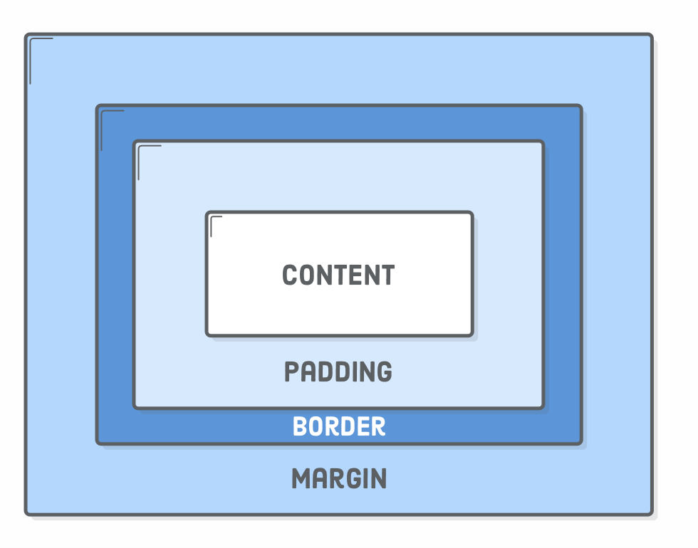
Box Styling
- Content The text, image, or other media content in the element.
- Padding The space between the box’s content and its border.
- Border The line between the box’s padding and margin.
- Margin The space between the box and surrounding boxes.
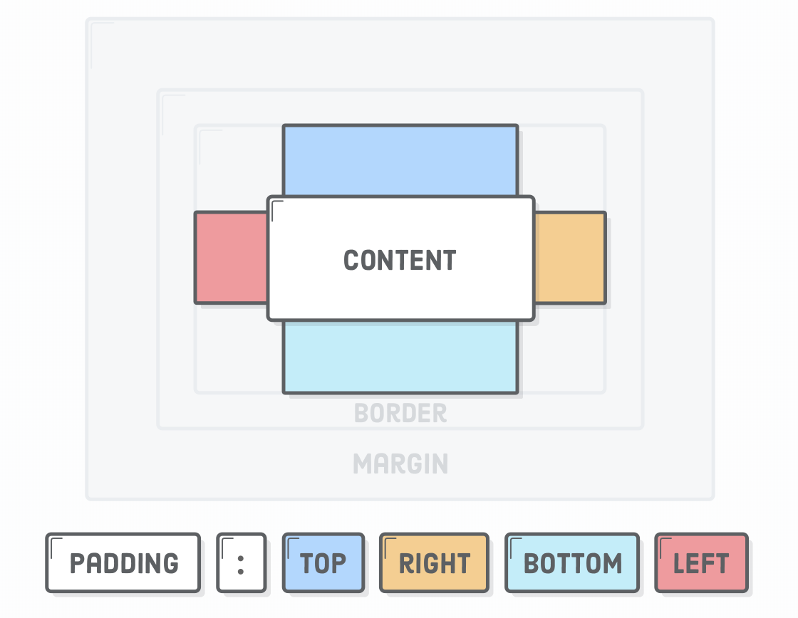
Box Styling - Padding
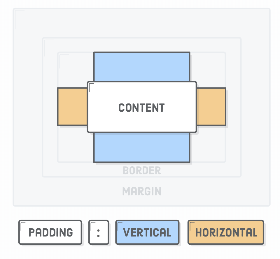
<!DOCTYPE html>
<html lang="en">

<head>
    <meta charset="UTF-8">
    <meta name="viewport" content="width=device-width, initial-scale=1.0">
    <meta http-equiv="X-UA-Compatible" content="ie=edge">
    <title>Document</title>
    <style type="text/css">
        h1 {
            background-color: black;
            color: white;
            padding: 200px;
        }

        p:first-child {
            background-color: lightgrey;
            padding-top: 20px;
            padding-bottom: 20px;
            padding-left: 10px;
            padding-right: 10px;
        }

        p:nth-child(2) {
            background-color: lightblue;
            padding: 20px 10px;
            /* Vertical  Horizontal */
        }

        p:nth-child(3) {
            background-color: lightpink;
            padding: 20px 0 20px 10px;
            /* Top  Right  Bottom  Left */
        }

        p:nth-child(4) {
            background-color: beige;
            padding: 20px 0 20px 10px;
        }
    </style>
</head>

<body>
    <h1>Padding Example</h1>

    <p>Lorem ipsum dolor sit amet consectetur adipisicing elit. Et vitae architecto quod velit natus molestiae inventore
        exercitationem amet atque nisi veritatis error repudiandae, quos, quisquam, reprehenderit incidunt consequuntur ratione!
        Laboriosam?
    </p>
    <p>Incidunt sed a illo veritatis quaerat dolore modi sequi quidem. Error inventore nam fuga distinctio officiis ducimus
        facilis, quasi a, consectetur porro exercitationem aperiam cum natus, laudantium sunt asperiores suscipit!</p>
    <p>Error et eos molestias ullam animi voluptas accusantium ad cumque ducimus natus hic, possimus earum maxime magnam
        corrupti tenetur reiciendis alias temporibus dicta odio eveniet deserunt nisi! Recusandae, pariatur autem.</p>
    <p>Ea perferendis saepe eaque ut alias minus laboriosam, aliquam veritatis quisquam, rem libero fuga quasi harum. Ullam,
        dolorem officiis! Tempora pariatur quia, dignissimos earum commodi obcaecati tenetur molestiae nihil distinctio!</p>
    <p>Architecto quae in quisquam aut distinctio, rerum minus rem porro quasi molestias voluptate similique veritatis minima
        provident nam non autem vel ratione aliquid commodi, saepe laborum! Unde dicta voluptatum porro?</p>

</body>

</html>
Box Styling - Border
h1 {
  padding: 50px;
  border: 1px solid #5D6063;
}

h2 {
    border-bottom: 1px solid #5D6063;
    border-top: 3px dashed red;
    /* -top, -bottom, -left, and -right */
}

Box Styling - Margin
Margins define the space outside of an element’s border
- invisible, not-clickable, no-background, collapse vertically
- margin 20px auto: center boxes in the middle of the parent.
- note: inline elements ignore top and bottom margin!
<!DOCTYPE html>
<html lang="en">

<head>
    <meta charset="UTF-8">
    <meta name="viewport" content="width=device-width, initial-scale=1.0">
    <meta http-equiv="X-UA-Compatible" content="ie=edge">
    <title>Document</title>
    <style type="text/css">
        h1 {
            background-color: aquamarine;
            margin: 50px;
        }

        p {
            background-color: lightcoral;
            margin-left: 25px;
            margin-right: 100px;
            margin-top: 25px;
            /* is this displayed? */
        }

        span {
            background-color: lemonchiffon;
            margin: 200px;
            /* left and right margin are ignored on inline elements */
        }

        .center {
            margin-left: auto;
            margin-right: auto;
            /* margin: 20px auto; */
            width: 300px;
        }
    </style>
</head>

<body>
    <h1>Lorem ipsum dolor sit amet <span>consectetur adipisicing</span> elit. Aperiam, accusamus!</h1>

    <p>Lorem ipsum dolor sit amet consectetur adipisicing elit. Magnam, eligendi?</p>


    <p class="center">Lorem ipsum dolor sit amet consectetur adipisicing elit. Magnam, eligendi?</p>
</body>

</html>
Box Styling - dimensions
- by default: width and height specify the size (dimensions) of the content (content-box), this is annoying.
- solution: * { box-sizing: border-box; }

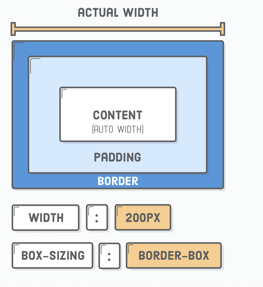
<!DOCTYPE html>
<html>
<head>
<style>
.div1 {
width: 300px;
height: 100px;
padding: 50px;
border: 1px solid blue;
}
.div2 {
width: 300px;
height: 100px;
padding: 50px;
border: 1px solid red;
box-sizing: border-box;
}
</style>
</head>
<body>
<div class="div1">This div is bigger (width is 300px and height is 100px).</div>
<br>
<div class="div2">This div is smaller (width is also 300px and height is 100px).</div>
</body>
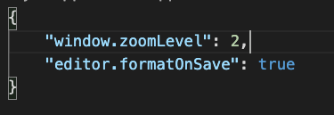
</html>Formatting & HTML Validation
In VSCode
ctrl + shift + p
Add
"editor.formatOnSave": true
Week 3 - CSS - Layout
- CSS has multiple layout techniques
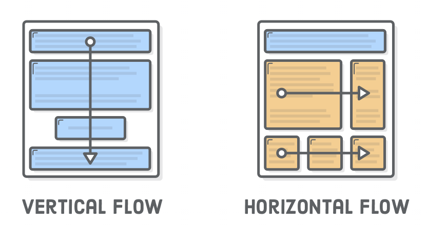
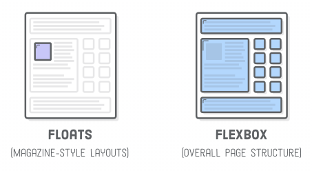
Week 3 - Layout Techniques
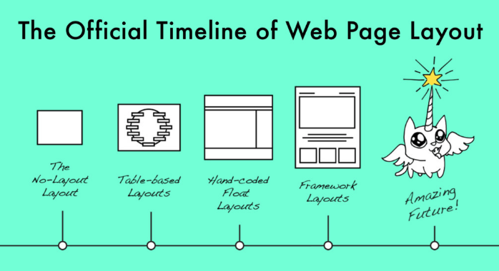
A little less of this:
Layout techniques
- normal flow (vertical flow)
- floats (horizontal flow)
- positioning
- flexbox
- grid (not discussed)
- column (not discussed)
Positioning:
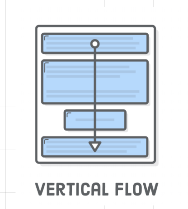
Normal Flow (Vertical)
- Normal flow (vertical flow)
- See previous sheets
- Block level elements
- Inline level elements
Change with display property:
- display: block;
- display: inline;
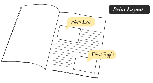
Floats
https://developer.mozilla.org/en-US/docs/Learn/CSS/CSS_layout/Floats
Positioning
Flexbox
-
Flexbox
- sizes well on most screens (responsive?)
- used by bootstrap
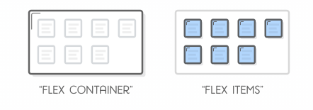
Flexbox
- Flex Container
- Flex Items
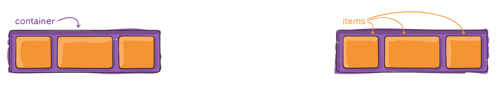
Be aware: properties are flex container properties or flex item properties!
Flexbox - Tools
- Development Tools
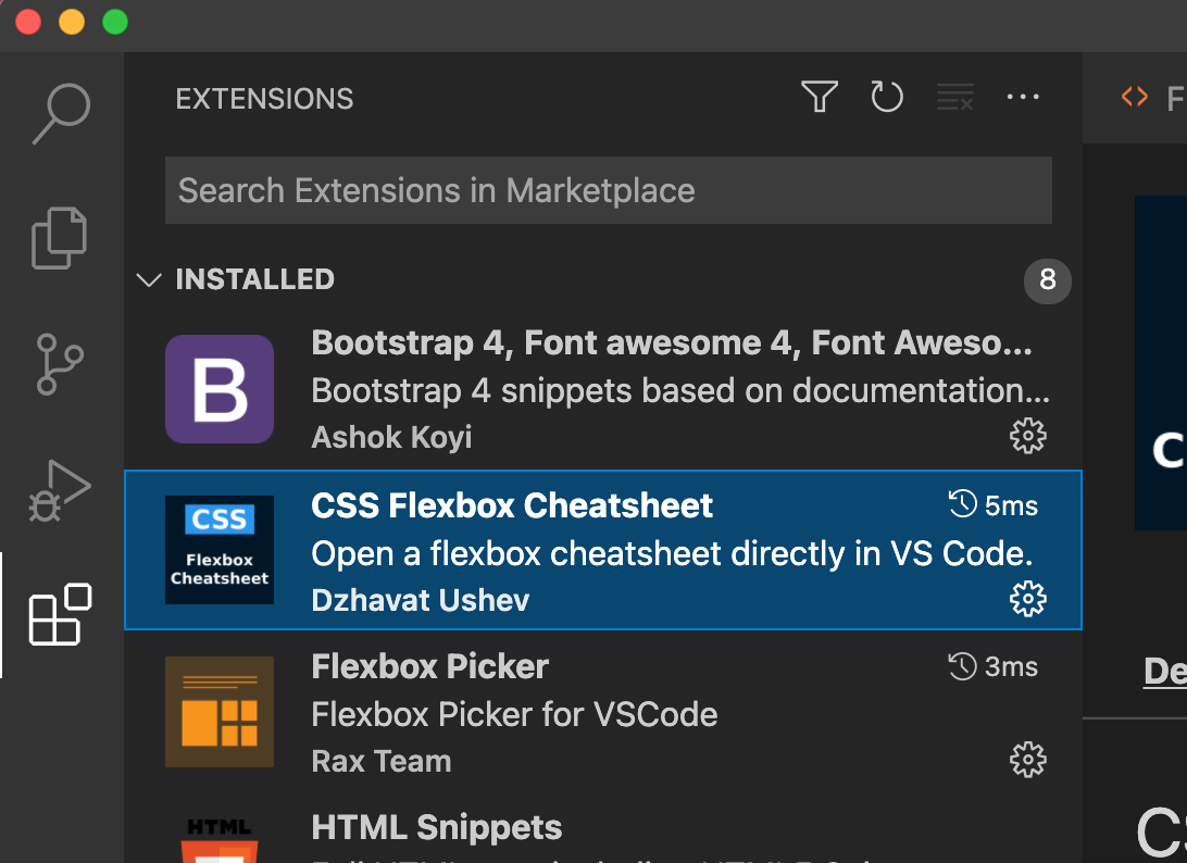
Flexbox - Visual Studio Code
- Two extensions:
- CSS Flexbox Cheatsheet
- Flexbox Picker
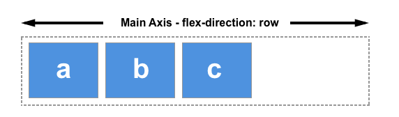
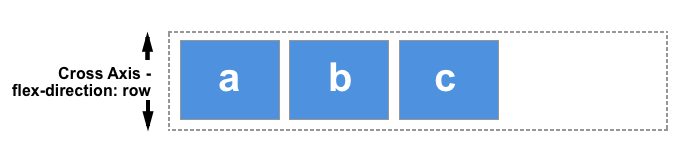
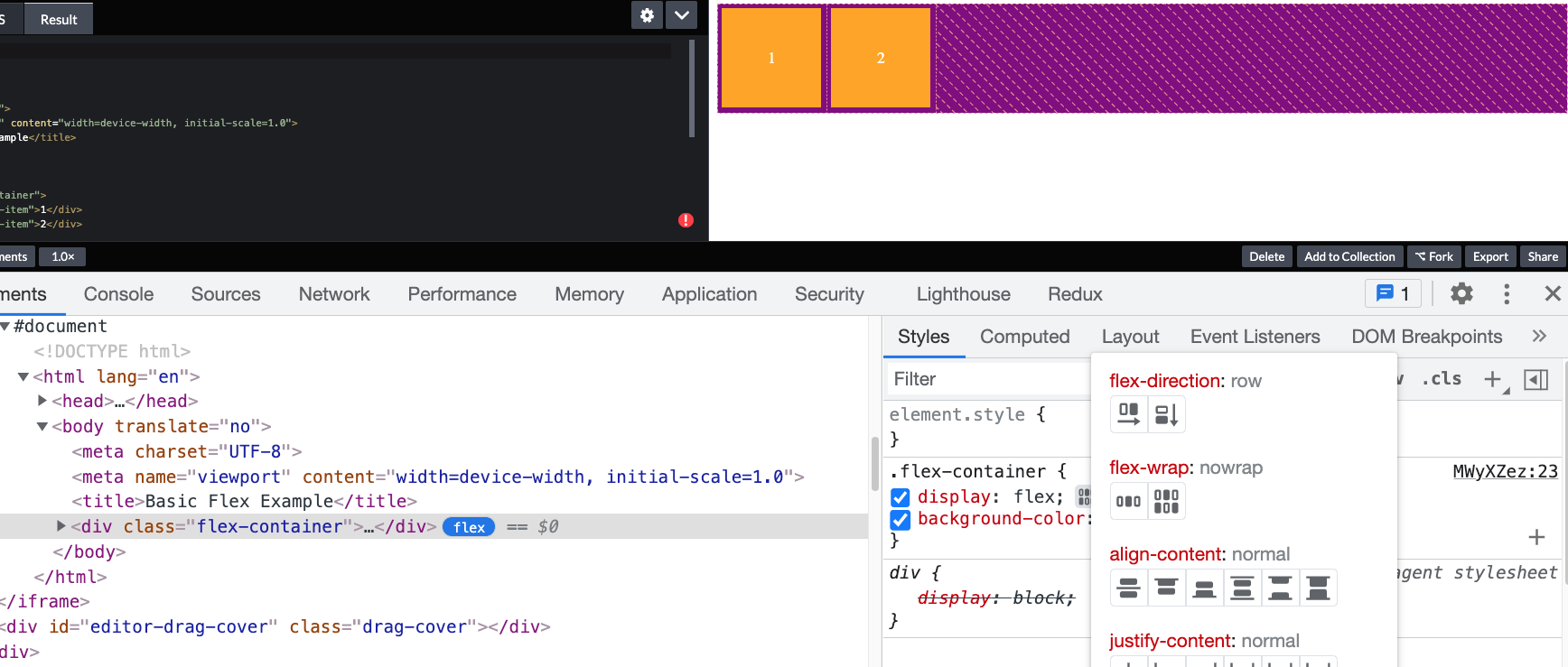
Flexbox - flex-direction
- container property
- row or column orientated
- reversed
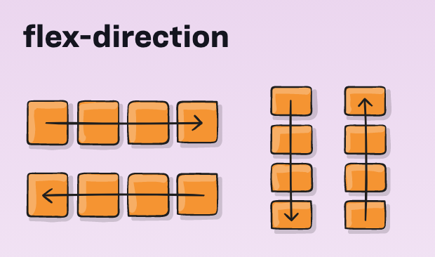
Flexbox - flex-direction
- Container
- flex-direction:
- row
- column
- !axis change!
- flex-direction:


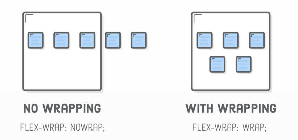
Flexbox - flex-wrap
- container property
- default: flex items will all try to fit to one line
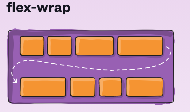
Flexbox - Wrap Items
- Container
- flex-wrap:
- wrap
- no-wrap (default)
- wrap-reverse
- flex-wrap:
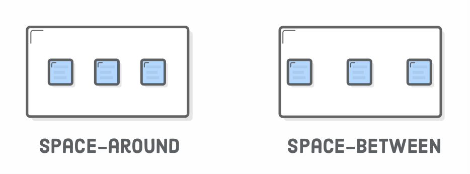
Flexbox - justify-content
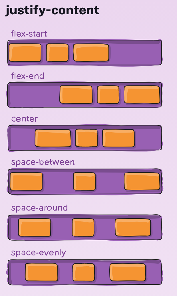
For more info:
- items are layout along the main axis
!Demo: Result in "fullscreen"!
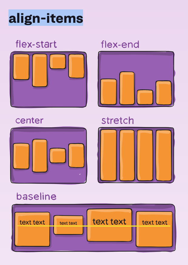
Flexbox - align-items
For more info:
- container property
- items are layout along the cross axis
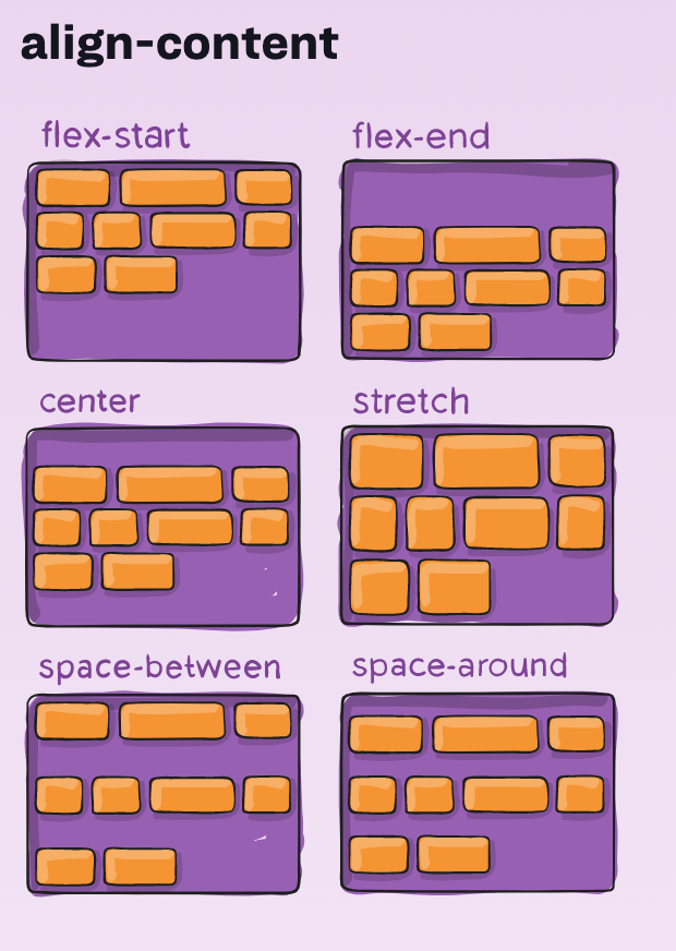
Flexbox - align-content
For more info:
- container property
- items are layout along the cross axis
Flex Item - order
For more info:
- flexbox item property
- flex items are laid out in source order
- order: 0 /* default value */
Flex Item - grow and shrink
For more info:
- flexbox item property
- to grow or shrink item if necessary
- ratio (default value 1)
Flex Item - flex-basis
For more info:
-
The flex-basis CSS property sets the initial main size of a flex item. It sets the size of the content box unless otherwise set with box-sizing.
- No scrollbars (as with min-width)
!!Nested Structures in Flexbox!!
Media Query
For more info:
Enables/Disable CSS-rules based on screen size (other attributes are also available)
<link rel="stylesheet" media="screen and (min-width: 900px)" href="widescreen.css">
<link rel="stylesheet" media="screen and (max-width: 600px)" href="smallscreen.css">
Different Stylesheets:
Media Query + Flexbox
small screen = column layout
large screen = row layout
Demo Website
Key learning outcomes:
- Use Reference!
- Use dev tools!
- In Visual Studio Code & Chrome Development Tools.
- Structure of page (div's), plan ahead
- Step by step (be patient)
Specifictiy
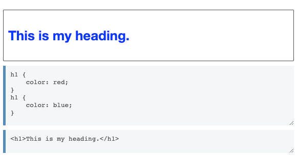
Specificity is the means by which browsers decide which CSS property values are the most relevant to an element and, therefore, will be applied. Specificity is based on the matching rules which are composed of different sorts of CSS selectors.
Same Specificity, last "seen" rule wins (source order)
Demo Specificity:
- VSCode
- ChromeDevTools
Cascade
Stylesheets cascade — at a very simple level this means that the order of CSS rules matter; when two rules apply that have equal specificity the one that comes last in the CSS is the one that will be used.
How to (try) to learn
- Kevin Powell Flexbox Basics Playlist
- The Net Ninja Playlist (aanrader)
- https://www.internetingishard.com/html-and-css/
- W3schools (tutorials, exercise, examples, template & reference)
- https://developer.mozilla.org/en-US/docs/Web/CSS
- https://css-tricks.com/ (google css-tricks.com: property or subject)
- https://www.freecodecamp.org/learn/
- https://www.sololearn.com/Play/CSS
- https://flukeout.github.io/ (selector game)
- https://flexboxfroggy.com/ (game to learn flexbox)
- Get inspired: http://www.csszengarden.com/
Be realistic
- Be realistic (know when to stop, accept it's not perfect)
- website design is an art
- Use development tools to try things out & find "bugs"
- Practice (exercise / assignment)
- Google a lot
- I can't remember all the css properties
Other useful resources
- https://www.codecademy.com/catalog/language/html-css (not free anymore :-()
- https://internetingishard.com/ (good explanation of HTML & CSS, most of the content in this presentation is based on this website)
A good starting point for your assignments:
Week 4 - Bootstrap
-
Bootstrap is the most popular HTML, CSS, and JavaScript framework for developing responsive, mobile-first websites.
- industry standard
- many skins / extensions / ui-designs
Deadline opdrachten aftekenen
- Voor het tentamen
- Liefst eerder en mag per week
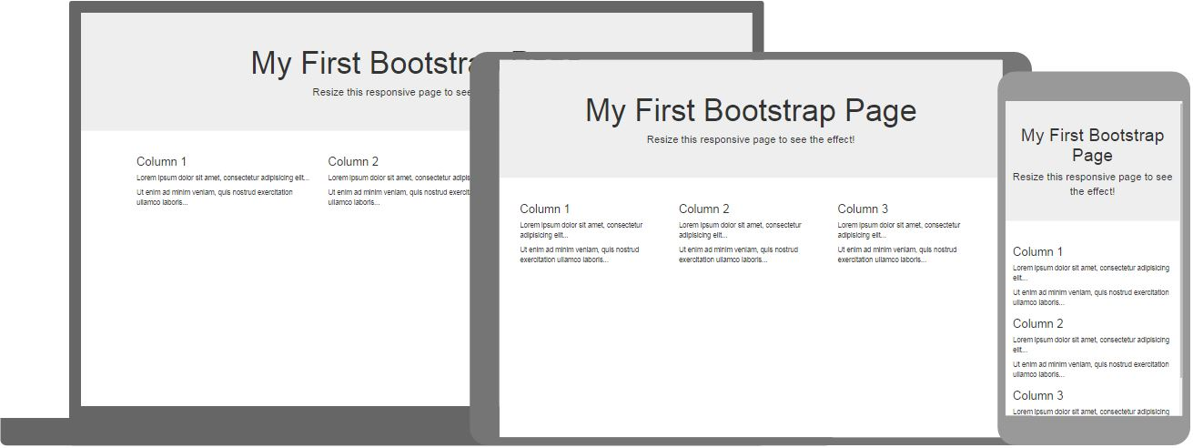
Bootstrap 5 - Example
Example from W3Schools
Bootstrap 5 - Example
- Check the responsive behaviour in Chrome Dev Tools
- change browser size or use device toolbar
Example from w3schools
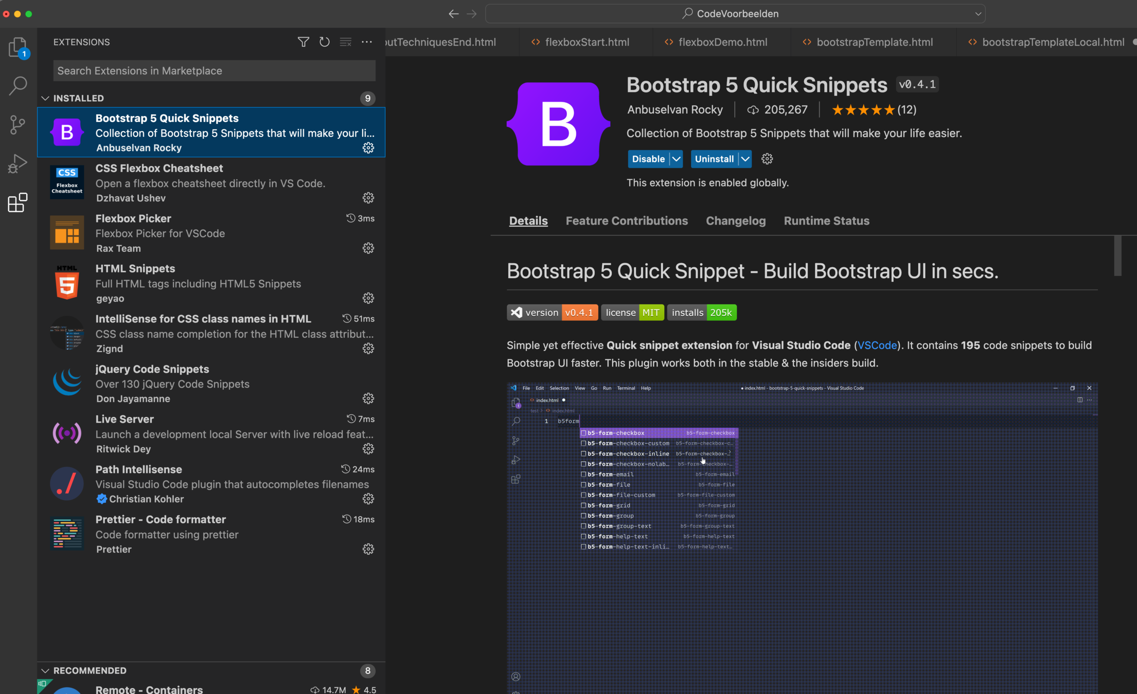
Visual Studio Code Plugins
To GET CodeCompletion (intelliSense) working in VS Code download bootstrap
Download Bootstrap & jQuery (not needed in bootstrap 5)
link the correct stylesheet and scripts
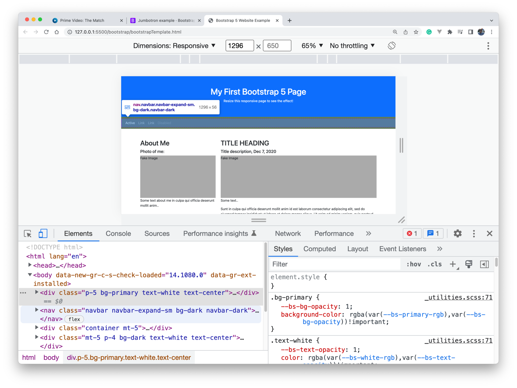
<!DOCTYPE html>
<html lang="en">

<head>
    <title>Bootstrap 5 Website Example</title>
    <meta charset="utf-8">
    <meta name="viewport" content="width=device-width, initial-scale=1">
    <link href="bootstrap-5.2.1-dist/css/bootstrap.css" rel="stylesheet">
    <script src="bootstrap-5.2.1-dist/js/bootstrap.js"></script>
    <style>
        .fakeimg {
            height: 200px;
            background: #aaa;
        }
    </style>
</head>

<body>
    <div class="p-5 bg-primary text-white text-center">
        <h1>My First Bootstrap 5 Page</h1>
        <p>Resize this responsive page to see the effect!</p>
    </div>

    <nav class="navbar navbar-expand-sm bg-dark navbar-dark">
        <div class="container-fluid">
            <ul class="navbar-nav">
                <li class="nav-item">
                    <a class="nav-link active" href="#">Active</a>
                </li>
                <li class="nav-item">
                    <a class="nav-link" href="#">Link</a>
                </li>
                <li class="nav-item">
                    <a class="nav-link" href="#">Link</a>
                </li>
                <li class="nav-item">
                    <a class="nav-link disabled" href="#">Disabled</a>
                </li>
            </ul>
        </div>
    </nav>

    <div class="container mt-5">
        <div class="row">
            <div class="col-sm-4">
                <h2>About Me</h2>
                <h5>Photo of me:</h5>
                <div class="fakeimg">Fake Image</div>
                <p>Some text about me in culpa qui officia deserunt mollit anim..</p>
                <h3 class="mt-4">Some Links</h3>
                <p>Lorem ipsum dolor sit ame.</p>
                <ul class="nav nav-pills flex-column">
                    <li class="nav-item">
                        <a class="nav-link active" href="#">Active</a>
                    </li>
                    <li class="nav-item">
                        <a class="nav-link" href="#">Link</a>
                    </li>
                    <li class="nav-item">
                        <a class="nav-link" href="#">Link</a>
                    </li>
                    <li class="nav-item">
                        <a class="nav-link disabled" href="#">Disabled</a>
                    </li>
                </ul>
                <hr class="d-sm-none">
            </div>
            <div class="col-sm-8">
                <h2>TITLE HEADING</h2>
                <h5>Title description, Dec 7, 2020</h5>
                <div class="fakeimg">Fake Image</div>
                <p>Some text..</p>
                <p>Sunt in culpa qui officia deserunt mollit anim id est laborum consectetur adipiscing elit, sed do
                    eiusmod tempor incididunt ut labore et dolore magna aliqua. Ut enim ad minim veniam, quis nostrud
                    exercitation ullamco.</p>

                <h2 class="mt-5">TITLE HEADING</h2>
                <h5>Title description, Sep 2, 2020</h5>
                <div class="fakeimg">Fake Image</div>
                <p>Some text..</p>
                <p>Sunt in culpa qui officia deserunt mollit anim id est laborum consectetur adipiscing elit, sed do
                    eiusmod tempor incididunt ut labore et dolore magna aliqua. Ut enim ad minim veniam, quis nostrud
                    exercitation ullamco.</p>
            </div>
        </div>
    </div>

    <div class="mt-5 p-4 bg-dark text-white text-center">
        <p>Footer</p>
    </div>

</body>

</html>
Visual Studio Code Plugins
bs5-
class completion
path completion
Bootstrap - Typography
Works out of the box! Just use normal HTML-elements related to text!
Bootstrap - Colors
Prefixes: text-, bg-, btn-
For example: btn-succes
Bootstrap - Icons
Icons by bootstrap
Bootstrap - Icons
Font awsome, other "icon libraries" are supported as well in Bootstrap 5!
Bootstrap - Table
Bootstrap - Images
- Explain Responsive in Chrome Dev Tools
- responsive: .img-fluid
- visual appearance: .rounded, .rounded-circle, img-thumbnail
- position: .float-left .float-right
- center to screen (.mx-auto & .d-block)
<!doctype html>
<html lang="en">

<head>
    <title>Image</title>
    <!-- Required meta tags -->
    <meta charset="utf-8">
    <meta name="viewport" content="width=device-width, initial-scale=1, shrink-to-fit=no">

    <!-- Bootstrap CSS -->
    <link rel="stylesheet" href="bootstrap-4.1.3-dist/css/bootstrap.css">

    <!-- Optional JavaScript -->
    <!-- jQuery first, then Popper.js, then Bootstrap JS -->
    <script src="https://code.jquery.com/jquery-3.3.1.slim.min.js" integrity="sha384-q8i/X+965DzO0rT7abK41JStQIAqVgRVzpbzo5smXKp4YfRvH+8abtTE1Pi6jizo"
        crossorigin="anonymous"></script>
    <script src="https://cdnjs.cloudflare.com/ajax/libs/popper.js/1.14.3/umd/popper.min.js" integrity="sha384-ZMP7rVo3mIykV+2+9J3UJ46jBk0WLaUAdn689aCwoqbBJiSnjAK/l8WvCWPIPm49"
        crossorigin="anonymous"></script>
    <script src="https://stackpath.bootstrapcdn.com/bootstrap/4.1.2/js/bootstrap.min.js" integrity="sha384-o+RDsa0aLu++PJvFqy8fFScvbHFLtbvScb8AjopnFD+iEQ7wo/CG0xlczd+2O/em"
        crossorigin="anonymous"></script>
</head>

<body>
    <img src="https://picsum.photos/1000/1500" class="img-fluid rounded-circle" />

    <img src="https://picsum.photos/200/300" class="rounded" />
    <img src="https://picsum.photos/200/300" class="rounded-circle" />
    <img src="https://picsum.photos/200/300" class="img-thumbnail" />

    <div>
        <img src="https://picsum.photos/200/300" class="float-left">
        <img src="https://picsum.photos/200/300" class="float-right">
    </div>
    <!-- Need to clear:both, just as with normal floats -->
    <p style="clear:both; content: none;"></p>
    <div>
        <img src="https://picsum.photos/200/300" class="mx-auto d-block">
    </div>
</body>

</html>
Bootstrap - Navigation
Let's take a look at the documentation
Bootstrap - Grid System!
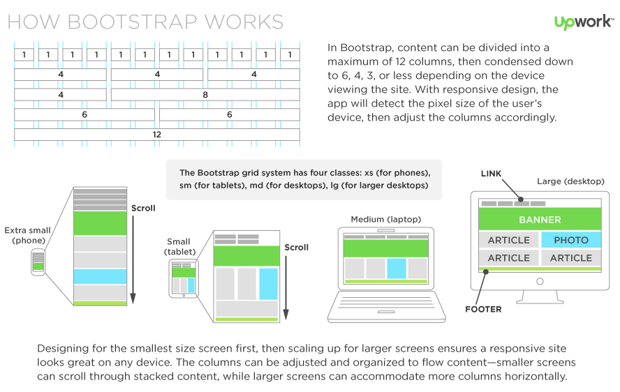
- Responsive layout
- Containers (.container .container-fluid)
- Rows (Fixed-width or Full-width)
- Columns
- stacked on small devices
- Columns
- Rows (Fixed-width or Full-width)
- Containers (.container .container-fluid)
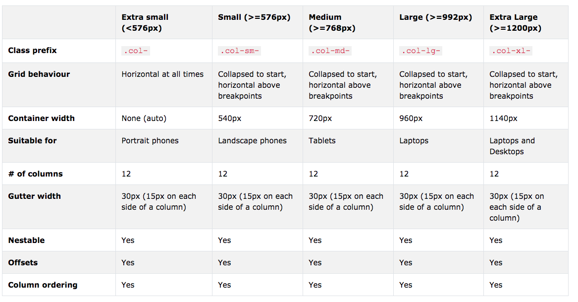
- Different size (resolution) of screens
- mobile first
- Bootstrap 4 & 5 = Flexbox Based!
- Bootstrap 3 is Float Based

!Mobile First!
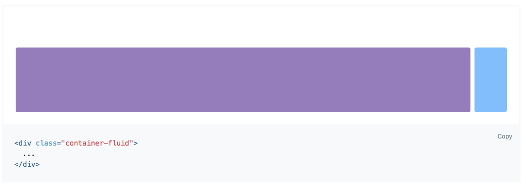
Bootstrap - Grid System - Container!
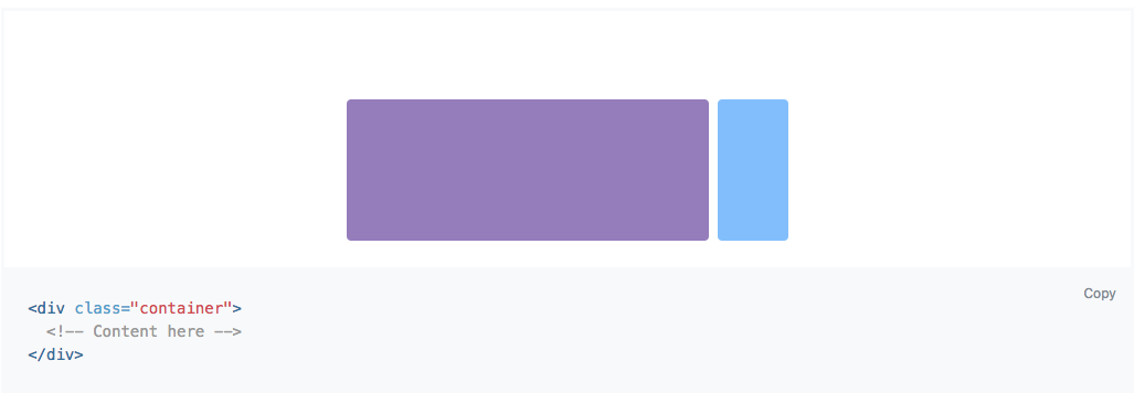
Fixed width
As width as the browser window (viewport)!
Bootstrap - Grid System!
And Extra Large
Bootstrap - Grid Example!
- The container .container or .container-fluid
- rows .rows
- columns .columns
- rows .rows
<div class="container">
    <div class="row">
        <div class="col-md-6 bg-danger">Lorem, ipsum dolor.</div>
        <div class="col-md-6 bg-info">Lorem, ipsum dolor.</div>
    </div>
</div>
<p></p> <!-- Hack to create whitespace :-( -->
<div class="container-fluid">
    <div class="row">
        <div class="col-md-6 bg-warning">Lorem, ipsum dolor.</div>
        <div class="col-md-6 bg-success">Lorem, ipsum dolor.</div>
    </div>
</div>
Bootstrap - Sizes!
- Show in chrome dev tools, resize!
- Show what happens when there are more than 12 columns!
- Show what happens when no size is specified!
    <div class="container">
        <div class="row">
            <div class="col-sm-12 col-md-6 col-lg-3 bg-danger">Lorem, ipsum dolor.</div>
            <div class="col-sm-12 col-md-6 col-lg-3 bg-info">Lorem, ipsum dolor.</div>
            <div class="col-sm-12 col-md-6 col-lg-3 bg-dark">Lorem, ipsum dolor.</div>
            <div class="col-sm-12 col-md-6 col-lg-3 bg-light">Lorem, ipsum dolor.</div>
        </div>
    </div>
Bootstrap - Grids Nested!
    <!-- Nested Grid Container -->
    <div class="container">
        <div class="row">
            <div class="col-8 bg-info">
                .col-8
                <div class="row">
                    <div class="col-6 bg-warning">.col-6</div>
                    <div class="col-6 bg-danger">.col-6</div>
                </div>
            </div>
            <div class="col-4 bg-success">.col-4</div>
        </div>
    </div>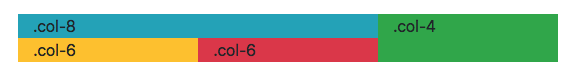
Bootstrap - Components
A lot of choices:
forms, nav-bar, cards, badges, alerts, modals, etc
Take a look and decide what's useful for your project/assignment! Then put everything together!
Tip: use icons to make UI intuitive!
How to get started
bs5-
Week 5 - JavaScript/jQuery
- JS = JavaScript
- We use jQuery
- jQuery is a JavaScript Library
- jQuery greatly simplifies JavaScript programming
- Less code, easier
- jQuery is easy to learn

Week 5 - JavaScript/jQuery
- Simple Example
Week 4 - jQuery


Getting Started
- Download or use CDN
- Wait for the document to be ready
<script type="text/javascript">
$(document).ready(function () {
//jQuery code
});
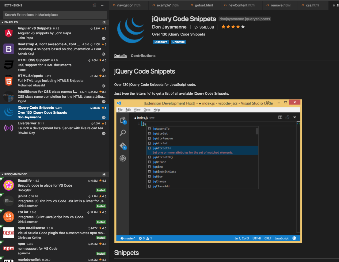
</script>Code Snippets in VS Code
JavaScript 101
CSS - Selectors
- Not only used for CSS styles, also by other tools/techniques (Emmet & jQuery)
- Read:
- Reference
Important CSS-Selectors
Game to learn selectors
jQuery Cheat Sheet
jQuery - selector
jQuery (CSS) selector, selects one or more elements to add behaviour to it!
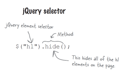
selector (jQuery)
Test/create the selector with chrome DevTools!
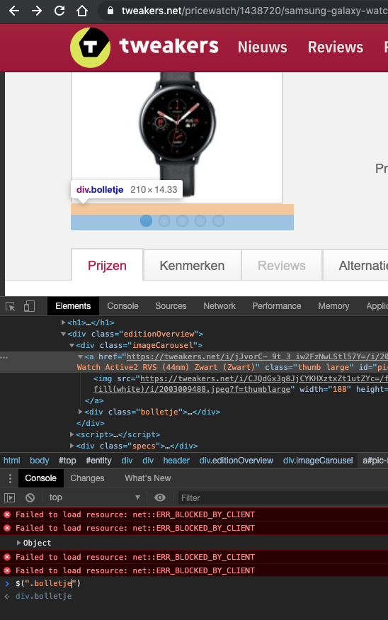
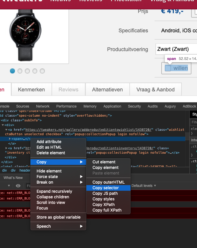
!copied to clipboard!
jQuery - Events
- React to events
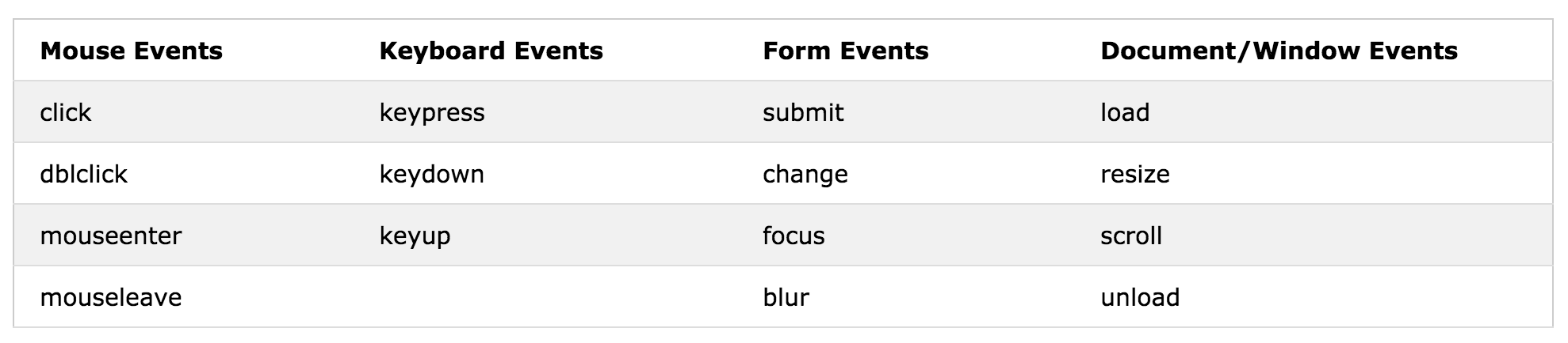
Syntax:
$("p").click(function(){
  // action goes here!!
});
Document ready event:
$(document).ready(function(){
    $("p").click(function() {
        $(this).hide();
    });
});
Event Arguments:
$(document).ready(function () {
    $(".change-color-btn2").click(function (evt) {
        console.log(evt.target);
        console.log(evt.screenX);
        console.log(evt.screenY);
    });
});
$(this) element that causes the event
jQuery - Effects
- Hide and show elements
- display: none;
- change hide to fadeOut()
- change show to fadeIn()
- fadeToggle()
More effects: W3Schools
jQuery - Effects
- Slides
- slideUp(), slideDown(), slideToggle()
jQuery - Chaining
- Very powerful concept
- applies methods one after the other on the same HTML elements
- The functions get execute immediately (not darkred)
- To fix this use a callback
jQuery - callback
- To execute a function when the previous is finished!
$(selector).hide(speed,callback);Syntax:
$("button").click(function(){
    $("p").hide("slow", function(){
        alert("The paragraph is now hidden");
    });
});
Example:
jQuery - chrome devtools
- Show changes to DOM (HTML-elements)
- Debugger
Get/Set Content
- text() - Sets or returns the text content of selected elements
- html() - Sets or returns the content of selected elements (including HTML markup)
- val() - Sets or returns the value of form fields
- css() - Sets or get css value (next sheet)
CSS
- $("h1").css("background-color", "red") //set
- $("h1").css("background-color") //get
- addClass(), removeClass(), toggleClass()

Remove Elements
- Remove Elements
- remove() method removes the selected element(s) and its child elements.
- jQuery empty() method removes the child elements of the selected element(s).
Add Elements
- Add new content (W3Schools)
- append() method inserts content AT THE END of the selected HTML elements
- prepend() method inserts content AT THE BEGINNING of the selected HTML elements
- after() / before() method inserts content AFTER / BEFORE the selected HTML elements.
Move Elements
- Move Elements
- select the element and use it as a parameter for a "insert"-method
!The easiest way to swap two Elements, i.e. implement "sortable/prioritize" elements.
Add Element with Event
- Add new content (W3Schools)
- with events (on method can also be used, next slide)
Event on elements - On()
-
also on elements that are added later
-
on() method
Remove Added Elements
- onclick
- not the jQuery way but it's easy
Traversing DOM Elements
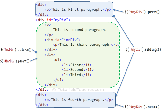
-
Terminology is from (family tree)
-
parent(), parents()
-
children(), siblings()
-
prev(), next()
-
find()
-
Filter
-
The first(), last(), eq(), filter() and not()
-
This is also possible with CSS3 Selectors
-
How to get started

- Tip: use the Chrome Developer Tools Debugger to see what's going on and fix bugs!
Week 5 (optional) - CSS Layout a page
CSS Layout techniques
- Chronological:
- No layout (normal flow, see the lesson about CSS Week 2)
- Layout with <table> tag (don't use, from the past)
-
Divs: with floats and positioning techniques
- Frameworks based on this (Bootstrap 3)
-
Flexbox
- Frameworks based on this (Bootstrap 4)
- Grid Layout
- For really complex situations?
- Easy
- For really complex situations?
- Columns
Normal Flow / Vertical Flow
CSS - Box Model
<!DOCTYPE html>
<html lang='en'>
<head>
<meta charset='UTF-8' />
<title>Boxes Are Easy!</title>
<style type="text/css">
h1,
p {
background-color: #DDE0E3;
/* Light gray */
}
em,
strong {
background-color: #B2D6FF;
}
</style>
</head>
<body>
<h1>Headings Are Block Elements</h1>
<p>Paragraphs are blocks, too. <em>However</em>, <em> and <strong> elements are not. They are <strong>inline</strong>
elements.</p>
<p>Block elements define the flow of the HTML document, while inline elements do not.</p>
</body>
</html>- Block (horizontal spaced):
- new line
- fill width
- height determined by the content
- Inline (vertical spaced)
- width determined by the content
Display Property
- <div>
- <h1> - <h6>
- <p>
- <form>
- <header>
- <footer>
- <section>
- <span>
- <a>
- <img>
Display Property
- display property: changes elements to block or inline element or hide the elements
    <style>
        p {
            display: inline;
        }

        p:last-child {
            display: block;
        }

        p:first-child {
            display: none;
            /* hide element(s) */
        }

        span {
            display: inline;
        }

        #blockspan {
            display: block;
        }
    </style>
<div>
<p>Lorem, ipsum.</p>
<p>Distinctio, deleniti.</p>
<p>Aliquid, nobis.</p>
<p>Quaerat, nemo.</p>
<p>Reiciendis, placeat!</p>
</div>
<p>
<span>Item 1</span>
<span>Item 2</span>
<span>Item 3</span>
<span id="blockspan">Item 4</span>
<span>Item 5</span>
</p>Layout with tables
- Please don't use
- It's from the past, difficult to maintain
- http://www.ironspider.ca/webdesign102/tables4layout2.htm


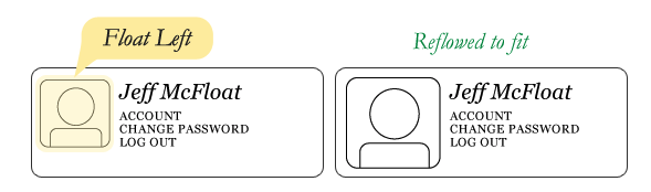
Layout - Floats
- Vertical flow is the default
- To create horizontal flow we can use floats.
- float: left | right (float element left or right)
- clear: both (resets floating layout)
Layout - Floats
- Vertical flow is the default
- To create horizontal flow we can use floats.
- float: left | right (float element left or right)
- clear: both (resets floating layout)
- And a lot of <div>'s
Layout - Floats
Layout - Floats - Clear
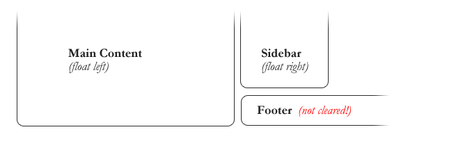
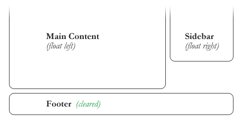
#footer {
    clear: both;
}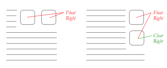
Not used often to clear
left or right!
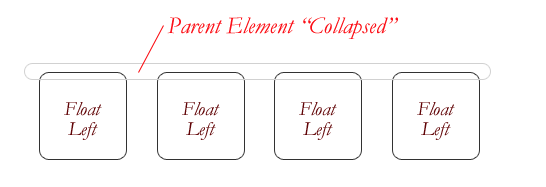
Layout - Floats - Great Collapse
- If parent contains only float then it collapse
<!DOCTYPE html>
<html lang="en">

<head>
    <meta charset="UTF-8">
    <meta name="viewport" content="width=device-width, initial-scale=1.0">
    <meta http-equiv="X-UA-Compatible" content="ie=edge">
    <title>Document</title>
    <style>
        .container {
            background-color: red;
        }

        .floater {
            float: left;
        }

        /* The Empty Div Method */
        /* .empty-div {
            clear: both;
        } */

        /* The Overflow Method */
        /* .container {
            overflow: hidden;
        } */

        /* The Easy Clearing Method */
        /* .clearfix:after {
            content: ".";
            visibility: hidden;
            display: block;
            height: 0;
            clear: both;
        } */
    </style>
</head>

<body>
    <div class="container clearfix">
        <div class="floater">1</div>
        <div class="floater">2</div>
        <div class="floater">3</div>
        <div class="floater">4</div>
        <!-- <div class="empty-div"></div> -->
    </div>

</body>

</html>
fix it by clearing the float after the floated elements in the container but before the close of the container
Three methods to fix in code
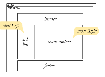
Layout - Floats - Example
Layout - Float - Example
- Example
- Complete explanation:
<!DOCTYPE html>
<html lang="en">

<head>
    <meta charset="UTF-8">
    <meta name="viewport" content="width=device-width, initial-scale=1.0">
    <meta http-equiv="X-UA-Compatible" content="ie=edge">
    <title>Float Layout</title>
    <style type="text/css">
        /* comment out the comments and see what happens */
        /* explained in https://internetingishard.com/html-and-css/floats/ */

        * {
            margin: 0px;
            padding: 0px;
            box-sizing: border-box;
        }

        .page {
            width: 900px;
            margin: 0 auto;
        }

        .menu {
            height: 100px;
            background-color: blue;
        }

        .sidebar {
            height: 300px;
            width: 200px;
            background-color: brown;
            /* float: left; */
        }

        .content {
            /* float: left; */
            height: 500px;
            width: 650px;
            background-color: chartreuse;
        }

        .footer {
            /* clear: both; */
            height: 200px;
            background-color: darkmagenta;
        }
    </style>
</head>

<body>
    <div class='page'>
        <div class='menu'>Menu</div>
        <div class='sidebar'>Sidebar</div>
        <div class='content'>Content</div>
        <div class='footer'>Footer</div>
    </div>
</body>

</html>
Layout - Floats - Column Layout
- Three Equal Columns
<!DOCTYPE html>
<html lang="en">

<head>
    <meta charset="UTF-8">
    <meta name="viewport" content="width=device-width, initial-scale=1.0">
    <meta http-equiv="X-UA-Compatible" content="ie=edge">
    <title>Three Column Layout with Floats</title>

    <style type="text/css">
        .container {
            margin: 0 auto;
            width: 960px;
        }

        .column {
            float: left;
            background-color: lightblue;
            width: 31%;
            margin: 20px 1.15%;
            height: 100px;
        }
    </style>
</head>

<body>
    <div class="container">
        <div class="column"></div>
        <div class="column"></div>
        <div class="column"></div>
    </div>
</body>

</html>
Layout - Floats - Bootstrap
- responsive floats
- clearfix
<div class="float-sm-left">Float left on viewports sized SM (small) or wider</div><br>
<div class="float-md-left">Float left on viewports sized MD (medium) or wider</div><br>
<div class="float-lg-left">Float left on viewports sized LG (large) or wider</div><br>
<div class="float-xl-left">Float left on viewports sized XL (extra-large) or wider</div><br><div class="bg-info clearfix">
<button type="button" class="btn btn-secondary float-left">Example Button floated left</button>
<button type="button" class="btn btn-secondary float-right">Example Button floated right</button>
</div>Layout - Column Layout
- Relatively "new", is it used?
<!DOCTYPE html>
<html>
<head>
<style>
.newspaper {
    -webkit-column-count: 3; /* Chrome, Safari, Opera */
    -moz-column-count: 3; /* Firefox */
    column-count: 3;
}
</style>
</head>
<body>

<p><b>Note:</b> Internet Explorer 9, and earlier versions, does not support the column-count property.</p>

<div class="newspaper">
Lorem ipsum dolor sit amet, consectetuer adipiscing elit, sed diam nonummy nibh euismod tincidunt ut laoreet dolore magna aliquam erat volutpat. Ut wisi enim ad minim veniam, quis nostrud exerci tation ullamcorper suscipit lobortis nisl ut aliquip ex ea commodo consequat. Duis autem vel eum iriure dolor in hendrerit in vulputate velit esse molestie consequat, vel illum dolore eu feugiat nulla facilisis at vero eros et accumsan et iusto odio dignissim qui blandit praesent luptatum zzril delenit augue duis dolore te feugait nulla facilisi. Nam liber tempor cum soluta nobis eleifend option congue nihil imperdiet doming id quod mazim placerat facer possim assum.
</div>

</body>
</html>
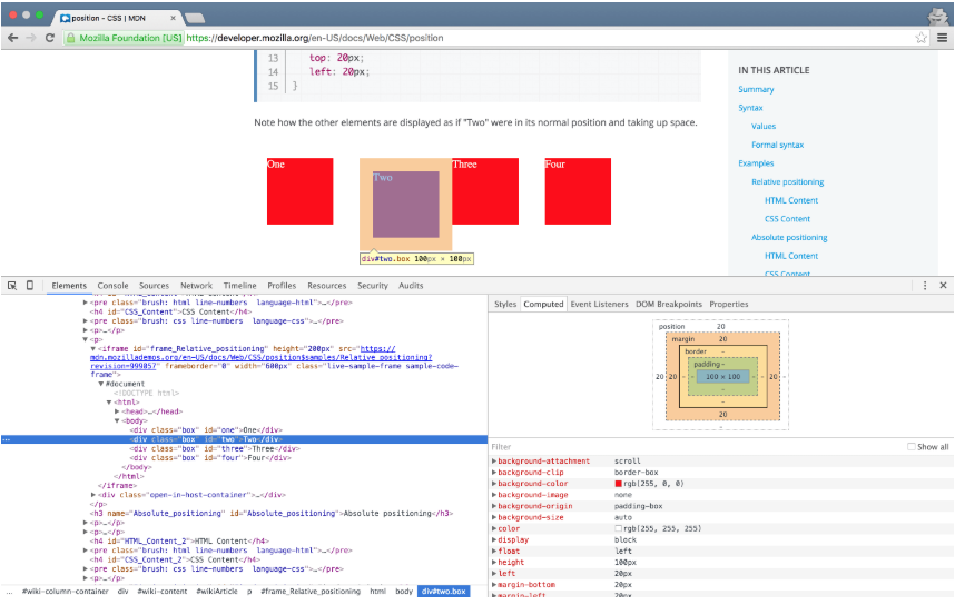
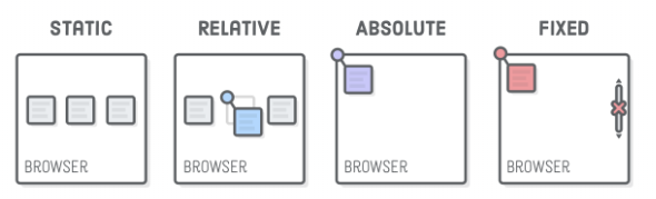
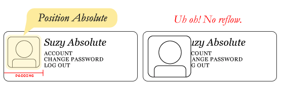
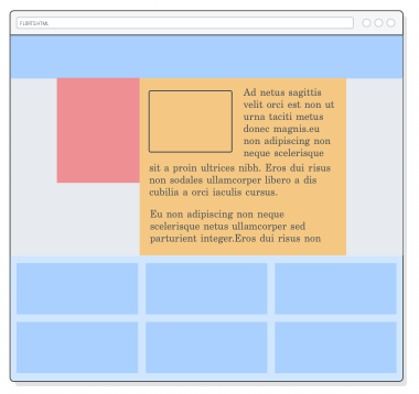
Layout - Position of a box
<!DOCTYPE html>
<html lang="en">
<head>
<meta charset="UTF-8">
<meta name="viewport" content="width=device-width, initial-scale=1.0">
<meta http-equiv="X-UA-Compatible" content="ie=edge">
<title>Document</title>
<style>
div {
margin: 20px;
}
#box-static {
position: static;
background-color: green;
}
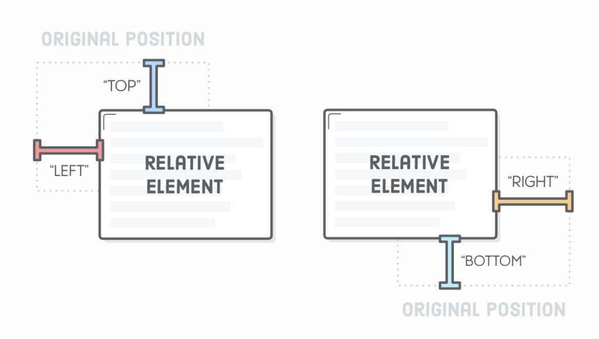
#box-relative {
position: relative;
left: 40px;
background-color: yellow;
/* top, bottom, right */
}
#box-fixed {
position: fixed;
left: -20px;
top: -20px;
background-color: blue;
}
div.relative {
position: relative;
width: 400px;
height: 200px;
border: 3px solid #73AD21;
}
div.absolute {
position: absolute; top: 80px;
right: 0;
width: 200px;
height: 100px;
border: 3px solid #73AD21;
}
</style>
</head>
<body>
<div id="box-static">HTML elements are positioned static by default.</div>
<div id="box-relative">An element with position: relative; is positioned relative to its normal position.</div>
<div id="box-fixed">An element with position: fixed; is positioned relative to the viewport, which means it always stays
in the same place even if the page is scrolled.</div>
<div class="relative">This div element has position: relative;
<div class="absolute">This div element has position: absolute;</div>
</div>
</body>
</html>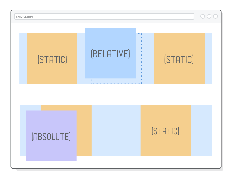
Layout - Example
<!DOCTYPE html>
<html lang="en">
<head>
<meta charset="UTF-8">
<meta name="viewport" content="width=device-width, initial-scale=1.0">
<meta http-equiv="X-UA-Compatible" content="ie=edge">
<title>Document</title>
<style>
.container {
position: relative;
top: 100px;
left: 100px;
width: 500px;
height: 300px;
border: 1px dashed red;
}
.box {
background-color: green;
width: 100px;
float: left;
margin: 10px;
}
.box2 {
position: relative;
top: 20px;
left: 20px;
}
.box4 {
position: absolute;
top: 40px;
left: 10px;
}
.box6 {
position: fixed;
bottom: 0px;
}
</style>
<script src="https://code.jquery.com/jquery-3.3.1.js" integrity="sha256-2Kok7MbOyxpgUVvAk/HJ2jigOSYS2auK4Pfzbm7uH60="
crossorigin="anonymous"></script>
</head>
<body>
<button id="position-btn">Enable/Disable position</button>
<div class="container">
<div class="box">Box 1</div>
<div id="box2" class="box">Box 2<span style="display:none;"> relative</span></div>
<div class="box">Box 3</div>
<div id="box4" class="box">Box 4<span style="display:none;"> absolute</span></div>
<div class="box">Box 5</div>
<div id="box6" class="box">Box 6<span style="display:none;"> fixed</span></div>
<div style="clear: both;"></div>
</div>
<script type="text/javascript">
$(document).ready(function () {
$("#position-btn").click(function () {
$("#box2").toggleClass("box2")
.find("span").toggle();
$("#box4").toggleClass("box4")
.find("span").toggle();
$("#box6").toggleClass("box6")
.find("span").toggle();
});
});
</script>
</body>
</html>Flexbox
-
Flexbox
- sizes well on most screens (responsive?)
- used by Bootstrap4 (version 3 is float based)
Flexbox
- Container
- Flex items
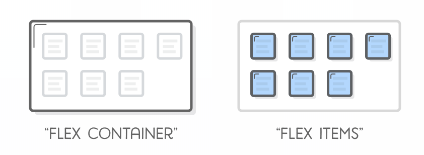
<style type="text/css">
.container {
  display: flex; /* enables flexbox (container) */
}

.item {

}
</style>

<div class="container">
    <div class="item">1</div>
    <div class="item">2</div>
    <div class="item">3</div>
</div>
Flexbox - Alignment
- Container
- justify-content:
- center
- flex-start
- flex-end
- space-around
- space-between
- justify-content:
<style type="text/css">
.container {
  display: flex; /* enables flexbox (container) */
  justify-content: flex-start;
}

.item {
    width: 300px; background-color: red;
}
</style>

<div class="container">
    <div class="item">1</div>
    <div class="item">2</div>
    <div class="item">3</div>
</div>
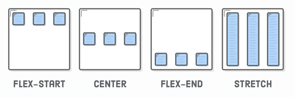
Flexbox - Align Items
- Container
- align-items:
- center
- flex-start (top)
- flex-end (bottom)
- stretch
- baseline
- align-items:
<style type="text/css">
    .container {
        display: flex;
        background-color: red;
        height: 300px;
        align-items: flex-end;
    }

    .child {
        background-color: lightgray;
    }
</style>
<div class="container">
    <div class="child">Lorem ipsum dolor sit.</div>
    <div class="child">Esse laudantium ipsum eum!</div>
    <div class="child">Possimus non soluta officia?</div>
</div>
Flexbox - Wrap Items
- Container
- flex-wrap:
- wrap
- no-wrap (default)
- wrap-reverse
- flex-wrap:
<!DOCTYPE html>
<html lang="en">

<head>
    <meta charset="UTF-8">
    <meta name="viewport" content="width=device-width, initial-scale=1.0">
    <meta http-equiv="X-UA-Compatible" content="ie=edge">
    <title>Document</title>
    <style type="text/css">
        .container {
            display: flex;
            width: 700px;
            justify-content: center;
            flex-wrap: wrap;
            background-color: green;
        }

        .item {
            width: 300px;
            background-color: red;
            text-align: center;
            border: 1px solid black;
        }
    </style>
</head>

<body>


    <div class="container">
        <div class="item">1</div>
        <div class="item">2</div>
        <div class="item">3</div>
    </div>
</body>

</html>
Flexbox - Direction
- Container
- flex-direction:
- row
- column
- axis change!
- flex-direction:
<!DOCTYPE html>
<html lang="en">
<head>
<meta charset="UTF-8">
<meta name="viewport" content="width=device-width, initial-scale=1.0">
<meta http-equiv="X-UA-Compatible" content="ie=edge">
<title>Document</title>
<style type="text/css">
.container {
display: flex;
flex-direction: column;
background-color: red;
width: 600px;
margin: 0 auto;
}
.child {
border: 1px solid black;
}
</style>
</head>
<body>
<div class="container">
<div class="child">Lorem ipsum dolor sit amet consectetur adipisicing elit. Soluta nobis ipsum doloremque totam ipsam
dignissimos iste vero laboriosam, quis, magni commodi asperiores blanditiis non dolorem sint architecto natus
nesciunt dicta.</div>
<div class="child">Iste quidem, voluptas dignissimos quibusdam facere sunt debitis officia doloremque eos consectetur
illum et ad, ullam consequuntur facilis consequatur autem exercitationem nam molestias atque aut praesentium
rerum laborum ratione. Voluptatem!</div>
<div class="child">Inventore, voluptates necessitatibus? Consectetur dolore praesentium illum impedit corrupti suscipit
est nostrum consequuntur ullam a. Dicta, quaerat totam ipsa minus impedit provident illo corrupti culpa labore
cumque obcaecati libero maxime?</div>
</div>
</body>
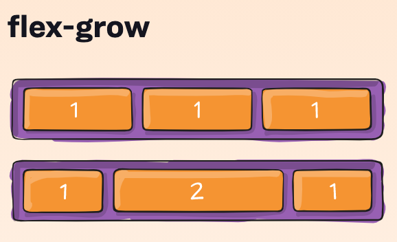
</html>Flexbox - Flex
-
Specify the size
-
or relative to other items in the container
- flex: 2;
-
or relative to other items in the container
-
%
- flex: 30%;
<!DOCTYPE html>
<html lang="en">

<head>
    <meta charset="UTF-8">
    <meta name="viewport" content="width=device-width, initial-scale=1.0">
    <meta http-equiv="X-UA-Compatible" content="ie=edge">
    <title>Document</title>
    <style type="text/css">
        body {
            margin: 0px 0px;
        }

        .header {
            display: flex;
            flex-direction: column;
            align-items: center;
            margin: 0 auto;
            background-color: lightseagreen;
        }

        .footer {
            padding: 20px;
            text-align: center;
            background: lightseagreen;
        }

        .navigation {
            background-color: black;
            padding: 10px 20px;
        }

        .navigation a {
            text-decoration: none;
            color: white;
        }

        .navigation a:hover {
            background-color: white;
            color: black;
        }

        .main {
            display: flex;
            justify-content: center;
        }

        .left {
            flex: 1;
            background-color: lightgray;
        }

        .right {
            flex: 2;
            /*two times as big a .left */
            background-color: gray;
        }
    </style>
</head>

<body>
    <div class="header">
        <h1>My Company Name</h1>
        <h2>Slogan</h2>
    </div>
    <div class="navigation">
        <a href="item1.html">Item</a>
        <a href="item1.html">Item</a>
        <a href="item1.html">Item</a>
        <a href="item1.html">Item</a>
    </div>
    <div class="main">
        <div class="left">
            <h5>Lorem, ipsum dolor.</h5>
        </div>
        <div class="right">
            <h5>Main</h5>
            <p>Lorem ipsum dolor, sit amet consectetur adipisicing elit. Nulla, alias ipsam deserunt quasi dolores
                possimus
                illum at, expedita vel ratione officiis suscipit exercitationem. Vitae doloremque, harum libero totam
                reprehenderit
                nam possimus at ipsa cupiditate neque quam commodi quidem vel odio laboriosam eum magnam quisquam
                dolorum
                officiis sapiente ea quis non. Eligendi fuga eum tenetur, perferendis quam iusto ipsa labore sequi
                ratione,
                minus reprehenderit necessitatibus officiis placeat, dolore doloremque earum sapiente enim expedita
                dolorum
                non distinctio id at. Dolor eos ea eius aspernatur sed. Eius corporis non veritatis, sapiente similique
                eos
                deleniti eaque repellendus atque, tempora recusandae ea. Minima dolor possimus libero quo harum. Quidem
                inventore
                doloribus exercitationem eum accusantium impedit dolorem minus voluptates nemo placeat neque blanditiis
                ducimus
                qui magni quaerat recusandae at amet sed ad, in, eius perspiciatis laboriosam excepturi debitis. Quo a
                rem
                perferendis laborum molestias voluptatibus earum repellat eum error delectus tempore, excepturi vel
                necessitatibus
                magnam totam nemo dicta eos exercitationem. Neque repellendus quibusdam placeat numquam dolore? Nulla,
                minus
                excepturi beatae accusamus aliquid animi molestiae vitae quia quod totam reprehenderit sed debitis ad
                praesentium
                nihil porro, iste numquam facilis aut? Vero, minima labore! Voluptate aperiam nobis porro cumque!
                Blanditiis
                soluta veniam culpa, atque eaque cumque alias officia minus laudantium modi maiores ad sapiente velit
                dolorum
                quo doloribus perferendis nostrum voluptate eos placeat. Quidem eaque quisquam atque pariatur recusandae
                at, voluptatibus doloribus dolorum commodi tempore exercitationem aut consectetur ex nulla assumenda
                nemo
                in error molestias quam tempora natus voluptatum repellendus accusamus. Voluptatem ipsum illo quasi cum
                sit
                consectetur eos aliquam, esse repellendus sequi laudantium aut. Nemo quas, nihil molestiae ea iure nobis
                pariatur quisquam dolores, reiciendis commodi qui cum libero in alias. Quis, maxime nobis accusamus
                obcaecati
                porro deleniti natus! Sit, eum. Sit error sapiente rem totam labore eum sunt velit possimus, cum et,
                mollitia
                modi. Ullam voluptatibus reiciendis, placeat labore quibusdam non libero earum, saepe maxime impedit
                aliquid
                in consequatur tempora est deserunt quidem ab ea harum, quisquam beatae ex illo ipsa. Magni nemo,
                voluptate
                quod laborum officiis, maxime sit distinctio architecto eveniet in blanditiis commodi at quia accusamus
                non
                culpa, totam iste fugit veritatis sunt odit dicta quo repellat quaerat? Aliquam porro nulla et placeat,
                sit
                quas excepturi animi ducimus ipsa quae. Fugit repellendus esse perferendis error rem? Reprehenderit
                consectetur
                ipsa inventore accusantium unde dolorem vel asperiores quos earum illo deleniti iste minima architecto
                cupiditate
                blanditiis ullam voluptatum quibusdam, odit reiciendis maiores. Alias aut reprehenderit dicta quisquam
                error
                repellat! Qui, optio! Tempora nulla earum voluptates natus voluptate mollitia inventore nihil, quis non
                delectus
                laboriosam quos quas esse quam fugiat enim in sit odio suscipit soluta maxime architecto! Hic, facilis
                nemo
                ad provident saepe quibusdam possimus, nam ex aperiam mollitia eum ab rerum voluptas asperiores
                voluptatem
                similique perferendis id officiis est dolore! Quis earum repudiandae, quae aspernatur ex error omnis.
                Sint
                aliquam fugit quidem incidunt labore esse ipsa commodi sed iure. Rerum maxime, tempora iure maiores
                vitae
                commodi. Ipsam dolor, distinctio expedita nesciunt quae at dicta repudiandae et cupiditate debitis
                perferendis
                voluptatum sequi itaque veritatis reprehenderit quod! Aliquam voluptatum dolores consequuntur animi, hic
                quisquam rerum, iusto tempora maiores culpa officiis corporis. Dolores veritatis asperiores explicabo
                temporibus
                facilis reiciendis, et impedit exercitationem, quod velit incidunt soluta suscipit laborum aspernatur
                accusantium
                ad, dolorum ab architecto quisquam voluptatibus. Laudantium rem dolorum voluptates nemo deserunt quia
                impedit,
                aut tempore dolore deleniti, consequuntur esse officiis qui asperiores soluta voluptatibus expedita
                consectetur
                illo aliquid similique fuga quidem praesentium, totam aliquam! Molestias veniam officiis ad recusandae
                quibusdam
                illo minima eius ab magnam. Molestias optio, nulla est error veniam adipisci similique saepe aliquam
                exercitationem
                officia distinctio illo suscipit delectus, quia sint beatae assumenda ipsa tenetur explicabo vel ab
                voluptatum
                animi laudantium. Architecto nulla, ad obcaecati dolorum autem accusamus repellat provident enim laborum
                magni nihil tenetur distinctio? Quis aperiam ducimus in a dolores nesciunt vel impedit reprehenderit
                odio,
                laborum corporis recusandae consequuntur, minima fugiat illo sed error harum incidunt aspernatur quidem
                eum
                beatae saepe voluptates. Quibusdam maiores, blanditiis quos, quas odio explicabo voluptas, sapiente
                consequatur
                quod repellendus porro reprehenderit a ad! Porro consequatur impedit recusandae sit, iure voluptatibus
                alias
                obcaecati nesciunt fugiat mollitia modi doloremque optio, veritatis ipsam et officiis, nam deleniti! Qui
                ipsum quos temporibus laboriosam, excepturi amet aut id dicta ab nisi mollitia alias iste sequi non at
                rem
                voluptas dolore maxime obcaecati ratione facilis quas voluptate consequatur explicabo? Autem at nulla
                delectus
                mollitia velit alias, quidem error necessitatibus, omnis nihil vero aliquam exercitationem laboriosam.
                Itaque
                iure inventore unde, quidem amet aliquid sed similique perferendis sint voluptate distinctio soluta
                magnam
                asperiores a officia autem cum, magni reiciendis vel nemo voluptas atque. Deserunt tempora aspernatur
                fugiat,
                molestias consequuntur accusantium sit voluptatum iure dolore, maiores quae rerum unde eum porro alias
                dolorem
                facilis natus nihil aliquam et? Vero sequi aut, accusantium aliquam animi molestiae recusandae
                laboriosam
                expedita, excepturi nisi atque tempora fugiat maxime eveniet veritatis ipsum quaerat fuga commodi
                assumenda
                totam impedit dolores? Mollitia quas, aliquam commodi corrupti libero voluptatibus saepe iusto
                assumenda,
                accusamus fuga aliquid temporibus eius tempora ducimus molestiae laborum consequuntur ex necessitatibus
                ratione.
                Voluptatibus laboriosam quas libero aut dicta eius velit nobis saepe. Aut temporibus accusamus et
                blanditiis
                eveniet pariatur dolore doloribus itaque exercitationem quasi? Sequi cum porro ducimus nihil dolore est
                iure
                quia reprehenderit alias? Harum, suscipit, illo, cupiditate voluptate voluptas deleniti dolores dolorum
                ab
                atque omnis culpa ullam cum asperiores veniam! Necessitatibus quis, reiciendis blanditiis explicabo
                numquam
                harum architecto alias ipsa illo, debitis perspiciatis pariatur animi officia exercitationem aut id
                adipisci
                tempore cumque aliquid corrupti vel obcaecati aperiam. Quos fugiat facere accusamus magnam aliquam modi,
                doloremque ratione repellendus repellat corrupti ab sit reiciendis eos temporibus iure veniam aliquid
                delectus
                dicta. Quidem nisi officia dolores voluptates iste illo commodi quisquam rerum possimus cumque, debitis
                voluptatibus,
                dicta explicabo iure placeat nam non a. Commodi ea asperiores dicta dolorum pariatur adipisci dolor
                accusantium
                nam sit consequuntur recusandae, sequi minus corrupti voluptas quisquam nostrum voluptates tempora.
                Iusto
                possimus beatae maiores quidem animi deserunt quas, tempore officia suscipit, exercitationem id
                dignissimos
                ullam aperiam cumque iste atque ipsam? Eaque ad unde iusto reprehenderit ipsum praesentium vero
                consequuntur.</p>
        </div>
    </div>
    <div class="footer">
        <h2>Footer</h2>
    </div>
</body>

</html>
Flexbox - Grouping
To group use div tags (not only for flexbox)
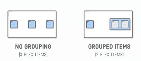
<div class='menu'>
  <div class='date'>Aug 14, 2016</div>
  <div class='links'>
    <div class='signup'>Sign Up</div>      <!-- This is nested now -->
    <div class='login'>Login</div>         <!-- This one too! -->
  </div>
</div>
.links {
border: 1px solid #fff; /* For debugging */
display: flex;
justify-content: flex-end;
}
.login {
margin-left: 20px;
}.menu {
border: 1px solid #fff;
width: 900px;
display: flex;
justify-content: space-around;
}Flexbox
Explanation of Flexbox:
Explanation and layout example:
Playgrounds:
A nice starting point!
CSS - Grid
- Row and columns
- Really easy! -- my opinion
- Really new "2017", not in IE 10 & IE11
<!DOCTYPE html>
<html lang="en">

<head>
    <meta charset="UTF-8">
    <meta name="viewport" content="width=device-width, initial-scale=1.0">
    <meta http-equiv="X-UA-Compatible" content="ie=edge">
    <title>Grid Example</title>
    <style>
        .grid-container {
            display: grid;
            grid-template-columns: 50px auto 30% auto;
            grid-template-rows: 100px 50px auto;
            column-gap: 10px;
            row-gap: 5px;
            padding: 10px;
            background-color: lightblue;
        }

        .grid-item {
            background-color: lightgrey;
            border: 1px solid black;
            text-align: center;
        }

        .item1 {
            grid-column-start: 1;
            grid-column-end: 5;
        }

        .item2 {
            grid-row-start: 2;
            grid-row-end: 6;
        }

        .item3 {
            grid-row: 2 / span 2;
        }

        .item4 {
            grid-row: 3 / span 4;
        }
    </style>
</head>

<body>
    <div class="grid-container">
        <div class="item1 grid-item">1</div>
        <div class="item2 grid-item">2</div>
        <div class="item3 grid-item">3</div>
        <div class="item4 grid-item">4</div>
        <div class="grid-item">5</div>
        <div class="grid-item">6</div>
        <div class="grid-item">7</div>
        <div class="grid-item">8</div>
        <div class="grid-item">9</div>
        <div class="grid-item">10</div>
        <div class="grid-item">11</div>
        <div class="grid-item">12</div>
    </div>
</body>

</html>
Bootstrap Utils
Their own way (utilities):
- Positioning (not responsive)
- Float & Clearfix
- Flex
- Sizing
- Utils
Flexbox - Creating a Layout
- Container
- flex-direction:
- row
- column
- axis swap!
- flex-direction:
<!DOCTYPE html>
<html lang="en">

<head>
    <meta charset="UTF-8">
    <meta name="viewport" content="width=device-width, initial-scale=1.0">
    <meta http-equiv="X-UA-Compatible" content="ie=edge">
    <title>Document</title>
    <style type="text/css">
        .container {
            display: flex;
            flex-direction: column;
            background-color: red;
            width: 600px;
            margin: 0 auto;
        }

        .child {
            border: 1px solid black;
        }
    </style>
</head>

<body>
    <div class="container">
        <div class="child">Lorem ipsum dolor sit amet consectetur adipisicing elit. Soluta nobis ipsum doloremque totam ipsam
            dignissimos iste vero laboriosam, quis, magni commodi asperiores blanditiis non dolorem sint architecto natus
            nesciunt dicta.</div>
        <div class="child">Iste quidem, voluptas dignissimos quibusdam facere sunt debitis officia doloremque eos consectetur
            illum et ad, ullam consequuntur facilis consequatur autem exercitationem nam molestias atque aut praesentium
            rerum laborum ratione. Voluptatem!</div>
        <div class="child">Inventore, voluptates necessitatibus? Consectetur dolore praesentium illum impedit corrupti suscipit
            est nostrum consequuntur ullam a. Dicta, quaerat totam ipsa minus impedit provident illo corrupti culpa labore
            cumque obcaecati libero maxime?</div>
    </div>
</body>

</html>
Chrome Dev Tools
- Chrome Development Tools
- Debug Website
- HTML, JavaScript, Network
- Prototype
- Try it out at runtime!

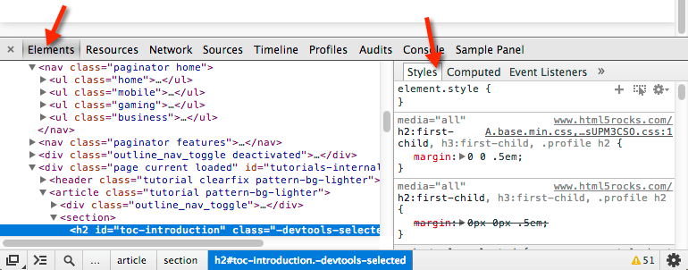
HyperText Transfer Protocol
-
HTTP = HyperText Transfer Protocol
- How is an website surfed?
- HTTP
-
Request message
-
Response message
-
- HTTP

HyperText Transfer Protocol
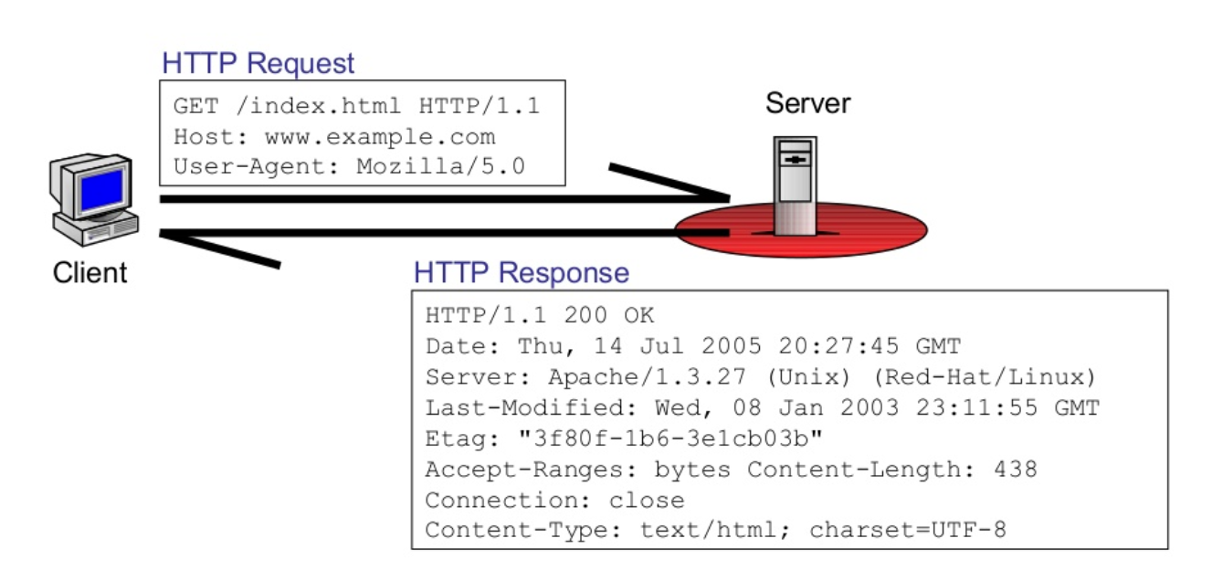
Client = a browser request a page
Server = stores html files
Let's see this in action!
Assignments
-
Three Assignments
- Portfolio
- Happy Brides
- Bootstrap
- jQuery
See Blackboard for:
- Assignments
- Course Material
- Schedule
Happy Brides - Also for Period 3
Study Material
- Freecodecamp.org (interactive tutorial)
-
Reference website & tutorial
- Video Courses – Safari: O’reilly’s learning platform for Higher Education (register here, second link)
- https://www.w3schools.com/
- Codecadamy - Web Development Path
- Books (Package deal)
- YouTube tutorials: The New Boston


HTML, CSS & JS
By Joris Lops


