CSS Grid Component Patterns
.illuminati{
	position: absolute;
    visibility: hidden;
}
(and incomplete)
History of CSS Layout
A Very Short
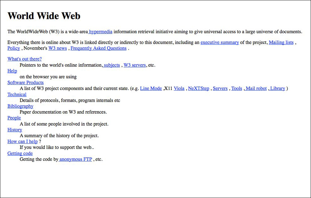
Text
In The Beginning...
Before CSS, Layout Was a Mess
- Page layout was not even an afterthought
- Early page layouts were little more than hacks
- Table Layouts
- Transparent "spacer" images
- Image Mapping
CSS added in the late 90s
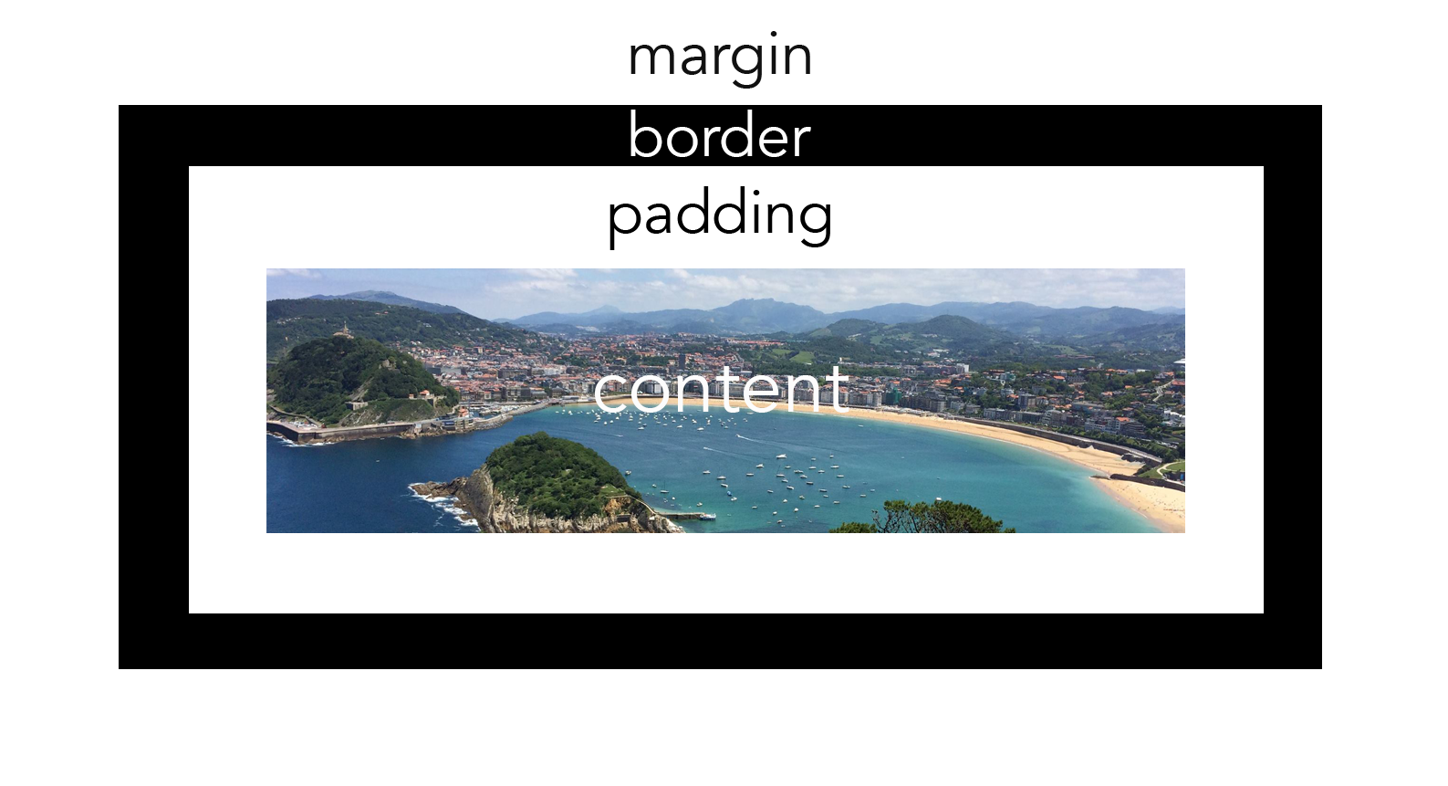
Box Model
Position

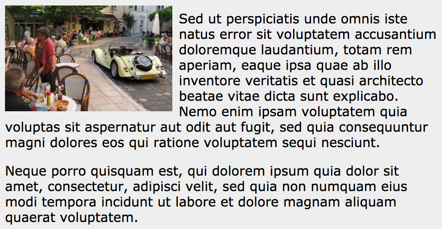
Float
Real Page Layout
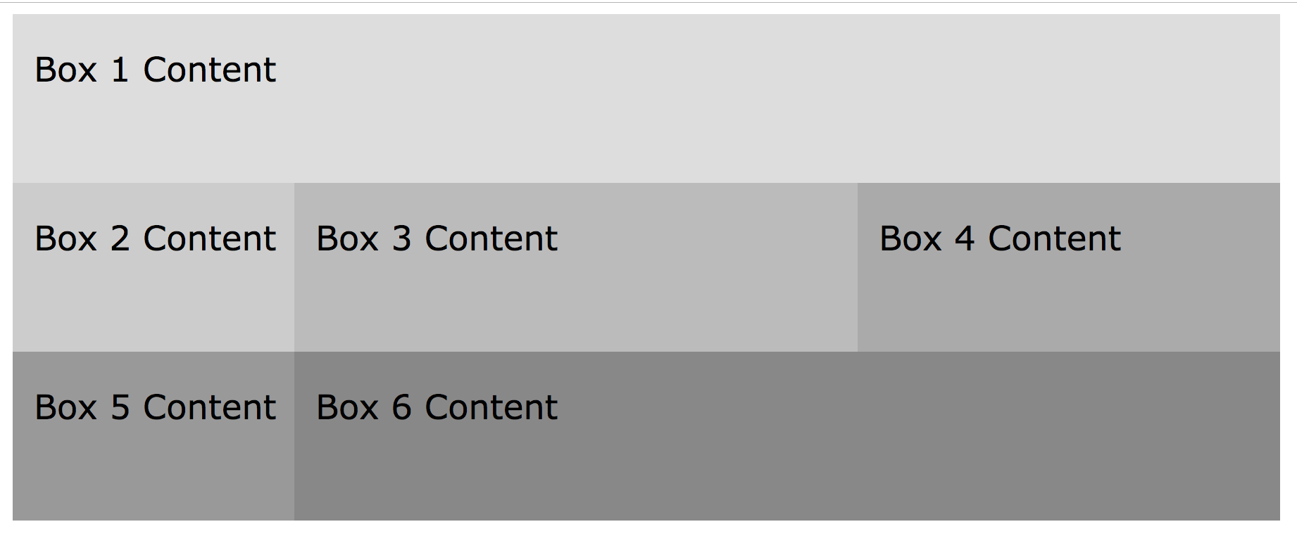
...Kinda
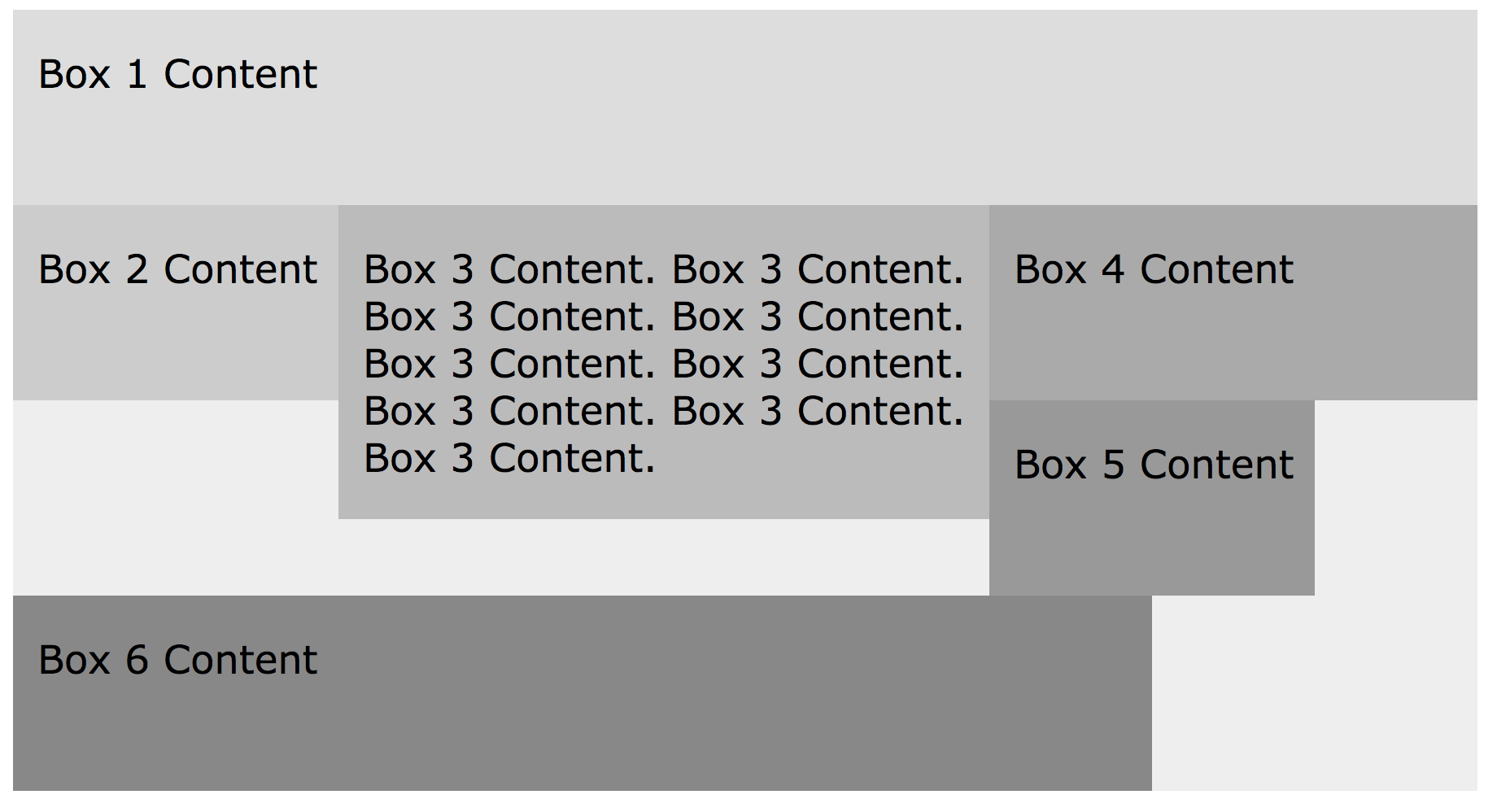
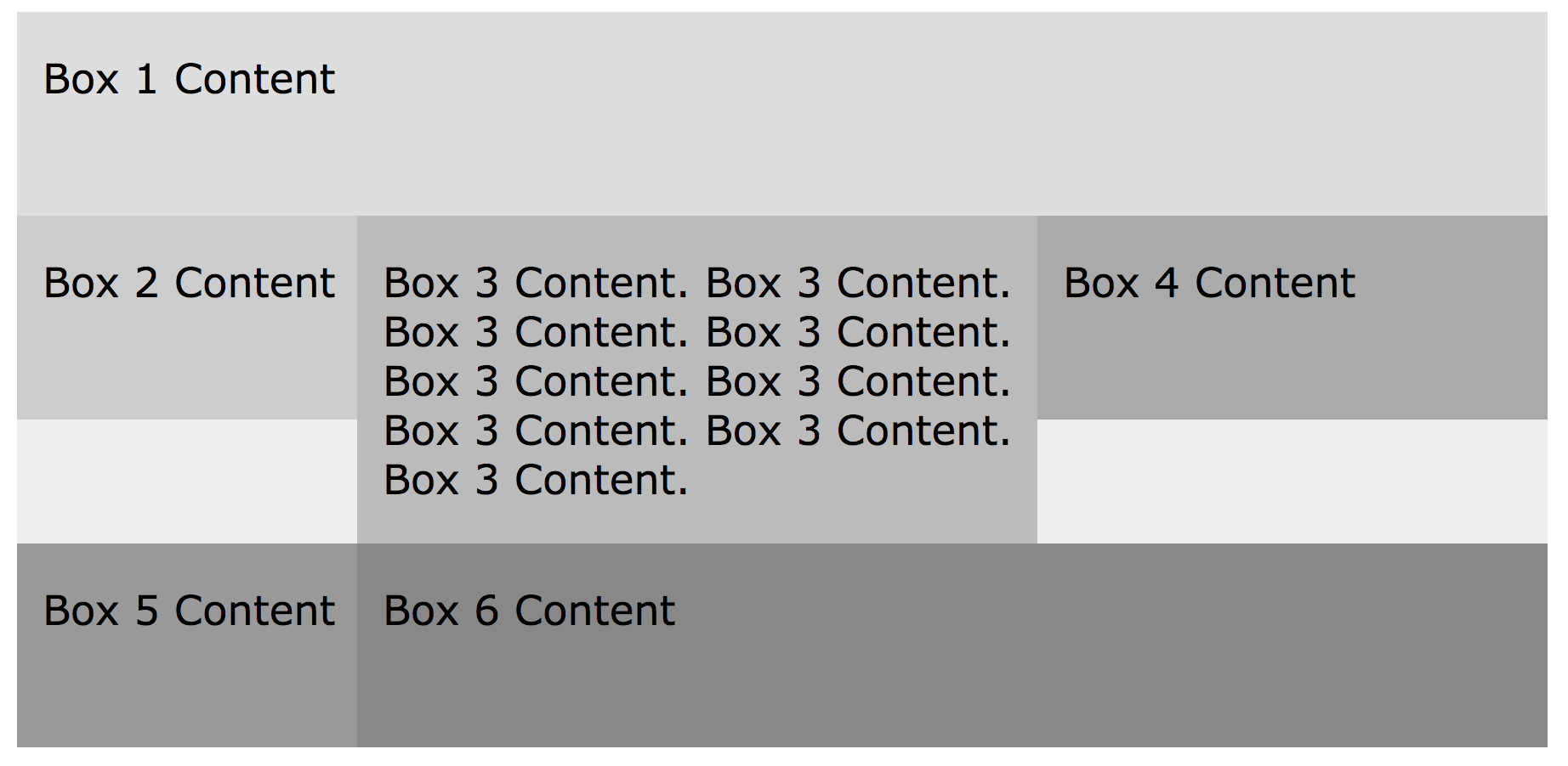
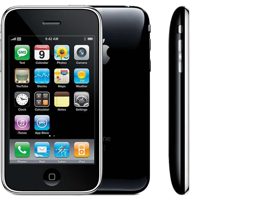
Responsive Web
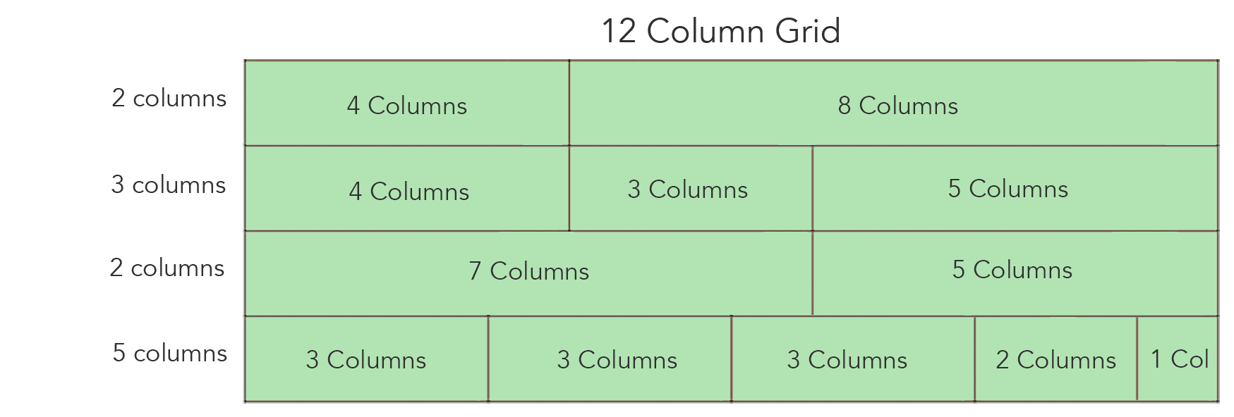
Bootstrap
CSS Still Lacked True Layout Primitives
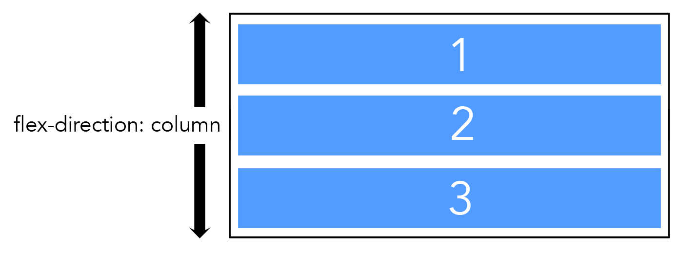
CSS Flex-Box
- It fixes the problems with float-based layouts
- Proper justification and alignment properties (centering is a thing now)
- Flexible size items with flexible spacing that will grow/shrink according to the container size
- Property values built with i18n standards
One Direction at a time

CSS Grid
What CSS Grid
- We can now define our layouts in columns and rows at the same time
- The rows/columns can be defined both explicitly and implicitly
- Introduced a concept of a "gap" property
Gap Property

CSS Grid !> Flex-Box
The Age of Components


Why Components?
- Build single responsibility UI pieces that can be composed into more complex UI parts
- Easier to Unit test components built-in isolation
- Opportunity for code reuse and standardization (Rone Design System Plug)
- Declarative API that focuses on the what and not the how
- i.e. UI is now a f(data) and not f(time)
Our Concerns Have Changed
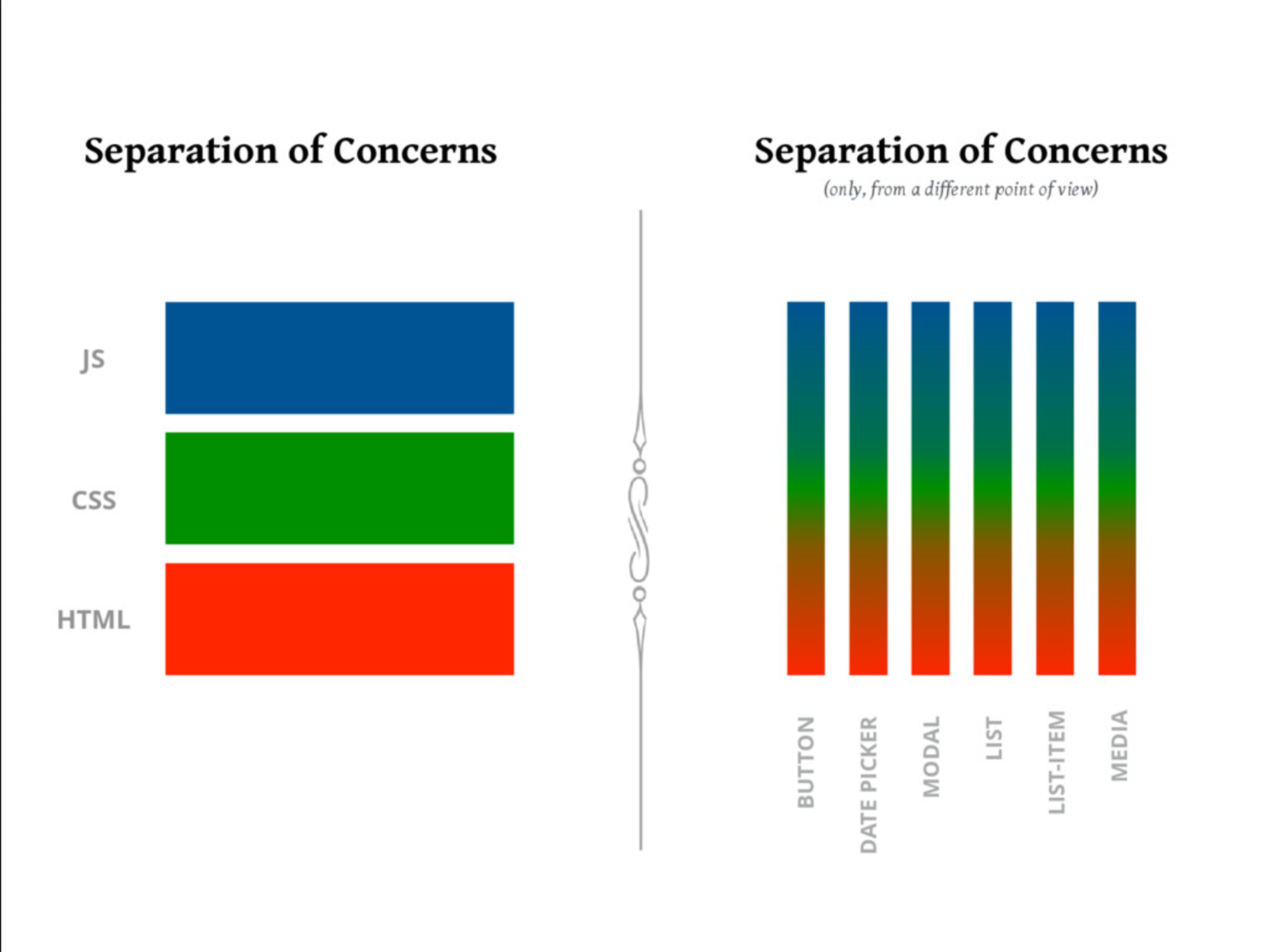
Components Have Changed How We Look at Page Layout
- Adding Margin to our components is harmful
- Most components should allow the container to determine it's the width
- Layout by itself can and should be componentized when possible
How do we use CSS Grid to build reusable Layout
Let's Address the

lephant
In the Room
IE11 does not support CSS Grid
Should I Use it?
- Global IE usage May 2020 estimated about 1.4%
- Now that Windows 7 is at the end of support and Edge has committed to supporting "IE Mode", that number will continue to drop.
- More importantly what is your app's usage?
Support != Same Experience

Support Solutions
- The Grid support might be good enough
- Use a Fallback Layout for unsupported browsers
@supports (display: grid) {
  div {
    display: grid;
  }
}

@supports not (display: grid) {
  div {
    display: flex;
  }
}
Stack
Problem
Need to create a consistent margin in between 2+ elements stacked on top of each other

Solution
display: grid;

grid-template-columns: 1fr;

gap: 1rem;Split
Problem
Putting two items next to each other with a consistent gap in between

Solution
display: grid;

gap: 1rem;

grid-template-columns: auto 1fr;Grid
Problem
Create a responsive grid of content that doesn't break the column boundaries

Solution
display: grid;

gap: 1rem;

grid-template-columns: repeat(auto-fit, minmax(250px, 1fr));Rone Design
CSS Grid Component Patterns
By Justin Travis Waith-Mair
CSS Grid Component Patterns
- 313


