Before
we jump in...
Typeface
the design of the characters/alphabet;
what you see
what you see
FONT
the physical or digital form of the alphabet;
the file format: TTF, OTF, WOFF, SVG
what you use
A typeface is like a
song
A font is like an
MP3
(or a cassette or CD
or other format)
or other format)
HOW DO YOU TALK ABOUT TYPOGRAPHY?
Good Typography
is more than
“Because it looks cool.”
MESSAGE / VOICE
authoritative - scientific - formal
friendly - feminine - handmade
READABILITY
Line length between 45-72 characters [try this handy tool]
Enough line spacing in between so that y doesn't touch T
Can you tell the difference between each letter?
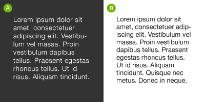
For white text on black, make sure you increase the leading,
tracking and decrease your font-weight.
Leading ("line-height: ;" ) should be inversely proportional
to your text column width.
Small column, less leading. Big column, more leading.

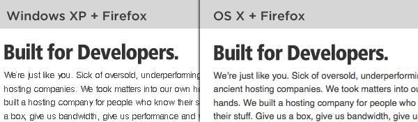
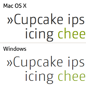
COMPATIBILITY & ACCESSIBILITY
pc and mac render type totally differently.
Anti Aliasing! It's weird, you guys.
remember to test your type.
not just in different browsers,
but on different systems.
How do you pick a typeface?
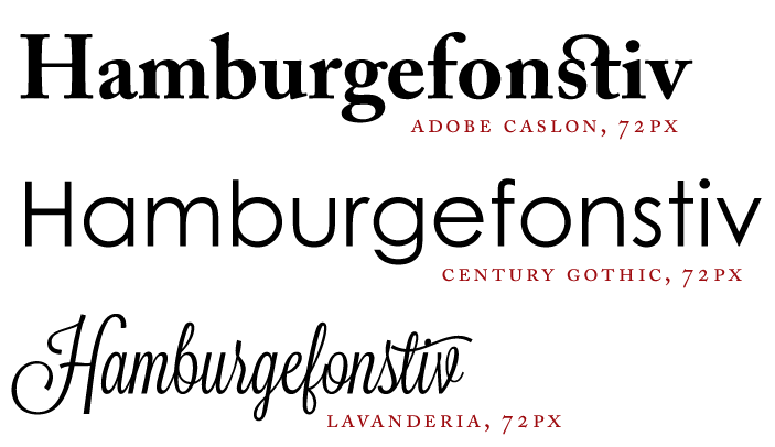
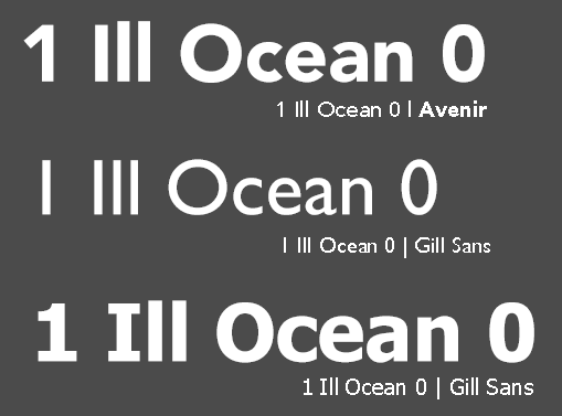
1 Ill ocean 0
Further reading:
Let's Pair our picks!
define roles
mix personalities
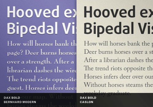
weight / power
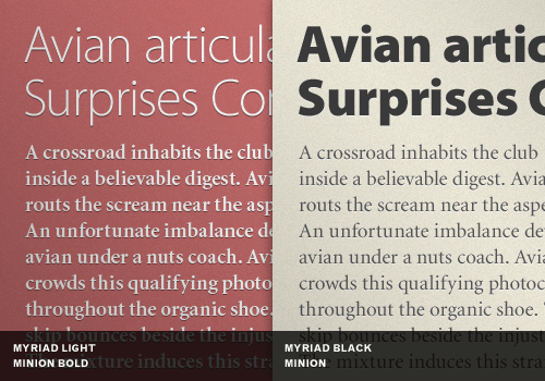
Why Pair?
use superfamilies.

Google fonts is full of novelty one-hit wonders,
but it has tons of font families with multiple weights.
Meet the families
Let's experiment
click here and let's
get prototyping on Typecast
Thanks.
@katbuilt
katbuilt.com/blog
Pick, Pair, & Prototype: Tips for choosing & using web type
By Kat Bautista
Pick, Pair, & Prototype: Tips for choosing & using web type
A five-minute presentation meant for front-end developers developing their design sensibilities. Speed up your typeface selection process, learn to talk to clients about type, and prototype your typography online with webfonts.