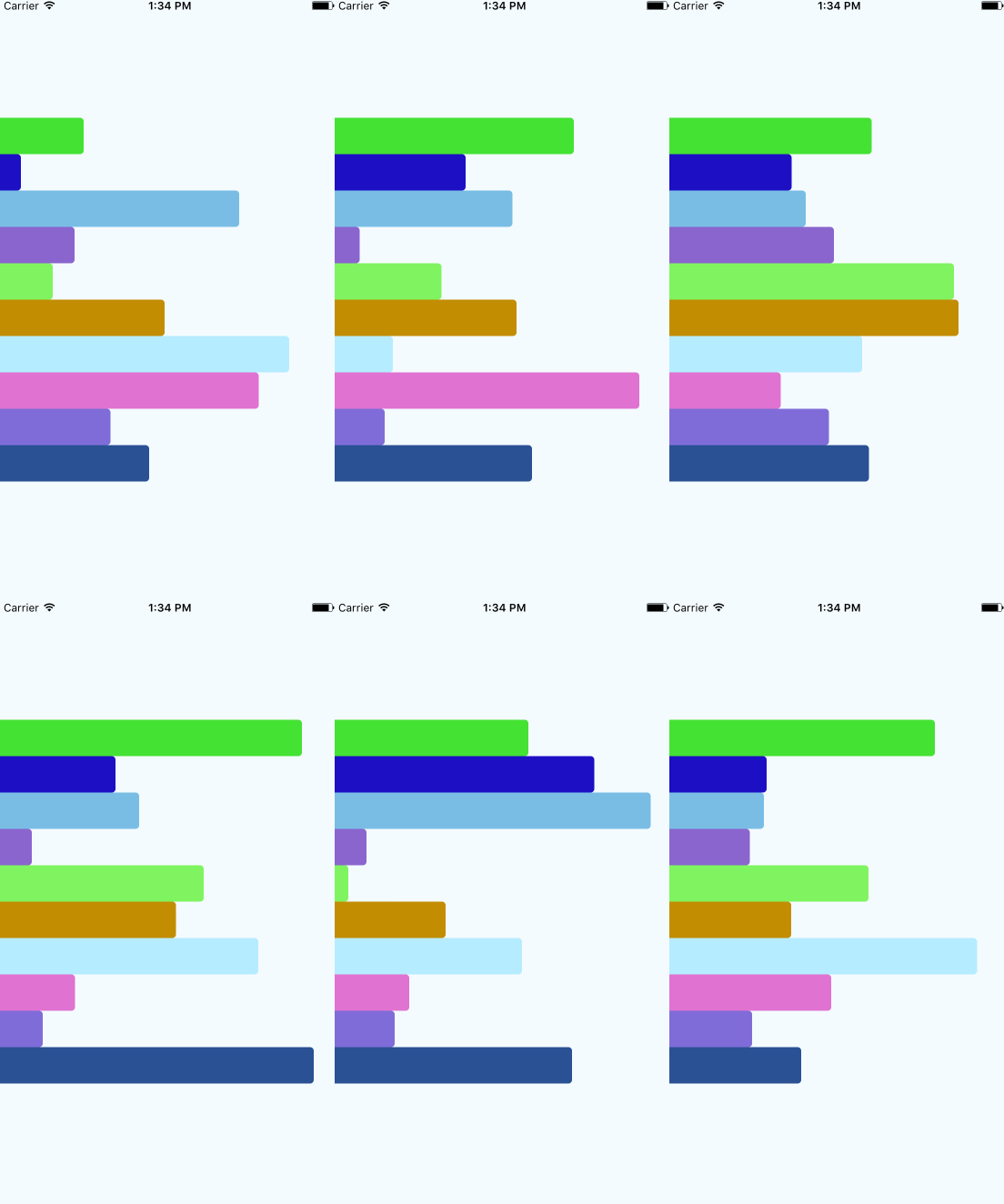
Animations in React
Intro to
by Keziyah Lewis

reactjsexample.com/tic-tac-toe-game-on-react-js/

hackernoon.com

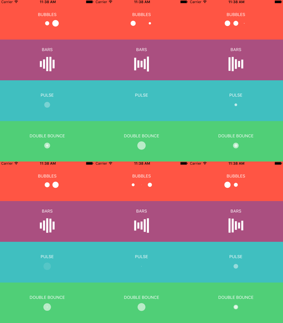
react-native-loader (github)

react-motion demo

reaction-page-transition demo

react-screen

lottie-react-native
How do you animate a React component?
Today, we will use
- CSS transitions + react-transition-group
- a 3rd party package (react-screen)
- Higher Order Components
- TweenMax
to animate a UI for a fake e-commerce site.
Because the sharing economy has officially gone too far.

Task 1
Animate the appearance of a search box upon clicking a
search icon.
Tools needed:
- react-transition-group (fork and download from Github)
Approach
CSS transitions

source: codeproject.com

Text
from Facebook's React docs
Starting Point
Import CSSTransitionGroup, and wrap it around Search
import React, { Component } from 'react'
import {Link} from 'react-router'
import CSSTransitionGroup from './react-transition-group/src/CSSTransitionGroup'
import Search from './Search'


class Hero extends Component {
    render() {
        return (
            <div id="heroimg">
                <div id="hero-text" className="container">
                    <div className="col-md-8">
                        <h1>New hair don't care.</h1>
                        <h4>Boot the bundles. Skip the beauty shop. Buy hair for your next look from people right in your neighborhood.</h4>
                    </div>
                </div>
                <CSSTransitionGroup>
                    <Search/>
                </CSSTransitionGroup>
            </div>
        )
    }
}

export default Hero
Hero.jsx
Add CSS
/*Keep consistency with class names
**Use "appear" for initial loading of the page
**Use "enter" for components that load after the page load
    such as those that load in response to an event.
**The transition seconds in CSS should match the milliseconds passed into
    CSSTransitionGroup
*/

/*Conditions for when the search form first appears.*/
 .search-enter {
    width: 0;
 }

/*Specify length of time and end result of transition, before
the search component renders as normal*/

  .search-enter.search-enter-active {
    width: 90%;
    transition: width 0.4s ease-in;
  }
style.css
Add transition props
<CSSTransitionGroup
transitionName="search"
 transitionAppear={false}
 transitionEnterTimeout={400}
 transitionEnter={true}
 transitionLeave={false}>
                     <Search/>
 </CSSTransitionGroup>
Hero.jsx
Make sure the transition name and timeout values reflect what is in style.css.
Add click handler + logic
class Hero extends Component {
    constructor() {
        super()

        this.state = { shouldShowSearch: false }
        this.showSearch = this.showSearch.bind(this)
  }

    showSearch() {
        this.setState({ shouldShowSearch: true })
    }

    render() {
        const searchIcon = <button className="mdl-button mdl-js-button"
                            id="icon-search" onClick={this.showSearch}>
                            <span className="glyphicon glyphicon-search"
                            aria-hidden="true"></span>
                            </button>
Hero.jsx
 <CSSTransitionGroup transitionName="search" transitionAppear={false}
     transitionEnterTimeout={400} transitionEnter={true} transitionLeave={false}>
                    {!this.state.shouldShowSearch && searchIcon}
                    {this.state.shouldShowSearch && <Search />}
  </CSSTransitionGroup>
There you go!
Task 2
Animate page transitions.

Approach
CSS Transitions
Tools Needed
Just CSS and keyframes or react-transition-group
Starting Point
'use strict'
import React from 'react'
import {Router, Route, IndexRoute, browserHistory} from 'react-router'
import {render} from 'react-dom'

import App from './components/App'
import Home from './components/Home'
import Results from './components/Results'

render(
    <Router history={browserHistory}>
      <Route path="/" component={App}>
          <IndexRoute component={Home} />
          <Route path="/results" component={Results} />
      </Route>
    </Router>,
  document.getElementById('main')
)
main.jsx
import React, { Component } from 'react'

class App extends Component {
    render() {
        return (
            <div>
               {this.props.children}
            </div>
        )
    }
}

export default App
App.jsx
Wrap the App's children in <CSSTransitionGroup /> and clone them.
import React, { Component } from 'react'
import CSSTransitionGroup from './react-transition-group/src/CSSTransitionGroup'

class App extends Component {
    render() {
        return (
            <div>
                //We will add transition properties later...
                <CSSTransitionGroup >
                //We need to clone the children because we are adding props
                    {React.cloneElement(this.props.children,
                    {key: this.props.location.pathname})}
                //Won't work without the key
                //location.pathname -> /results
                </CSSTransitionGroup>
            </div>
        )
    }
}

export default App
App.jsx
/*Conditions for when the search form first appears.*/
.fade-enter {
    opacity: 0.01;
}

/*Specify length of time and end result of transition, before
the search component renders as normal*/

.fade-enter.fade-enter-active {
    opacity: 1;
    transition: opacity 0.8s ease-in;
}

/*Conditions for when the search icon first leaves*/
.fade-leave {
    opacity: 1
}
/*When it first appears you can't see anything*/
.fade-appear {
    opacity: 0;
  }

/*But while it's appearing...*/
.fade-appear.fade-appear-active {
    opacity: 1;
    transition: opacity 0.8s ease-in;
}
style.css
Add CSS
//Use keyframes without react-transition-group
//Just send class names to components as a prop

.anim {
    animation: anim 1s ease-out 0s 1;
}


@keyframes anim {
    0% {
        transform: translateX(-100%);
    }
    100% {
         transform: translateX(0);
    }
}
Alternative: Use keyframes
style.css
 <CSSTransitionGroup transitionName="fade"
    transitionAppear={true} transitionEnter={true}
    transitionLeave={true}
    transitionLeaveTimeout={200}
    transitionEnterTimeout={800}
    transitionAppearTimeout={800}>
    {React.cloneElement(this.props.children,
    {key: this.props.location.pathname})}
  </CSSTransitionGroup>
App.jsx
Add transition properties
Or if just using keyframes, add the className to the div that holds the component, and you don't need <CSSTransitionGroup />
done & done
Task 3
Add a carousel for the how-to guide.

Approach
Use a node package,
react-screen by Gao Sun.
Tools needed
- react-screen
- link to CSS
- see website
source: react-view-pager on github
Starting Point
class HowTo extends Component {
    render() {
        return (
            <div className="container">
                <div id="tutorial-header">
                    <h1 id="hair-tutorial-header">Hairbnb is
                     revolutionizing the way you shop for hair.
                     Here's how.
                    </h1>
                </div>
                <HowToCard image={image1} header={header1} paragraph={paragraph1}/>
                <HowToCard image={image2} header={header2} paragraph={paragraph2}/>
                <HowToCard image={image3} header={header3} paragraph={paragraph3}/>
                <HowToCard image={image4} header={header4} paragraph={paragraph4}/>
            </div>
        )
}
}
HowTo.jsx

<HowToCard />
That's it!
import React, { Component } from 'react'
import { Screen, ScreenSlice } from 'react-screen';
//Don't forget to link to the CSS file

class HowTo extends Component {
    render() {
        return (
            <div className="container">
                <div id="tutorial-header">
                    <h1 id="hair-tutorial-header">Hairbnb is
                     revolutionizing the way you shop for hair.
                     Here's how.
                    </h1>
                </div>
                <Screen>
                    <ScreenSlice>
                        <HowToCard image={image1} header={header1} paragraph={paragraph1}/>
                    </ScreenSlice>
                    <ScreenSlice>
                         <HowToCard image={image2} header={header2} paragraph={paragraph2}/>
                    </ScreenSlice>
                    <ScreenSlice>
                        <HowToCard image={image3} header={header3} paragraph={paragraph3}/>
                    </ScreenSlice>
                    <ScreenSlice>
                        <HowToCard image={image4} header={header4} paragraph={paragraph4}/>
                    </ScreenSlice>
                </Screen>
            </div>
        )
}
}
HowTo.jsx
Task 4
Make each results card flip to reveal a "report user" form.

Approach
Higher order components with TweenMax.
Tools Needed
- link to TweenMax in script tag in HTML
- react-transition-group
source: codemyui.com

Starting Point
We have a ResultsCard component and a ReportCard component

<ResultsCard />
<ReportCard />

MakeFlip.jsx
Write HOC
import React from 'react'
import {findDOMNode, render} from 'react-dom'

function makeFlip (Component) {
    return class Flip extends React.Component {

    //This is called at the same time as componentDidMount
    componentWillEnter (callback) {
        const el = findDOMNode(this)
    }

    //This is called when the child has been removed from the ReactTransitionGroup
    componentWillLeave(callback) {
        const el = findDOMNode(this)
    }

    render() {
        return <Component { ...this.props } />
    }
    }
}

//Animation hooks that are provided a callback will prevent other
//animations from running until the callback is called.
This function takes a regular component and returns an enhanced component.
Animate with TweenMax
The fromTo function lets you specify the start and end.
of an animation.
TweenMax.fromTo(el,
                1,
                {rotation: 180, opacity: 0},
                {rotation: 0, opacity: 1, onComplete: callback}
              )
1. The element that is being animated.
2. Time in seconds
3. Starting point
4. Ending point.
function makeFlip (Component) {
    return class Flip extends React.Component {

    componentWillEnter (callback) {
        const el = findDOMNode(this)
        TweenMax.fromTo(el, 0.5, {rotationY: 180, opacity: 0},
        {rotationY: 0, opacity:1, onComplete: callback})
    }

//This hook is not needed for this animation
// (that's why time is set to 0.)
//But if I were using it, I would have the card
// flip on the Y axis -180deg.
    componentWillLeave(callback) {
        const el = findDOMNode(this)
        TweenMax.fromTo(el, 0, {rotationY:0, opacity:0},
        {rotationY: -180, opacity: 0, onComplete: callback})
    }

    render() {
        return <Component { ...this.props } />
    }
    }
}
Add animation to lifecycle hooks.
MakeFlip.jsx
Export the enhanced functions.
import React from 'react'
import {findDOMNode, render} from 'react-dom'
import ResultCard from './ResultCard'
import ReportCard from './ReportCard'


function makeFlip (Component) {
    return class Flip extends React.Component
        //...see previous slide
}

//Create the animated front card by passing it into the HOC above
export const Front = makeFlip(ResultCard)

//Create the animated back card by passing it into the HOC above
export const Back = makeFlip(ReportCard)
MakeFlip.jsx
import React, {Component} from 'react'
import TransitionGroup from './react-transition-group/src/TransitionGroup'
import {Front, Back} from './MakeFlip'

export default class Results extends Component {
  state = {
    shouldShowResult: true,
    shouldShowReport: false
  }

  toggle = () => {
    this.setState({
      shouldShowResult: !this.state.shouldShowResult,
      shouldShowReport: !this.state.shouldShowReport
    })
  }

  render () {
    return (
    <div>

//For as many cards as you have...
      <TransitionGroup>
        { this.state.shouldShowResult && <Front/>}
        { this.state.shouldShowReport && <Back/>}
      </TransitionGroup>

      <button onClick={this.toggle}>toggle</button>

    </div>
    )
  }
}
Results.jsx
Add toggling logic. Wrap components in a <TransitionGroup />
Render a toggle button or pass the toggle function as a prop to <Front /> and <Back />
...NOT <CSSTransitionGroup />
Take aways:
- You don't need jQuery
- All you really need is CSS
- Use libraries or packages
- HOCs are great for animation
- Be as creative or as lazy as you want
Learn more.
- Animations with React Transition Group: Part 1, Part 2 by Chang Wang
- Intro to React Motion, by Nash Vail
- Animated Microinteractions in React by Christian Sepulveda
- Video: Get Started Quickly with GSAP
- Facebook's react-transition-group
- react-transition-group-plus
- 29 React Motion examples on React Rocks
- Talk: Animating in React by Sarah Drasner
- Talk: SVG and GreenSock for complex animation by Sarah Drasner

Thank you
lottie-react
Link to presentation on - @KeziyahL


github.com/keziyah
Tech Talk: Intro to Animations in React
By Keziyah Lewis
Tech Talk: Intro to Animations in React
- 2,837


