


Lisi Linhart
Creative Frontend Developer
lisilinhart.info
Transitions
Animation
Transform
Easings
DevTools
Layers
Browser Rendering
CSS
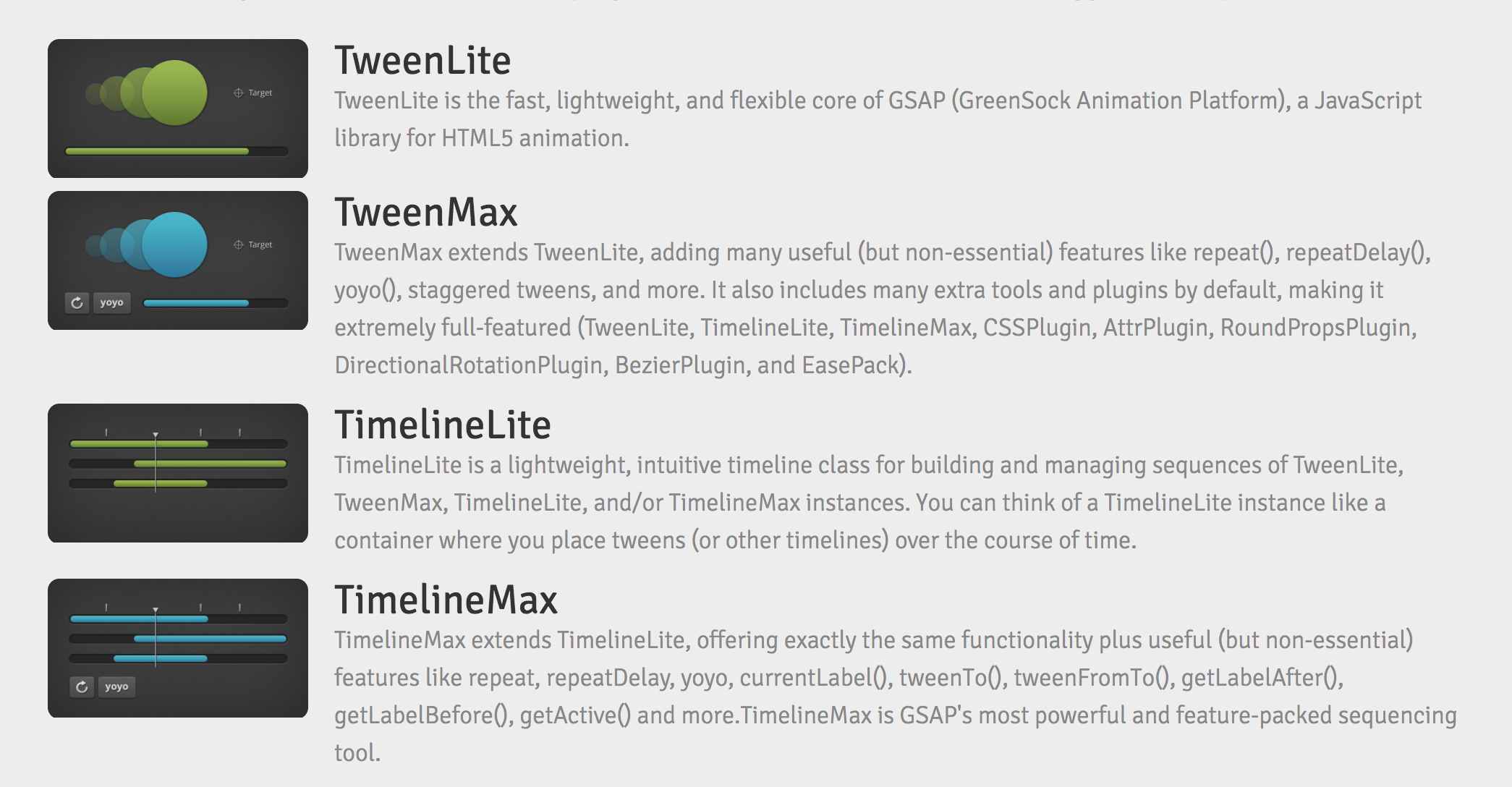
GSAP
.animate()
Libraries
controls & callbacks
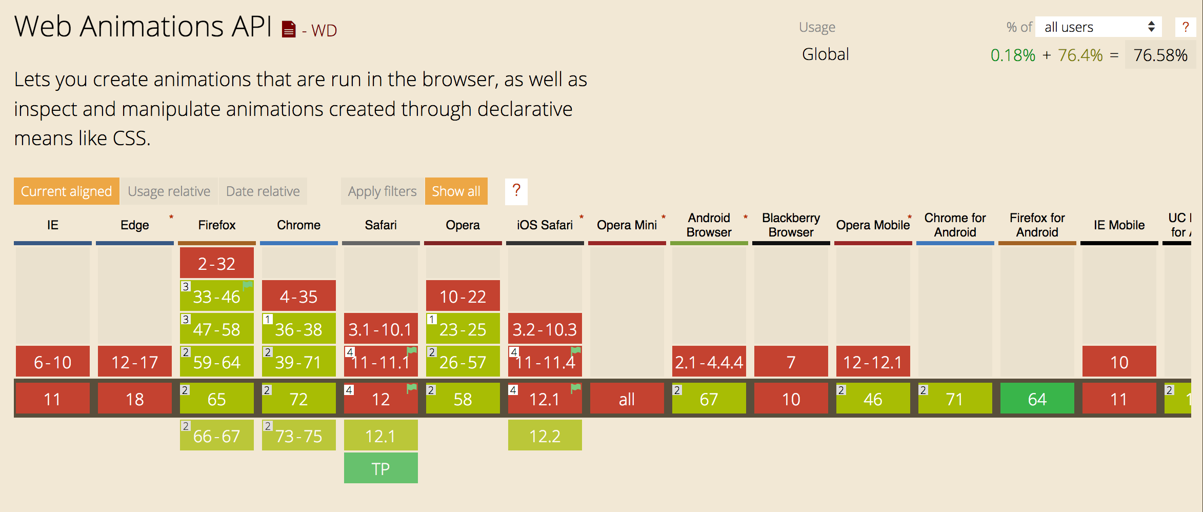
Support
.foo {
    transition: <property> <duration> <timing-function> <delay>;
}CSS
.color-delay {
  color: black;
  transition-property: color;
  transition-duration: 3s;
  transition-timing-function: ease-in-out;
  transition-delay: 2s;
}
.color-delay {
color: black;
transition: color 3s ease-in-out 2s;
}.color-delay:hover {
color: teal;
}
CSS
CSS
CSS
.color-delay {
  color: black;
  transition-property: color;
  transition-duration: 3s;
  transition-timing-function: ease-in-out;
  transition-delay: 2s;
}
.color-delay {
color: black;
}.color-delay:hover {
color: teal;
transition: color 3s ease-in-out 2s;
}
CSS
CSS
CSS
nicht hier definieren
.color-delay {
  color: black;
  transition-property: color;
  transition-duration: 3s;
  transition-timing-function: ease-in-out;
  transition-delay: 2s;
}
.color-delay {
color: black;
transition: color 3s ease-in-out 2s;
}.color-delay:hover {
color: teal;
transition: color 3s ease-in-out 2s;
}
CSS
CSS
CSS
immer im default definieren
gute für kleine Interaktionen
bei single state transitions wie :hover, :focus, :active
nicht alle CSS Properties können transitioned werden
developer.mozilla.org/enUS/docs/Web/CSS/CSS_animated_properties
.foo {
    transition: color 1s ease-in 1s, background 2s ease-out;
}
.foo {
transtion-property: color, background;
transition-duration: 1s, 2s;
transition-timing-function: ease-in, ease-out;
transition-delay: 1s, 0;
}CSS
pseudo elements erlauben Einfügen von CSS Content vor oder nach einem DOM Element
ideal für Animation, da keine unnötigen HTML Elemente erzeugt werden
die content: ""; property muss definiert sein
kein html einfügen: content: "<h1>big text</h1>";
h1::before {
  content: "🐼";
}

h1::after {
  content: "🚲";
}
<h1>Lieblingsdinge</h1>
Lieblingsdinge
🐼
🚲
CSS
HTML
Es gibt 4 Dinge, die der Browser performant animieren kann
.foo {
    transform: translateX(-20px);
}
CSS
translateX(-20px)
rotate(25deg)
scale(0.5)
skewY(-20deg)
rotateX(50deg)
.foo {
    transform-origin: 100% 50%;
}
Position von wo der Transform ausgehen soll
Default is 50% 50%
CSS
einen Button der Transforms auf dem :before oder :after Element animiert
die Animation soll beim :hover Event passieren
Animation soll über die CSS transition property geregelt werden.
transition: transform 300ms cubic-bezier(0.470, 0.000, 0.745, 0.715);@keyframes fadeInOut {
0% {
opacity: 0;
}
50% {
opacity: 1;
}
100% {
opacity: 0;
}
}.foo {
opacity: 0;
animation: fadeInOut 2s;
}
@keyframes fadeInOut {
50% {
opacity: 1;
}
}
@keyframes fadeOut {
 from {
   opacity: 0;
 }
 to {
   opacity: 1;
 }
}
CSS
CSS
CSS
.foo {
    animation: <name> <duration> <timing-function> <delay>
                <iteration-count> <direction> <fill-mode> <play-state>;
}
.foo {
animation: bounce 3s linear .2s infinite alternate forwards paused;
}CSS
.foo {
    animation: slideIn 2s, fadeIn 1.75s;
}
CSS
@for $i from 1 to $letter-count {
	span:nth-child(#{$i}) {
		animation-delay:  (0.2s * $i);
	}
}
@keyframes colorChange {
	50% {
		color: #FFBD39;
	}
}
animation: colorChange 2.5s ease-in-out infinite forwards;
Javascript
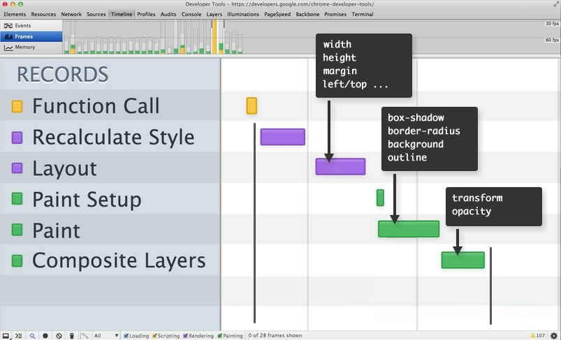
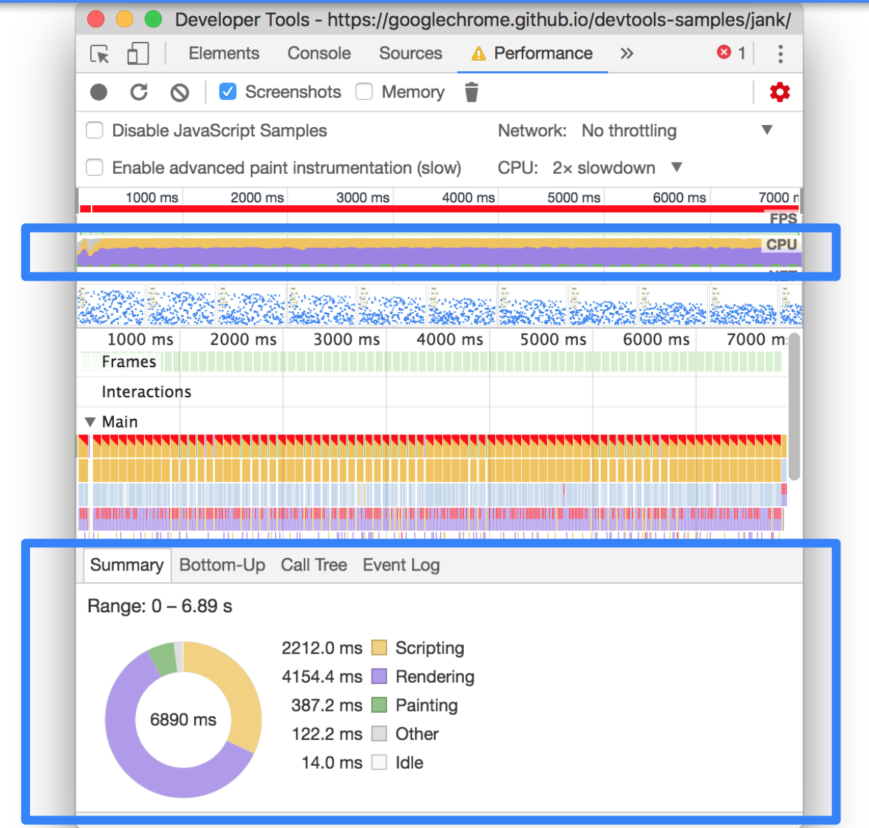
Recalculate Styles
Layout
Paint
Composite
1 frame
Javascript
Recalculate Styles
Layout
Paint
Composite
Javascript
Recalculate Styles
Layout
Paint
Composite
Javascript
Recalculate Styles
Layout
Paint
Composite
width, margin-top, left
Javascript
Recalculate Styles
Layout
Paint
Composite
background, shadow, outline
Javascript
Recalculate Styles
Layout
Paint
Composite
transform, opacity
.menu {
    top: 100%;
    transition: all 0.3s ease-in-out;
}

.menu {
    top: 0%;
}
.menu {
transform: translateY(100%);
transition: transform 0.3s ease-in-out;
}
.menu {
transform: translateY(0%);
}! Jeder Layer verbraucht Memory !
3D transforms
animierte 2d transforms
über einem compositing layer zu liegen
beschleunigte CSS filters
will-change property
@mixin accelerate($name) {
 will-change: $name;
 transform: translateZ(0);
 backface-visibility: hidden;
 perspective: 1000px;
}

.foo {
  @include accelerate(transform);
}
SCSS
nicht auf zu viele Elemente anwenden
nur nutzen wenn die Änderung konstant stattfindet
wieder entfernen wenn die Animation fertig ist
nicht supported in IE, Edge, Safari (stattdessen kann man translate3d or translateZ nutzen)
!! niemals alle Elemente auf neue Layers !!
* {
  will-change: transform;
  transform: translateZ(0);
}animiere nur transform & opacity wenn mögliche
nutze will-change oder requestAnimationFrame wo notwendig
erstelle nicht zuviele Layers
animiere Elemente in oberen Layers
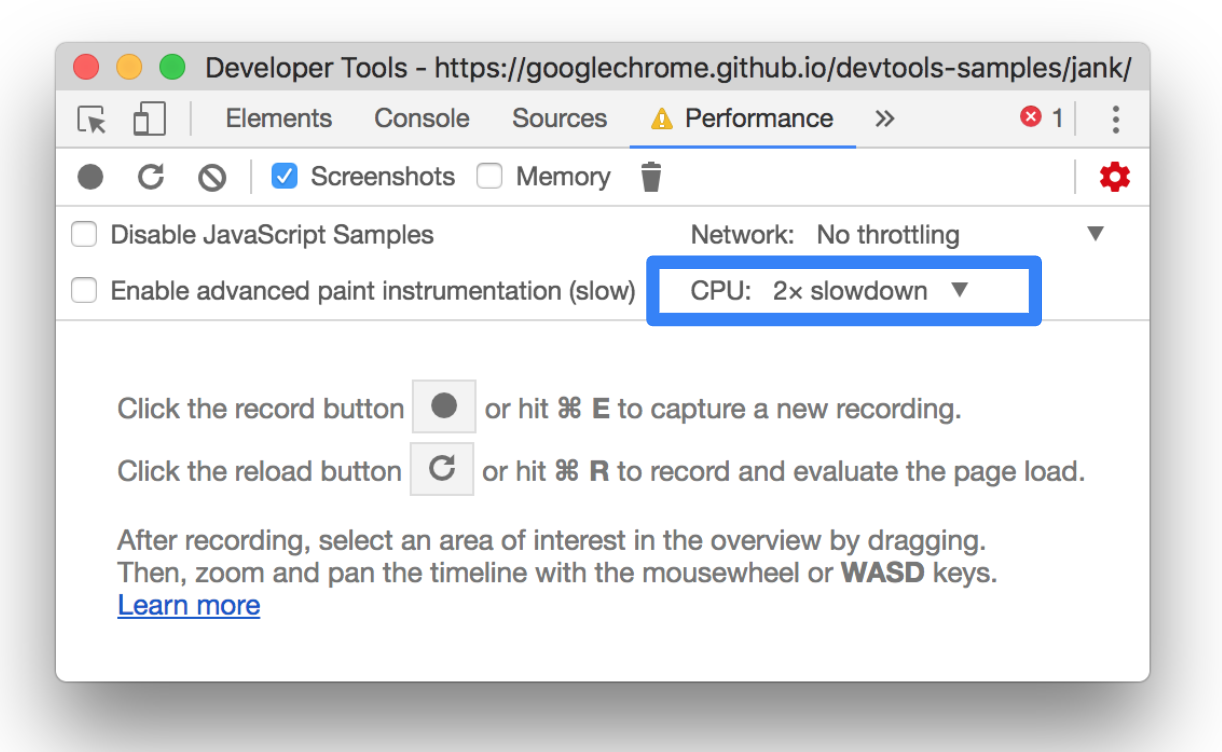
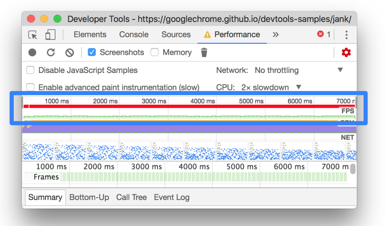
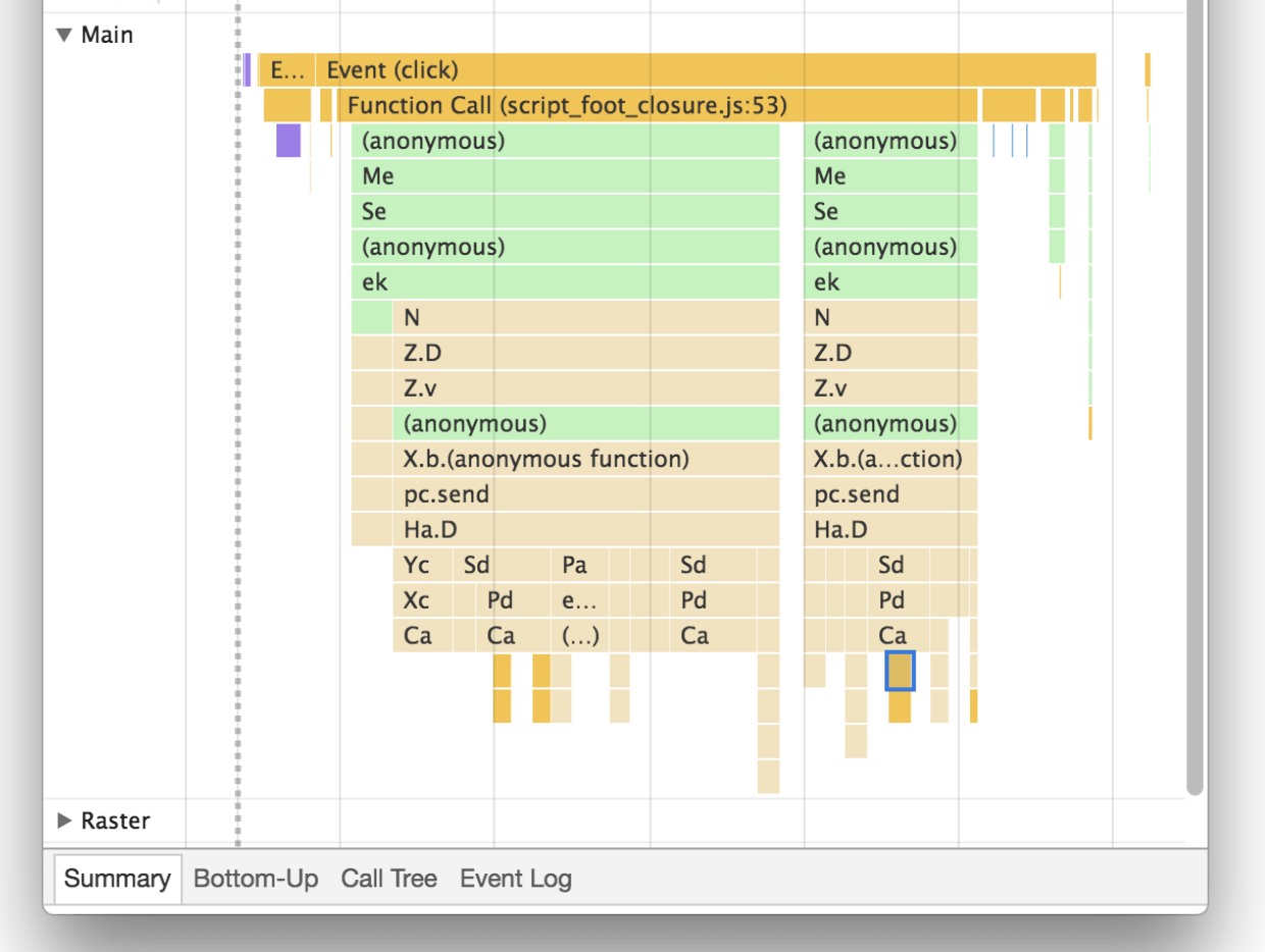
Inspiziere & teste deine Animationen in den Devtools
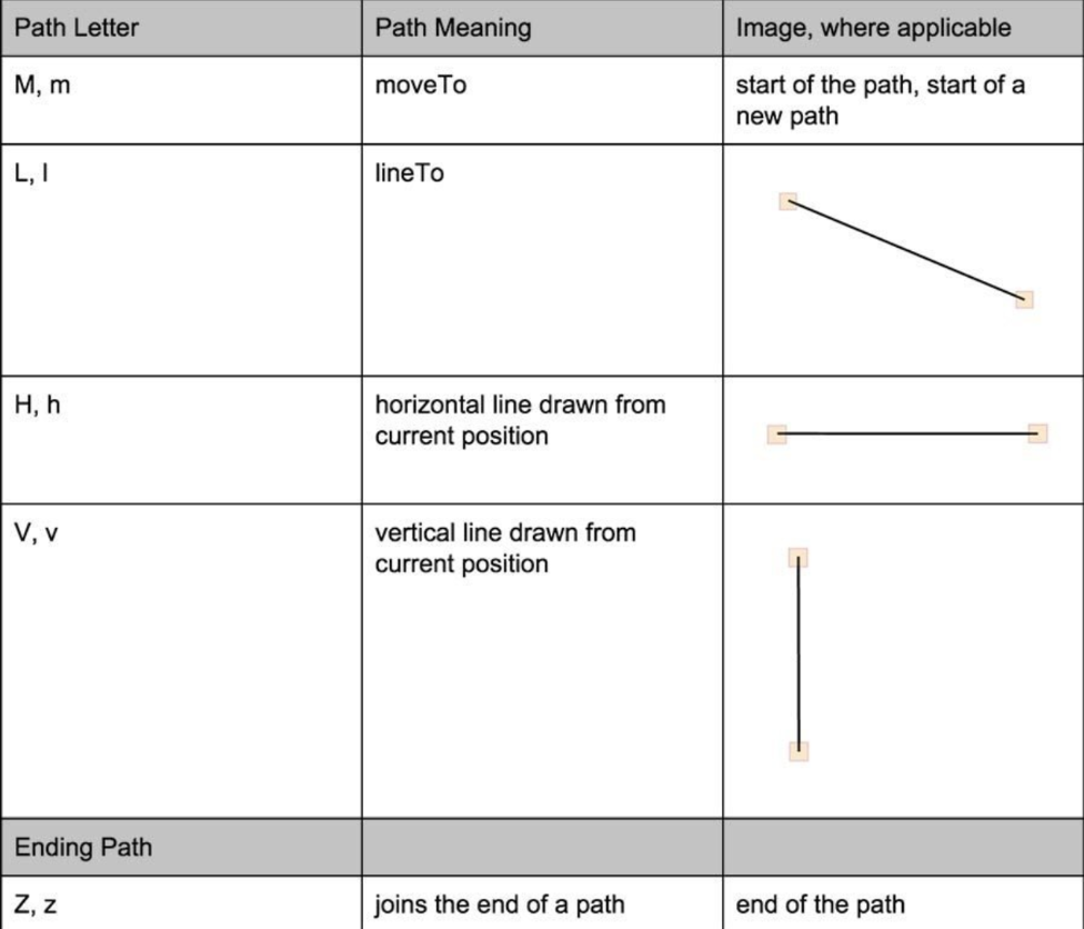
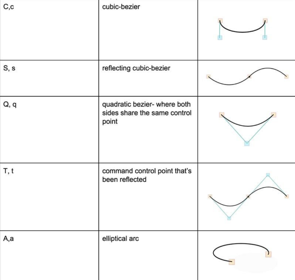
 <circle
    cx="100"
    cy="100"
    r="80"
    fill="#4e9a06" />
<ellipse
cx="170"
cy="43"
rx="27"
ry="15"
fill="#73d216"
/><rect
x="80"
y="100"
width="90"
height="90"
fill="#204a87" /><path
d="M 149,109 L 149,127 ... z"
fill="#edd400" /><polygon points="0,100 50,25 50,75 100,0" />
<svg viewBox="0 0 450 100">...</svg> svg { width: 450px; }
<svg viewBox="0 0 450 100">...</svg> svg { width: 200px; }
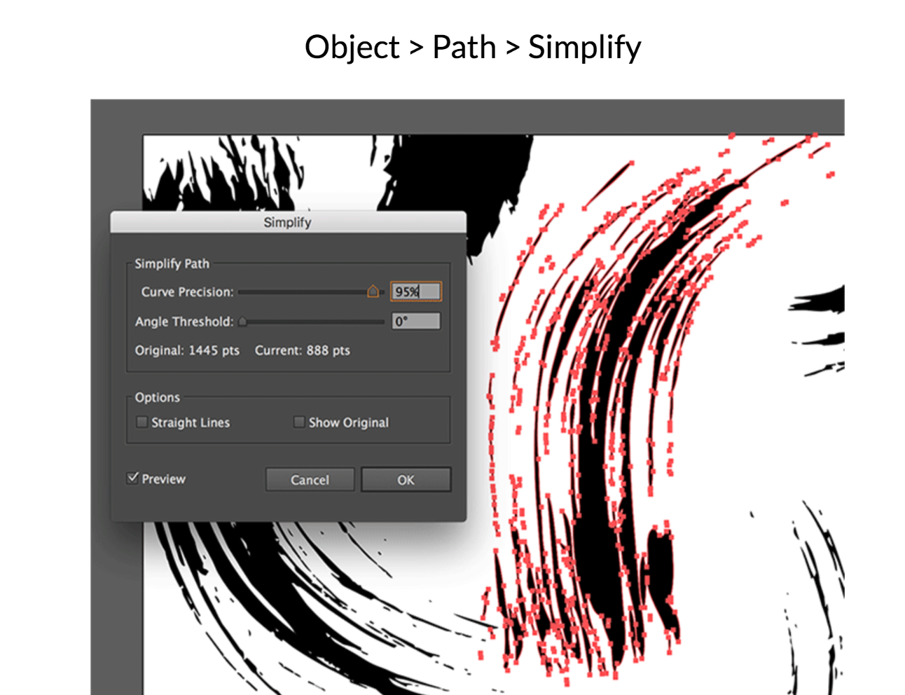
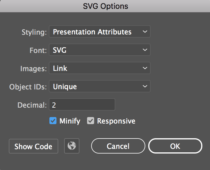
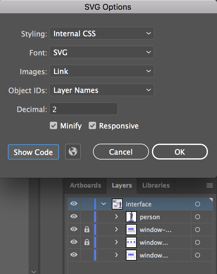
export Optionen des Editors verwenden!
<?xml version="1.0" encoding="utf-8"?>
<!-- Generator: Adobe Illustrator 18.1.1, SVG Export Plug-In
 . SVG Version: 6.00 Build 0)  -->
<svg version="1.1" id="Layer_1" xmlns="http://www.w3.org/2000/svg"
xmlns:xlink="http://www.w3.org/1999/xlink" x="0px" y="0px"
	 width="218.8px" height="87.1px" viewBox="0 0 218.8 87.1"
enable-background="new 0 0 218.8 87.1" xml:space="preserve">
<g>
	<path fill="#FFFFFF" stroke="#000000" stroke-miterlimit="10"
d="M133.1,58.2c0,0,12.7-69.2,24.4-47.5c0,0,4.1,8.6,9.5,0.9
		c0,0,5-10,10.4,0.9c0,0,12.2,32.6,13.6,43c0,0,39.8,5.4,15.8,
15.4c-13.2,5.5-53.8,13.1-77.4,5.9C129.5,76.8,77.5,61.4,133.1,58.2z"
		/>
	<path fill="#FFFFFF" stroke="#000000" stroke-miterlimit="10"
d="M6.7,61.4c0,0-3.3-55.2,20.8-54.8s-7.2,18.1,4.1,29.9
		s8.6-31.2,32.1-15.8S86.7,41,77.2,61.8C70.4,76.8,76.8,79,37.9,
79c-0.4,0-0.9,0.1-1.3,0.1C9,81,40.1,58.7,40.1,58.7"/>
</g>
</svg><svg viewBox="0 0 218.8 87.1">
<g fill="none" stroke="#000">
<path d="M7.3 75L25.9 6.8s58.4-6.4 33.5 13-41.1 32.8-11.2 30.8h15.9v5.5s42.6 18.8 0 20.6" />
<path d="M133.1 58.2s12.7-69.2 24.4-47.5c0 0 4.1 8.6 9.5.9 0 0 5-10 10.4.9 0 0 12.2
32.6 13.6 43 0 0 39.8 5.4 15.8 15.4-13.2 5.5-53.8 13.1-77.4 5.9.1 0-51.9-15.4 3.7-18.6z" />
</g>
</svg><svg xmlns="http://www.w3.org/2000/svg" viewBox="0 0 65 65">
<circle data-name="outer-fade" cx="32.5" cy="32.5" r="32.5" fill="#489ba9"/>
<circle data-name="outer-fill" cx="32.5" cy="32.5" r="32.5" fill="#fff"/>
<path data-name="outer-stroke" d="M32.5 2A30.5 30.5 0 1 1 2 32.5 30.5 30.5 0 0 1 32.5 2m0-2A32.5 32.5 0 1 0 65 32.5 32.5 32.5 0 0 0 32.5 0z" fill="#254355"/>
<path data-name="center-star-fill" d="M22.1 46.9a.4.4 0 0 1-.4-.5l2-11.3-8.3-8.1a.4.4 0 0 1 .2-.6L27 24.7l5.2-10.4a.4.4 0 0 1 .6 0L38 24.7l11.4 1.7a.4.4 0 0 1 .2.6l-8.2 8 2 11.5a.3.3 0 0 1-.2.3.3.3 0 0 1-.4 0l-10.3-5.3-10.2 5.3a.3.3 0 0 1-.2 0z" fill="#3c3c3c"/>
<path data-name="center-star-stroke" d="M22.1 46.9a.4.4 0 0 1-.4-.5l2-11.3-8.3-8.1a.4.4 0 0 1 .2-.6L27 24.7l5.2-10.4a.4.4 0 0 1 .6 0L38 24.7l11.4 1.7a.4.4 0 0 1 .2.6l-8.2 8 2 11.5a.3.3 0 0 1-.2.3.3.3 0 0 1-.4 0l-10.3-5.3-10.2 5.3a.3.3 0 0 1-.2 0zM18 27.3l7.1 7a.3.3 0 0 1 .1.3l-1.7 9.8 8.8-4.7a.4.4 0 0 1 .4 0l8.8 4.7-1.7-9.8a.3.3 0 0 1 0-.3l7.2-7-9.8-1.4a.3.3 0 0 1-.3-.2l-4.4-9-4.4 9a.3.3 0 0 1-.3.2z" fill="#3c3c3c"/>
<path data-name="star-10" d="M19.4 19.5c-.3 0-.2-1-1-2s-2-.8-2-1 1.2-.3 2-1 .9-2 1.2-2 .2 1.1 1 2 2 .8 2 1.1-1.2.2-2 1-.9 2-1.2 2z" fill="#fd7865"/>
<path data-name="star-9" d="M9.4 27.5c-.2 0-.1-.7-.6-1.3s-1.3-.5-1.3-.8.7-.1 1.3-.6.5-1.4.8-1.3.1.7.6 1.3 1.4.5 1.3.8-.7.1-1.3.6-.5 1.3-.8 1.3z" fill="#489ba9"/>
<path data-name="star-8" d="M13.4 41.5c-.3 0-.2-1-1-2s-2-.8-2-1 1.2-.3 2-1 .9-2 1.2-2 .2 1.1 1 2 2 .8 2 1.1-1.2.2-2 1-.8 2-1.2 2z" fill="#fd7865"/>
<path data-name="star-7" d="M18.4 53.5c-.2 0-.1-.7-.6-1.3s-1.4-.5-1.3-.8.7-.1 1.3-.6.5-1.3.8-1.3.1.7.6 1.3 1.3.5 1.3.8-.7.1-1.3.6-.5 1.3-.8 1.3z" fill="#fcc14c"/>
<path data-name="star-6" d="M32.4 55.5c-.3 0-.2-1-1-2s-2-.8-2-1 1.2-.3 2-1 .9-2 1.2-2 .2 1.1 1 2 2 .8 2 1.1-1.2.2-2 1-.9 2-1.2 2z" fill="#489ba9"/>
<path data-name="star-5" d="M46.4 52.5c-.2 0-.1-.7-.6-1.3s-1.3-.5-1.3-.8.7-.1 1.3-.6.5-1.3.8-1.3.1.7.6 1.3 1.3.5 1.3.8-.7.1-1.3.6-.5 1.3-.8 1.3z" fill="#fd7865"/>
<path data-name="star-4" d="M52.4 40.5c-.3 0-.2-1-1-2s-2-.8-2-1 1.2-.3 2-1 .9-2 1.2-2 .2 1.1 1 2 2 .8 2 1.1-1.2.2-2 1-.8 2-1.2 2z" fill="#fcc14c"/>
<path data-name="star-3" d="M56.4 26.5c-.2 0-.1-.7-.6-1.3s-1.3-.5-1.3-.8.7-.1 1.3-.6.5-1.4.8-1.3.1.7.6 1.3 1.3.5 1.3.8-.7.1-1.3.6-.5 1.3-.8 1.3z" fill="#fd7865"/>
<path data-name="star-2" d="M43.4 19.5c-.3 0-.2-1-1-2s-2-.8-2-1 1.2-.3 2-1 .9-2 1.2-2 .2 1.1 1 2 2 .8 2 1.1-1.2.2-2 1-.9 2-1.2 2z" fill="#489ba9"/>
<path data-name="star-1" d="M31.4 10.5c-.2 0-.1-.7-.6-1.3s-1.4-.5-1.3-.8.7-.1 1.3-.6.5-1.4.8-1.3.1.7.6 1.3 1.3.5 1.3.8-.7.1-1.3.6-.5 1.4-.8 1.3z" fill="#fcc14c"/>
</svg>TweenLite.to("div", 2, {
scaleY:0.75, scaleX:1.25, y:100, opacity:0.75, ease:Elastic.easeOut
});TweenLite.to("div", 2, {
scaleY:0.75, scaleX:1.25, y:100, opacity:0.75, ease:Elastic.easeOut
});Element Selektor
Dauer der Animation
CSS Attribute die animiert werden
Easing
TweenMax.staggerTo(".square", 2, {
    y:100,
    backgroundColor:"#4f9d88",
    ease:Elastic.easeOut
}, 0.05);const tl = new TimelineLite();
tl.to('.square--one', 1, { y: 100, ease: Back.easeOut })
.to('.square--two', .8, { rotation: '30deg', backgroundColor: 'teal', ease: Elastic.easeOut })
.to('.square--three', .5, { scale: 0.5, borderColor: '#2F3C4F', ease: Bounce.easeOut });const tl = new TimelineLite();
tl.set('.square--one', { y: -200 });
tl.to('.square--one', 1, { y: 100 })
.to('.square--two', 0.8, { rotation: '30deg' })
.to('.square--three', 0.5, { scale: 0.5 }, '-=0.4')
.fromTo('.square--four', 0.5, { scale: 0 }, { scale: 0.5 }, '+=0.25')
.to('.square--five', 0.5, { rotation: '120deg' }, { scale: 0.5 }, 0.2);neue Timeline
startet wenn die vorige Animation fertig ist
setzt Elementstyling bevor Animation startet
startet 0.4s bevor die vorige Animation fertig ist
startet 0.25s nachdem die vorige Animation fertig war
startet 0.2s nach Beginn der Timeline
TweenMax.to(obj, 1, {x:100});TweenMax.fromTo(element, 1, {x:0}, {x:100});
TweenMax.staggerTo(objects, 1, { y:"+=150", opacity:0 }, 0.2);TweenMax.staggerFromTo(objects,
1,
{opacity:1},
{opacity:0},
0.2);TweenMax.set(object, {x:100, y:50, opacity:0});<svg aria-labelledby="title"
id="svg"
role="presentation"
xmlns="http://www.w3.org/2000/svg"
viewBox="0 0 765 587">
<title id="title"
lang="en">
Icons that illustrate Global Warming Solutions
</title>Title for elements in the SVG DOM
Role to let the screen reader know whether to traverse
el.animate(<keyframes>, <timing object>);{
opacity: [ 0, 1 ], // [ from, to ]
color: [ "#fff", "#000" ] // [ from, to ]
}[
{ // from
opacity: 0,
color: "#fff"
},
{ // to
opacity: 1,
color: "#000"
}
]JS
JS
{
    duration: 2000, // milliseconds
    iterations: 1, // or Infinity
    direction: 'normal', // 'alternate', 'reverse', 'alternate-reverse'
    fill: 'forwards', // 'backwards', 'both', 'none', 'auto'
    delay: 0, // milliseconds
    endDelay: 0, // milliseconds
    easing: 'linear', // 'ease', 'ease-in-out', 'ease-in', ...
 }
JS
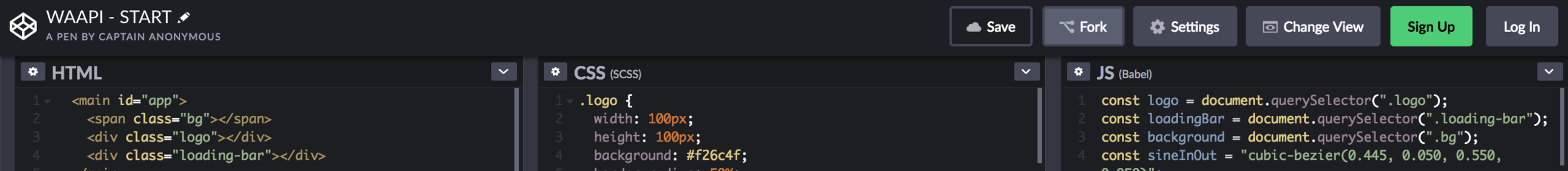
const foo = document.querySelector(".foo");

foo.animate(<keyframes array>, <timings object>);
JS
const foo = document.querySelector(".foo");

foo.animate([
    { transform: 'scale(0)', opacity: 0 },
    { transform: 'scale(1)', opacity: 1 },
  ], {
    duration: 2000,
    easing: 'ease-in-out',
    iterations: 1,
    direction: 'normal',
    fill: 'forwards'
  }
);
JS
const animation = element.animate(/* animation */);
console.log(animation.playState); //"running"

animation.pause(); //"paused"
animation.play();  //"running"
animation.cancel(); //"idle"... jump to original state
animation.finish(); //"finished"...jump to end state
animation.reverse(); // play animation in reverse

animation.playbackRate = 1.5; // play fasterconst animation = element.animate(/* animation */);
animation.onfinish = function() {
console.log("Animation finished");
};
// remove element from DOM
animation.oncancel = animation.effect.target.remove();const keyframes = [
{ transform: 'translateY(0%)', easing: 'ease-in', offset: 0 },
{ transform: 'translateY(500%)', easing: 'ease-out', offset: .33 },
{ transform: 'translateY(420%)', easing: 'ease-in', offset: .5 },
{ transform: 'translateY(500%)', easing: 'ease-out', offset: .66 },
{ transform: 'translateY(460%)', easing: 'ease-in', offset: .82 },
{ transform: 'translateY(500%)', easing: 'ease-out', offset: .92 },
{ transform: 'translateY(480%)', easing: 'ease-in', offset: .97 },
{ transform: 'translateY(500%)', easing: 'ease-out', offset: 1 },
];
const timing = {
    duration: 2000,
    iterations: 1,
    direction: 'normal',
    fill: 'forwards',
    delay: 0,
    endDelay: 0,
    easing: 'linear',
};
const apple = document.querySelector(".apple");
const animation = apple.animate(keyframes, timing);tree.addEventListener('click', () => {
animation.currentTime = 0;
animation.play();
});apple.addEventListener('click', () => {
animation.playbackRate += 0.2;
});player.onfinish = function() {
console.log(player.currentTime); // 3500
};background.animate({
transform: ['scaleY(0)', 'scaleY(1)'],
},{
duration: 700,
fill: 'both',
easing: sineInOut,
});cssreference.io/animations/
developer.mozilla.org/en-US/docs/Web/API/Web_Animations_API
cross-browser compatiblity & SVG
browser renderer & optimization
native Animation vs. externe Libraries
small size vs. fancy plugins
By Lisi Linhart
Workshop JSDays München


