


Lisi Linhart
Creative Frontend Developer
.foo {
    transition: <property> <duration> <timing-function> <delay>;
}CSS
.color-delay {
  color: black;
  transition-property: color;
  transition-duration: 3s;
  transition-timing-function: ease-in-out;
  transition-delay: 2s;
}
.color-delay {
color: black;
transition: color 3s ease-in-out 2s;
}.color-delay:hover {
color: teal;
}
CSS
CSS
CSS
.color-delay {
  color: black;
  transition-property: color;
  transition-duration: 3s;
  transition-timing-function: ease-in-out;
  transition-delay: 2s;
}
.color-delay {
color: black;
}.color-delay:hover {
color: teal;
transition: color 3s ease-in-out 2s;
}
CSS
CSS
CSS
don't define it here
.color-delay {
  color: black;
  transition-property: color;
  transition-duration: 3s;
  transition-timing-function: ease-in-out;
  transition-delay: 2s;
}
.color-delay {
color: black;
transition: color 3s ease-in-out 2s;
}.color-delay:hover {
color: teal;
}
CSS
CSS
CSS
always define it in the default state
great for small interactions
use on single state transitions like :hover, :focus, :active
not all properties can be transitioned, e.g. display
developer.mozilla.org/enUS/docs/Web/CSS/CSS_animated_properties
@keyframes fadeInOut {
  0% {
   opacity: 0;
 }
  50% {
   opacity: 1;
 }
 100% {
   opacity: 0;
 }
}
.foo {
opacity: 0;
animation: fadeInOut 2s;
}
@keyframes fadeInOut {
50% {
opacity: 1;
}
}
@keyframes fadeOut {
 from {
   opacity: 0;
 }
 to {
   opacity: 1;
 }
}
CSS
CSS
CSS
.foo {
    animation: <name> <duration> <timing-function> <delay>
                <iteration-count> <direction> <fill-mode> <play-state>;
}
.foo {
animation: bounce 3s linear .2s infinite alternate forwards paused;
}CSS
.foo {
    animation: slideIn 2s, fadeIn 1.75s;
}
CSS
4 things the browser can animate cheaply
.foo {
    transform: translateX(-20px);
}
CSS
translateX(-20px)
rotate(25deg)
scale(0.5)
skewY(-20deg)
rotateX(50deg)
.foo {
    transform-origin: 100% 50%;
}
Position for where the transform should origin
Default is 50% 50%
CSS
Javascript
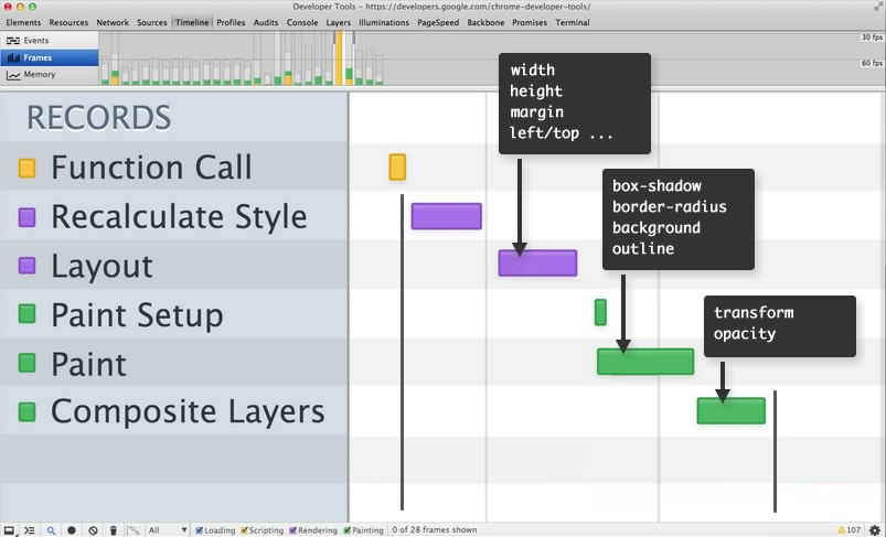
Recalculate Styles
Layout
Paint
Composite
1 frame
Javascript
Recalculate Styles
Layout
Paint
Composite
width, margin-top, left
Javascript
Recalculate Styles
Layout
Paint
Composite
background, shadow, outline
Javascript
Recalculate Styles
Layout
Paint
Composite
transform, opacity
3D transforms
animated 2d transforms
being on top of a compositing layer
accelerated CSS filters
will-change property
! Every layer consumes memory !
@mixin accelerate($name) {
 will-change: $name;
 transform: translateZ(0);
 backface-visibility: hidden;
 perspective: 1000px;
}

.foo {
  @include accelerate(transform);
}
SCSS
don't optimize too many elements
use it only if the change will happen constantly
remove it once the animation finished
not supported in IE, Edge, Safari (use translate3d or translateZ instead)
a function that the browser can optimize it, so animations will be smoother
you don't need it if you're using the Web Animations API, Greensock
cancelAnimationFrame to end function calling
function repeatOften() {
  // Animate something
  requestAnimationFrame(repeatOften);
}

requestAnimationFrame(repeatOften);
JS
animate only transform & opacity if possible
use will-change, requestAnimationFrame where needed
don't create too many layers
animate elements on the top layers
inspect & test your animations in the devtools
animate only transform & opacity if possible
use will-change, requestAnimationFrame where needed
don't create too many layers
animate elements on the top layers
inspect & test your animations in the devtools
:root {
  --my-color: crimson;
}
CSS
button {
  background-color: var(--my-color, red);
}
button.special {
  --my-color: teal;
}const element = document.querySelector('.foo');
element.style
.setProperty('--my-color', 'orange');
element.style
.getPropertyValue('--my-color'); // => 'orange'
element.style
.removeProperty('--my-color');JS
:root {
    --primary: #f60;
}

.foo {
    color: var(--primary, orange);
}
global
.foo {
    --primary: #f60;
    color: var(--primary, orange);
}
local
CSS variables are inheritable
CSS
CSS
.foo {
    transform: translateX(var(--x)) rotate(var(--rotation));
}
CSS
const foo = document.querySelector('.foo');

document.addEventListener('mousemove', (e) => {
  foo.style.transform = `
    translateX(${e.clientX}px)
    translateY(${e.clientY}px)
  `;
});
JS
const root = document.documentElement.style;

document.addEventListener('mousemove', (e) => {
  root.setProperty('--mouse-x', x);
  root.setProperty('--mouse-y', y);
});
.foo {
  transform:
    translateX(calc(var(--mouse-x) * 1px))
    translateY(calc(var(--mouse-y) * 1px));
}
JS
CSS
el.animate(<keyframes>, <timing object>);{
opacity: [ 0, 1 ], // [ from, to ]
color: [ "#fff", "#000" ] // [ from, to ]
}[
{ // from
opacity: 0,
color: "#fff"
},
{ // to
opacity: 1,
color: "#000"
}
]JS
JS
{
    duration: 2000, // milliseconds
    iterations: 1, // or Infinity
    direction: 'normal', // 'alternate', 'reverse', 'alternate-reverse'
    fill: 'forwards', // 'backwards', 'both', 'none', 'auto'
    delay: 0, // milliseconds
    endDelay: 0, // milliseconds
    easing: 'linear', // 'ease', 'ease-in-out', 'ease-in', ...
 }
JS
const foo = document.querySelector(".foo");

foo.animate(<keyframes array>, <timings object>);
JS
const foo = document.querySelector(".foo");

foo.animate([
    { transform: 'scale(0)', opacity: 0 },
    { transform: 'scale(1)', opacity: 1 },
  ], {
    duration: 2000,
    easing: 'ease-in-out',
    iterations: 1,
    direction: 'normal',
    fill: 'forwards'
  }
);
JS
const animation = element.animate(/* animation */);
console.log(animation.playState); //"running"

animation.pause(); //"paused"
animation.play();  //"running"
animation.cancel(); //"idle"... jump to original state
animation.finish(); //"finished"...jump to end state
animation.reverse(); // play animation in reverse

animation.playbackRate = 1.5; // play fasterconst animation = element.animate(/* animation */);
animation.onfinish = function() {
console.log("Animation finished");
};
// remove element from DOM
animation.oncancel = animation.effect.target.remove();const keyframes = [
{ transform: 'translateY(0%)', easing: 'ease-in', offset: 0 },
{ transform: 'translateY(500%)', easing: 'ease-out', offset: .33 },
{ transform: 'translateY(420%)', easing: 'ease-in', offset: .5 },
{ transform: 'translateY(500%)', easing: 'ease-out', offset: .66 },
{ transform: 'translateY(460%)', easing: 'ease-in', offset: .82 },
{ transform: 'translateY(500%)', easing: 'ease-out', offset: .92 },
{ transform: 'translateY(480%)', easing: 'ease-in', offset: .97 },
{ transform: 'translateY(500%)', easing: 'ease-out', offset: 1 },
];
const timing = {
    duration: 2000,
    iterations: 1,
    direction: 'normal',
    fill: 'forwards',
    delay: 0,
    endDelay: 0,
    easing: 'linear',
};
const apple = document.querySelector(".apple");
const animation = apple.animate(keyframes, timing);tree.addEventListener('click', () => {
animation.currentTime = 0;
animation.play();
});apple.addEventListener('click', () => {
animation.playbackRate += 0.2;
});cross-browser compatiblity & SVG
browser renderer & optimization
native animation vs external library
small size vs. fancy plugins
By Lisi Linhart
An intro to the Web Animation


