We see a "cover" page for the website with a banner-type image advertising her new album "ANTI R8". This cover page has really influenced me to create my own cover page for my website as it looks very professional and sleek.
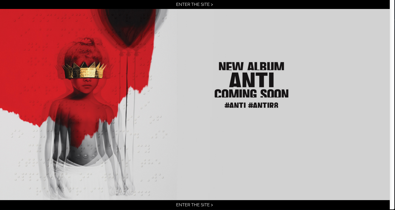
At the header and footer we se the words "ENTER SITE >", hovering over the words reveal that it is actually a link to her actual website. The colours used on the cover page from both the text and the artwork give off a very eerie tone which could signify the style of music of her new album.
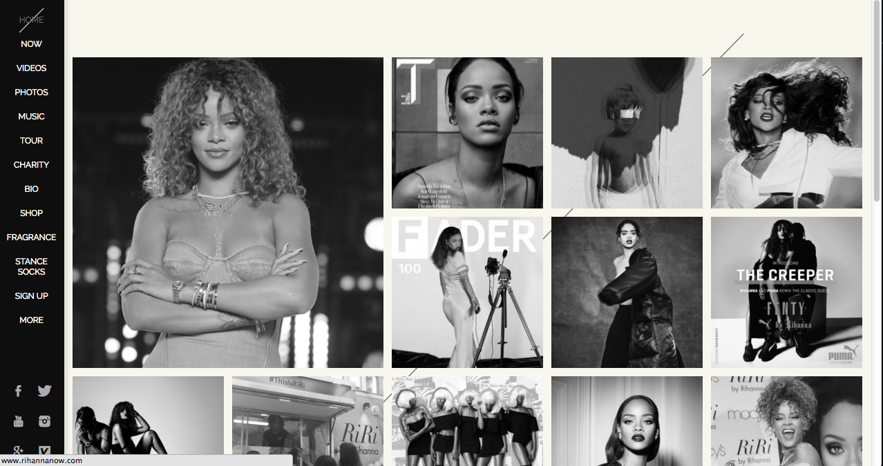
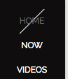
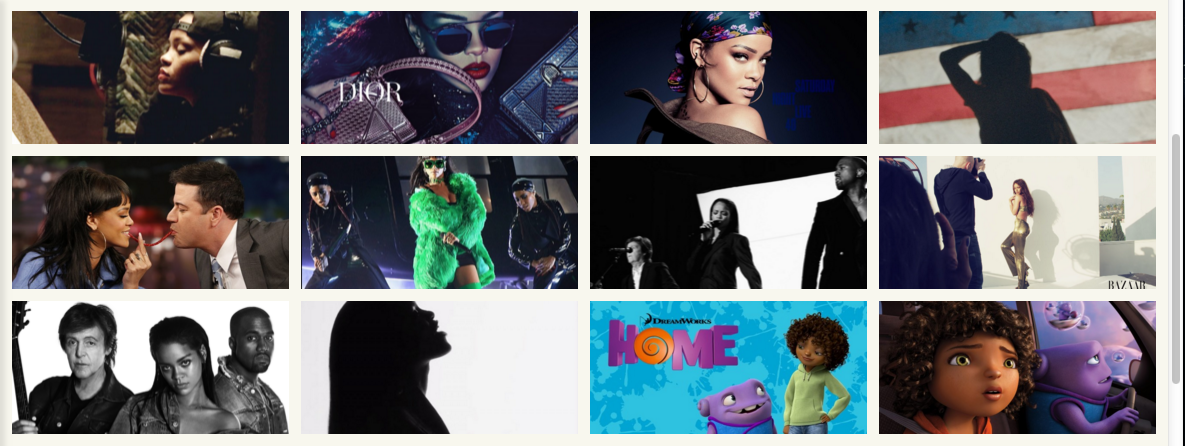
Upon entering the website we are automatically on the home page which is filled with photos regarding what Rihanna has been doing. The website's background is very plain in my opinion (a plain grey background with a black slash in the centre) however the black slash is seen to be all over the website, for example in the navigation bar a black slash is shown to show us the page that we are currently on:
The nav bar, unlike the majority of other artist's websites is on the left hand side and is a vertical nav bar.
Upon first look, the website seems to be colourless as everything seems to be in either black, white or grey. However when hovering over an image the colour appears on the image making it feel as if we have made the image come to life (which is very interactive and engages the audience):
Hovering over the images also reveal information about it which could be informative for the fans.
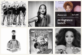
The photos when clicked on, redirect you to her "Now" page which shares the same features as a blog page. The "Now" page is a chronological blog which shows everything Rihanna has been doing which is very useful for her fans.
The dates on the blog keep to the visual style of the website a they also feature a slash through them. When hovering over the dates on the page, it reveals a banner style image which gives us a "sneak peek" of what we will see when we click on the article/date, this subtle interactive feature is what makes the website look so professional.
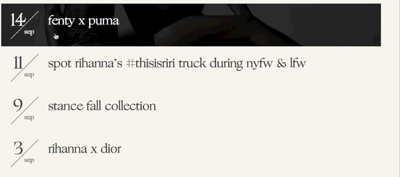
The option to filter the type of content on screen is made available too suggesting that Rihanna has been very busy.
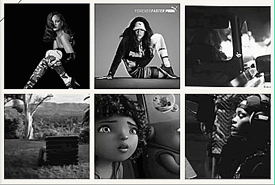
Rihanna's "Videos" page reveals a grid type view of all her videos. I like the layout and design of her Videos page as it makes the website look busy and full of content for the fans.
We are also given the option to filter the content on screen as there are different types of videos we are able to watch such as BTS (Behind the Scenes), Music Videos, Films etc. this makes it easier for the audience.
The "Photos" page keeps to the layout of the Videos page as all the photos are in a grid view. I like the grid design and will try to incorporate it into my website for my Videos and Photos page.
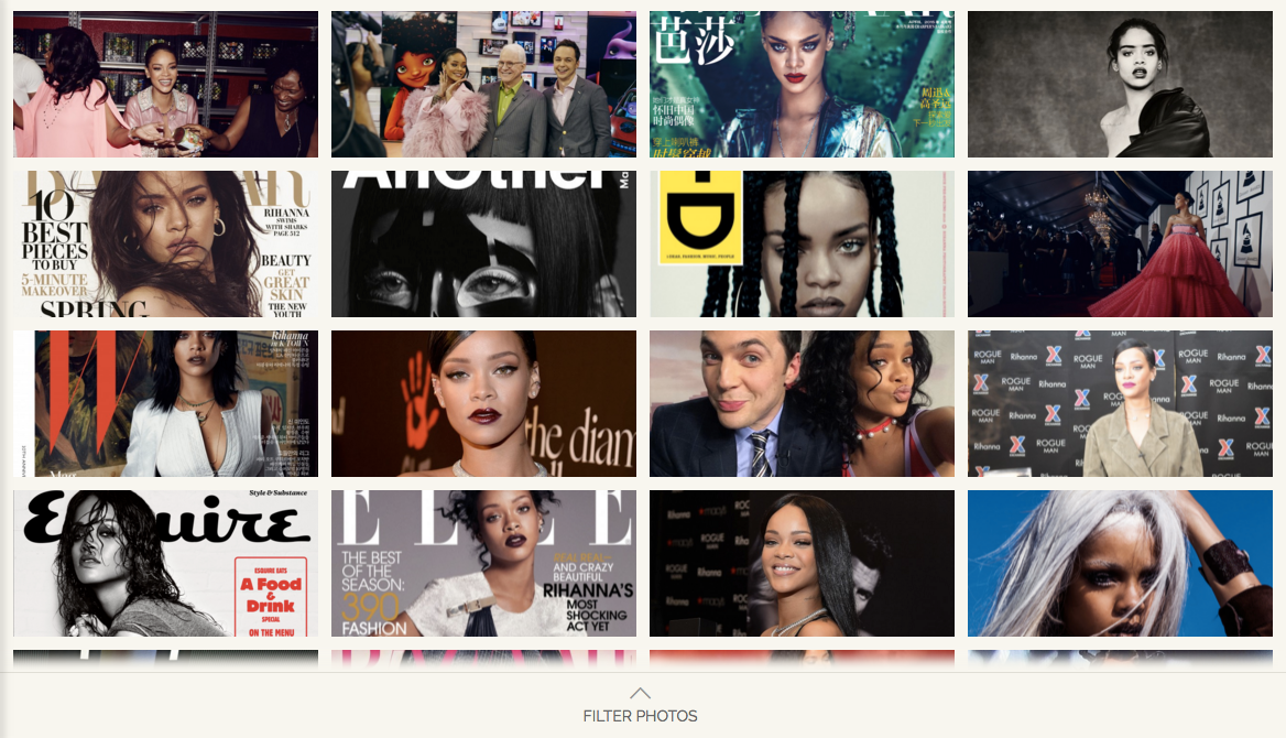
Again, we are given the option to filter the content we see which makes it even easier for the audience to sift through the information to look for what they want, showing that Rihanna has paid attention to every little detail as she cares about her fans a lot.
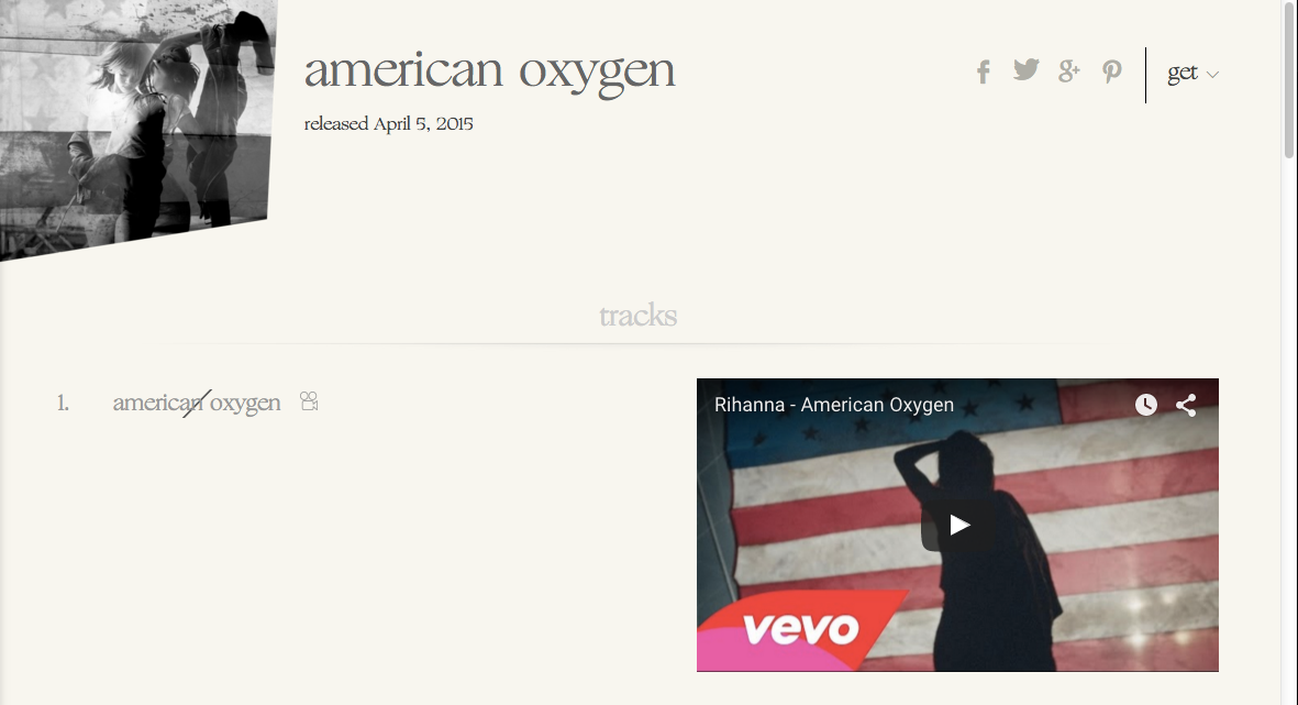
Her "Music" page also keeps to the grid view and is in my opinion, the most interactive and interesting page as we are given her entire discography to view. Clicking on an album cover expands the page to show us information about the album such as release date and tracklisting and even music videos:
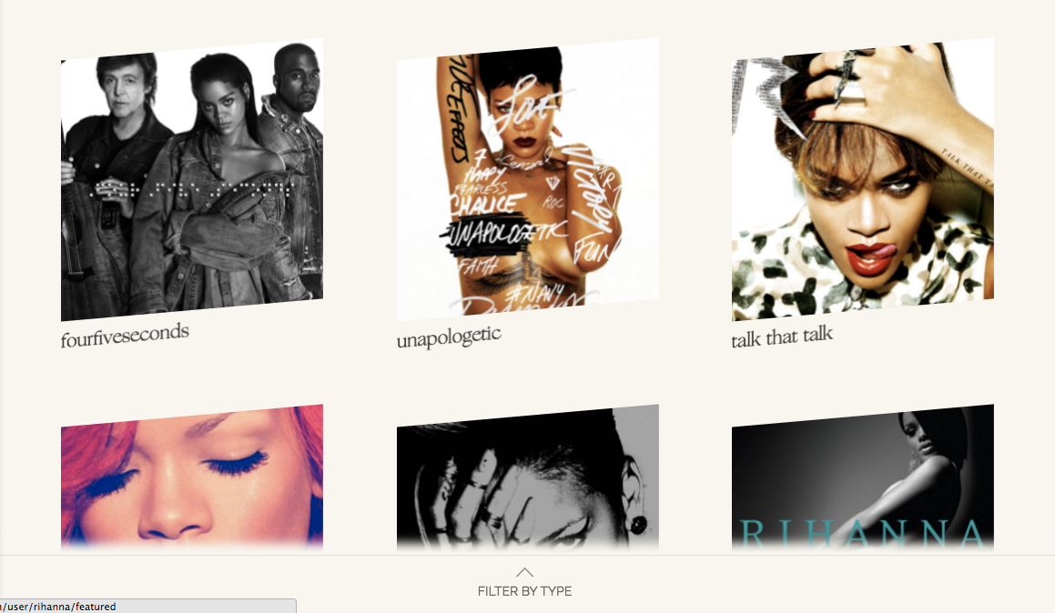
Showing her dedication to her fans, on some albums/singles when clicked, reveals the lyrics for the song!
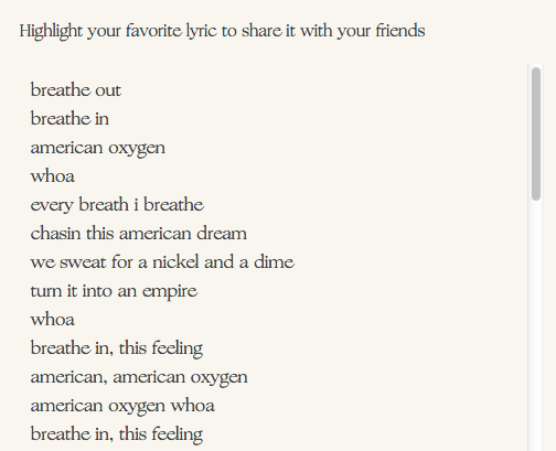
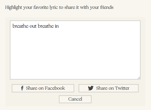
We are given the option to "Highlight your favourite lyric to share with your friends". The website encourages the use of social media in a very subtle way that isn't in your face unlike other websites, something I really admire about the website.
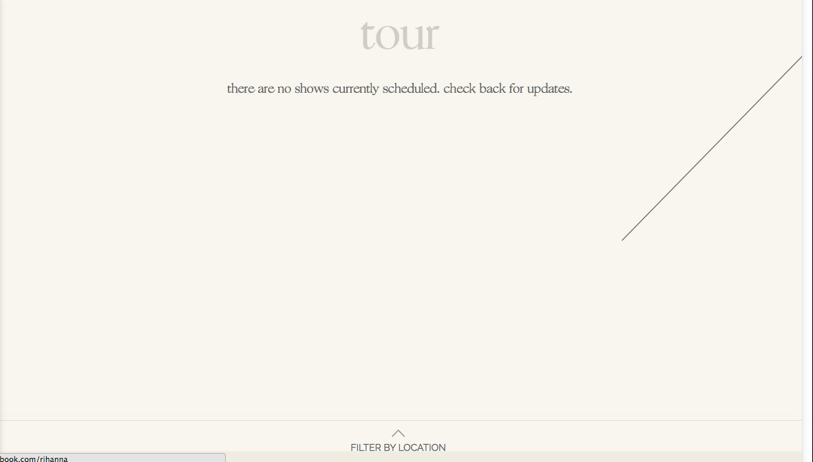
Her "Tour" page is currently empty as it states to "check back for updates". The page keeps to the same colour and backgrounds used throughout the rest of the website which shows consistency.
The "Charity" link on the nav bar redirects you to a charity that she is currently associated with called the "Clara Lionel Foundation".
Her biography page is very interactive as the page reacts to you scrolling up and down by revealing/hiding information.
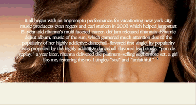
The "Bio" page contains a textual timeline of her life before her career, to present time suggesting that she has been in the music industry for a long time.
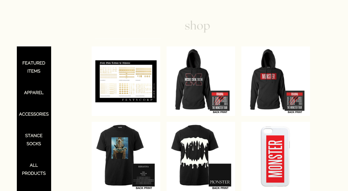
Her "Shop" link directs you to another website selling Rihanna's merchandise. The visual style on the website is almost identical to Rihanna's website suggesting that she may have paid them to customise the look to tailor it to her needs.
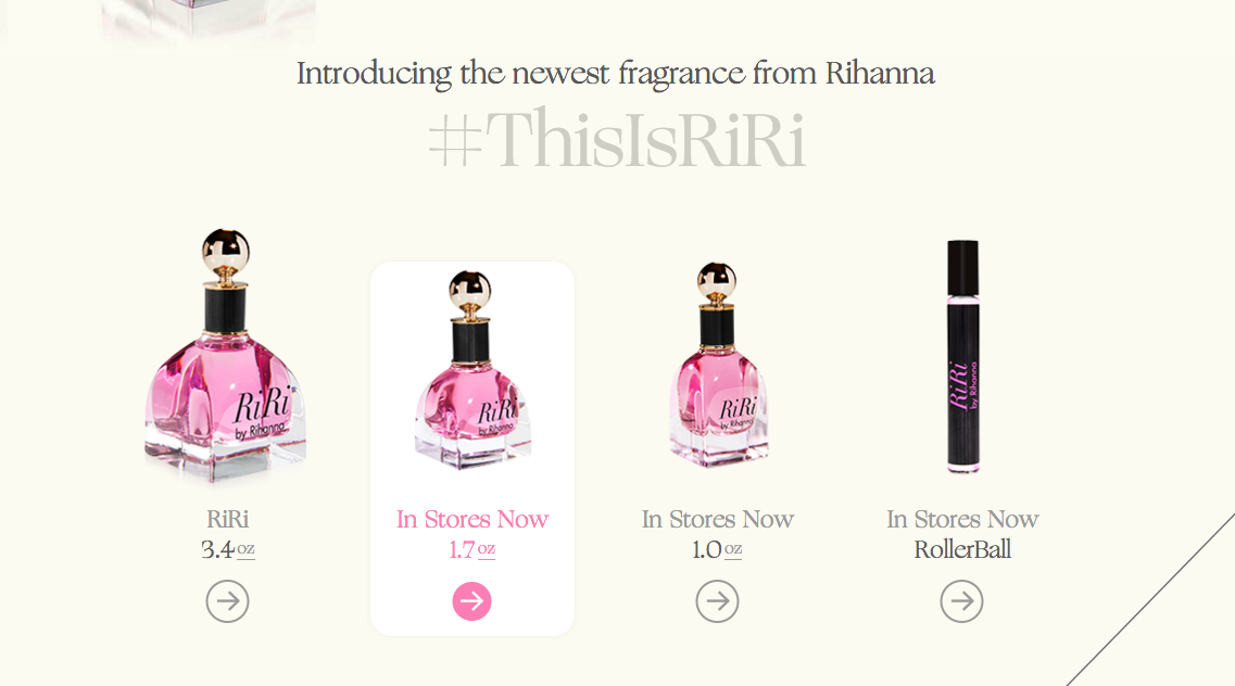
Her "Fragrance" page is dedicated to promoting her newly released perfume named "RiRi" with links towards the bottom of the page to buy the fragances.
Her "Sign Up" page encourages fans or even the general public to sign up to her mailing list which allows them to get information regarding Rihanna first.
www.rihannanow.com
By Manh


