Design

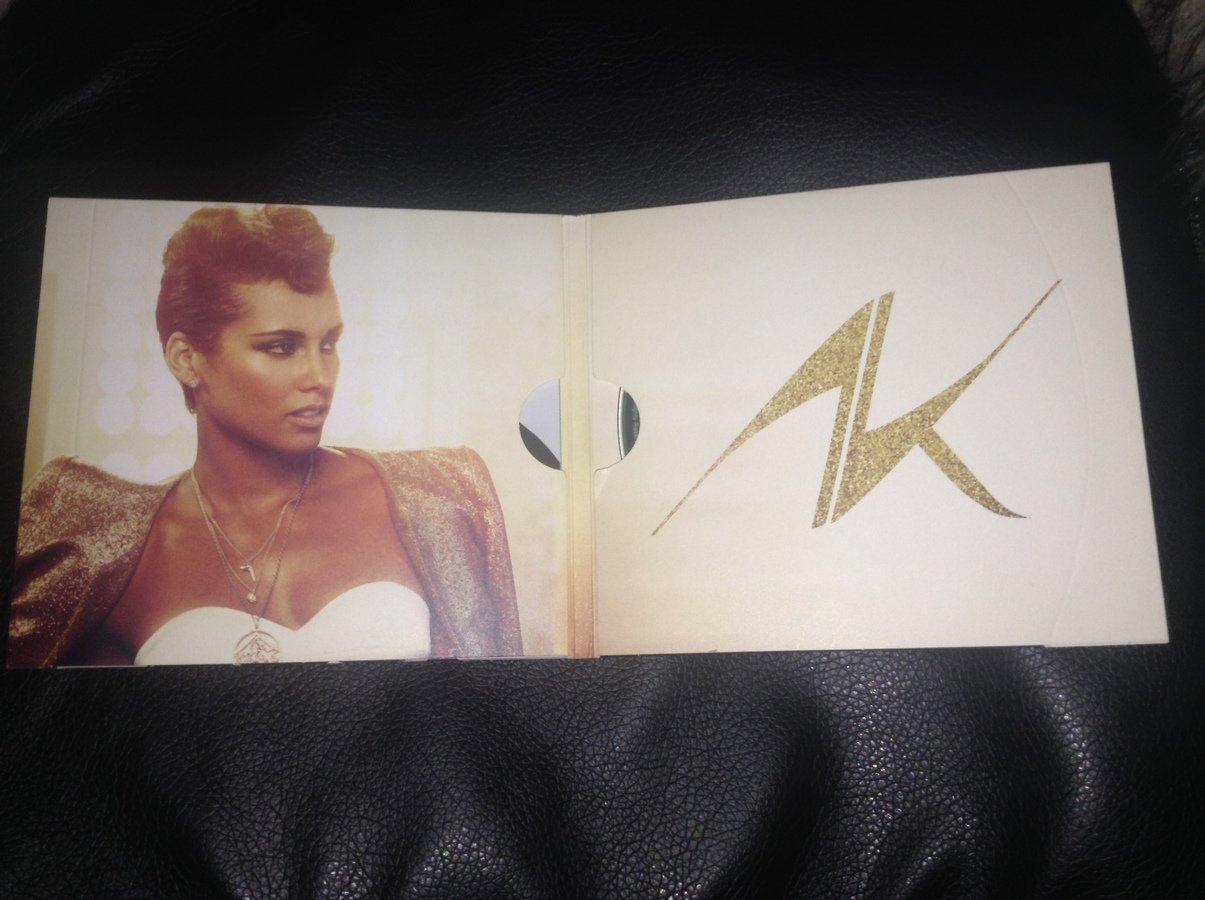
The design is the typical flip-book style but it is different to other flip-book 2 panel style digipaks as both of the panels on the inside feature "pockets". The left pocket contains pictures and booklets whereas the right pocket actually holds the CD itself.
The overall colour scheme is bright golden colours as her logo "K" is gold, in addition the photo on the left panel shows her wearing a gold shiny jacket and her skin is edited to look almost browney-golden could have connote that she feels like an egyptian queen. The colour gold is also associated with being rich and wealthy so if we buy her album it shows that we are owning a high quality product. The inside panels are very simplistic with the surface only showing a picture of her and her logo a stylised "K".
CD Design

The design of the CD itself is also simplistic and sleek with the only image on it being her logo "K". The contrast between the black background and the golden logo is very aesthetically pleasing. Below the logo we see the title of the album "GIRL ON FIRE" all in capitals. The remaining text below it are for copyright reasons and shows that the executive producer was the artist herself "Alicia Keys".
Front Cover

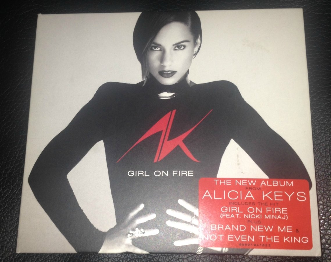
I feel that the front cover works very well as it fits in with the digipaks's concept of being simplistic and sleek. The only image on the front cover is of Alicia Keys in a very confident pose, she is wearing all black clothes with the background being a mesh between white and golden (keeping to the bright golden colours scheme). Her logo is now red to connote that her album presents a clear danger to any other albums in the chart and also fits in with the title "Girl on Fire".
Back Cover

The back cover is simplistic also, containing no images. The text on the back is the tracklist (all the songs on the album) and the text below the tracklist is copyright information. The tracklist being red fits in with the her red logo on the front cover.
Alicia Keys Girl on Fire
By Manh
Alicia Keys Girl on Fire
- 584


