DESIGN
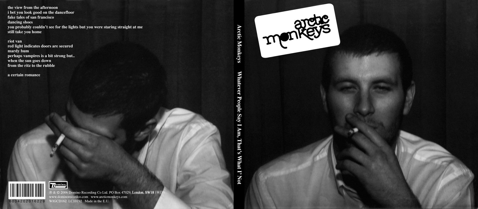
Similarly to the Loud digipak I analysed before, Arctic Monkey's digipak uses the conventional 4 panel book-styled design. The entire digipak is in black and white which may show that they are trying to be purposefully plain and to fit in. It feels almost as if they have tried to make the digipak as plain as possible, but in retrospect Arctic Monkey's style has always gone against pop culture as they have always tried to differentiate themselves from pop society as much as possible.
CD DESIGN

The CD has no virtually no text on it and the main image we see is piles of cigarette butts on top of each other. This adds to the image of the man on the front cover smoking which could signify his addiction to nicotine or even further connote that Arctic Monkey's music is addictive. Keeping to the theme, the image on the CD is also in black and white.
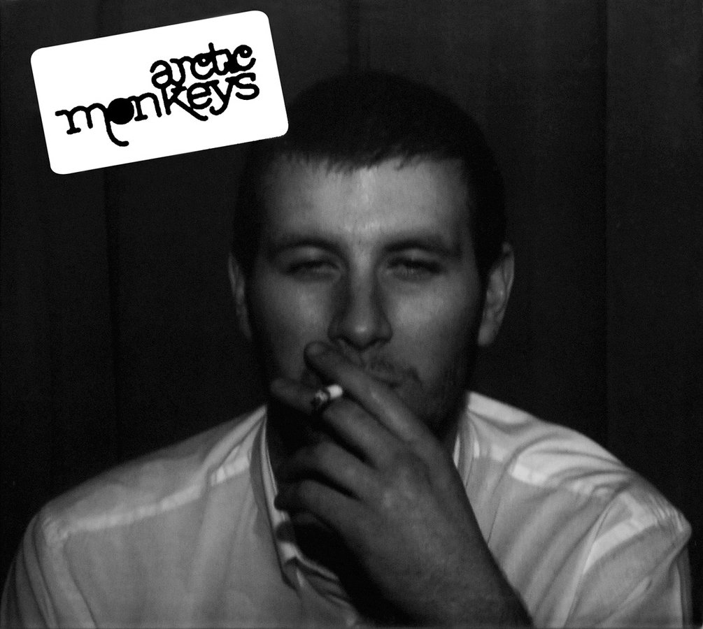
FRONT COVER
The front cover of the digipak is very plain and features virtually no textual information at all (not even the name of the album). On the top left hand side there is a logo for the band which fans may use to recognise the band. The main image used is in black and white and is of one of the band member's friend who is just seen to be smoking. The choice to use a non-famous friend adds to the concept of being plain and fitting in as they could have used themselves or a famous person on the front cover but they chose to put their regular non-famous friend on the front cover.
BACK COVER
The back cover features the same guy from the front cover but he is covering his face, this may signify that the band aren't trying to be in the limelight and are actually trying to hide from it (signified through the guy covering his face).
The back cover keep to the conventions of digipaks by putting the tracklist of the album on the back with copyright information towards the bottom. When creating my digipak I will keep in mind these conventions.

Arctic Monkey Whatever People Say...
By Manh


