
Design
The Loud digipak uses a 6 panel design and the left and right panel fold in to make it look like it is 1 panel. I feel that this design is very appealing as it is very interactive, the audience are essentially forced to fold out each panel to discover content whereas, contrasting the book style design which in my opinion is very basic and standard.
The digipak uses very feminine and calm red colours which makes Rihanna seem like a femme fatale as red is associated with danger however it can also be associated with love (depends on the audience's interpretation, I see it as being associated with love because Rihanna's songs are mostly about love and heartbreak). The fact that the digipak uses very feminine colours may suggest the intended target audience (females), I will think about the use of colours very carefully when creating my digipak.
CD Design
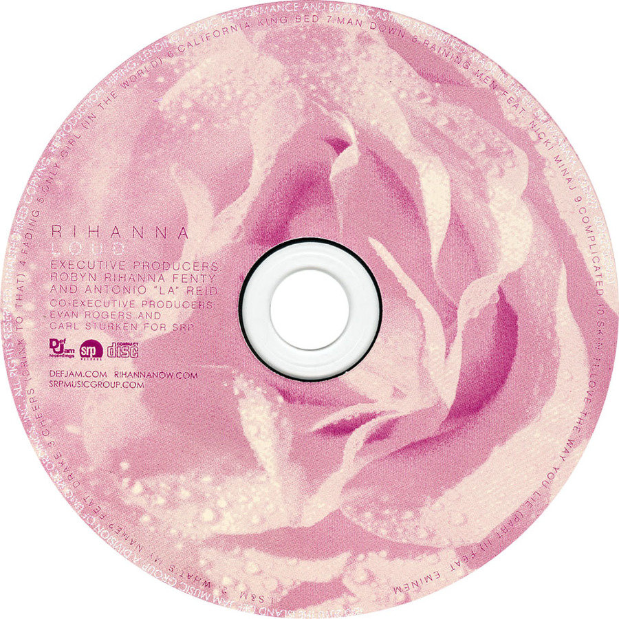
The CD uses the image of roses to cover the entire CD. The roses add to the digipak's overall concept of love as roses are often associated with love and Valentine's day. Rihanna doesn't have a particular logo or image that she uses over and over, she creates a new visual style for every album. She is able to do this because she is already well known so it means that her fans won't need a recurring theme/logo/image to know that it is a Rihanna album.
On the left-hand side of the CD we see the words "RIHANNA" and "LOUD" in capital letters followed by copyright information with logos from the companies/labels involved in the making of the album. I feel that the use of pink works very well for the album because the colour pink is associated with innocence and Rihanna is seen as a very young artist and a "pop princess".

Front Cover
The front cover shows consistency with the use of fonts as the entire digipak uses the same font. I have noticed that a recurring convention within digipaks is that the front cover features one main image and the majority of the time it is an image of the artist. Rihanna is the main focus of the front cover (as to be expected) and keeping with the colour scheme, she has vibrant red hair and red lips. For my digipak I will also keep to this convention by having my actor be the main focus of the front cover!
Back Cover
Another convention of digipaks that I have noticed is that the back cover will feature the tracklist of the album/EP. Rihanna's tracklist uses the same font that the rest of the digipak uses showing consistency, I will take into consideration the use of fonts when creating my digipak and whether I will be consistent or change the font for every panel.

A single image is used on the back cover and the image is of Rihanna, the image has been purposefully edited to make it seem very bright and almost dream-like suggesting that the type of music we will get from this album won't be dark, it will be very happy and positive.
Inside
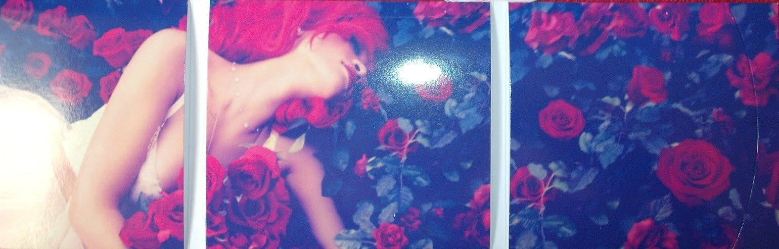
Inside the digipak we are presented with one image covering all three panels, it is an image of Rihanna laying on a bed of roses, the consistency in the use of imagery and colours in this digipak is very impressive in my opinion. The imagery adds to the overall theme of the digipak (love). The panels fold out to reveal the panels being pockets holding the content which can easily slide out. I don't like the inner design as I feel like there are too many pockets and it feels like the content would fall out if you held it the wrong way therefore I won't be using this design for my digipak.
Rihanna Loud Analysis
By Manh


