1. How do your products use or challenge conventions and how do they represent social groups or issues?
The xx does not fall into a single, defined music style or genre but it's more like a mixture between genres. The term "indie" is used to describe a vast category from indie pop to indie rock, metal and so on. This band is somewhere between indie pop and indie electronic, so I will just generalise this and label it as "indie". This word comes from "independent" because in the past, this style of music was owned by independent record labels. Even though "indie" is associated with "low budget", it actually refers to the independence within individuals, where uniqueness is embraced through the lyrics and visuals.
There are many conventions associated with this genre: from narrative to mise-en-scene, camera shots and editing.
An indie music video usually combines the band's performance with a narrative who breaks the music video, making it entertainment for the audience. This narrative is usually linked with the lyrics and it makes the whole music video more appealing and memorable for the audience, who relates and even identifies with this low budget and slightly amateur genre.
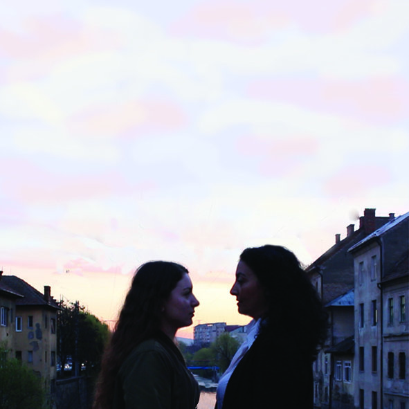
Georgia and I had limited access to a band to perform in our music video so we took advantage of the other reachable convention when it comes to narrative. The whole plot is based on a parallel montage that presents Mia's life in the present and past - a contrast between teenage years and adulthood. Our two actresses, Mia Young and Mia Old are reflecting what most teenagers are (the essence of youth, the mainstream culture, the pilot episode of life) and also what they fear to become (robots with responsibilities, deadlines, no time for self, lonely). This antithesis has a deeper level, emphasising the complexity of human beings and their development in an elongated period, being conceptual and also narrative, in the same time.
I believe that Mise-en-scene is the unique selling point for indie bands: they differentiate each other by creating their own unique style supported by the props they use, the costumes, make up, lighting and so on.
The realistic costumes are based on the target audience in order that they can easily relate to the music video. In our music video, we followed this convention. We got inspired from our typical artsy tumblr audience and from The xx's clothes.
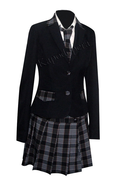
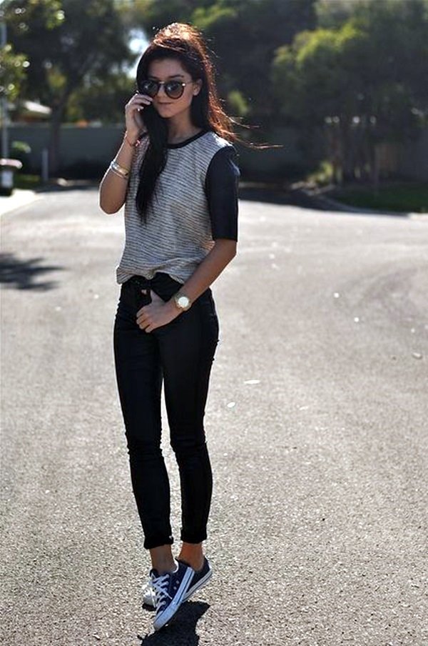
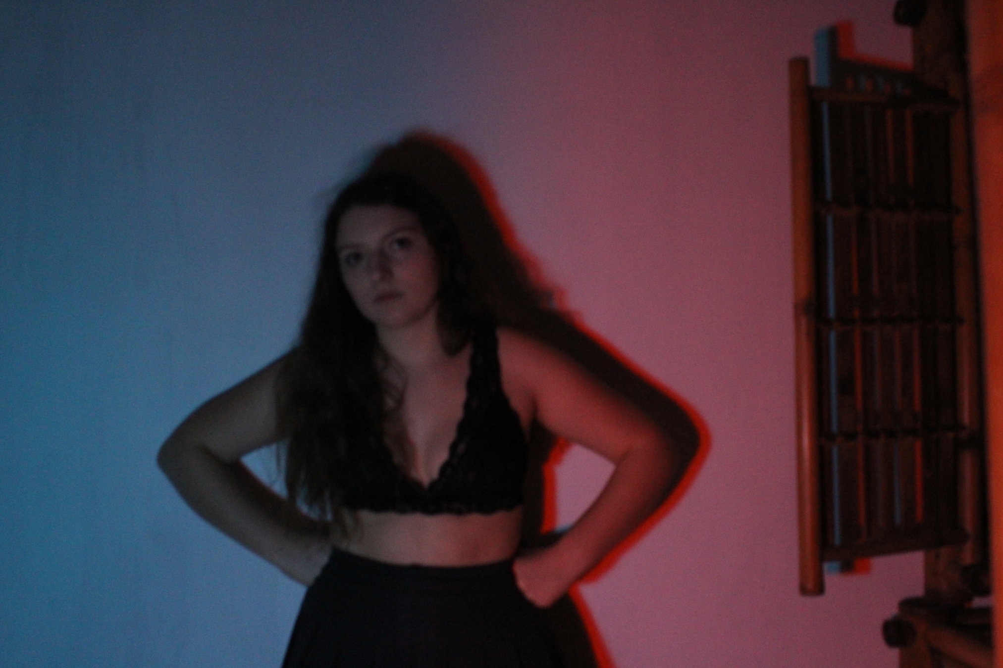
For Mia Young we chose a school uniform in order to portray the fact that she came back from school. The fact that she wears this outfit implies that she conforms the norms but having a closer look at her uniform, we observe that she is quite a rebel teen with broken tights, loose tie, unfolded shirt sleeves and converse (in contrast with her uniform skirt). In Mia's second outfit she can express herself freely, so we chose to relate her clothing to our mainstream indie audience: lace bra, transparent blouse, black jeans, converse and a bomber jacket. For Mia Old we chose an office outfit to suit the character and to show a clear antithesis between the two Mias.

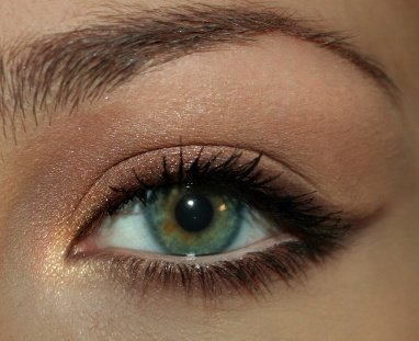
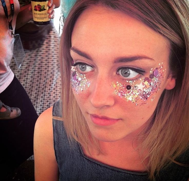
The make up goes hand in hand with the costumes. In Mia Young's case she comes home from school without make up and she goes out wearing glitter on her cheeks and lipgloss as a reference to Coachella, a famous indie music festival. Mia Old wears a discrete office make up: liner, eyeshadow and lipstick. Here, an antithesis was constructed between the two characters, as Mia Young starts the day without make up and finishes with a lot of make up while Mia Old starts the day with make up and she finishes her day wiping it off- conforming to the society’s requirements.
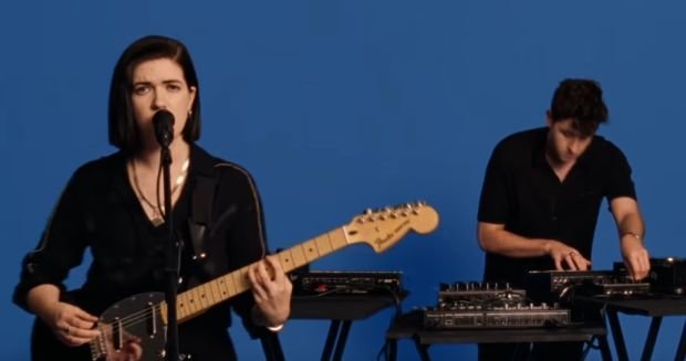
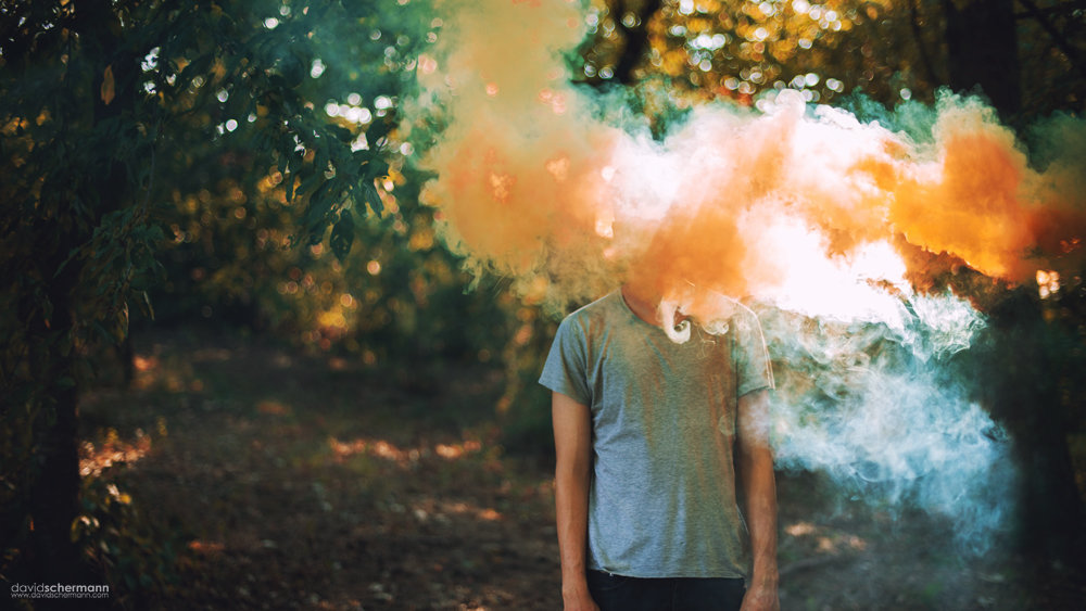
The conventional props for indie music videos are the band's instruments. The artists are filmed in their creative environment, showing how talented they are and how much they enjoy what they do. Here we broke this convention because we didn't use any live band or footage from The xx. Our music video doesn't include any performance and it's rather narrative/conceptual. The props we used were again, low budget props which help us make a connection between our two characters. For example, we used the same mirror when Mia Young was putting her make up on as well as when Mia Old whipped off her make up. They both smoke cigarettes and both were drinking (coffee vs alcohol). We also used the coloured smoke grenades - pink and blue, which both connote the fact that Mia Young is living her teenage years at their fullest, being full of vitality, creativity and sensitivity (pink) but also kind, calm and optimistic (blue).
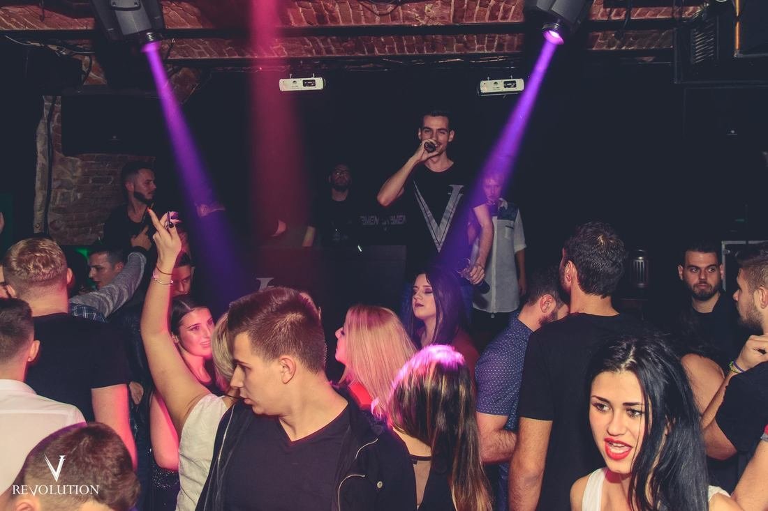
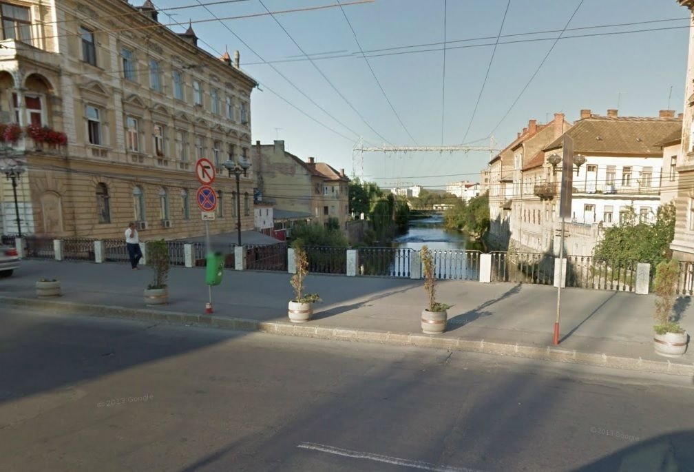
The setting is made out of low budget accessible areas like studios cities parks and so on. These simple locations are quite relatable for audience, so they can get more involved when watching the music video. Georgia and I chose common areas as locations to our music video, for example a middle class family house, a club, an office and other urban settings. Most of our locations had a perfect lighting conditions but for others, like Mia’s house, we used coloured neons - green, red and blue. They connotes feelings like balance, emotional depth and stamina, vitality. Another example is for the rooftop scene, where we used strobe lights to be in concordance with the club atmosphere. We set our timeline in concordance with the weather because a big part of our music video was filmed outside, in natural light.

Most indie videos include certain type of shots: close up on the artists, performing - which is mostly used for promoting these independent (indie) artists. Long shots are used for establishing the narrative. There are also some handheld shots which engage with the audience from their own point of view. Not having a band, Georgia and I followed the narrative, breaking the shot convention. We supported The xx's style by adding series of conceptual aesthetic shots almost everywhere in our filming process. These shots fit in our music video because they belong to the indie genre and they are highly used by The xx in their official music videos. We supported their already created brand image by adding visually pleasing shots, full of contrast.
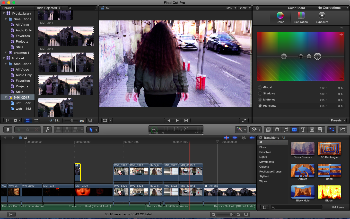
The last but not least is the editing part. Indie means color correction, special effects and filters. We used a lot of color correction in this process and we also added different filters on top of the clips. The coloured raw lighting helped us in post production because some shots were extremely beautiful when it comes to their colour so they set us a quality standard for the others. Our video runs smoothly and all the editing made our final product look experimental, edgy and fresh, full of contrast. We edited the video in concordance to the song, using cut to the beat techniques and lipsync. Our video is based on a parallel montage which was obtained by editing - we presented two contrasting stories in parallel, having a few similarities for example when Mia Young is drinking a shot in the club, Mia Old is drinking coffee at the office. When Mia Young is dancing with her friends, Mia Old is keeping the rhythm with her foot. The mirror in which one puts make up on and the other wipes it off, is the same. We made all these connection in order for the audience to understand that the two characters are connected, not only randomly filmed.
When it comes to our minor task, we sticked to The xx's style, giving it a natural continuity but still keeping some typical elements from their previous albums and website. Georgia and I broke the universal conventions but we followed The xx's "habit". Even though he most stereotypical feature of this genre is simplicity, The xx take this to a new level, somehow exaggerating this convention.
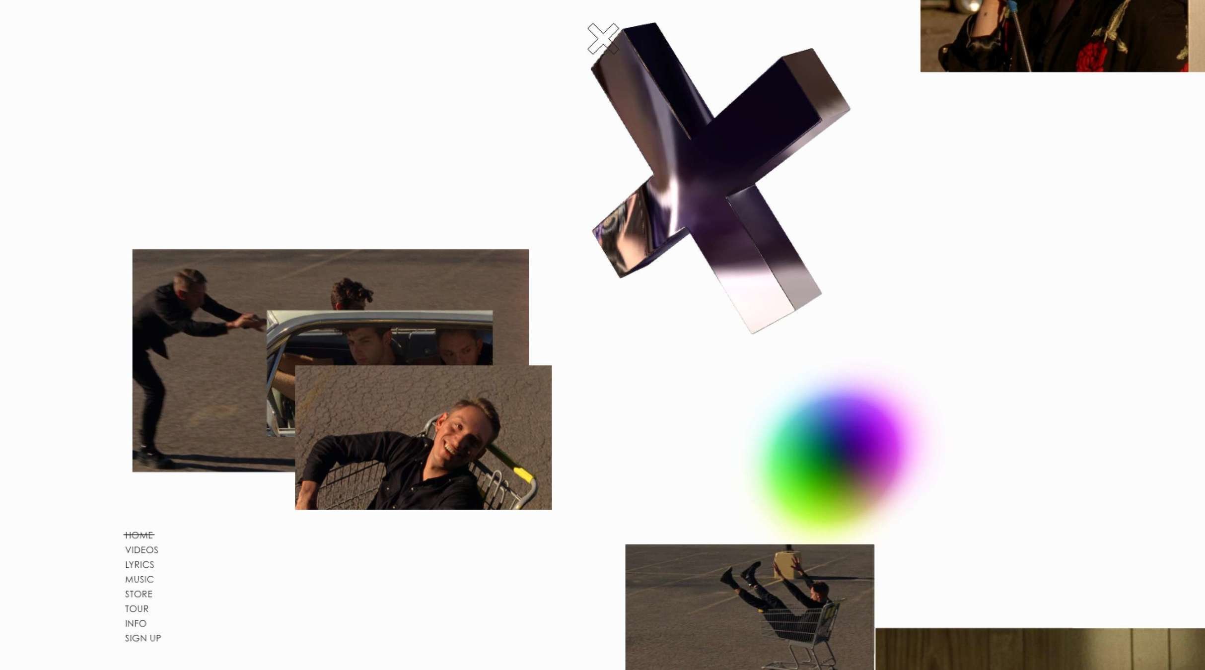
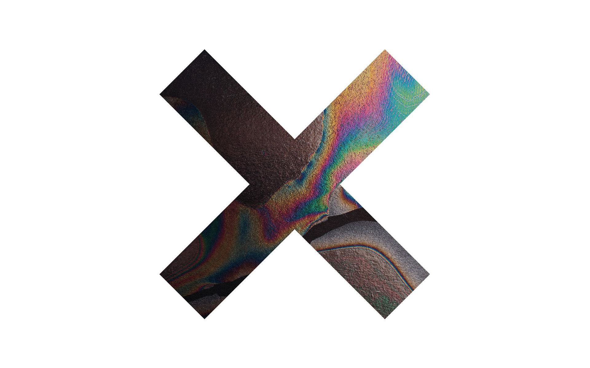
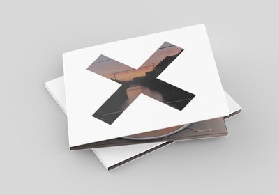
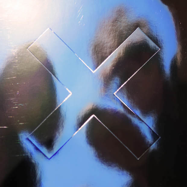
Although the name of an indie band is usually presented on the front cover of the digipak, Georgia and I kept the iconic X shape in which we introduced a balanced and aesthetic photo which matches our band's style. The photo we used resembles the petrol oil gradient they usually use for their digipaks and we recreated that effect by choosing the suited colours for the photo. We kept the back cover clean, presenting just the songs in a light font, the barcode, some Copyrights, the record label logo, web links and contact details, respecting the conventions. We believe that this stands out for our target audience, showing that The xx care more about their songs than any art which would help them sell better their albums. Indie artists want to be easily noticed and recognised by their audience. Knowing this, The xx chose this extremely clean and minimal etiquette, creating their own image within the indie genre - this is also why we used the same pictures on our website and digipak.
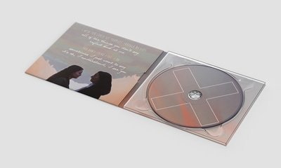
Here we followed an indie convention, where a character from the narrative features on the cover of the album. The inside of the digipak has 2 parts: one part is with our two characters on the bridge, in the final scene - facing each other. This photo was edited in such way in which it has a reflective texture, resembling the name of the album “I See You”. On this side of the digipak we inserted some lyrics which bestly describe this album because they can be found on The xx’s official album as well. The other part is with the CD which has a mirror like effect. Here we superimposed the same image from the background on the cd shape but a bit shifted. The shift is in the form of a discrete X, contributing to The xx’s new style. Furthermore, the image is balanced, minimalistic and unique, again supporting the raw genre - it makes our album stand out.
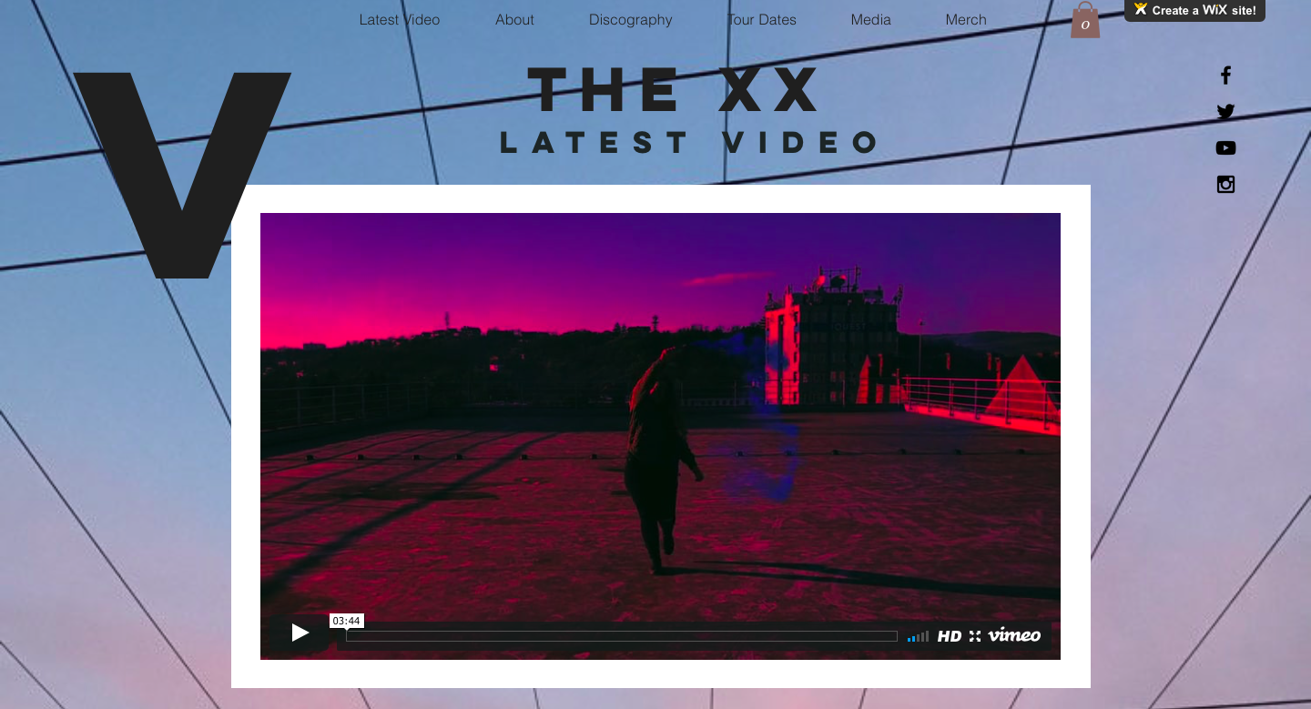
Our website follows a music band website conventions, including categories like About, Discography, Merch, Tours and Media. The amount of info from The xx's official website is quite restricted, following the indie minimalistic pattern, so we had to take some more information from their official social media as well as from Spotify. The website has one page, inspired from their official website, with anchor links attached to each category and a menu on top of the page. The social media links can be found on the right side of the page, with direct links to the band's official channels. The background image has the same colours as the bridge scene because it was taken exactly in that day, during filming. We tried out different fonts and we chose a style which would support our music video, would please us and would fit The xx’s style.
Keeping this level of consistency, I feel that we provided a much more professional look of the product.
deck
By maraciorba