HTML/CSS Three
Responsive Design, Animations, Transitions

What is Responsive Design?
Responsive design refers to making your websites design responsive to different screen sizes.
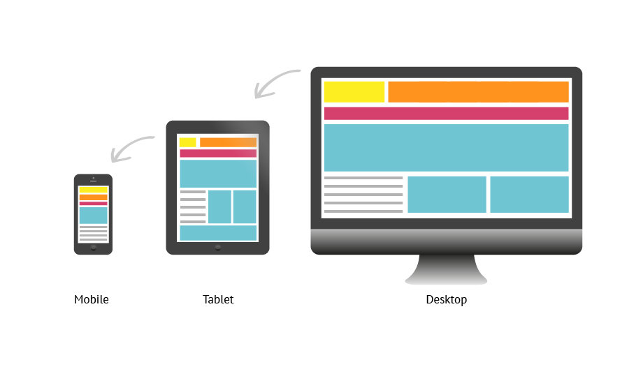
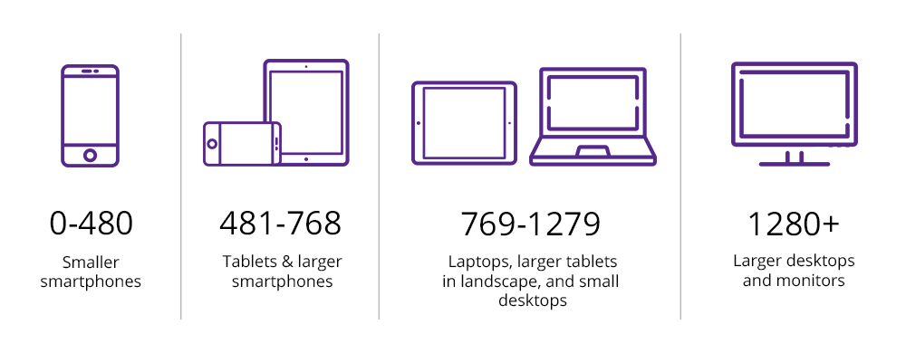
Screen Sizes
A responsively designed website should be designed for many different types of devices. See below for typical pixel sizes for these different devices.
Note: It is often better to design mobile first, and expand your layout to desktop view later on.
Media Queries
To style responsively, we can take advantage of CSS Media Queries. Media Queries allow us to dictate styles for different screen widths. Media Queries can take two main values: min-width and max-width.
@media (max-width: 500px) {
    body {
        background: tomato;
    }
}

@media (min-width: 500px){
    body {
        background: tomato;
    }
}
max screen width for styles
min screen width for styles
@media declares a media query
style changes for screen width
Animations
With CSS we are also able to create animations. Animations can add extra life to a website. To animate an element, we need to declare the element is able to animate.
We can use animations with the following properties:
div {
  height: 50px;
  width: 50px;
  background-color: red;
  animation-name: rotate;
  animation-duration: 5s;
  animation-iteration-count: infinite;
}
Other CSS animation properties here:
name animation
how long animation runs
how many times animation runs
Animations Continued
Once the element has been given animation properties, we can use @keyframes to create what the animation does.
This is done outside of the elements styling.
@keyframes rotate {
  from {
    transform: rotate(0deg)
  }
  to {
    transform: rotate(360deg)
  }
}
Percentages can also be used in keyframes for more specific animation instructions.
Transform
One of the most common CSS properties used in @keyframe animations is transform.
The syntax is slightly different than what you may be used to:
.move-a-lot {
transform: translate(x,y);
transform: rotate(x,y);
transform: scale(x,y);
transform: skew(x,y);
}
documentation on transform property here:
transform property
type of transform being done
values that determine amount of transform
Transitions
Transitions are another way to animate elements, and are typically started by user interaction. Like animations, the element has to have a transition property defined on it. We can then create the transition based on different interaction.
div {
  height: 50px;
  width: 50px;
  background-color: blue;
  transition: 5s;
}

div:hover {
  transform: scale(2.0)
}
More on transitions here:
HTML/CSS Three
By matias_perez
HTML/CSS Three
Responsive Design, Animations, Transitions


