<AccessibleCSSinJS />
Maya Shavin
Senior Software Engineer
In this talk
- ✨ A quick recap of accessibility
- 😰 Challenges & Solutions
- ✅ Tools
- 🚀 Developing an accessible mindset
What is accessibility?

See
🦻
Hear

Understand
⌨️
Use/Navigation

See
🦻
Hear
Understand
⌨️
Use/Navigation
Standards
Web Content Accessibility Guidelines
Perceivable
Operable
Understandable
Robust
WCAG 2.1
A
AA
AAA
- Web content
- Assist Technologies (WAI-ARIA)
- Web technology (Flash, video, audio)
- Visually impaired
- Cognitive disorders
Accessibility is HARD
Accessibility in React is HARD
Accessibility in React is COMPLEX
But NOT hard!
Accessibility is COMPLEX
Accessibility in components
With or without CSS-in-JS
Semantic HTML Tags
Focus management
Screen Reader support (WAI-ARIA etc)
Dynamic Content
Accessibility in components
Magnification support (200%, 400%)
Using Sematic HTML Tags
Landmarks/Regions
& Headings
table
h1-h7
article
header
footer
nav
dialog
button
a
input
JS
CSS
Parse CSS
Inject to Stylesheet
stylesheet.insertRule
Browser
HTML Paint
load
download
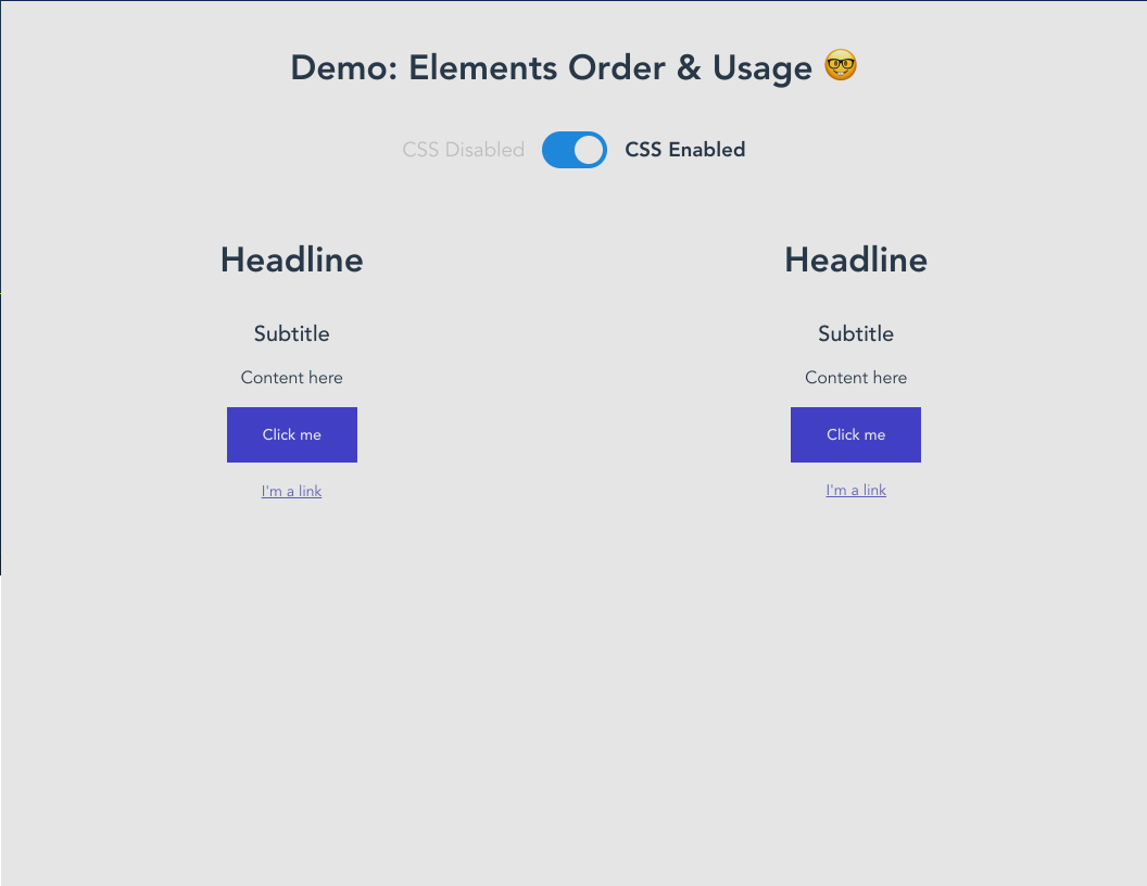
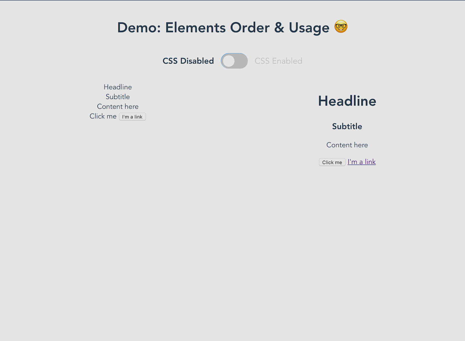
✅ Keep the heading order structure (h1 - h7)
✅ Use CSS order to re-arrange the appearance
Focus management
- Order of focus?
- Auto-focus ?
- Keyboard navigation flow ?
- Think logical
- Use refs, DOM API (.focus())
- Use tabIndex, order
Screen Reader support (WAI-ARIA)
<button
    aria-label="Place an order"
>
    Order
</button>
<button
aria-label="Place order button"
>
Order
</div>✅
Place an order, button
❌
Place order button, button
aria-label vs aria-labelledby
<dialog role="dialog" aria-label="Sample Modal">
  <header>
    <h2 id="header-title">
      Sample Modal
    </h2>
  </header>
  <main>
    <p id="description">
      This is the content
    </p>
  </main>
  <footer>
    <button aria-label="close dialog">
      Close
    </button>
  </footer>
</dialog>
<dialog role="dialog" aria-labelledby="header-title">
<header>
<h2 id="header-title">
Sample Modal
</h2>
</header>
<main>
<p id="description">
This is the content
</p>
</main>
<footer>
<button aria-label="close dialog">
Close
</button>
</footer>
</dialog>
<Badge>
  Item Two
  <BadgeIcon
    aria-label="Badge count 6"
    role="status"
  >
    6
  </BadgeIcon>
</Badge>Item two, badge count 6
✍️ Visible and understandable label
✅ Clear ARIA role when needed
👷♂️ Interactive value (aria-disabled, aria-selected, etc)
🗒️ Concise description as hints (don't use title)
Working with screen reader
3 out of 5 tasks completed
Add to list, button
Dynamic content with aria-live & aria-atomic
<Badge className="v-badge theme--dark">
  Item Two
  <BadgeIcon
    aria-atomic="true"
    aria-live="polite"
    aria-label="Badge count 6"
    role="status"
  >
    6
  </BadgeIcon>
</Badge>100% accessible in combination with lazy loading component
Magnification support
200% - 400% Zoom
Text readability
Contrast/Color
Layout consistency
===
Responsiveness
Use media query & JS calculation
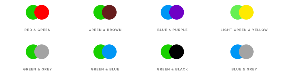
Color combination 🎨
Tools
Think Accessibility FIRST
And split the CSS code
Building an accessible component
What is component's type?
Focus & navigation behavior
Component internal flow and external flow
Component stylings
Interactivity
Take action 📢
- ✅ Be intuitive & organized
- ✅ Apply WAI-ARIA approriately
- ✅ Image Alt & description whenever needed!
- ✅ Pay attention to color combination!
- ✅ Test accessibility with Axe, Accessibility Insights or Lighthouse
- ✅ Manual testing with Screen reader and Screen magnifier


Thank you
@mayashavin

mayashavin.com
Accessible CSS in JS?
By Maya Shavin


