Theming in Vue apps

Can it be DYNAMIC?
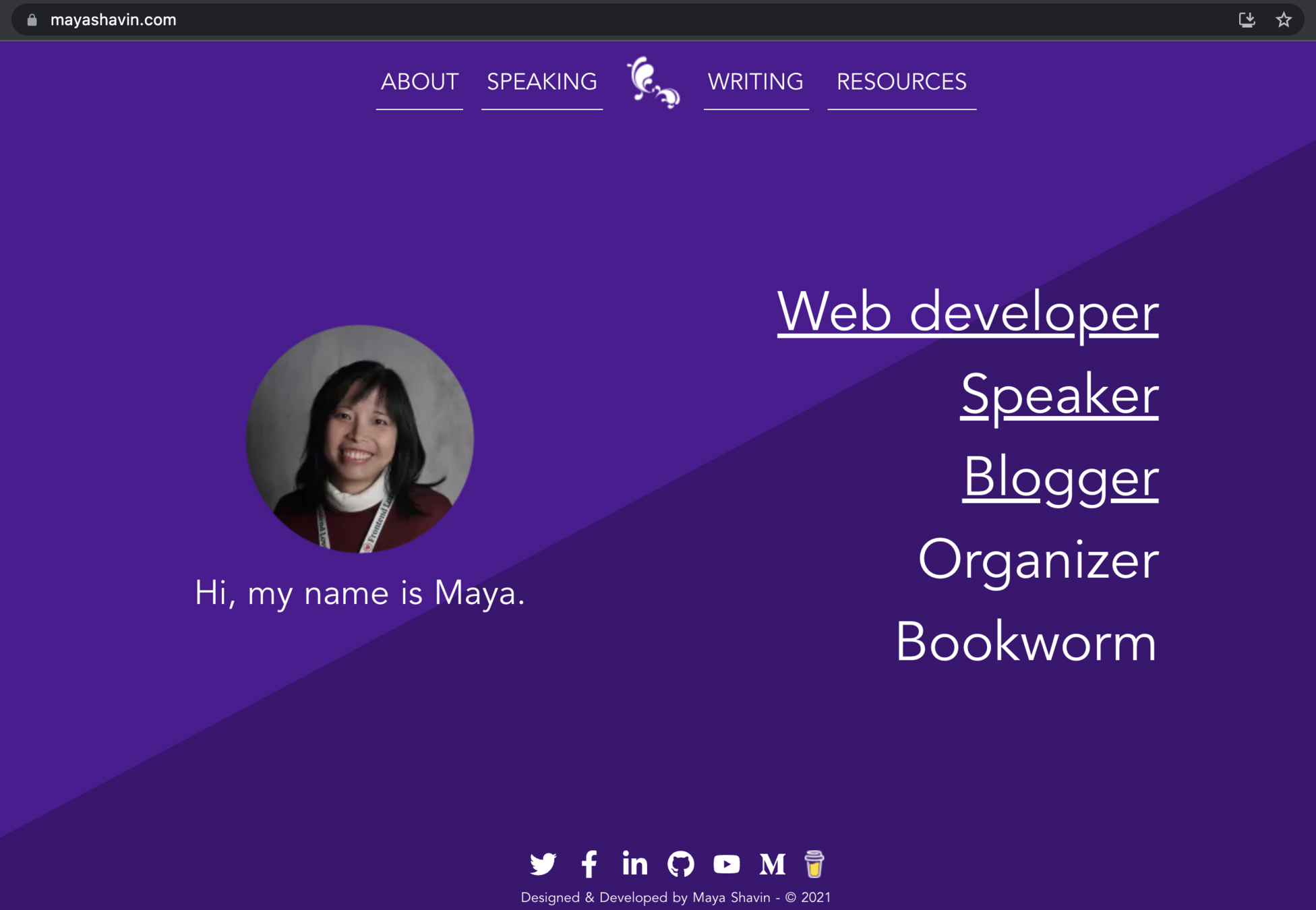
@mayashavin


@mayashavin
Senior Software Engineer at
OSS Maintainer
author, community organizer & speaker

Web

Ambassador

What is Theming ?
Theming is
The process of designing and constructing styles based on specific idea
recognizable & Memorable Experience for user
brand look & Feel


Source: Wordpress
theming for applications
Theming is about
Color
Typography
ICONS

and more...
static theming
configurations based
Pre-processed styles
limited customization
Dynamic theming
Default configurations
run-time generating styles
full customization
Static theming
boilerplate + clients' configurations


Dynamic theming
Theme is loaded on run-time based on user's choice
Dynamic theming
single & consistent theme provider for components
communicate with css on run-time
Extendable with other styles
the techniques
dynamic theme - single theme provider
State Management
Provide/Inject
import Vue from 'vue';
import Vuex from 'vuex';

Vue.use(Vuex);

const store = new Vuex.Store({
  state: {
    isDarkMode: isDarkMode(),
  },
  mutations: {
    toggleDarkMode(state, darkMode) {
      state.isDarkMode = darkMode;
    },
  },
});
<template>
  <theme-provider :theme="theme">
    <layout :isDarkMode="isDarkMode">
      <slot/>
    </layout>
  </theme-provider>
</template>

<script>
import styled, { ThemeProvider } from 'vue-styled-components';
import theme from '@/plugins/theme';
import { LightLayout, DarkLayout } from './ModeLayouts';

const layoutProps = { isDarkMode: Boolean };

const Layout = styled('div', layoutProps)`
  ${({ isDarkMode }) => (isDarkMode ? DarkLayout : LightLayout)}
`;

export default {
  components: { Layout, ThemeProvider },
  data() {
    return { theme }
  },
  computed: {
    isDarkMode() { return this.$store.state.isDarkMode },
  },
};
</script>
/* plugins/theme.js */
const theme = {
dark: {
background: '#2d3239',
title: '#e9d970',
text: '#fff',
subLabelText: '#cfcfcf',
},
light: {
background: '#fff',
title: '#333',
text: '#2c3e50',
subLabelText: '#757575',
},
};
Single configurations
dynamic theme - communicate CSS on run-time
vue-styled-component
CSS Variables for common theme
polished
communicate CSS on run-time
import styled from 'vue-styled-components';
import {
  getStyledTitle
} from '@/components/PokemonItem/StyledPokemonTitle';
import {
  DarkLayout,
  LightLayout
} from '@/layouts/ModeLayouts';
import { lighten } from 'polished';

const itemProps = {
  themeColor: String,
  isDarkMode: Boolean,
};

export const InfoSection = styled('section', itemProps)`
  border-left: 1px solid ${(props) => props.themeColor};
  border-right: 1px solid ${(props) => props.themeColor};
  background: var(--page-background);
`;

export const SectionTab = styled('h3', itemProps)`
  border-bottom: 1px solid ${(props) => props.themeColor};
  color: ${(props) => lighten(0.1, props.themeColor)};
`;

const StyledView = styled('div', itemProps)`
  ${({ isDarkMode }) => (isDarkMode ? DarkLayout : LightLayout)};
  background: ${(props) => props.themeColor};
`;
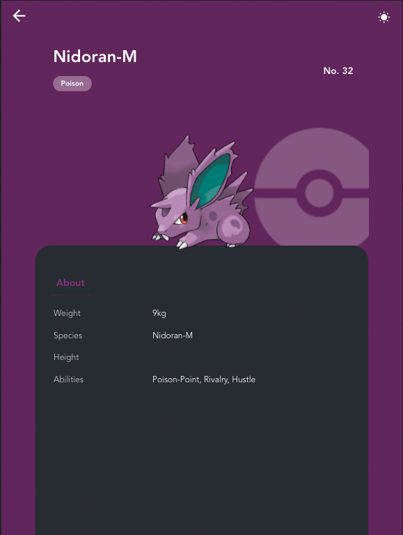
<template>
  <styled-view :themeColor="color" :isDarkMode="isDarkMode">
    <div class="pokemon-main-view">
      <section class="pokemon-view--top-section">
        <!--...-->
      <cld-image
        type="fetch"
        :public-id="pokemon.avatar"
        width="220"
        crop="scale"
        class="pokemon-view--image"
      />
      <info-section :themeColor="color">
        <section-tab :themeColor="color">About</section-tab>
        <tab-details>
          <details-row>
            <!--something-->
          </details-row>
        </tab-details>
      </info-section>
    </div>
  </styled-view>
</template>dynamic theme - extendable styles
import { css } from 'vue-styled-components';

export const LightLayout = css`
  --page-background: ${(props) => props.theme.light.background};
  --page-title: ${(props) => props.theme.light.title};
  --page-text: ${(props) => props.theme.light.text};
  --page-sub-label-text: ${(props) => props.theme.light.subLabelText};
`;

export const DarkLayout = css`
  --page-background: ${(props) => props.theme.dark.background};
  --page-title: ${(props) => props.theme.dark.title};
  --page-text: ${(props) => props.theme.dark.text};
  --page-sub-label-text: ${(props) => props.theme.dark.subLabelText};
`;
import StyledButton from './StyledButton';
const TomatoButton = StyledButton.extend`
color: tomato;
border-color: tomato;
`;
export default TomatoButton;With tailwindcss?
With tailwindcss?
import tw from 'tailwind.macro';

const StyledTitle = styled('h3')`
    ${() => tw("text-red-500")}
`;
using Babel macro
RESOURCES
@mayashavin
RESOURCES
@mayashavin
summary
Create single theme System (VueX, XState, etc)
USE built-in css properties
vue styled component for dynamic component styling
Plan configuration before developing

thank you!
Theming in Vue Apps
By Maya Shavin


