Rihanna:
Magazine Advert
Colour
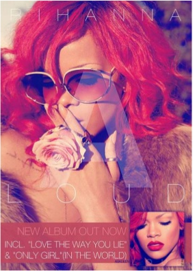
The colours on this magazine advert is what stood out for me the most. The bright reds, pinks and white really draws attention to Rihanna and her album 'LOUD'. The choice of the bright colours marry up to the album name , which is clever. The colour scheme is consistent throughout all of Rihanna's marketing and release of her album. This makes it recognisable for the audience. Red reflects love, anger and vunrability which is are key themes in the pop music genre.
Imagery
Rihanna is the artist of this album and she is the main part of the magazine advert. She is what the audience will first look at, as she does take up pretty much the whole of the advert. I like how Rihanna is the main part of the advert as it shows she is strong within herself and her music. However, her hand placement and stance makes her look vunrable. But, this could be an undertone of what the album is going to be about. Love, despair and heartbreak would fit into this magazine advert.
Typography
The title of the album and Rihanna's name is very faint on the advert. But it fits into the 'pretty' theme. The font is all the same on the advert and using white on the font makes it stand out behind the red and pink. The font is the same throughout the advert, which would make the audience read the whole thing as there isnt anything that stand out, except of course Rihanna helsef.
Placement
A photo of the front cover of Rihanna's album is displayed in the bottom right corner. This will help the audience recognise the album in stores. Also, the audience will be able to distinguish the album because of the matching colour schemes.
Rihanna
By mia1111111111


