Film Poster Analysis
The common conventions of this film poster is:
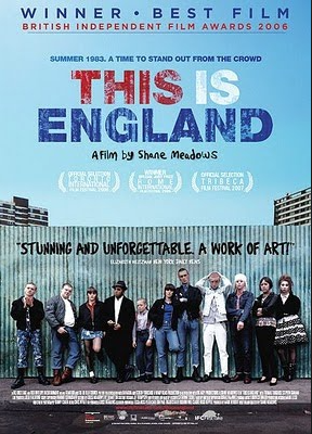
The typography for this poster is big bold and colourful, it was made to be coloured in red, blue and white to represent the colours of Union Jack. This is a very smart and convenient way that the film company used to leave an impression on the viewers mind upon seeing this poster.
It also shows the awards it received and a quote given by a critic. The effect of this is to compel the audience to watch the film due to the good review that they heard about it.
The main characters are standing in front of a metal wall, all lined up from left to right. The location is most likely set in a rundown estate with dull, grey housing complex. it gives the audience an in sight on what the movie is set and about.
Lastly, it contains a tagline quoting, 'Summer 1983. A Time To Stand Out From The Crowd'. This gives the audience an impression of what can they expect from the film and what the main character could do.
The common conventions of this film poster is:
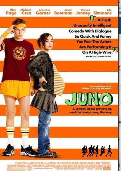
The typography that this poster has is that it consists of green, thick and animated title, 'Juno'. I assume that it was used to represent somewhat of a cartoon title and seeing that the main character is bearing a baby, it would seem appropriate to use that font.
The two main characters are standing to the left of the poster and both have very different body and facial expressions. The young man hast the impression that he has no idea whats happening given that he is scratching his head and possesses a lifeless posture. On the other hand, the young pregnant girl has the body expression of someone who's fed up and somewhat feels sympathy for the young man.
Just like with the previous poster this one also shows the awards it received and a quote given by a critic. The effect of this is to attract the audience come see the film due to the fact that they have seen good reviews about it
Lastly, it contains the institutional information at the bottom of the poster to show what film production company made the in a smaller and finer text, because it needs to make sure that all the information is there without drawing too much attention away from the rest of the poster.
Film Poster Analysis
By __