Responsive Web Design Experience
講者介紹

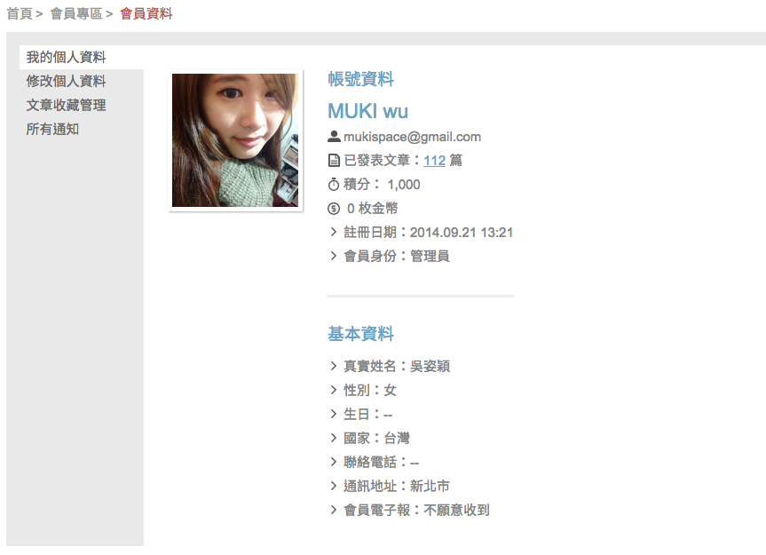
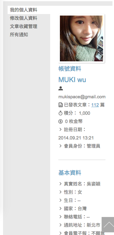
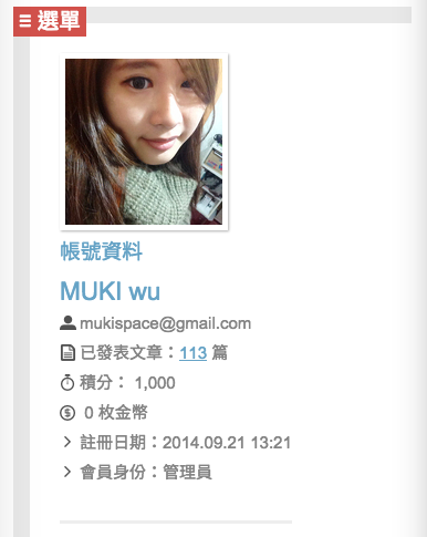
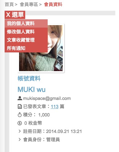
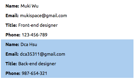
MUKI wu (Front-end designer)
- 手帳寫真創辦人 handbook.tw
- 技術部落客 muki.tw
- 台北科技大學 兼任講師
- 世新大學 企業講師
- WordPress 著作 x 2
- WordPress 譯作 x 2
- 神奇的手帳整理魔法 作者
自由工作者丶網站授課講師
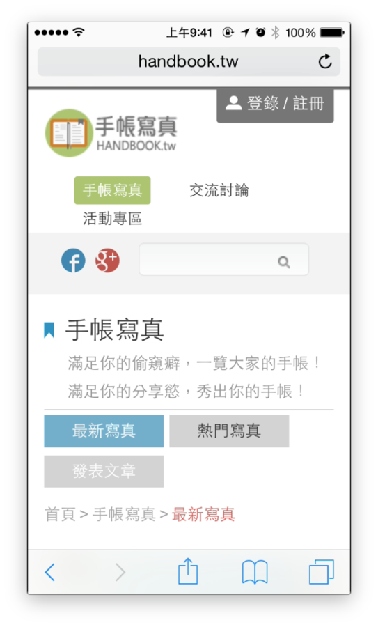
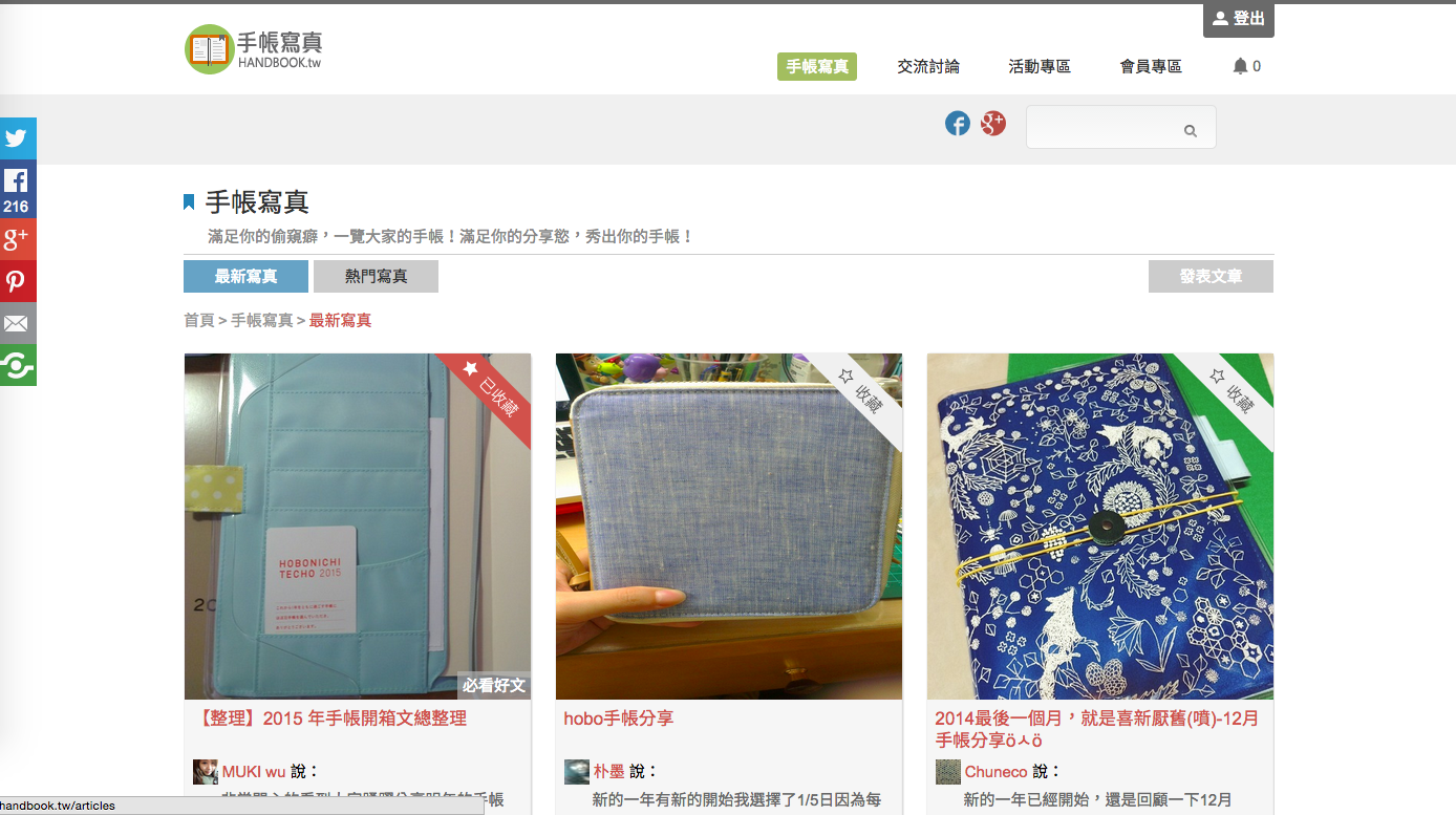
手帳寫真
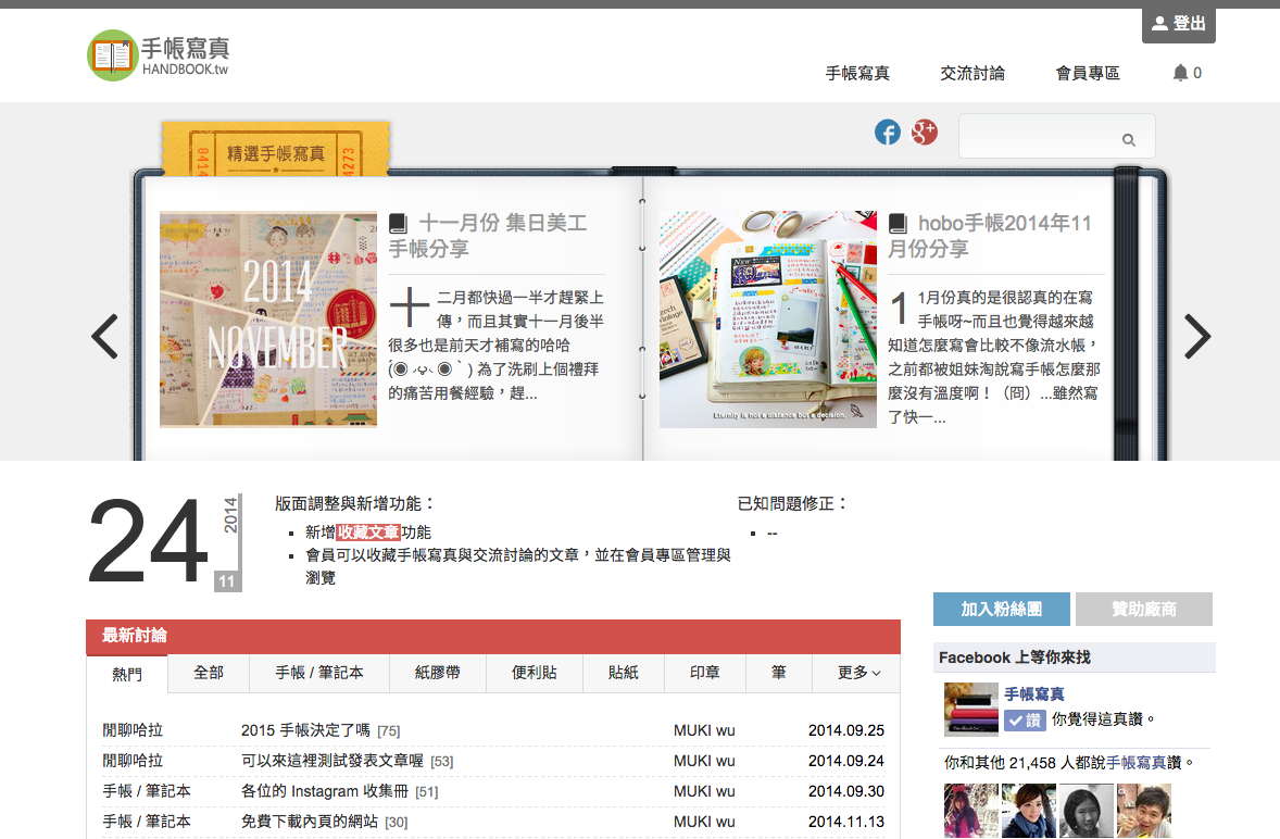
http://handbook.tw
今天分享的主題是 ...
惱人的 RWD
RWD 的心臟與骨幹
Fluid Grid
Media queries
那些年
我遇過的問題
那些年,我遇過的問題
為什麼我寫了一些 media query 的設定,但是縮放視窗的時候卻沒有效果?
Viewport 很重要
<meta name="viewport" content="
  width=device-width,
  initial-scale=1.0,
  minimum-scale=0.8,
  maximum-scale=2.0,
  user-scalable=no
">
Viewport 還可以這樣玩
<meta name="viewport" content="width=1024">
<meta name="viewport" content="initial-scale=1, maximum-scale=1, user-scalable=no">非 RWD 網站常見錯誤用法
1024 為實際頁面寬度
那些年,我遇過的問題
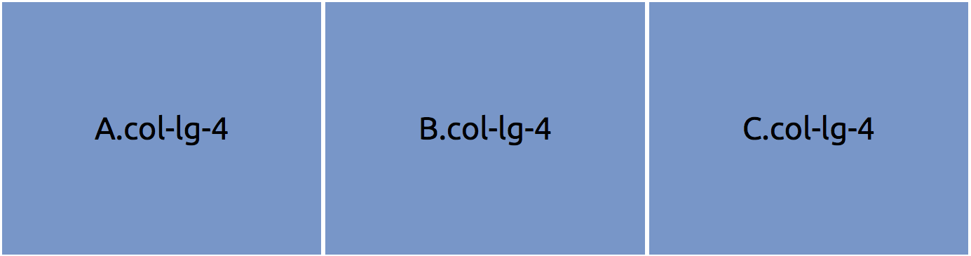
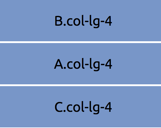
lg 有三個 column 各是 col-lg-4,在 xs 是col-xs-12。
我想在 xs 讓前面二個 col順序調換,第一個 col 用 xs-push-12,第二個用 xs-pull-12,但他們不會互換。請問該怎麼寫?
字好像有點多 ?
那畫個圖吧!
桌面版
那畫個圖吧!
手機版
可以換個思維
<div class="row">
  <div class="col-lg-4 col-lg-push-4">b</div>
  <div class="col-lg-4 col-lg-pull-4">a</div>
  <div class="col-lg-4">c</div>
</div>
那些年,我遇過的問題
如何實現影片的 RWD
影片小 trick
.responsive-container {
  position: relative;
  padding-bottom: 56.25%;
  padding-top: 30px;
  height: 0;
  overflow: hidden;
}

.responsive-container iframe {
  position: absolute;
  top: 0;
  left: 0;
  width: 100%;
  height: 100%;
}- div 裡面要有文字,width 跟 height 才會有作用。
- 影片 16:9 的寬螢幕比例:9/16 = 0.5625
padding-bottom 的妙用
除了影片之外,也能等比例縮放背景
ex. 空的 div 放置背景,並讓背景維持等比例
.responsive-bg {
  width: 100%;
  background-size: cover;
  padding-bottom: 56.25%;
}
那些年,我遇過的問題
為什麼縮小視窗的時候,字型即使設定了 % 或 em 也不會跟著變小?
字體大小不是寬度高度唷
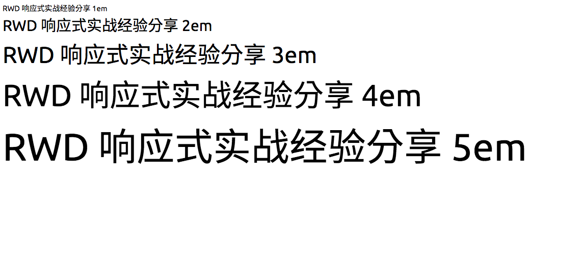
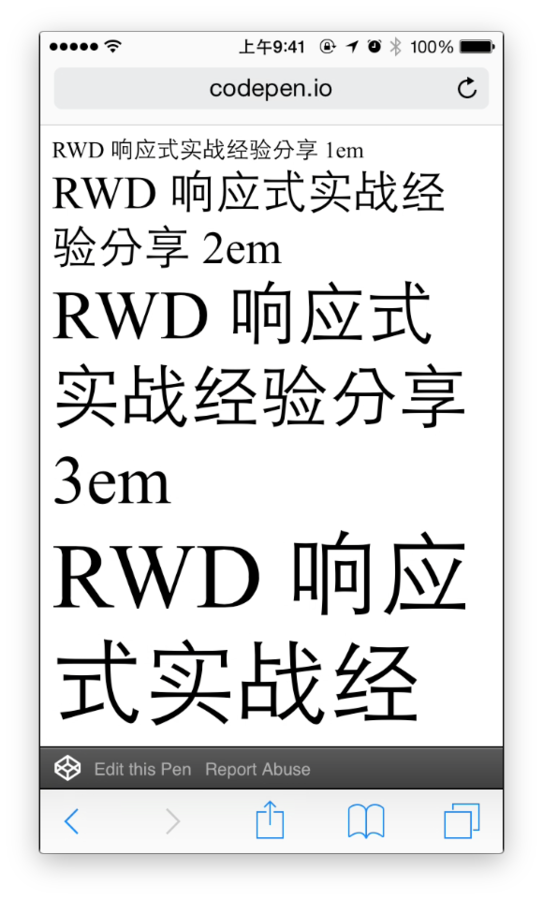
font-size 的單位是以瀏覽器的預設字體大小為基準。
ex. chrome 預設 font-size: 16px
(16px = 1em = 100%)
如果真的想讓字體縮小 ...
來玩玩 vw ,vh 吧!
那些年,我遇過的問題
要怎麼讓我的 JavaScript 也跟著有 RWD 的效果?
在 JavaScript 加上 media query
window.matchMedia("(min-width: 500px)")輕鬆加上 Breakpoint 判斷
mq.addListener(WidthChange);再加上 addListener 監聽
WidthChange(mq);記得給他初始值
也有 plugin

那些年
我硬幹過的事情
硬幹通常發生在 ..
已上線的
網站
RWD 網站
手帳寫真也是
Text
- 2014.9.27 正式開站宣傳
- 先求上線丶再求調整
- 啟動硬幹模式 ...
實作三原則
- 寬度
- 位置
- 樣式
寬度
Desktop
Mobile
.wrap {
  width: 960px;
}

.wrap .col {
  background: red;
  float: left;
  width: 500px;
}

.wrap .box {
  background: green;
  float: right;
  width: 400px;
  margin: 0 20px;
}
@media only screen and (max-width: 600px) {
  .wrap {
    width: 100%;
  }

  .wrap .col {
    width: 52%;
  }

  .wrap .box {
    width: 41.666%;
    margin: 0 .208333%;
  }
}
位置
Desktop
Mobile
.a {
  float: left;
}

.b {
  display: inline-block;
}

.c {
  position: relative;
  top: 10px;
}
@media only screen and (max-width: 600px) {
  .a {
    float: none;
  }

  .b {
    display: block;
  }

  .c {
    top: 20px;
  }
}
樣式
Desktop
Mobile
.col {
  background: url("http://placehold.it/350x150");
}
@media only screen and (max-width: 600px) {
  .col {
    background: none;
  }
}
Slider

桌機 (Desktop) 畫面
Slider

- 寬度
- 位置
Slider

Before
After
Discuss Board
桌機 (Desktop) 畫面
Discuss Board
- 寬度
Discuss Board
Before
After
Card List

桌機 (Desktop) 畫面
Card List
- 寬度
Card List

Before
After
Member
桌機 (Desktop) 畫面
Member
- 寬度
Member
Before
After
Comment List
桌機 (Desktop) 畫面
Comment List
- 寬度
Comment List
Before
After
RWD 難嗎 (?
做 RWD 很難?
要實作一個 RWD 網站並不難。
HTML ? CSS ? JavaScript ?
難的是
- 設計模式
- 效能處理
設計模式(design pattern)
RWD 設計模式
- Layout 網站佈局
- Navagation 導航列
- Images/ Media 媒體影音
- Table / Form Data 表格與表單的資料
- Text 文字
- Module 模組
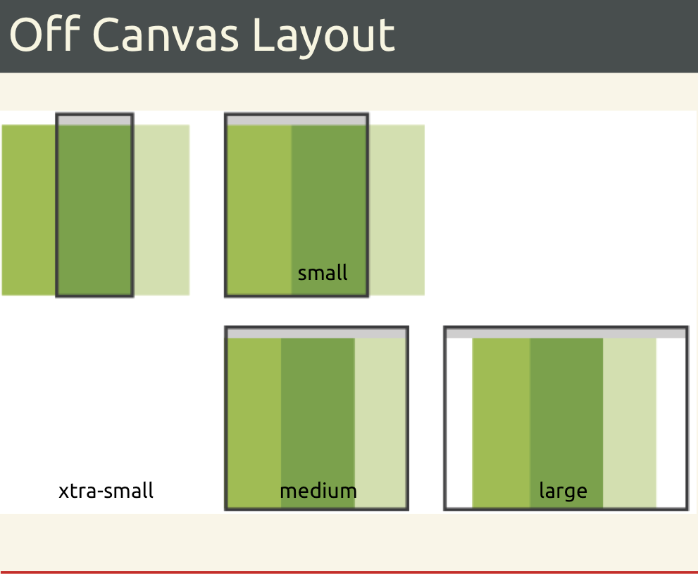
網站佈局
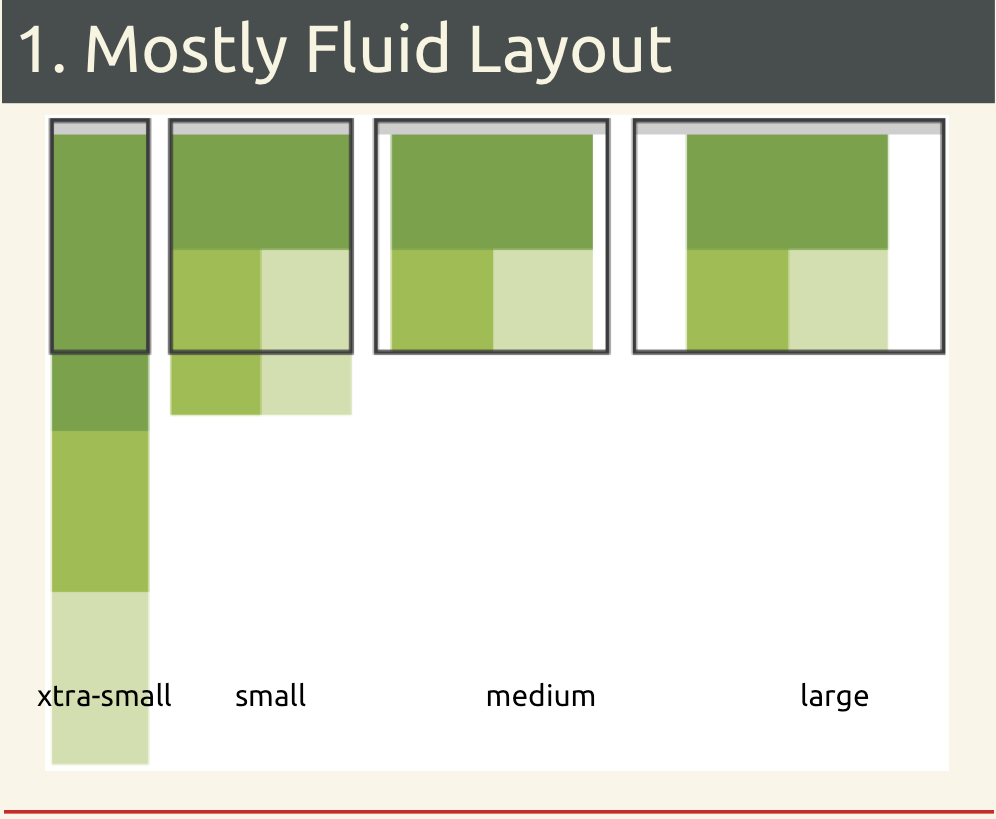
網站佈局
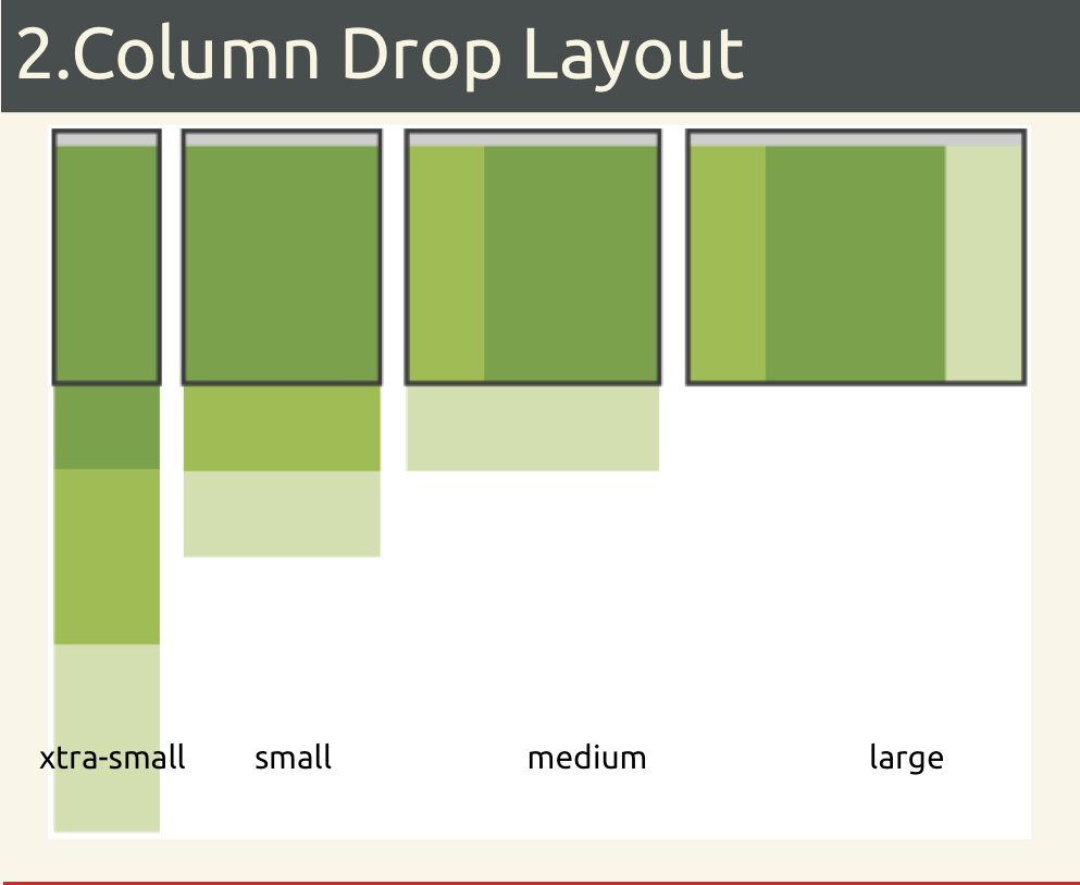
網站佈局
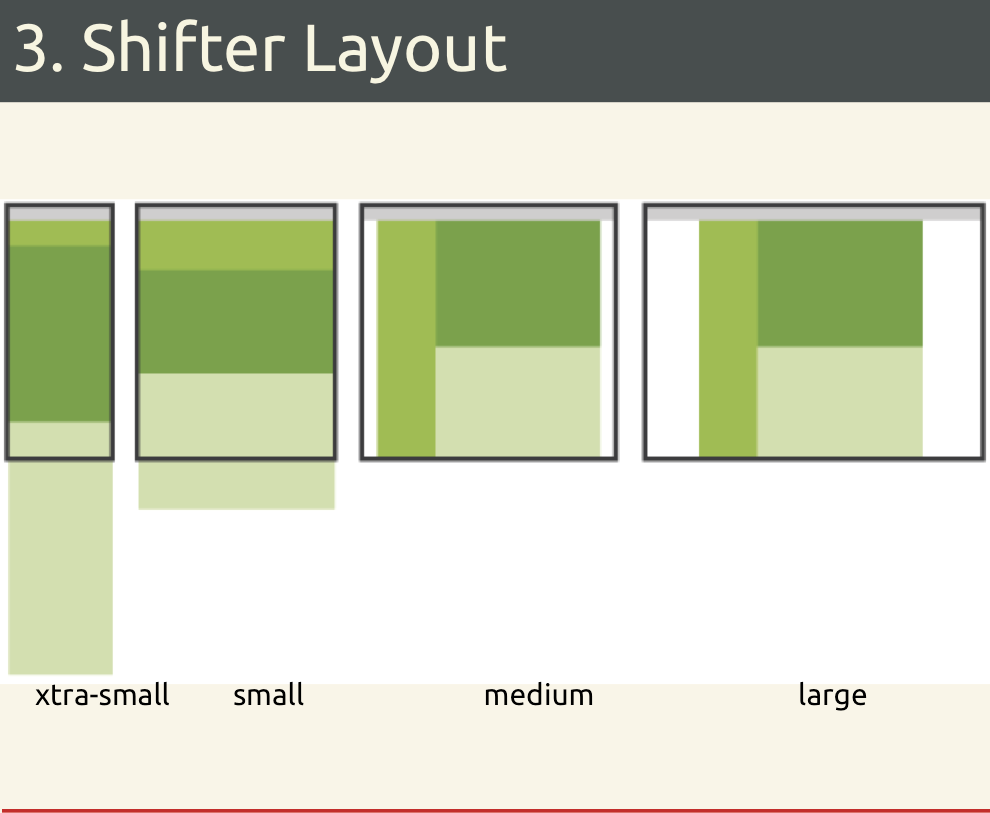
網站佈局
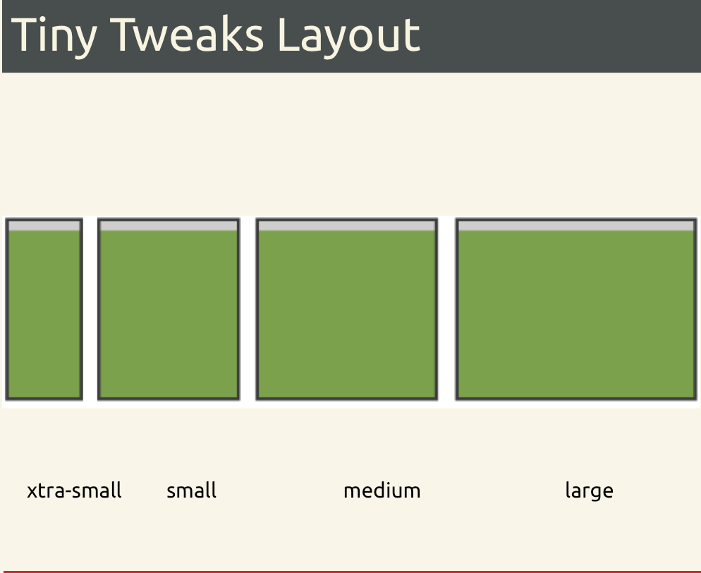
網站佈局
導航列
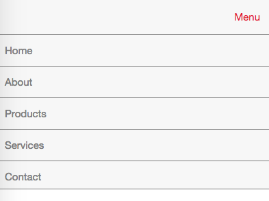
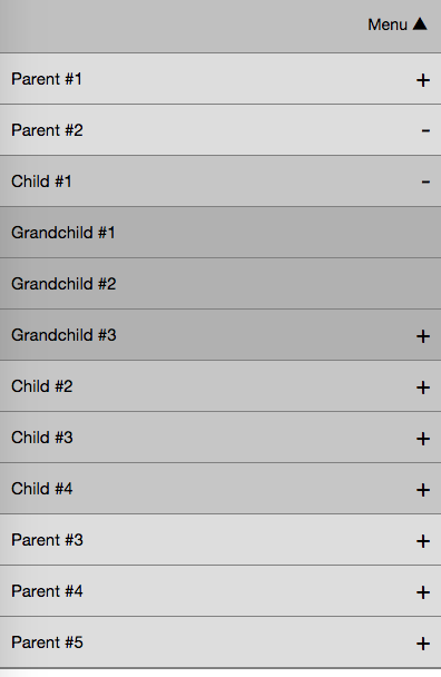
Single
Multi
表格 / 表單資料
Desktop

Mobile
表格 / 表單資料
表格 / 表單資料
<input type="tel">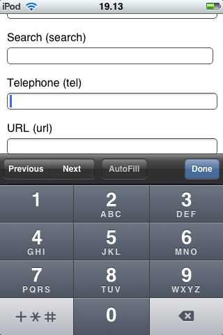
<input type="url">Tab 模組
Desktop
Mobile
說好的效能呢
常見的效能問題
圖片檔案
- Picturefill
- Lazy Loading
- SVG
- Web Fonts
RWD 檢測經驗談
- 縮放視窗時,出現橫向捲軸,可能是元件超出 div 的寬度
- 專有名詞或產品 / 公司名稱,設定 禁止斷行
- 連續文字 (ex.網址) 導致超出畫面,可設定
- 圖片設為 , 實現基本的圖片 RWD
- 移動裝置上沒有 hover 這個動作
- 過度消耗資源的特效,可以偵測 user-agent 以避免
- 第三方廣告的 flash 或 iframe,可視情況隱藏
- 特別檢查 的元件,縮放時切忌佔用螢幕
white-space: nowrap;word-break: break-all;max-width: 100%; height: auto;position: fixed;來源:http://blog.evendesign.tw/post/48853824439/rwd-test
Q & A
Thanks for listening
RWD 經驗分享 @廣州前端
By muki wu


